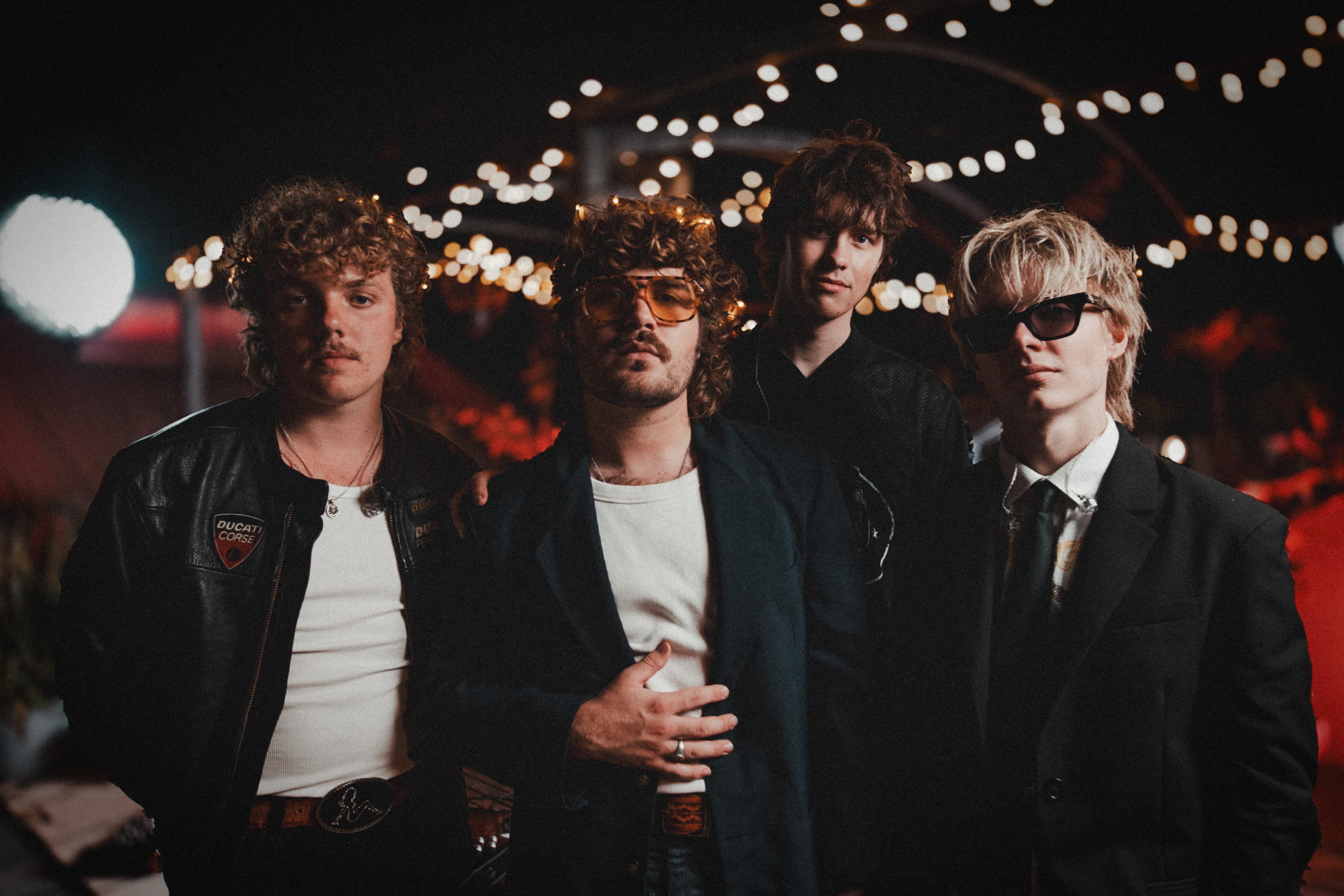

Mood on the Roof
Moody rooftop concerts bringing you your next musical obsession
Shot above Mude Studios, Sydney, Mood on the Roof hosts live concerts catering to all moods.
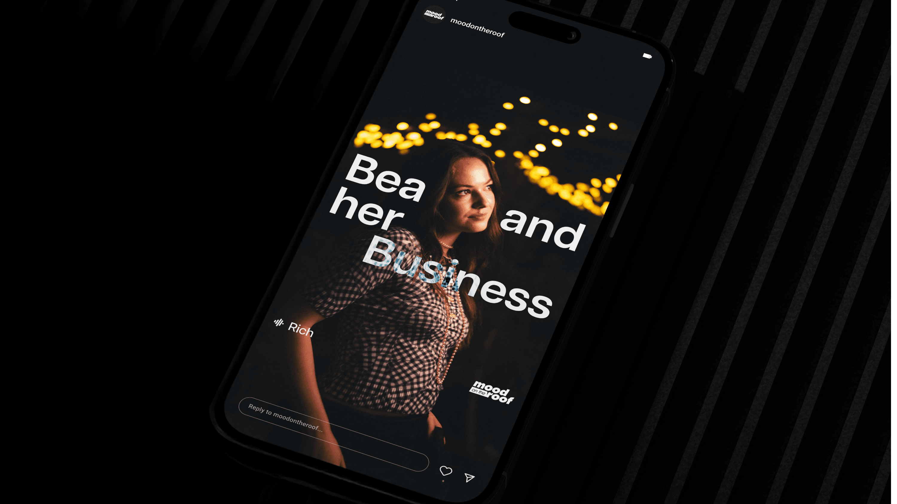
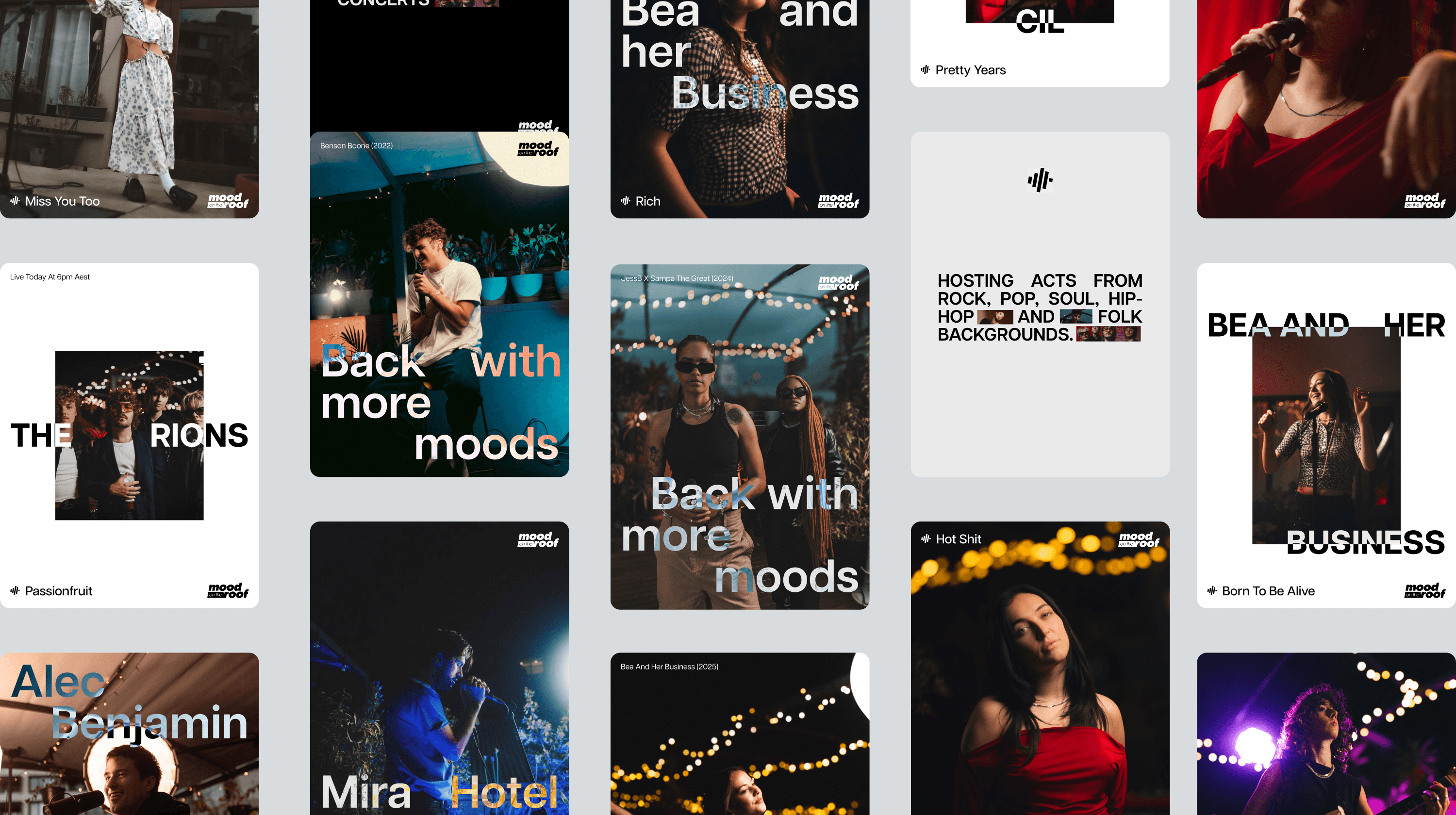
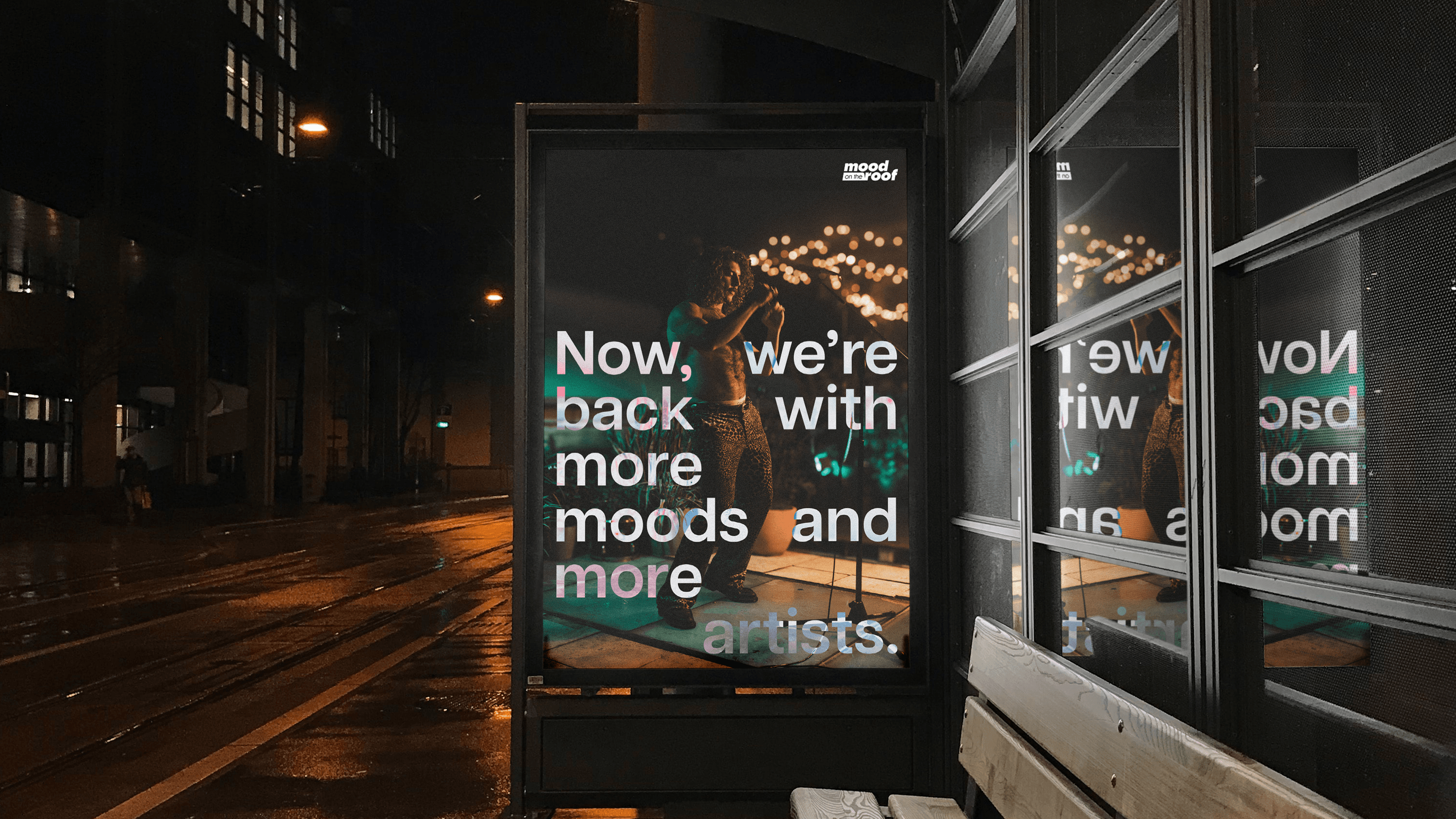
Five years ago we launched Mood on the Roof as a curated tastemaker series, a platform built purely from passion for advocating the artists we believed the world needed to hear. Five years on, we felt it was the right time to give the branding a refresh to maintain the series’ vitality and relevance. We’ve evolved towards a bolder, cleaner, modern-contemporary aesthetic, while carefully preserving the moody essence inherent to our name and iconic to the series. Another goal was to make the identity more scalable. The updated design system brings consistency to the way the brand shows up across video title cards, social templates, and the website, making it easier to scale the brand while maintaining its distinct visual language.
Mood on the Roof has become known as a series where sound matters, where live performance is treated with reverence, and where artists feel proud to be featured. Part discovery platform, part cultural archive, the refresh signals our continued commitment to platforming exceptional talent and curating the sounds that deserve to be heard.
Webby Awards Nominee
2
Telly Awards
3
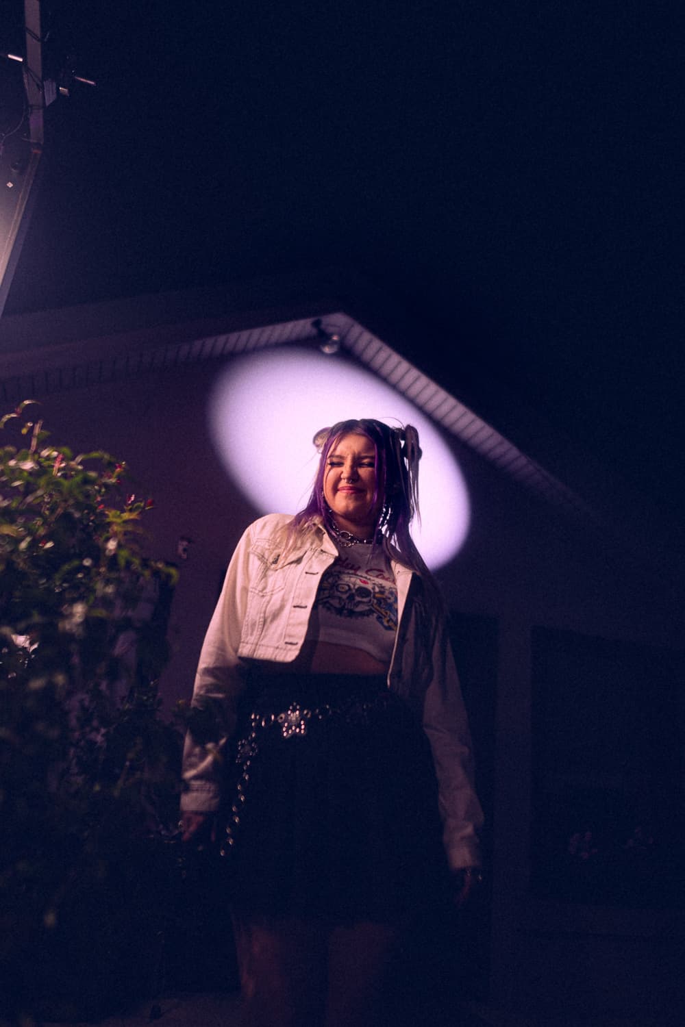


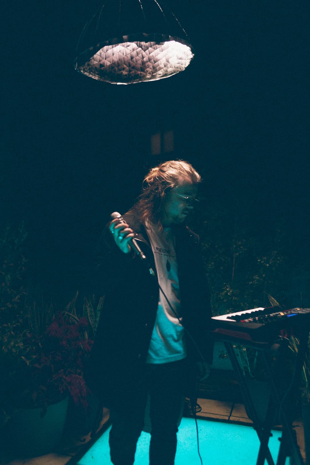
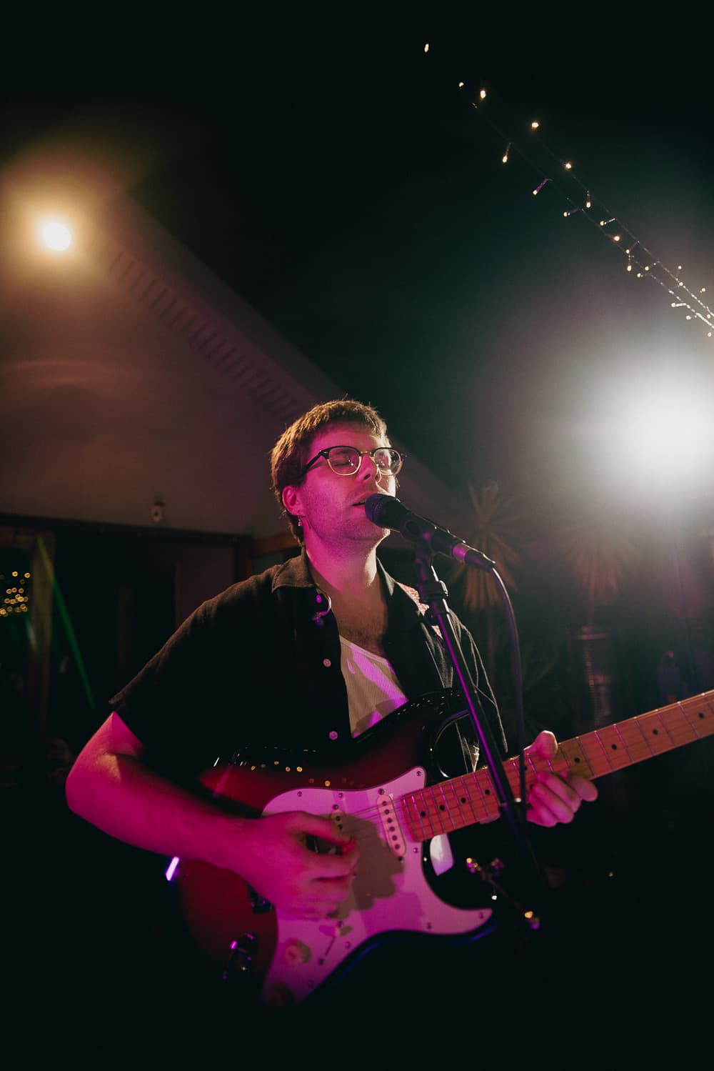
Benson Boone - Before You
Live on Mood on the Roof
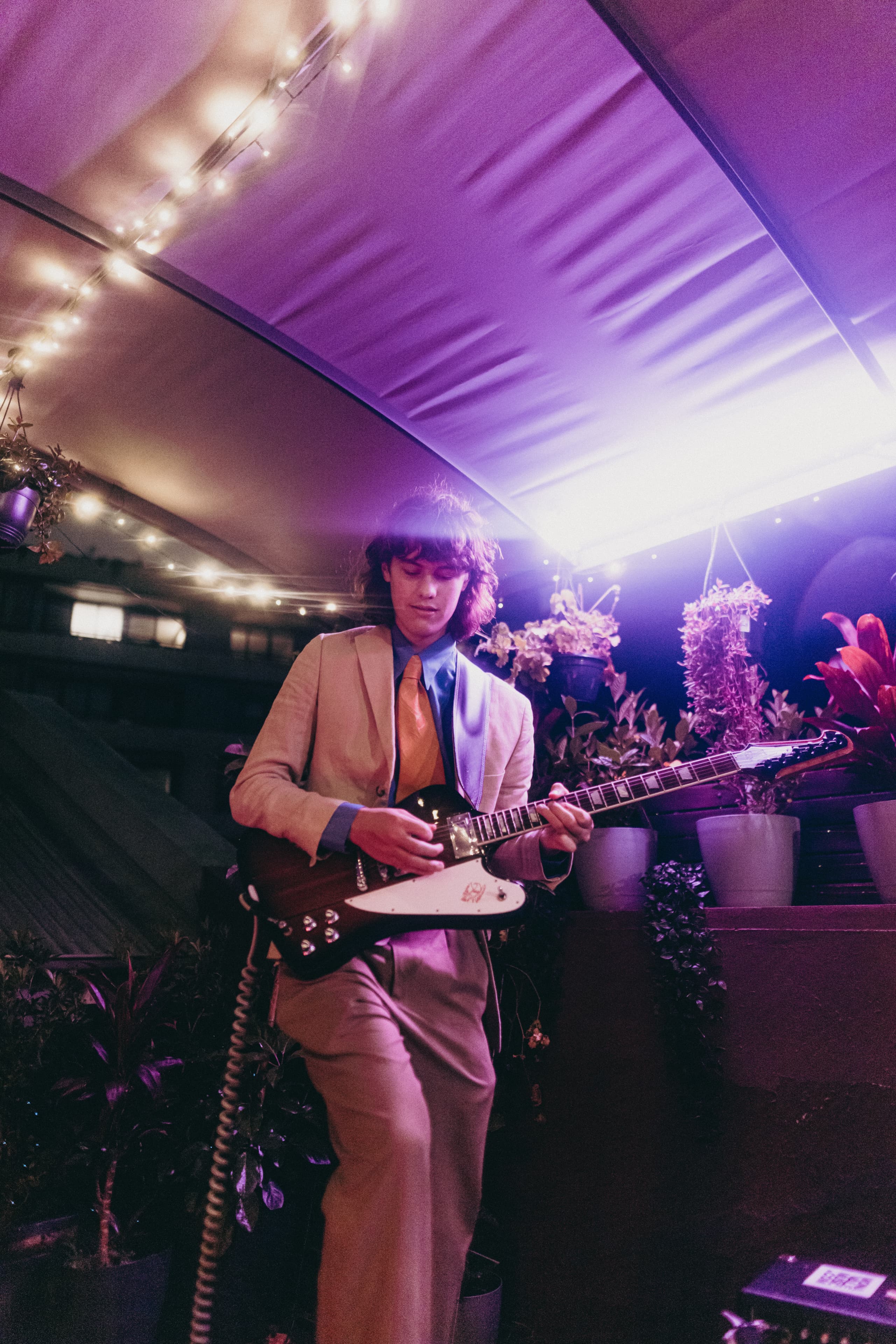
grentperez - Cherry Wine
Live on Mood on the Roof



Related Projects
View Project

Website, Graphic Design
Amazon Music
View Project

Video, Photography
View Project

Video, Photography
Amazon Music
View Project

Website
Amazon Music
View Project

Video, Photography
Chugg Music
View Project
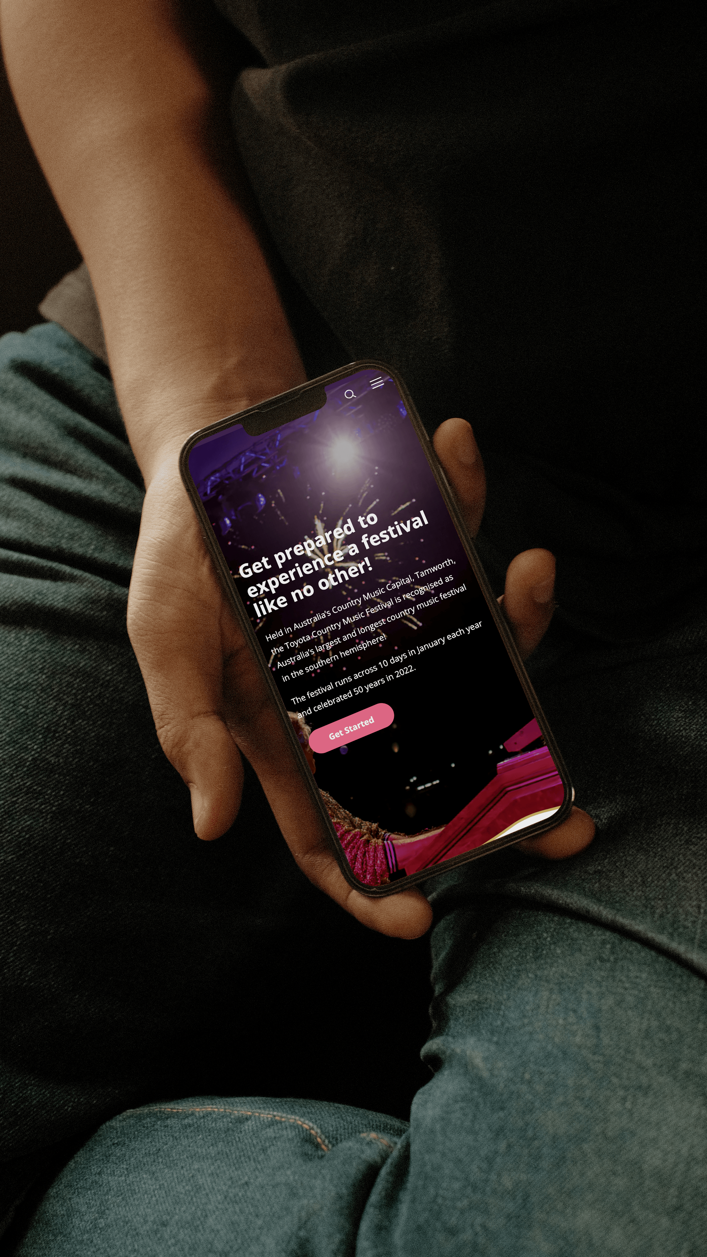
Website
Tamworth Regional Council
View Project

Campaigns
Mavin Records
View Project
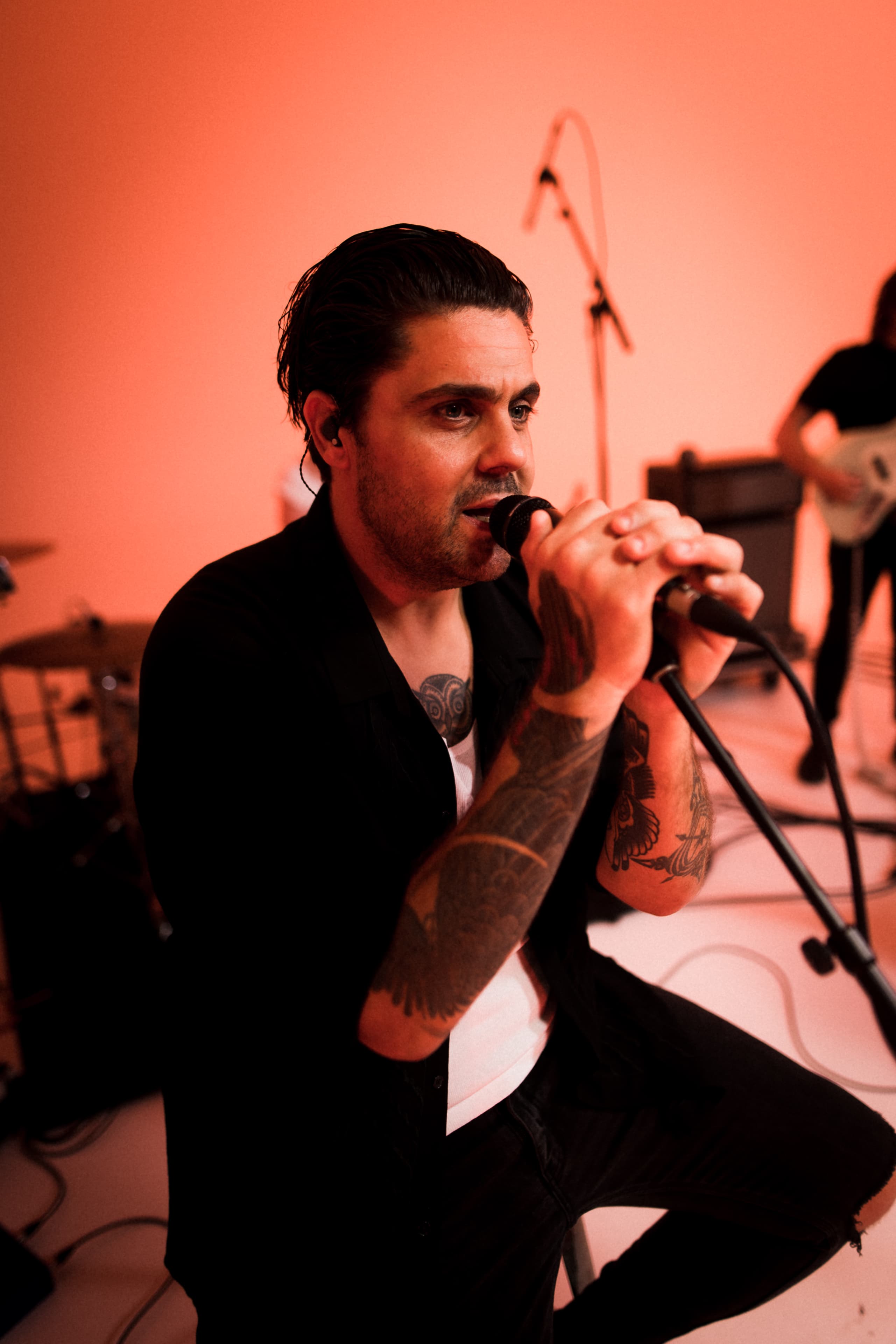
Video
Dan Sultan
Frequently Asked Questions
Rooftop concerts, made for all moods
A brand refresh updates how a brand looks and feels while keeping its underlying strategy, name and market position in place. It modernises the visual and verbal expression, the logo, typography, colour, layout and tone, without rebuilding the brand from scratch, which makes it the right move when a brand is still working and starting to look dated. A refresh sits at the lighter end of the scale that runs through refresh, repositioning and full rebrand.
Mood on the Roof, the rooftop live-music series created and produced by Mude, is a clear example. After five years, Mude refreshed the brand to keep it current, moving towards a bolder, clean, modern-contemporary look while holding on to the moody essence that gives the series its name. The strategy did not change, since the series still exists to platform exceptional artists, so the work focused on the expression and the system behind it. A refresh has limits worth naming: if the audience, the offer or the market has shifted underneath a brand, a refresh will not fix that, and a deep rebrand is the better answer. For a brand with strong foundations and a loyal audience, a refresh keeps it current without putting that existing recognition at risk.
A brand is usually ready for a refresh when it still works and no longer looks current, when its identity is starting to feel dated next to current competitors, or when it has grown into places the original design was never built to go. The trigger is rarely a single event, and more often a build-up of small signs that the brand is starting to feel dated for the business it represents. A refresh at the right moment keeps a brand feeling current without the cost and risk of a full rebrand.
Mood on the Roof reached that point at five years. Mude had launched the series as a curated tastemaker platform, and by year five the brand was still strong and ready to be brought up to date, both to stay relevant and to work hard across the channel set the series uses today. The refresh modernised the look and made the system more scalable, so the brand could keep pace with the way the series had grown. Timing matters, because a refresh done too often unsettles recognition, and one left too long lets a brand fall behind. Most brands reach that point when the work is still good and the design around it has started to show its age.
Rolling out a brand refresh well means updating every place the brand appears, in a planned order, so the new identity arrives as one coherent change. The work is less about the design and more about the system behind it: a clear set of components and rules that let the brand be applied the same way everywhere, by different people, without drifting. A refresh is only really finished once it has been applied consistently everywhere the brand actually appears.
For Mood on the Roof, Mude built the refresh as a scalable design system that carries across the series’ main surfaces, the video title cards, the social templates and the website. Designing those touchpoints from one system means a new episode, a social post and a web page all read as the same brand without each one being made from scratch. The hard part of any rollout is the long tail of small applications, which is where consistency usually slips, so the value of a system is that it answers most of those cases in advance. Consistency comes from the system behind the refresh, which carries the same rules into every new application.
Designing a brand identity to scale means building it from flexible parts that hold their character at any size and in any format, with no single fixed lock-up that has to be forced everywhere. A scalable identity has a clear core, a logo, a palette, a type system and a visual language, plus rules for how those parts flex between a tiny app icon and a full-screen video. A scalable identity is one that still feels like itself when the format changes.
Mood on the Roof has to work across very different surfaces, from a YouTube thumbnail to a video title card to a social post to the website, so Mude designed the refreshed identity as a system built to stretch across all of them. Each surface uses the same visual language, which keeps the series recognisable whether someone meets it on a phone screen or a desktop. Scalability does have a cost, since a flexible system takes more design effort to build, and it asks for discipline to maintain. For a brand that lives across many formats at once, that upfront work keeps the identity intact as it moves between contexts.
Keeping a brand consistent across video, social and web comes down to giving every channel the same building blocks and clear rules for using them, so each platform expresses one brand. The practical tools are shared templates, a defined type and colour system, and a small set of repeatable layouts, which let different formats stay recognisably connected even when their shapes and constraints differ. Consistency still allows for difference between formats, since a video, a social post and a web page each have their own demands, as long as they clearly come from the same place.
Mude’s refresh of Mood on the Roof was built to do this, with a design system that carries across video title cards, social templates and the website. Designing those surfaces from shared components means the series looks coherent across all of them while still suiting each one, so a title card and a web page feel related without being identical. The challenging channel to hold is usually social, where fast output and many formats tempt people to improvise, which is why good templates matter, since they make the on-brand option a quick one to reach for. Consistency holds when the system makes applying the brand correctly a straightforward option.
Branding a content series as a standalone media product means treating it as a brand in its own right, with its own name, identity, voice and audience,. A standalone media brand needs the things any product brand needs: a clear idea of what it is, a distinctive identity, and a consistent presence that an audience can follow and trust over time. Here the series itself is the product, which people choose to return to for its own sake.
Mood on the Roof is a media product in this sense. Mude created it as a curated series with its own identity and following, described as part discovery platform and part cultural archive,. That standing lets it attract artists and build an audience independent of whoever produces it. Running a content series as a standalone brand does ask more than using content as promotion, because it has to earn attention on its own merits and sustain a distinct identity. The payoff is a brand with real equity of its own. It takes work to build, and lasts well past the campaign cycle.
Strong branding helps a platform attract artists and partners by signalling quality and seriousness before any conversation starts. When a platform looks considered and consistent, and has a clear identity and reputation, artists and partners can see that being associated with it will reflect well on them, which lowers the risk of saying yes. A platform that looks amateur has to work much hard to earn the same trust.
Mood on the Roof has built this kind of pull. Mude has made it a series known for treating live performance with care, to the point that artists feel proud to be featured, and its track record includes a roster of acclaimed Australian and international names. That reputation, carried by a credible, well-produced brand, is part of why strong artists choose to perform on a rooftop in Sydney. Branding alone will not carry a platform if the experience behind it disappoints, since artists talk to each other and a weak product is quickly found out. A strong brand helps a platform earn that first interest, and the experience itself has to keep people coming back.
Motion identity is the part of a brand that defines how it moves: how a logo animates, how titles and graphics enter and leave, and the timing and rhythm that make motion feel like the brand. It has become a core layer of identity. Video and content brands especially need it, since these brands appear mainly in motion.
For Mood on the Roof, a video-first live-music series, motion is central to how the brand shows up. Title cards and on-screen graphics are part of the refreshed system, so each episode is framed in a way that is unmistakably the series before the music starts. Good motion identity is intentional, using movement where it has a clear purpose, so the brand stays crafted and easy to read. For a brand that lives in video, motion sits at the foundation of the identity and is designed with the same care as the logo.
Keeping a brand’s core idea intact as its look evolves starts with naming that idea clearly, so it can guide the design through every iteration. Most strong brands have a central idea, sometimes captured in the name, that the rest of the identity expresses, and a refresh succeeds when that idea stays the reference point for every design decision. As long as that idea holds, a brand can change how it looks without losing its meaning.
Mood on the Roof is anchored by the idea in its name, a moody, after-dark feeling that runs through the music, the rooftop setting and the visual style. When Mude refreshed the brand, that moody essence was carried straight through while the look became bolder and more contemporary, so the series still feels like itself even as the design moves on. Holding an idea steady does constrain the design, since not every fashionable direction will fit the core thought, and some have to be ruled out. That kind of constraint is useful, because a clear central idea keeps a brand coherent even as its surface changes over the years.
You can tell a brand refresh worked when the brand is more consistent, easy to apply and better recognised than before, and when it has not cost the recognition it started with. Because a refresh keeps the underlying strategy, success is mostly about brand health: consistency across touchpoints, faster production of new work, and whether the brand still feels current to its audience. A good sign is a brand that looks unmistakably itself across everything it now produces.
For Mood on the Roof, the markers are practical. The refreshed identity holds together across the series’ title cards, social and website, the system makes new episodes faster to produce, and the series has kept the standing it built over five years, including a Webby nomination, multiple Telly Awards, and a roster that keeps attracting strong artists. None of that is proof a refresh alone caused the outcomes, since a good series and good music matter at least as much, and brand work should be careful about claiming more than it can show. The results of a refresh are usually subtle, since the brand mostly ends up working well and looking current.
The difference between a brand refresh and a rebrand is one of depth. A refresh updates the visual and verbal expression within the same strategic territory, while a rebrand changes the strategy itself, the positioning, the name, the audience or the promise, and rebuilds the identity to match. Deciding between them depends on whether the problem is with the brand’s strategy or only with its appearance. If the strategy still holds, a refresh is enough. If the business has outgrown or moved away from what the brand stands for, a rebrand is the better call.
Mood on the Roof, the live-music series created and produced by Mude, is a refresh. The series still does what it always has, platforming artists Mude believes deserve to be heard, so the positioning was left intact and the work modernised the look and tightened the system. A rebrand would have meant changing what the series is, which was never the goal. Getting this wrong is costly, since a rebrand applied to a brand that only needed a refresh throws away hard-won recognition, and a refresh applied to a brand with a deep problem leaves that problem unsolved. The aim is to choose a level of change that fits the size of the problem.
Modernising a brand without losing its recognition means deciding what to protect before deciding what to change. The most valuable parts of a brand, the elements people recognise without thinking, are kept and updated. Over-changing is the most common way a refresh goes wrong, because a brand that becomes unrecognisable has thrown away the equity it spent years building.
Mood on the Roof shows the balance. When Mude refreshed the series, the moody essence that gives the brand its name and character was treated as non-negotiable and carried straight through, while the look evolved towards something bolder, clean and more contemporary. The series still reads as the same one, brought up to date. Knowing which elements carry the recognition takes judgement, and the answer differs for every brand, since for one it might be a colour or a logomark and for another it might be a tone or a feeling. Either way, the approach is to let the expression change while protecting the small number of elements that make a brand recognisable.
A brand design system is the connected set of rules, components and assets that define how a brand looks and behaves everywhere it appears: the logo and its variations, typography, colour, spacing, layout, imagery and the templates that put them together. It is far more than a logo, and its job is practical: to make the brand repeatable, so anyone applying it produces work that looks like it belongs. A brand without a system tends to drift, with each new piece interpreting the brand slightly differently until the whole thing loses coherence.
When Mude refreshed Mood on the Roof, making the identity more scalable was a stated goal, and a design system was how that was achieved. The updated system brings consistency to video title cards, social templates and the website, so the series can grow without the brand splintering across formats. The value grows as a brand produces more, because a system saves time and holds the brand together across a rising number of episodes, posts and pages. A system is most useful for brands that publish often, which is the position a live-music series releasing regular content is in.
A brand mark works at small sizes when it is simple enough to stay legible when it is only a few millimetres wide. At thumbnail and app-icon scale, fine detail disappears, thin lines break up and complex logos turn to mud, so marks built for small sizes favour bold shapes, strong contrast and as few elements as possible. This matters increasingly every year, because most people now first meet a brand on a phone, as a small icon in a feed or a thumbnail in a list.
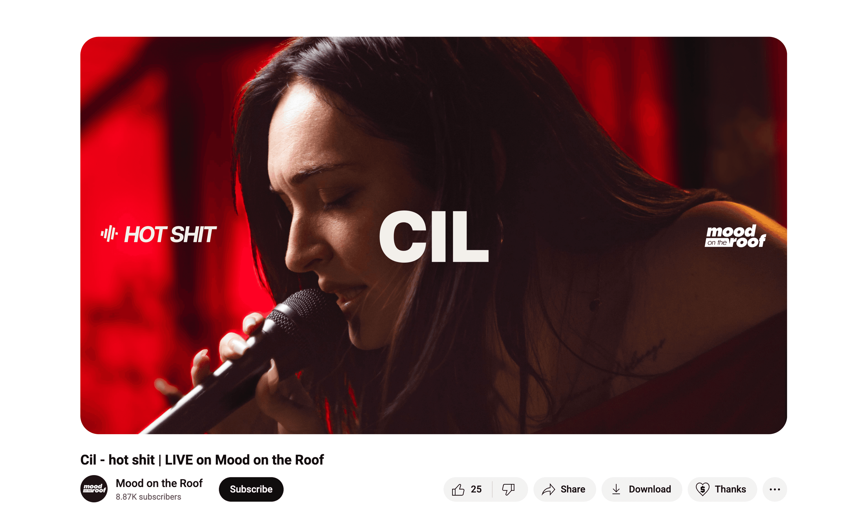
For a series like Mood on the Roof, which is discovered largely through YouTube thumbnails and social feeds, the refreshed identity had to read clearly at exactly those small sizes. Mude’s move towards a bolder, clean look serves that directly, since a confident, high-contrast mark survives the shrink to a thumbnail where a delicate one would vanish. There is a trade-off, because simplifying a mark for small sizes can cost some of the detail that looks rich at large scale, so the work is finding a form that holds up at both. For brands discovered on mobile, the mark has to be designed for the small size first.
A brand identity for a YouTube channel or content series is built around the series itself. The identity needs a recognisable system, a consistent thumbnail style, a title-card treatment, type and colour, and a tone, so that every upload is instantly identifiable as part of the series before a viewer reads the title. For a video-first brand, motion and the way episodes are framed carry weight alongside the static logo.
Mood on the Roof is exactly this kind of brand, a video-first live-music series that lives on YouTube and across social, created and produced by Mude. The refreshed identity gives the series a consistent visual language across its title cards, thumbnails and supporting channels, so a new episode reads as Mood on the Roof at a glance. A content brand also has to leave room for variety, since every episode features a different artist, so the system keeps the series coherent while allowing each episode to differ. The identity works when a viewer can recognise the series from the thumbnail alone, before the video starts.
Brand identity for an Australian media brand involves building editorial trust, a distinctive design language and a digital-first presence that travels beyond the local market. Media brands depend heavily on credibility and recognition, so the identity has to signal quality and consistency across the formats audiences actually use, which today means mobile, video and social first. For Australian media in particular, the work often balances a local identity with the reality that digital distribution reaches a global audience from day one.
Mood on the Roof is an Australian media brand with exactly that shape, a Sydney-based live-music series, shot above Mude Studios, that reaches viewers worldwide through YouTube. Mude’s refreshed identity gives it the design quality and consistency a credible media brand needs, while the rooftop setting keeps it rooted in its Sydney origins. Being Australian and globally distributed at once shapes the design, since the brand has to feel distinctive enough to stand out internationally without losing where it comes from. A media brand built this way can keep a local identity while reaching a global audience, which is increasingly how independent media grows.
A live-music or concert-series brand becomes distinctive through a clear point of view and a consistent way of presenting performance that sets it apart from the many channels filming live sessions. Live music alone is common, so what sets a series apart is usually its specific format, setting, production style and curation. Strong series brands have a clear personality that makes the whole series feel like a single place.
Mood on the Roof is built on a handful of distinctive choices. It is a single-take rooftop series shot above Mude Studios in Sydney, with a moody, cinematic style and a tightly curated line-up, and those decisions give it a character that a generic live-session channel lacks. The rooftop setting, the single continuous take and the considered visual treatment are the things audiences and artists remember. A distinctive format does narrow a series, since committing to one strong idea means turning down others. That focus also makes it memorable. A concert-series brand stands out by committing fully to one specific identity and format.
Designing title cards and motion for a recurring series means creating a repeatable template that establishes the series instantly while leaving room for what changes each episode. The fixed parts, the layout, type, animation style and timing, stay consistent so viewers recognise the format, while the variable parts, the artist, title or date, slot into the same frame. The aim is a system that can be produced again and again without redrawing it each time, and without it ever feeling like a stamp.
For Mood on the Roof, where every episode features a different artist, the title-card and motion treatment is part of the refreshed design system, so each new performance is introduced in a consistent, recognisable way. A repeatable structure means the production team can turn episodes around efficiently while every one still reads as the series. The challenge is making the template consistent without making it rigid, since a format that is too fixed becomes monotonous across a long run. A recurring series is easiest to sustain when its motion is built once as a system and reused for every episode.
A brand refresh is more than a visual update, even if it stays within the existing strategy. The decisions that drive a refresh, what to keep, what to change, which audiences and channels to design for, are strategic, and a refresh that only chases a new look without that thinking tends to age just as quickly as what it replaced. Most of what a refresh involves is judgement about what to keep and what to change, and the new look is the visible outcome of that thinking.
Mood on the Roof shows the difference. Mude’s refresh changed the look. It was driven by clear goals, keeping the series relevant after five years and making the identity scalable enough to work across more channels. Those goals drove the design, which is why the refresh comes across as purposeful. A refresh does not require new positioning, since that would make it a rebrand. It does need strategic intent about why the change is happening and what it should achieve. Whether a new look lasts depends on the strategy behind it.
Building a content brand that travels from a local scene to a global audience means making it specific enough to feel distinctive while still being easy for a wide audience to connect with. The local roots, a particular place, scene or culture, often make a brand interesting to a wide audience, so the aim is to keep that specificity while presenting it in a format the rest of the world can access.
Mood on the Roof is a clear case. It is unmistakably a Sydney series, shot on a rooftop above Mude Studios, yet it reaches a global audience through YouTube and features artists from Australia and around the world. Mude’s identity work gives it the polish to stand alongside international series while the rooftop and the local scene keep it grounded and distinctive. Travelling globally does test a brand, since what feels distinctive at home has to read clearly to people who have never been there, and an identity that is too inward can struggle to land. A local content brand reaches a wide audience when it keeps what makes it distinctive and presents it in a way that audience can access.