Lystr
Property branding for Lystr: building a people’s alternative in real estate
Lystr is the brand giving control back to homeowners. Built by Mude, it reimagines how Australians sell property: bold, irreverent, and independent. A people’s brand for those tired of inflated egos and hidden fees.
When Lystr came to Mude, they already had the product: a platform that makes selling homes simpler. The challenge was to create a property branding strategy that felt real: a confident, people-first identity that sides with sellers, not agents. A brand that calls out what’s broken in real estate and invites Australians to join a smarter, more independent way to sell.
The launch campaign was a mockumentary-style video series that introduced audiences to a lineup of overconfident, overstretched, and out-of-touch agents. Each one an exaggerated reflection of the industry’s worst clichés. Shot in a handheld, cinéma vérité style reminiscent of The Office and Utopia, each vignette plays out like a slow-motion car crash of ego and incompetence.
Brand Guide
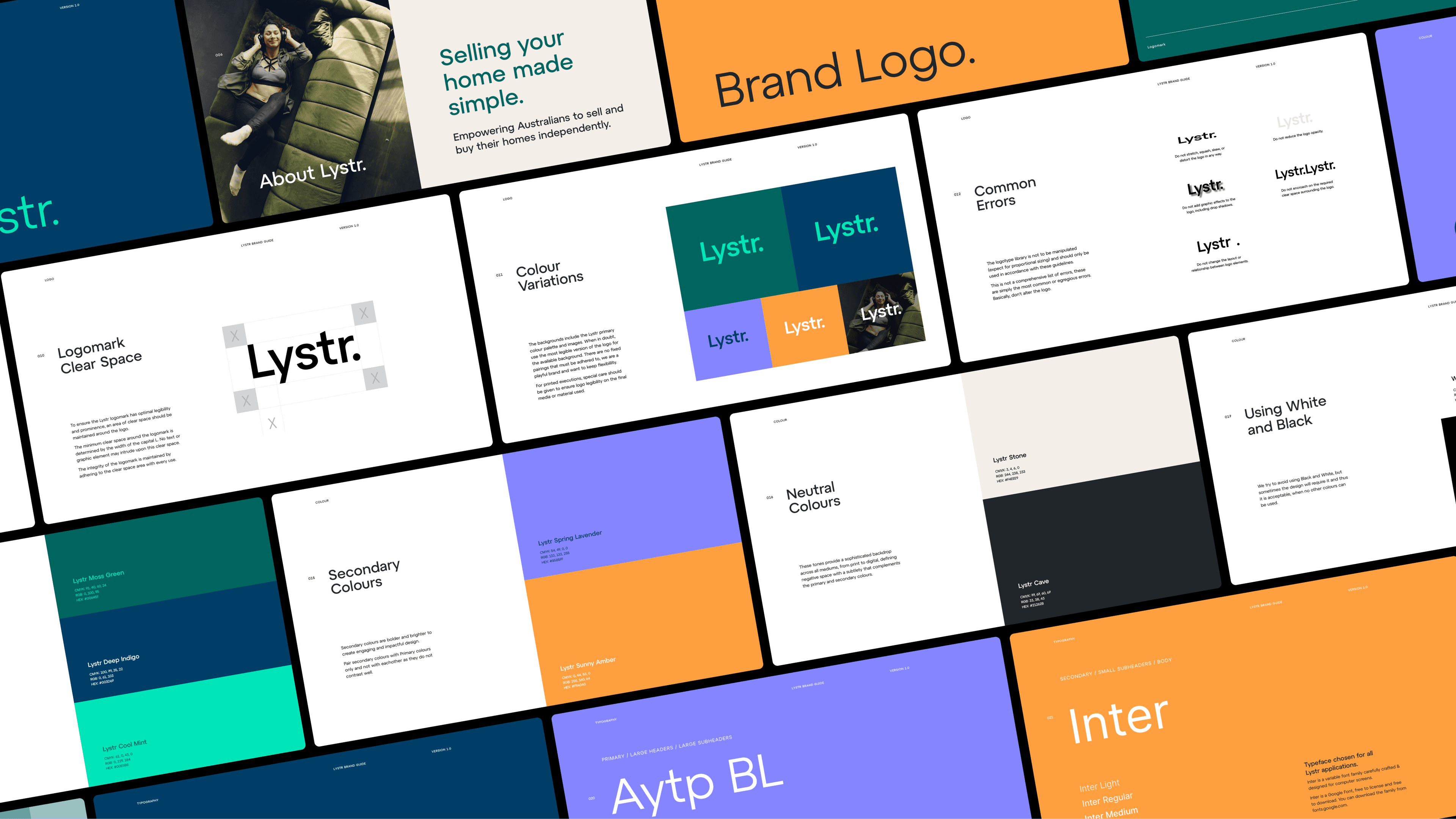
A clear, structured brand guide defined Lystr’s new property branding system, helping the internal team activate it with confidence.
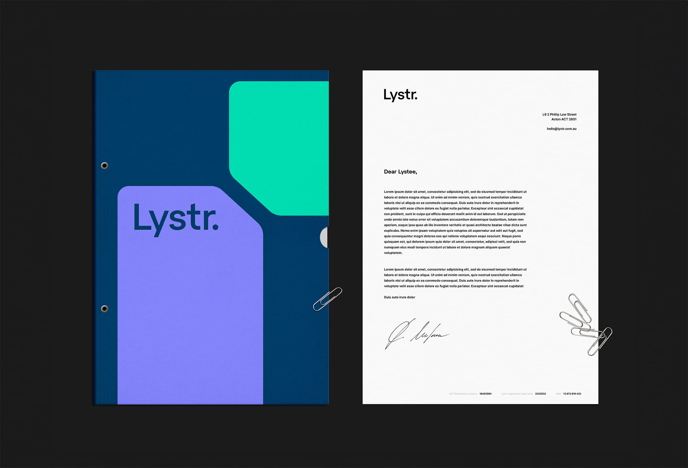
Letterhead
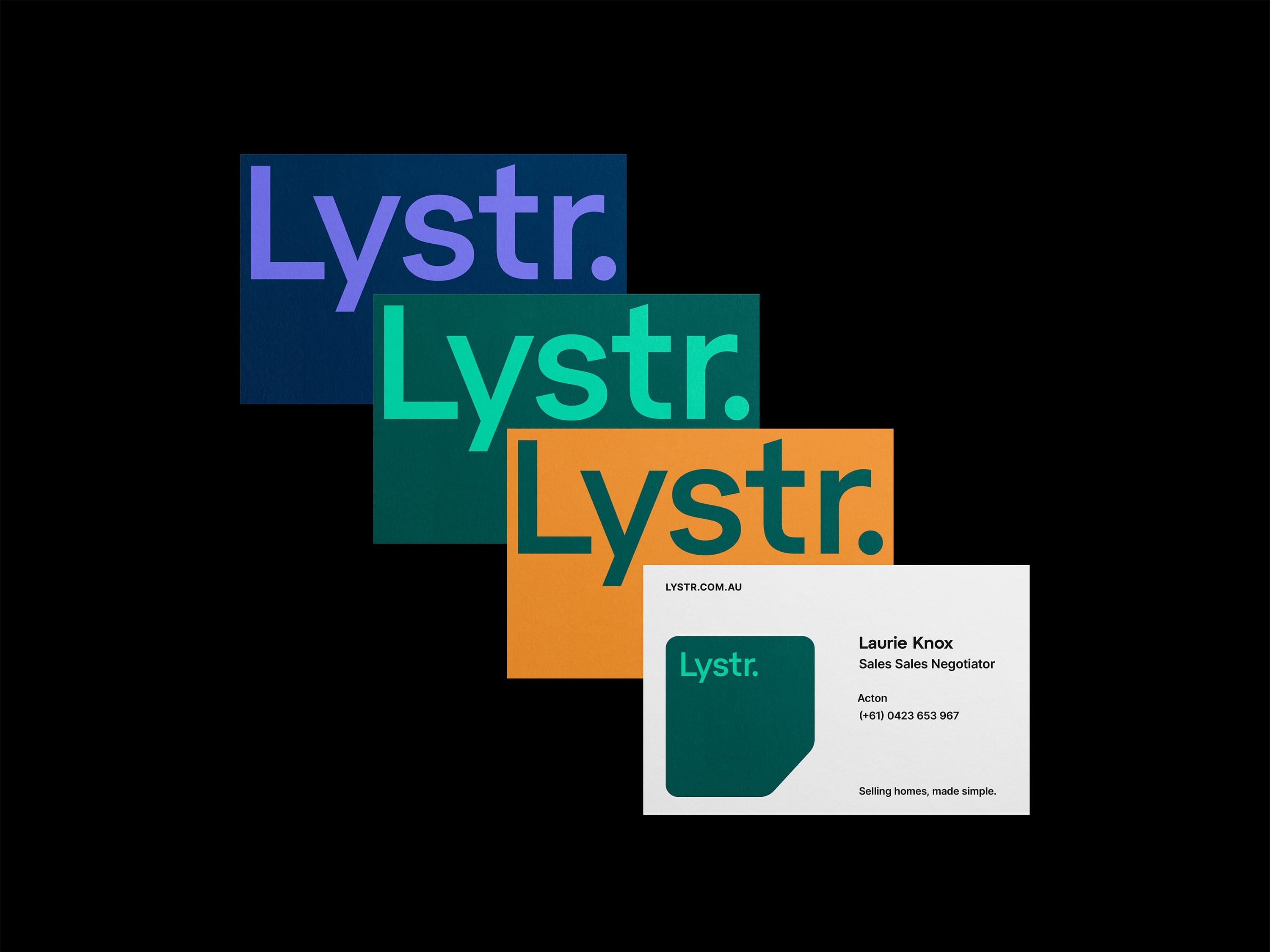
Letterhead from Mude’s property branding suite for Lystr. Demonstrates how the new brand identity extended into business stationery and daily communication materials.
Mude developed a brand identity that captures Lystr’s irreverent attitude while grounding it in trust and simplicity. The property brand design uses bold typography, confident colour, and everyday language to make the experience of selling a home feel modern, empowering, and transparent.
The visual identity strikes the balance between bold and human. Strong use of Lystr Indigo and Mint defines its brand palette, while clean layouts and conversational copy reinforce the brand’s challenger tone. Every element was built to help Lystr stand apart from the glossy sameness of traditional real estate branding.
Lystr’s new brand positions it as the people’s alternative: a challenger brand built for homeowners who want transparency, independence, and results. From the brand identity design to the property marketing strategy, everything about Lystr reinforces its promise: you don’t need to overpay for an agent to sell smarter.
Related Projects
View Project

Video, Campaigns
Defence Housing Australia
View Project
Website
GEOCON
View Project
Brand, Website
MagnaTerra Technologies
View Project
Brand, Website
Sunstrata
View Project
Brand
Skyline
AGDA Awards 2026 - Finalist
1View Project
Brand
Nescii
View Project
Brand
Full Proof
View Project
Brand, Graphic Design
ByAsia Food
Pentawards 2023 Shortlist
1Frequently Asked Questions
The people's alternative in real estate
Real estate agents are one of the least trusted professions in Australia. In Roy Morgan’s long-running survey of professions they sit near the bottom for ethics and honesty almost every year, in single figures, usually only ahead of advertising people and car salespeople. So a property brand does not start from neutral. It starts in a category the public has already decided to be wary of, and a nice logo does nothing about that.
What feeds the distrust is specific. An agent quotes a high price to win the listing, then manages the seller down to what the market was always going to pay, and the seller cannot tell whether anything they are told is true. Lystr answers that by making the process visible. Mude built the brand around a platform that shows the seller where every part of the sale is up to in real time, from the solicitor and the photographer to each offer as it lands, so the brand shows the receipts.
The distrust is mostly aimed at the category, not the person, and surveyed sellers usually say they were happy with their own agent and would use them again. A five-million-dollar home with a handful of possible buyers is also still a job for a specialist who works that market by hand. For an ordinary sale, where much of the work is coordination the seller could watch for themselves, a brand that opens the process up has more claim on a seller’s belief than one that asks them to take its word for it.
A good real estate logo should make the agency recognisable on its own,. Most property boards put a headshot front and centre and treat the logo as a small mark beside it, so when the agent moves on, the recognition tends to go with them.
A logo earns that recognition by being simple enough to hold its shape everywhere it lands, from a thumbnail on a portal listing to a corflute sign read from a moving car. Lystr uses a wordmark, the name set in bold Atyp BL with a full stop and nothing else, where most agencies bolt on a roofline motif, a monogram or the agent’s own headshot. Mude kept it to the name so it reads cleanly when it is small and stays the same mark whoever is selling the house. The full stop does quiet work, giving the name a flat, matter-of-fact finish that suits a brand that talks plainly.
A wordmark only works when the name is short and worth owning. A long or generic agency name usually needs a symbol to carry it, and a genuine solo operator whose whole business is their own reputation sometimes has a real reason to put a face on the sign. For a short, ownable name like Lystr, a clean wordmark does more than a crowded one.
The useful question for a real estate brand is which colours the category has left unused, with trust signalling as a secondary read. Colour does limited psychological work and substantial sorting work, since it is one of the quick ways a buyer tells one brand from another, and in property nearly everyone has reached for the same few.
Australian real estate branding runs on red and navy, with black and white close behind. When a category clusters on a handful of colours, those colours stop identifying anyone and start standing for the category itself, so a brand that adopts them inherits the sameness it was trying to leave. Green and teal are comparatively rare in property, which makes them available to own.
Lystr uses a deep Indigo with a bright Mint, plus Lavender and Amber in support, so it reads as a different kind of company on a street of red-and-navy boards. Mude chose the palette to do the sorting job. Colour cannot carry the difference on its own, and a few eco-led property brands already use green, so the palette only works next to a wordmark and a tone of voice that sound nothing like an agency.
A visual identity system is everything you can see that makes a brand recognisable: the logo, the colours, the type, the photography, the icons, the shapes, and the rules for putting them together. The logo is one piece of it, not the whole thing, which is worth saying because a lot of briefs treat the logo and the brand as the same object.
Lystr’s system runs from its wordmark and the Indigo-and-Mint palette to the Atyp BL and Inter type pairing, an angled-corner shape used as a recurring device, and a set of minimalist line icons for things like beds, baths and parking. Mude built it so the brand holds together whether it is a for-sale sign, an app screen or a business card.
A system can be lean or large depending on what the brand has to cover. A one-product brand rarely needs every element, and over-building a system the team will not use is its own kind of waste. What matters is that the parts share one logic, so the brand looks like itself even in a piece no designer touched.
A brand guide is the document that sets out how an identity is used: the logo and its lockups, the colour values, the type, the spacing, and the rules that keep a brand consistent as more people make work in it. It is a consistency tool. The thing it is not is a strategy, since documenting which colours to use is a small job than knowing why the brand behaves the way it does.
Lystr’s version 1.0 guide documents the wordmark with its clear space and 100px minimum, the Indigo, Green and Mint primaries with a tint system, the Atyp BL and Inter typefaces, the angled-corner shapes, the line icons, and worked examples of collateral. Mude built it so the in-house team could produce on-brand work without a designer in the room. That is why the everyday text face is Inter, a free screen font that renders on any machine and browser,.
A guide can be short or long depending on what the brand needs, and a small brand rarely needs every section. What matters is that the people producing the work each day can actually follow it, because a guide only a designer can apply stops working the moment the designer leaves the thread.
Shapes and patterns give a brand a signature beyond the logo, something it can be recognised by when the wordmark is not in the frame. Done well, they do real identifying work, so a regular customer starts clocking the brand from a pattern on a crop of a photo or a shape in the corner of a screen, before they have read a thing.
Lystr uses an angled-corner shape as its recurring device, built to scale along its straight edges so it can frame an image, hold a caption or sit as a graphic block without distorting, and a set of minimalist line icons drawn in one consistent style. Mude made these so the brand reads as a single world across a sign, a social tile and the app, beyond a logo dropped onto things.
Shapes and patterns are optional, not compulsory. A clean type-and-colour identity can stand on its own, and a forced pattern that means nothing just adds noise. They earn their place when they give the brand more ways to be spotted, which a property brand plastered across signs and feeds can genuinely use.
Comedy works as a brand launch when the film is something people would actually choose to watch, and the brand rides underneath the joke. The instinct is to explain the product. The strong move is to make people laugh at something they recognise, because a viewer who enjoyed it absorbs the point and a viewer who got pitched at clicks away.
Lystr launched with a mockumentary series about the agents, not the platform. A lineup of overconfident, out-of-touch characters running the clichés anyone who has sold a house knows on sight: the inflated promise, the pushiness, the expensive car, the feeling that you paid tens of thousands and thought afterwards that you could have done it yourself. Mude shot it handheld in the manner of The Office and Utopia, each scene a slow car crash of ego, so it plays like a show. The point, that there is a calmer way to sell, sits inside the comedy.
Comedy carries real risk on its own, and it only works when the joke lands on a shared frustration. It is also not the right tool for every brand, and a launch in a sombre or high-stakes moment usually has to earn attention another way.
A challenger brand is usually better served by a video style that looks a little raw than by high-gloss production, because polish reads as the establishment the brand is trying to stand apart from. When everyone in the category makes the same slick, golden-hour ad, the brand that looks handmade signals real substance, beyond marketing claim.
Lystr’s launch films are shot handheld and observational, closer to a comedy series than a property ad, so the tone matches a brand built to puncture industry polish. Mude chose the look so the films feel like something caught.
Raw is not automatically right. Some categories and some stories still reward a crafted, beautiful film, and low-fi done lazily just looks cheap. The style is a decision about what the brand is saying, so a challenger leans rougher only when rough is the point, which for Lystr it was.
Open any property portal and the brands blur into one: navy or red, and the agent’s own face beaming out larger than the house. The category runs on a small set of codes and nearly everyone uses them, so the first move is naming those codes and refusing them, which feels riskier than it is, because looking like every other agency is the actual risk.
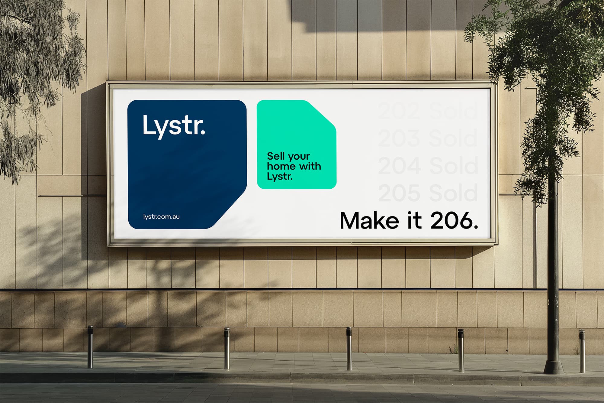
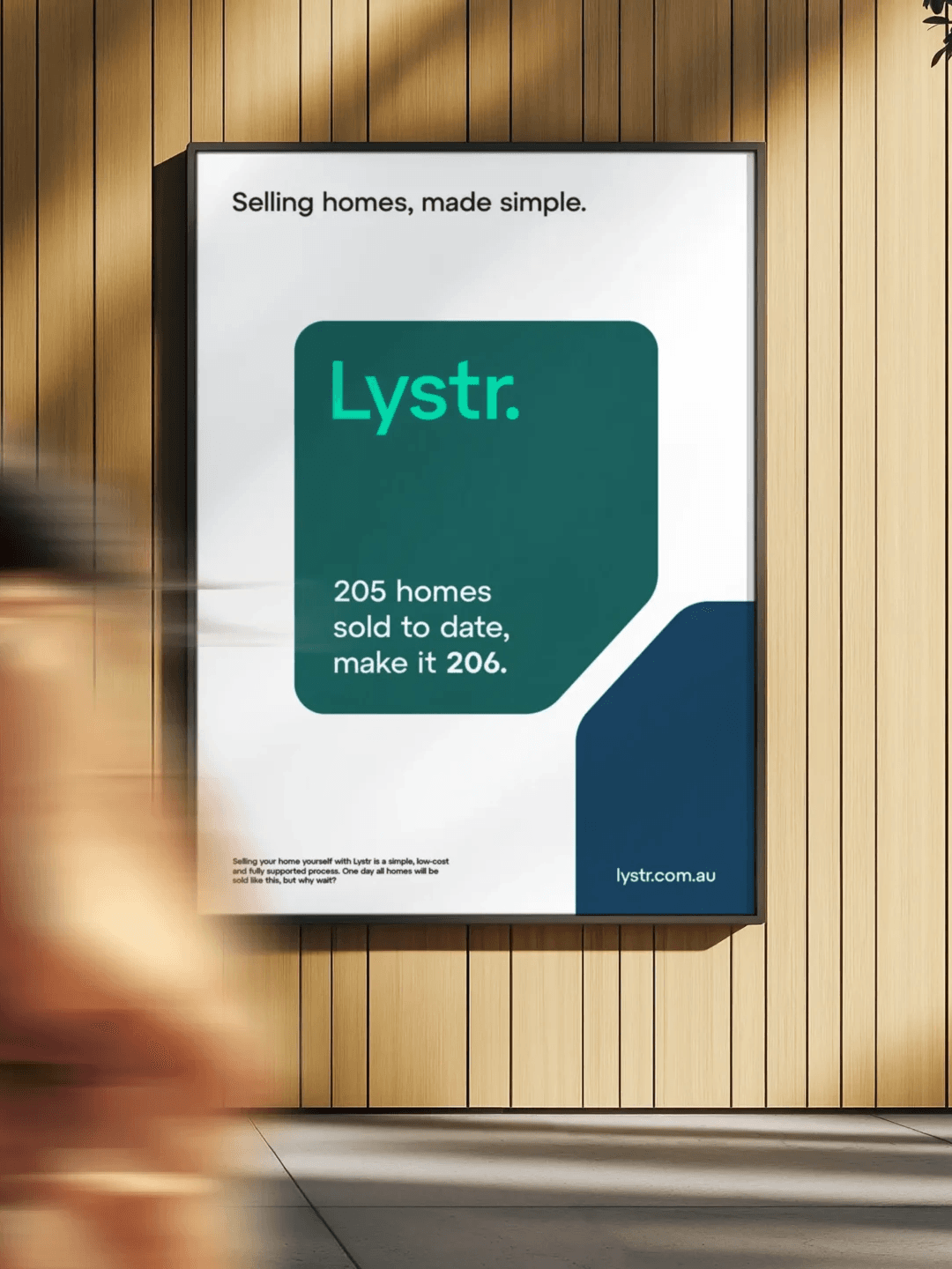
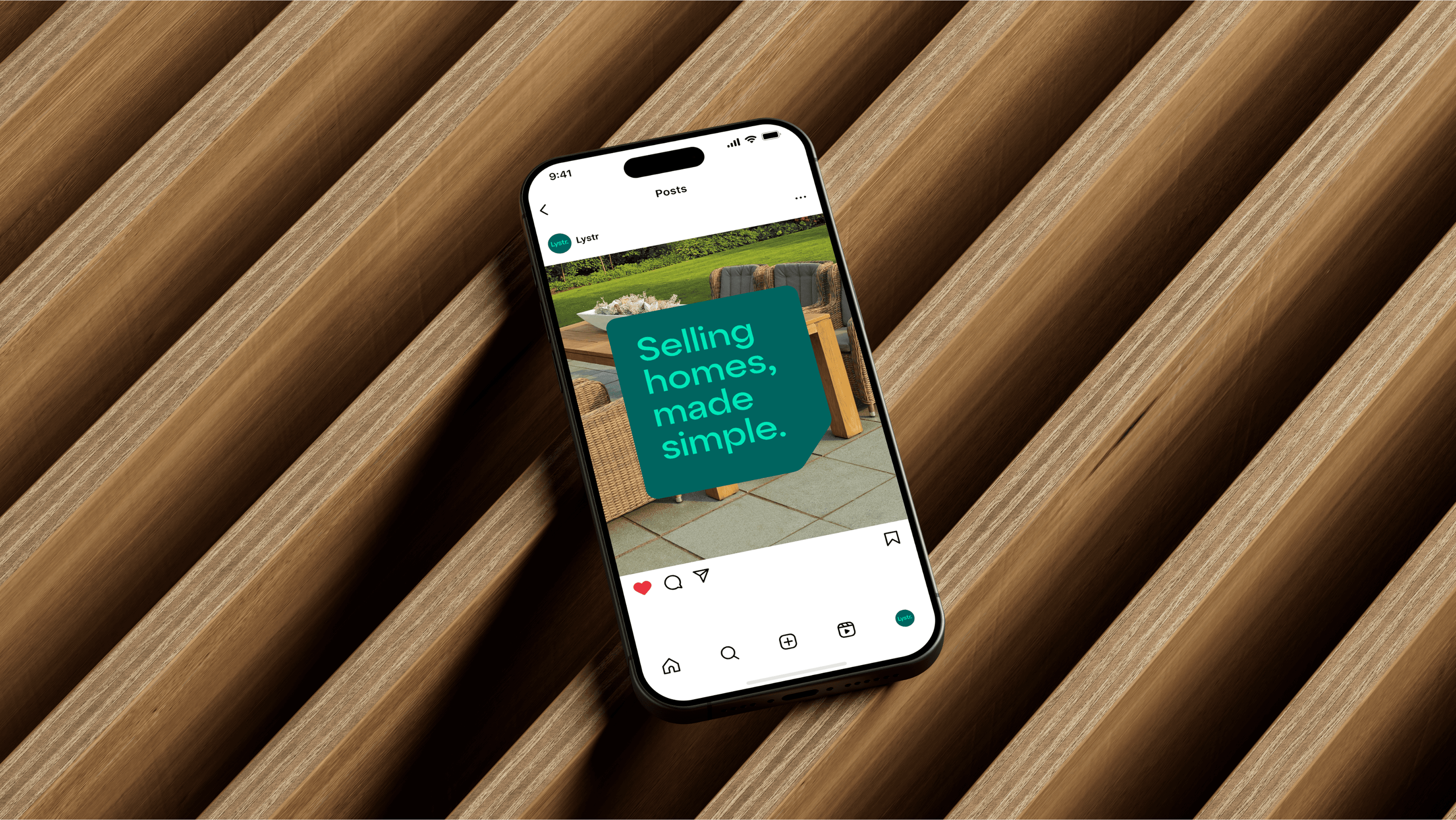
Lystr is built as a challenger to the traditional agent, so Mude gave it a look that does none of the category’s tricks: a Mint and Indigo palette on a street where every board is red and navy, a plain wordmark with a full stop where the others put a headshot, and copy that talks the way a person talks. The same world runs from the for-sale sign to a billboard that reads 205 homes sold to date, make it 206.
Refusing the codes buys recognition. A seller clocks that this is a different kind of company before they have read a word, which is the job an identity is there to do. Difference on its own is not enough. A brand can look distinct from its peers and still feel flimsy, which loses the seller it was chasing, so Lystr still had to read like a company you would hand a major sale to.
A proptech platform asks people to hand a major financial transaction to software. That is the brand problem before it is a design problem: the product is new, the category is one people already distrust, and the buyer cannot fall back on a familiar local agent’s face to decide whether to believe it.
Lystr came to Mude with a working platform that makes selling a home simple, so the job was to make a piece of technology feel like something a person would choose, without hiding what it does. Mude drew the brand around the seller’s experience. The brand makes the case that the platform is on the seller’s side.
What a platform cannot borrow is the thing incumbents lean on hardest: years of local sales, a name on every second sign in the suburb, the agent everyone’s neighbour used. A proptech brand has to earn that standing through a clear, consistent experience instead, and in the parts of the market where hands-on local knowledge genuinely moves the price, an established agent still has the edge.
Choosing typography is mainly about picking type the brand can use everywhere it actually appears, with characterful faces a secondary consideration. A typeface that looks sharp in the brand guide and then goes missing the moment a staff member opens a document or builds a slide is a liability, so the deciding constraint is usually where the type has to render, not how distinctive it looks.
That is why most brands end up with two faces. Lystr pairs Atyp BL, a bold modern sans with an almost mechanical evenness, for headlines and the wordmark, with Inter for everyday text. Mude chose Inter because it was drawn for screens, renders on any machine and browser, and reads comfortably down to small sizes, where the display face would tire the eye.
A single typeface can carry a simple brand, so a two-face system is a choice. A brand with the control to license and embed a distinctive text face can use one without trouble. The two-face approach earns its place when a brand has both headlines that need a manner and a lot of plain copy, on signs, in an app and in long contracts, that has to stay legible wherever it is produced.
A strong brand identity does two jobs, and both matter before anything looks good. It makes the brand easy to pick out at a glance, and it signals what kind of company this is and who it is for. Weak identities usually do one and forget the other. They end up distinctive without meaning, or full of meaning without standing out.
For a brand entering a market as samey as real estate, the big risk is blending in, because a brand that looks like every agency competes on the same things every agency competes on, which are price and recent sales. Lystr does both jobs at once: the Mint-and-Indigo look and the plain wordmark make it easy to recognise, and the plain talk and open manner signal a company that sides with the seller. Mude built the identity to be noticed and to mean something specific in the same move.
Strong does not mean loud, and the right identity depends on who it is for. A look built for a plain-spoken challenger would be wrong for a heritage firm whose buyers want restraint and history. Either way, an identity that cannot be picked out, or that says nothing about the company behind it, is not doing its job.
The touchpoints that decide how a brand is seen are usually the unglamorous, repeated ones, the sign on the verge, the listing, the letter that arrives in the post,. Touchpoints are the places a brand meets people and collateral is the everyday material it meets them with, and the everyday end of that list does most of the work because it is where most people actually encounter the brand.
The job is to make that everyday material feel like one brand. Lystr’s identity runs across for-sale and sold signage, business cards, letterhead, a social kit, and welcome tubes posted to new sellers in Indigo and Amber, all built together so the Mint, the angled-corner shapes and the plain voice carry from a sign on the verge to a billboard reading 205 homes sold to date, make it 206. Mude designed them as one system so a seller meets the same brand at every step.
Not every touchpoint earns equal effort. A young brand should put the work into the few its customers see most, usually the sign, the listing and the first thing that arrives in the post, and keep the rare ones simple. Effort spent polishing a touchpoint almost nobody reaches is effort that will not be seen.
A brand’s tone of voice is how it sounds in words, the same way a visual identity is how it looks: the vocabulary it uses, the length of its sentences, and what it refuses to say. It is defined the way a visual identity is, by deciding what the brand should sound like and then writing the rules and examples that keep it consistent when twenty different people are producing copy.
Lystr’s voice is plain, direct and a little dry, the way someone who has actually sold a house talks,. Mude set it deliberately against the category, which reaches for breathless adjectives and superlatives, so Lystr instead says things like sell your home with Lystr and make it 206. The brand reads as a straight talker in a market known for spin.
A tone only works if it is held. A brand that sounds plain on its website and then switches to corporate boilerplate in its contracts and emails teaches people not to believe either. The voice has to survive the boring documents, which are most of what a brand actually writes, beyond the campaign.
A brand launch video lands when it behaves like something people would choose to watch and the brand sits underneath it,. The makers who do this well work like film, documentary and music people, not corporate-video people. Launch films that work start from a problem the audience feels, not from a script that lists what the company does.
Lystr started from the problem everyone selling a house knows: the agent experience. Mude built the launch around that, in the writing first, casting the agents as the characters and keeping the platform in the background. Most of the work happened before the shoot, in the script and the casting, which is where a film like this is won or lost.
A comedy series is not the only way to launch, and the format should follow the story. A genuinely unfamiliar product is sometimes better served by a clear, straight explainer that shows how it works, and a brand with a serious or emotional story might need a single hero film. What does not change is starting from something the audience actually cares about.