

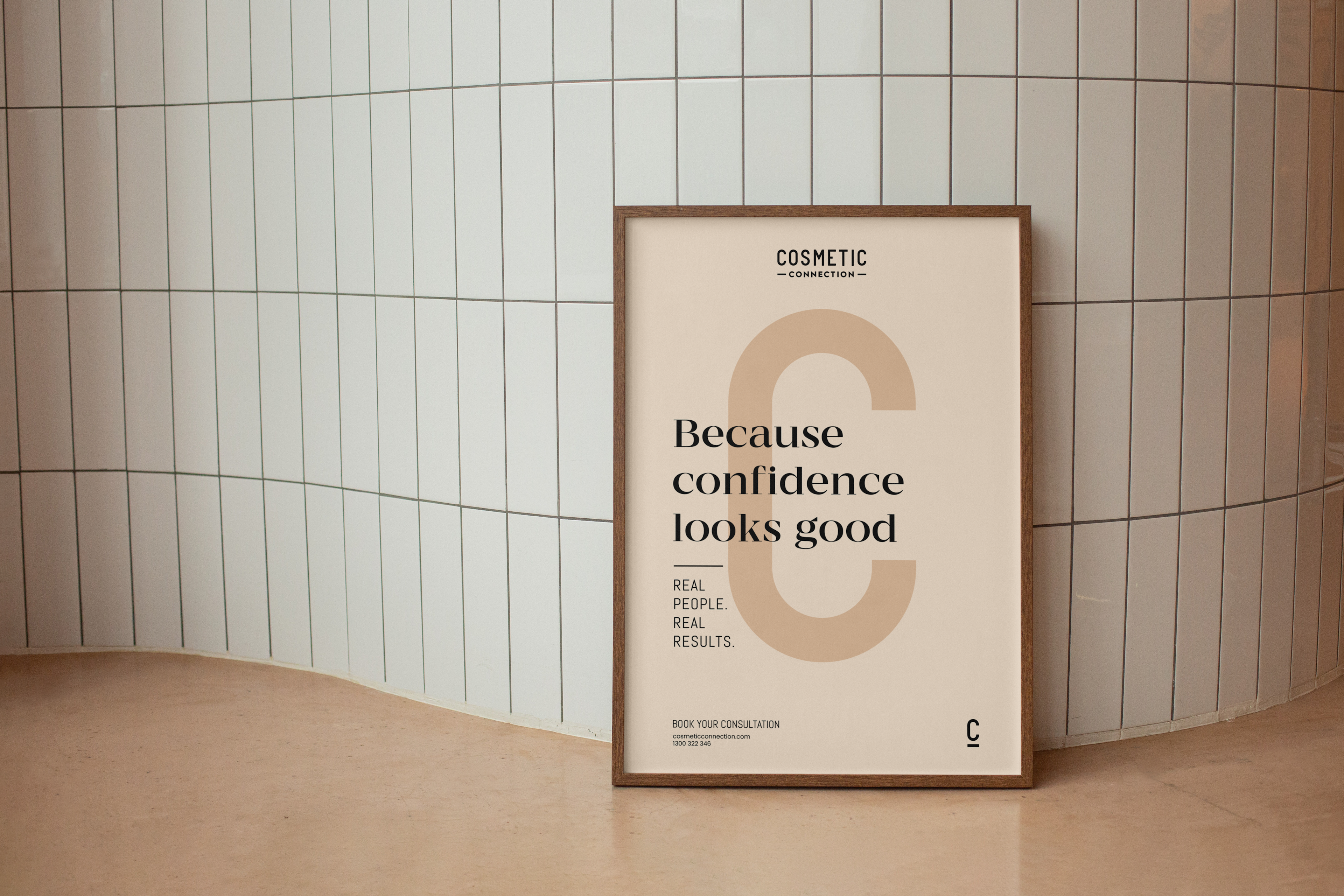
Cosmetic Connection
A cosmetic clinic website that starts the consultation before you walk through the door
A bespoke digital experience for Cosmetic Connection, combining design, video and photography to sharpen Cosmetic Connection’s presence online.
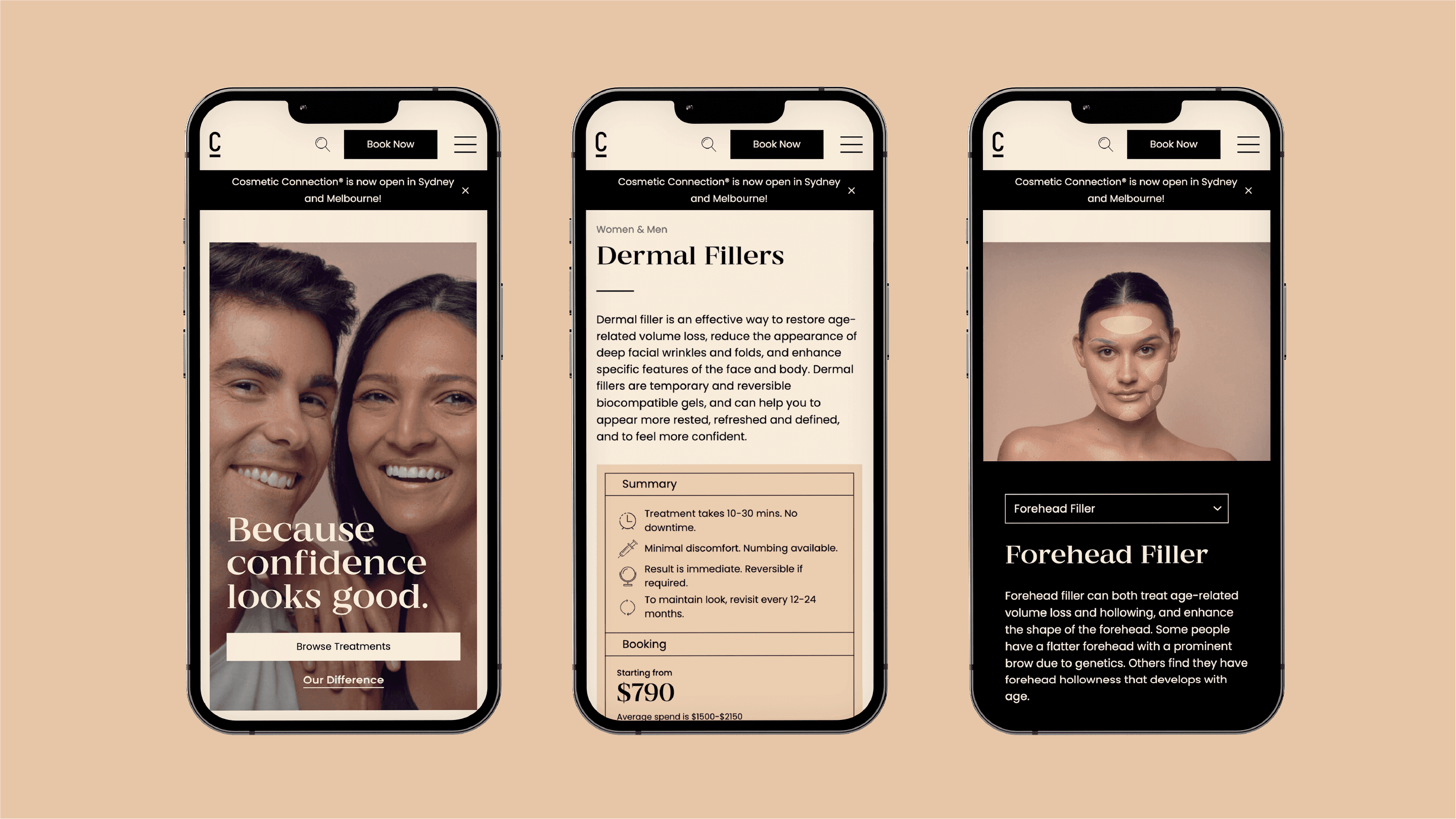
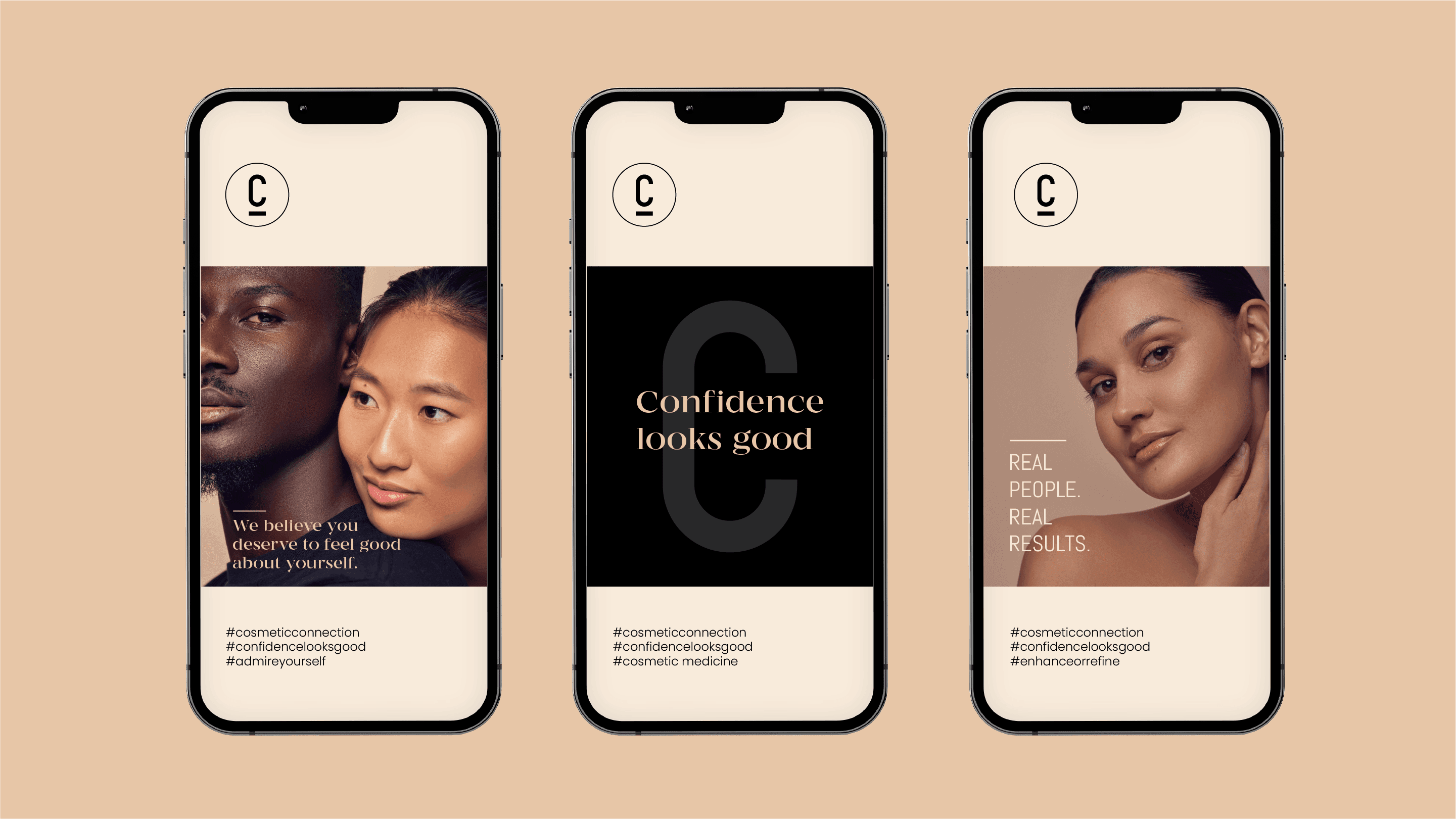
Built to inform and convert, the site rethinks the typical clinic experience, using interactive tools and structured storytelling to help visitors explore treatments before they step inside. An interactive facial map allows users to discover procedures visually, while content guides them toward informed decisions and faster consultations. The creative direction extended into a full-scale shoot, producing a library of visuals used across the website and digital campaigns. Backed by ongoing optimisation and digital marketing, Cosmetic Connection’s new platform carves out a distinct position in an increasingly crowded category: a clinic that feels contemporary, intelligent and confident in its craft.

- 340%
- Increase in sales from social channels
- 3k+
- New instagram followers in 6 months
The cosmetic clinic website problem
Walk through the cosmetic injectables market in Australia and the category default is a website that’s trying to close a sale before the visitor has worked out whether to trust the clinic. Banner promotions, package deals, before-and-after grids. The category trained itself to convert on price and urgency because the buying decision is treated like an impulse purchase.
The trouble with that approach is the patient it attracts. Customers acquired on discounts don’t graduate to full-price customers. They book once, they only come back when there’s another deal, and they leave the clinic exposed to whichever competitor turns up next with a bigger one.
The clinic ends up running discount cycles permanently, because raising prices loses the customer base to whichever competitor is still discounting.
Cosmetic Connection came to us trying to compete on a different mechanic entirely.
The business behind the brief
Dr Aaron Stanes is a cosmetic doctor with training from Monash, Melbourne and Sydney and a fellowship with the Australasian College of Cosmetic Surgery and Medicine. He started Cosmetic Connection because the injectables category in Australia is structurally broken at the franchise end. Clinics offer every treatment, do all of them poorly, and prop up volume with discount-led marketing that trains the market to treat the whole category like a commodity.
His ambition was to build the considered alternative. A doctor-led cosmetic clinic priced at the bottom of the top quartile, earning its place through clinical decision-making, transparent flat-fee pricing, and a posture the category doesn’t reward but a particular kind of patient is actively searching for. The patient who’s done the research, has the budget, and has stopped trusting clinics that compete on discounts and promotions.
By the time he came to Mude’s Sydney studio looking for a new cosmetic clinic website, Cosmetic Connection was already treating around sixty patients a week across its locations with an average spend in the four figures. The business worked. What he needed was a brand and a website that could carry the standard he was running internally into the part of the buyer’s journey he didn’t get to control: the bit before the consult, where the patient is alone on the internet trying to decide which clinic to trust.
The men’s problem
The second decision was treating the male visitor as a distinct audience rather than a footnote. The category default is a single feminine register, with men addressed as an afterthought if at all. Designing male-specific content is rare.
This leaves a sizeable revenue line on the table. Men are an undertargeted segment of the cosmetic injectables market in Australia. They tend to have more disposable income, less price sensitivity, and a longer consideration window, which means they consume more content before they’re willing to book.
We built two layers of male-targeted content. On the treatments that serve both genders, male content sits alongside female. Before-and-after galleries split by gender. Sections like “Treating Men’s Wrinkles” with male-specific context. Photography that includes men in the visual register. Then we built a dedicated masculinisation page for the concerns that are specifically male: full-face contouring around jaw, chin, cheekbones, and brow projection. A common shortcut here is to take a page built for women and swap the photography. We didn’t. The page was built from scratch for the male audience, addressing the things men actually arrive worrying about (avoiding photos, adjusting posture, growing facial hair to compensate for a feature they don’t like) and speaking to the natural alternatives men typically try first, like mewing or weight loss, and why those don’t produce the same result.
The men who arrive at the site through search or referral land on something that doesn’t make them feel like they’ve walked into a women’s space and have to apologise for being there. We reckon this is one of the highest-return moves available to any cosmetic clinic operating in a market where male demand exists and the category isn’t designing for it.


Suitability-first website design
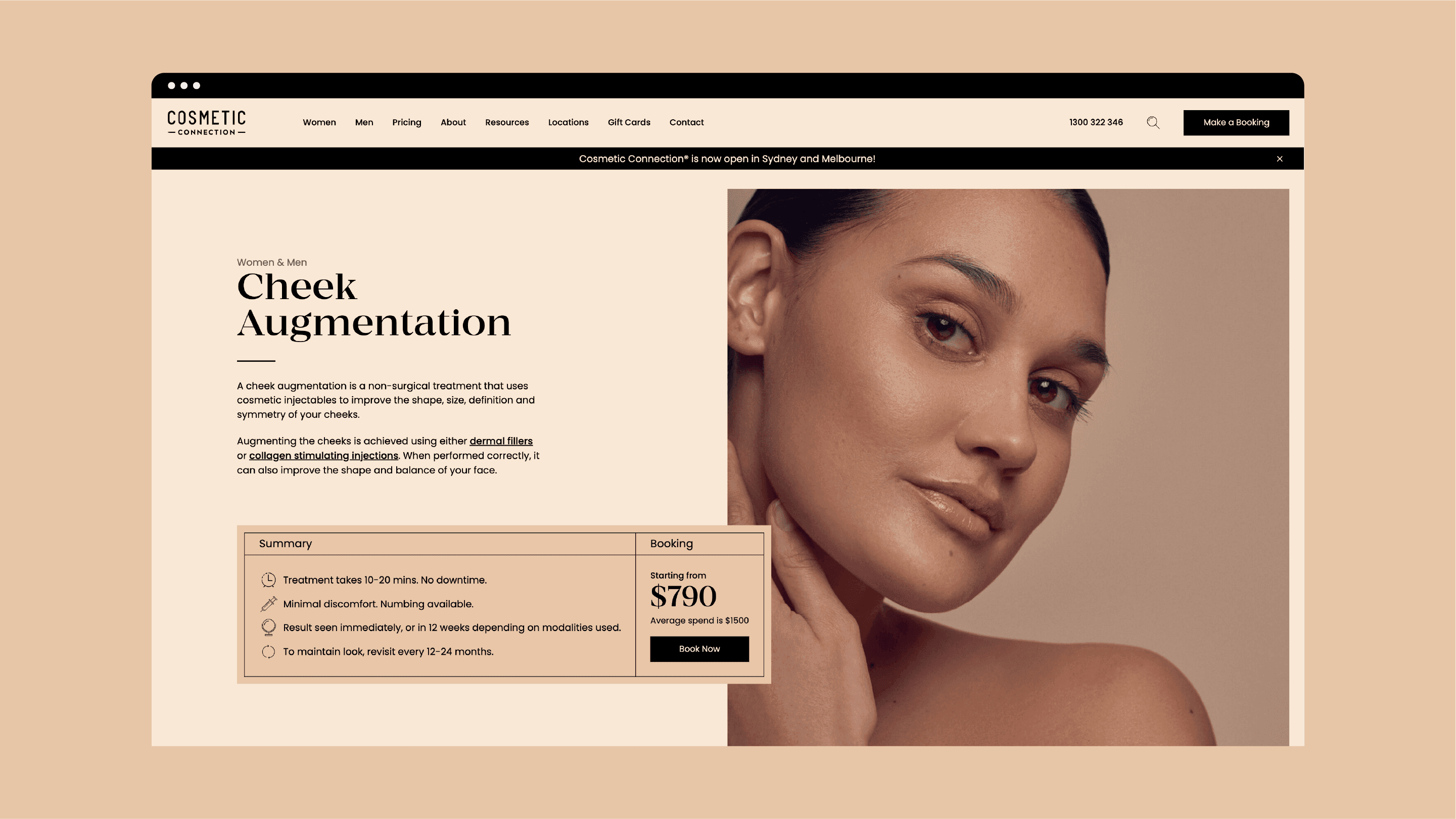
The third decision was making suitability the dominant content posture for the new cosmetic clinic website. The category default is to push every treatment at every visitor: widen the funnel and let conversion sort it out. The Cosmetic Connection website does the opposite. Every treatment page is built around whether the treatment is suitable for the specific patient reading it, not whether it can be sold to them.
That posture sits on top of a few specific moves. Every treatment page carries a three-step Your Experience flow, and Step 1 of 3 is “Check your suitability.” The patient is explicitly invited to find out whether the treatment is appropriate for them before being asked to book. Pricing is positioned as transparent flat fees and “all-inclusive” rather than the category’s habit of obscuring it behind “from $X” or “contact us for pricing.” Outcomes are shown alongside disclosures about variation (“Patient consent provided. Outcomes may vary.”). The website reads like a clinic that would rather lose the booking than mis-sell the procedure, which is exactly the read every Cosmetic Connection patient needs to take before they’re willing to book.
This connects directly to Aaron’s original positioning. He wanted to sell the service on its true merit, without overselling and without underselling. If the website oversells, the consult has to walk it back, and the patient leaves feeling sold to. If it undersells, the patient never books. Holding that middle is harder than it looks, and it can’t be done in the category’s default vocabulary, which is built for overselling.

What the new website delivered
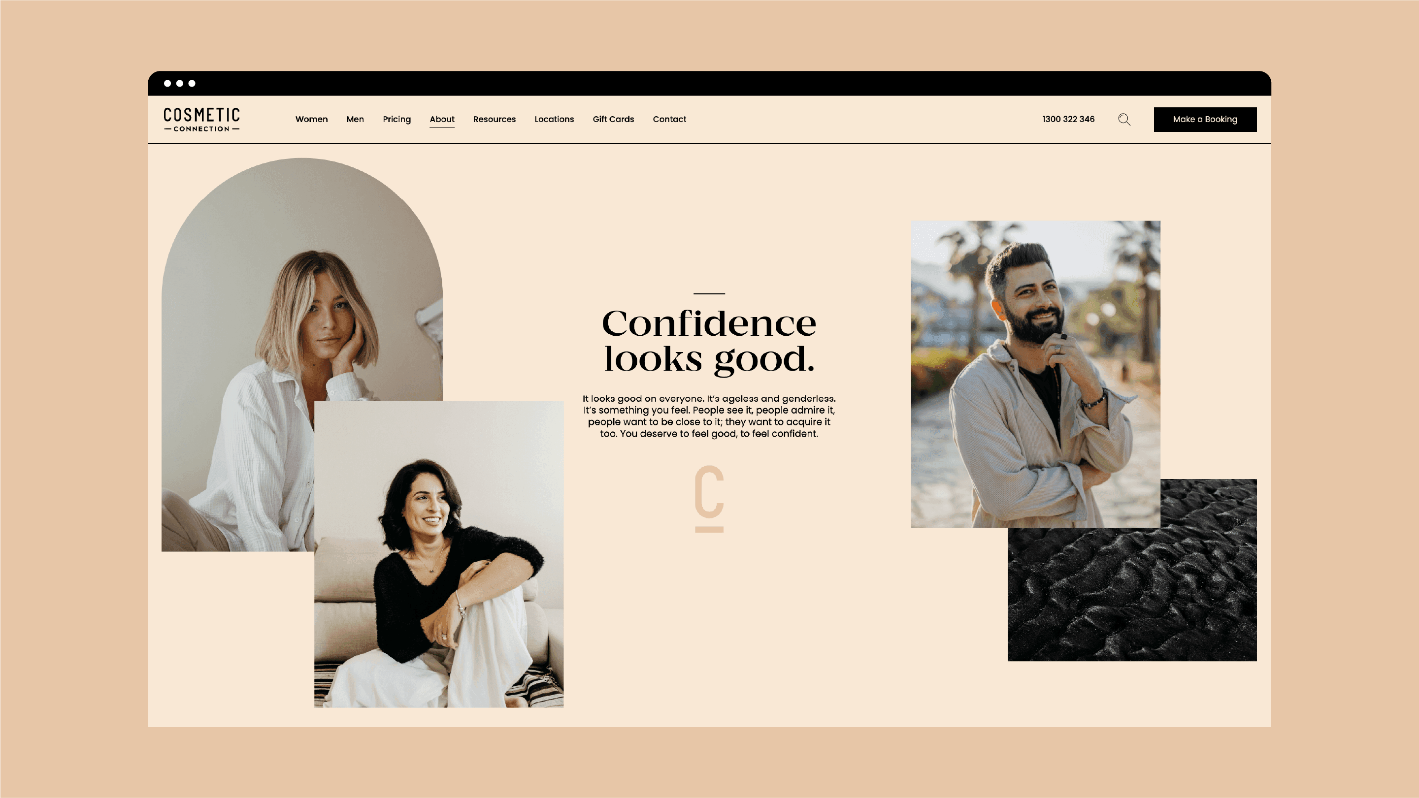
The Cosmetic Connection website that came out of this work was deliberately built not to look or behave like a typical cosmetic clinic website. Cosmetic Connection is the considered alternative in a category that competes mostly on noise, and the website signals that posture before the visitor has scrolled past the hero. The site runs on WordPress, designed and built from Mude’s Sydney studio, giving the clinic’s team direct control over treatments, clinicians and locations as the business scales.
It also moved real numbers. In the six months following launch, sales from social channels lifted 340% and Instagram followers grew by more than 3,000. The compounding effect happens when the website, the photography, and the supporting digital activity all reinforce the same posture instead of working against each other.
What it gives Aaron is a recruiting tool for the patients he actually wants, a brand asset he can scale into additional clinics and clinicians without diluting, and a WordPress platform that’s been the foundation for everything the clinic has built since, including the trademarked clinical frameworks Cosmetic Connection has developed around suitability, restraint, and outcome standards. The clinic was branded when we met him. It’s now brand-led, with a cosmetic clinic website, built by Mude in Sydney, that carries the standard before any clinician has to.
Related Projects
View Project

Video, Graphic Design
Department of Health, Disability and Ageing
View Project

Brand, Graphic Design
Sun Baby
View Project

Brand, Video
Dr Aya Naj
View Project

Brand, Graphic Design
Australian Medical Council
View Project

Video
Department of Health, Disability and Ageing
View Project

Brand, Website
Sunstrata
View Project

Website
Amazon Music
View Project

Website
GEOCON
Frequently Asked Questions
You were going to ask anyway
Cosmetic Connection is a doctor-led cosmetic injectables clinic founded by Dr Aaron Stanes, with multiple locations in Australia. The clinic positions itself as the considered alternative in the cosmetic injectables category, with transparent flat-fee pricing, clinical decision-making by trained medical doctors, and a posture aimed at the patient who’s done the research and stopped shopping on discounts. At the time of Mude’s engagement Cosmetic Connection was treating around sixty patients a week across its locations with an average spend in the four figures.
Dr Stanes trained at Monash (medical degree with honours), Melbourne (surgical anatomy, top of class) and Sydney (Master of Surgery), and holds a fellowship with the Australasian College of Cosmetic Surgery and Medicine. Mude was engaged to design and build the new Cosmetic Connection website, produce the original photography library for the brand, and run the paid social campaigns that drove acquisition through the new digital environment in the months after launch.
Dr Aaron Stanes is the cosmetic doctor who founded Cosmetic Connection. He trained at Monash (medical degree with honours), Melbourne (surgical anatomy, top of class) and Sydney (Master of Surgery), and holds a fellowship with the Australasian College of Cosmetic Surgery and Medicine.
Dr Stanes started Cosmetic Connection because the injectables category in Australia had a clear gap at the considered, doctor-led end of the market. Most clinics in the category compete on discount-led marketing and a wide treatment menu, which trains the market toward an impulse-purchase posture that suits some patients and loses others. Cosmetic Connection was built as the considered alternative for the patient the category was losing, priced at the bottom of the top quartile, with clinical decision-making by trained medical doctors and transparent flat-fee pricing across every treatment.
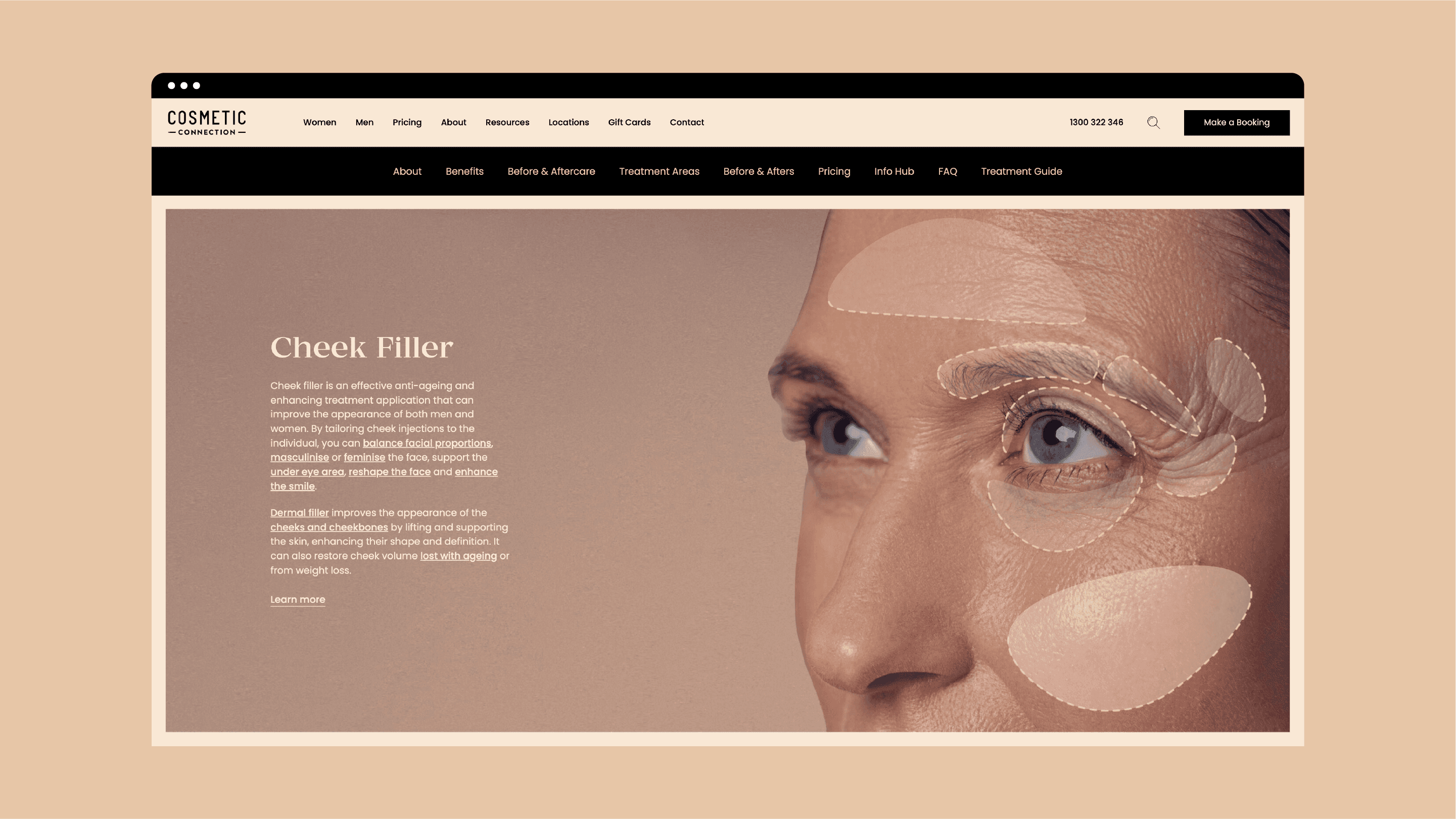
The Cosmetic Connection website is organised around patient concerns. Most cosmetic clinic websites are arranged by treatment type, by anatomy, or by which injectable is being administered, which mirrors how the clinician thinks about the work. It does not mirror how the patient arrives at it. The patient walks in with a concern (a line they don’t like, a sense they’re starting to look tired, a comment from a partner that’s still rattling around) and has to translate their question into the clinic’s vocabulary before they can work out which treatment is relevant.
The Cosmetic Connection site uses the language patients actually use. Treatment surfaces include Lines & Wrinkles, Volume Loss & Hollowness, Sagging Skin, Hollow Under Eyes (Tear Troughs), and Eye Wrinkles (Crow’s Feet). Each opens with the concern in plain language and then explains what the treatment does, who it’s suitable for, and what the experience involves.
Men are a meaningful segment of the cosmetic injectables market in Australia. They tend to have a long consideration window than the female-targeted majority of the category, often arriving at the site after extended research. Most cosmetic clinic websites address men as a footnote, with the male visitor landing on what’s effectively a women’s page with the photography swapped.
Cosmetic Connection’s website has a dedicated men’s treatment surface with male-specific content, framing, and visuals. It addresses what men actually arrive worrying about and speaks to the objections that don’t appear on the female-targeted pages, including the natural alternatives men typically try first (mewing, weight loss) and why those don’t produce the same result. The men’s surface is built so a male visitor doesn’t feel like he’s walked into a space designed for someone else.
Cosmetic Connection’s audiences span four distinct patient types with different motivations and different anxieties about cosmetic treatment.
There’s a cohort in their twenties using injectables to stay current with their peer group. The thirties cohort tends to start earlier than previous generations did, often thinking about the next two decades of how their face ages. Men, often across their late thirties and forties, arrive having researched alone, wary of being seen on the site at all. Patients in their fifties have a different brief again, usually wanting to manage the way they age without the outcomes looking like work. The website was designed to serve each of those audiences without forcing them into a single content surface.
Medical and healthcare website design is the practice of designing websites for clinics, medical practices, allied health providers, and cosmetic medicine practices. The work has to navigate two specific tensions that most websites don’t carry: the regulatory and ethical constraints on how clinical services can be marketed, and the elevated trust threshold patients apply to organisations they’re about to let touch their body.
Healthcare websites also have a job most other websites don’t. They have to qualify the clinic for visitors who haven’t met the team yet, addressing the fears that stop people booking (fear of being overdone, fear of judgement, fear of the horror stories that float around every patient’s social circle). Mude’s medical website design work for Cosmetic Connection covered the full website build, information architecture, suitability-first conversion design, dedicated audience surfaces, an interactive facial map, and an original photography library that replaced the supplier-issued stock imagery the category typically runs on.
Mude is a brand and design studio with Sydney and Canberra studios. The studio’s approach to clinic websites treats the site as a trust environment first and a marketing environment second, because patients in any clinical category are making decisions about who they trust with their face.
The Cosmetic Connection website is the case study of how Mude approaches cosmetic clinic web design. It’s built on WordPress and was designed to operate as the consultation before the consultation. The information architecture is organised around patient concerns, every treatment page opens with a suitability check, the clinical team is surfaced with credentials, and the visual environment is original to the brand. The same principles transfer to other cosmetic medicine and aesthetic clinic websites: the trust posture, the suitability-first content design, the WordPress flexibility, and the original photography library that gives the brand its own visual register.
Yes. The Cosmetic Connection website is built on WordPress. The platform was chosen because it gives the clinic’s team direct control over treatments and content as the offering evolves, makes adding new treatment pages straightforward, and integrates cleanly with the marketing tools the clinic uses to run its paid social and email programs.
The WordPress build also keeps the site portable. The Cosmetic Connection team can update treatments, clinicians and locations across multiple sites without depending on an agency for routine work, which matters for a multi-location clinic operating across different cities.
Mude designed and built the Cosmetic Connection website, produced the original photography library for the brand, and ran the paid social campaigns that drove acquisition in the months after launch. The work was scoped around expressing Cosmetic Connection’s existing clinical positioning through a digital and visual environment that could carry the clinic’s standards into the part of the patient’s journey before the consultation.
The website work included an information architecture restructure that organised the site around patient concerns. The photography library replaced the supplier-issued stock imagery the cosmetic injectables category typically runs on with original photography of the clinic, the team, and the treatments. The paid social campaigns ran the new digital and visual environment across social channels.
Cosmetic Connection had a clinical proposition and a market position that the existing website wasn’t communicating. The clinic was treating around sixty patients a week with strong outcomes. The website didn’t carry the clinic’s standards into the part of the patient’s journey before the consultation, which is where much of the trust decision gets made.
Mude was engaged to fix that. The brief covered a new website (information architecture, design, build), a full original photography library for the brand, and paid social campaign work to drive acquisition through the new digital environment. The work expressed Cosmetic Connection’s existing clinical positioning.
The facial map is an interactive feature built into the Cosmetic Connection website that lets visitors point at the part of their face they’re concerned about and be routed to the treatment information relevant to it. The patient who can articulate what bothers them, without knowing the clinical name for the procedure, can click on their tear troughs and be taken straight to the tear-trough page. The map removes the translation step the patient would normally have to do in a clinic’s navigation.
The facial map is a small UX decision with a meaningful commercial effect. Patients who land in the right content convert at a different rate to patients who land on generic treatment pages. The map also operates as a signal that the clinic understands the patient’s frame of reference, which is part of how Cosmetic Connection differentiates from clinics that expect the patient to learn the clinical vocabulary first.
Every treatment page on the Cosmetic Connection website opens with a suitability check as the first call to action. The patient is invited to find out whether the treatment is appropriate for them before being asked to book a consultation. The suitability check is structured around the patient’s actual situation, so the patient who isn’t a good candidate finds out early, and the patient who is gets routed into the consult with confidence about the recommendation.
The suitability-first content posture sits on top of a few specific design choices. Pricing is published as flat fees with the full cost of the treatment displayed in the open. Outcomes are shown alongside disclosures about variation. Treatment pages acknowledge that suitability is conditional. The site reads as a clinic that wants its patients informed at the time of booking.
In the six months following the launch of the new website and photography work, Cosmetic Connection’s sales attributed to social channels lifted by around 340% and the clinic’s Instagram following grew by more than 3,000 followers. The paid social campaigns Mude ran across the same period drove acquisition through the new digital environment, with the website doing the heavier conversion work and the campaigns feeding qualified visitors into it.
The result came from the alignment across all three pieces of work. The website, the photography, and the paid social activity were built to reinforce the same digital and visual environment, so each piece of spend compounds with the others. The clinic has continued to develop on top of the website and visual foundation in the years since launch, including the clinical frameworks Cosmetic Connection has built around suitability, restraint, and outcome standards.
Cosmetic clinic website design sits at the intersection of medical website design (regulated practice, clinical decision-making, ethical marketing constraints) and elective premium services (discretionary spend, aesthetic outcomes, beauty-category consumer psychology). The patient is making a consumer purchase inside a clinical context, which means the website has to read as medically credible to a patient worried about safety and visually considered to a patient who cares about the aesthetic outcome.
For Cosmetic Connection, the website Mude designed was built to do both jobs in the same digital surface. Medical credibility comes through doctor-led positioning, full clinician credentials surfaced on the team page, transparent flat-fee pricing, and the suitability-first content posture on every treatment page. The visual considered-ness comes through original photography, considered visual systems, and a content surface that treats patients as researched and capable of making their own decisions.
A cosmetic clinic website project of this scope typically runs from three to six months, depending on the volume of treatment content the site needs to cover and the photography production schedule. The Cosmetic Connection engagement covered website design and build (information architecture, suitability-first conversion design, the interactive facial map, the men’s surface, and the team page), production of the original photography library, and the paid social campaign work that ran the site’s acquisition once it launched.
The work was scoped so the clinic could operate continuously throughout, with the new website and photography launching as a complete package and the paid social campaigns running from launch onward. Healthcare web design projects benefit from being built as a connected system, with the photography, the conversion design, and the campaign work all referencing and reinforcing each other.