Brand identity is culture work: how distinction, meaning and cultural strategy drive growth
Most brands don’t have a design problem, they have a meaning problem. This article unpacks why brand identity design goes beyond the style guide as a form of cultural strategy work, and shapes how people perceive, desire, and trust your brand.
Brand identity is culture work
The first thing people experience about a brand is usually visual. Before they experience a product or service, they’ve already made a judgment. And often, that judgment sticks. It’s the instinctive impression people form when they come across your brand for the first time, or the hundredth. At its best, brand identity acts like a cultural shorthand, it’s cultural strategy expressed in design. It tells people what kind of brand this is and what world it belongs in. And maybe more importantly, what world it doesn’t.
A lot of brands are experiencing an internal tension, a kind of low-grade dissonance they can’t quite put their finger on. Perhaps it’s the way they’re showing up in the market no longer reflects what’s actually going on inside the business, and while they might not have the exact words for it, they can feel the drag on momentum.
We often meet companies sitting in a form of brand purgatory. The business has matured, maybe the product’s sharper, the team’s more experienced, the ambition’s grown bolder; but the identity still feels like an artifact from an earlier stage. A little of what they used to be, a little of what they hope to become,and a whole lot of guessing in between. The branding might be costing opportunity, reputation or pricing power.
But it’s not always about a disconnect between the brand and the business. Sometimes, it’s about vitality. The brand is just … dull. Brands lose energy when they aren’t nurtured, when they’re left to sit in a kind of strategic stasis. And vitality — the thing that makes a brand feel culturally awake — needs to be maintained. It doesn’t need constant reinvention every year, but it does need thoughtful stewardship. Neglect it, and it starts to wilt.
The two jobs of brand identity
A brand identity has two critical jobs: create distinction, and signal meaning.
Brand distinction is about carving out a space only your brand can occupy. Distinction is about becoming cognitively and emotionally entrenched in your audience’s memory. Distinctive brands reject category clichés and instead make conscious design choices that reinforce their position.
Signalling is about how people size you up, and how a brand telegraphs its value, intent, and credibility. Signals are how we orient ourselves in a crowded market, and how others orient around us.
It’s whether they trust you, rate you, or aspire to be associated with you. Brands that aren’t landing, whether that be on on pricing, on recruitment, on conversion, often have a signalling problem.
Brand identity as a mirror
People want to align with brands that reflect their own values, aspirations, and identity. If you understand what your customer values, your job as the brand is to reflect that back. And then to keep doing that, consistently, over time.
That reflection is what builds brand affinity.
We often use this frame:
- The customer’s identity aligns with your purpose.
- Their goals connect with your onlyness.
- Their sense of belonging mirrors your values.
Taste, culture and creative direction
Most people aren’t wired to make interesting creative decisions, at no fault of their own. They’re running companies, not critiquing art direction. So it’s easy to default to what’s familiar, to copy what the category is doing.
You can spot the companies that value taste. And taste, in this context, is shorthand for cultural awareness. It’s a mix of intuition, timing, aesthetic literacy, and a willingness to make decisions that don’t need to be focus-grouped to death.
But when you look closely at the brands people admire, almost always, there’s a spine of cultural relevance. From observing what’s happening in the world — art, design, film, fashion, music, language — and finding the thread that connects those cultural signals to the brand’s point of view. These brands are tuned into the world. They borrow, remix it, and contribute back.
Identity isn’t your styleguide. Those are tools. What matters is how you use them.
Supreme vs. Uniqlo: Same tools, different worlds
Too often, identity gets reduced to a set of parts: a colour palette, a font system, a logo lockup. But identity isn’t your style guide – not really. Those are tools. What matters is how you use them. That’s where creative direction lives: in brand expression, tone, vibe, and energy. Identity is the personality and soul of the brand.
Supreme and Uniqlo are great examples of what I mean. They use similar raw materials: red and white, and a nod to “minimalism”. However their take on minimalism diverges completely, shaped by radically different cultural codes and brand intentions.
Got Wheels
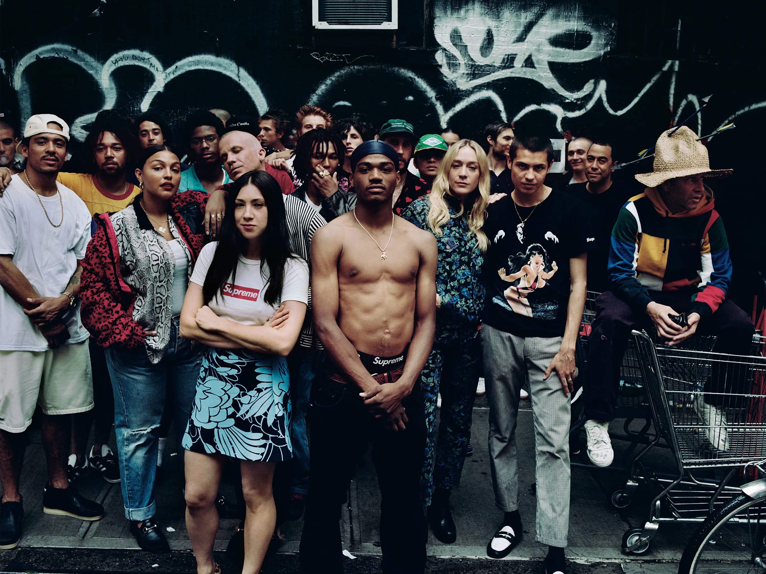
Supreme skaters Javier Nunez and Tyshawn Lyons, model Paloma Elsesser, Jen Brill, skater Tyshawn Jones, Chloë Sevigny, skaters Sean Pablo Murphy and Mark Gonzales, all wearing a mix of Supreme and their own clothing.Photographed by Anton Corbijn, Vogue, September 2017
Supreme flirts with minimalism through its refusal to explain itself. You can see this in its website, which offers almost nothing: no story, no context, just a silent grid of products. Its visual identity is built from bare-bones ingredients: Futura in a red box and a lot of blank space around it. But look beyond that, and the brand’s creative expression is absolutely maximalist: chaotic, layered, and wired with cultural signals.
Supreme’s DNA is rooted in street culture, skateboarding, and lives on scarcity and disruption. Supreme has built its identity not through traditional marketing, but through subcultural capital and a refusal to explain itself. It offers no welcome mat, and that’s part of its allure. Their creative is dense with subcultural signifiers: archival graphics, provocative imagery, oddball type treatments. And everything Supreme puts into the world feels like it belongs to a visual underground.
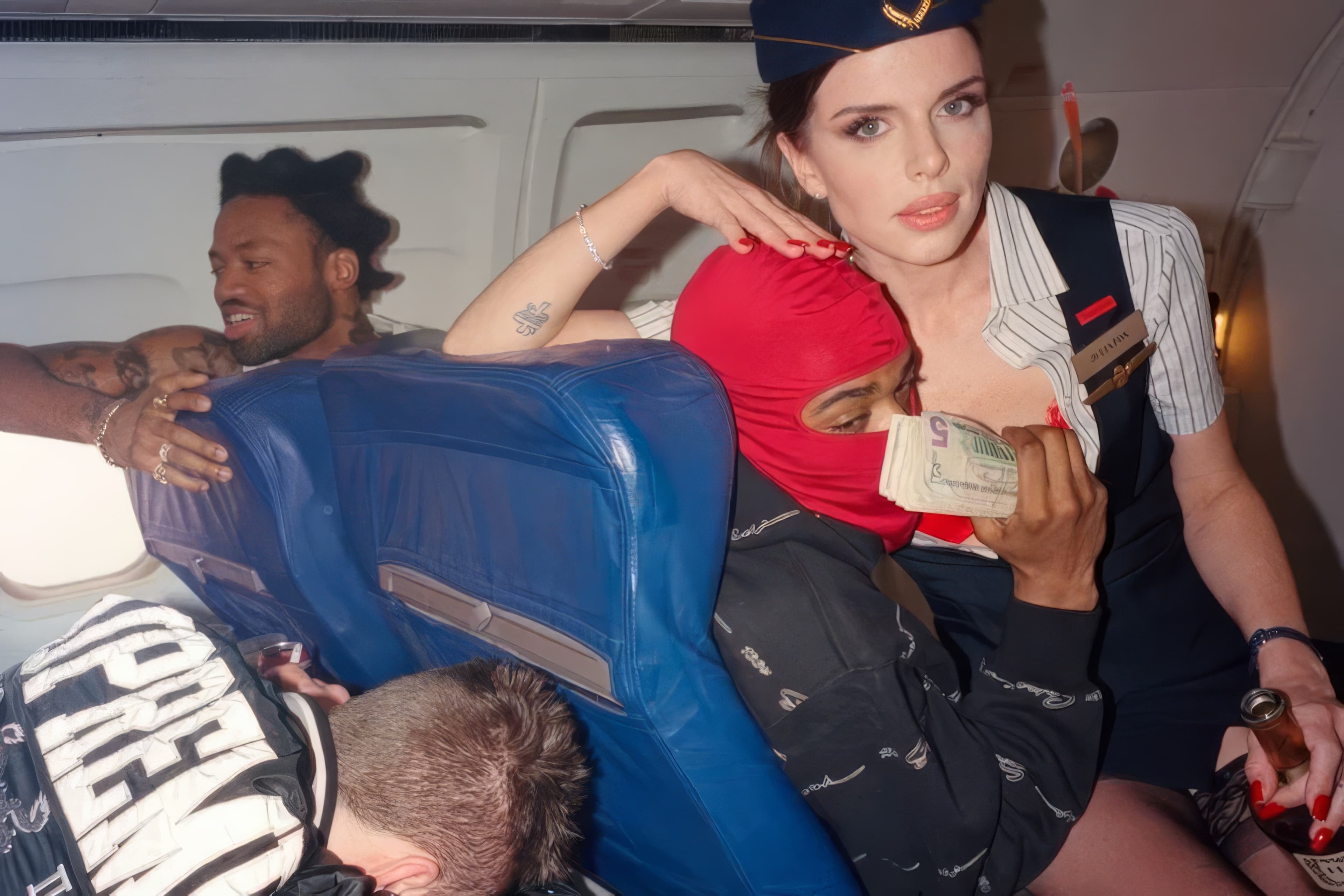
Supreme Spring/Summer 2022
By American director and photographer Harmony Korine. Model and actress Julia Fox, who became famous for her role in Uncut Gems by the Safdie brothers. Also pictured are professional skateboarders from the Supreme team such as Tyshawn Jones, Sean Pablo, and Mathias Sauvageon.
Campaigns are often fragmented, filled with clashing references that would feel out of place anywhere else, which is exactly the point. There’s no instructional tone, no explanatory narrative. The photography feels lo-fi on purpose, casting off the polish of commercial fashion in favour of rawness. The brand thrives on being a riddle, cultivating a sense of insider status. Supreme’s aesthetic twists “minimalism” and ambiguity into tension and exclusivity (before hitting you with a maximalist punch).

Supreme SS25
Features Collabs with SpongeBob, Damien Hirst & More

Uniqlo operates on an entirely different frequency. Uniqlo, by contrast, uses minimalism to achieve calm and quiet consistency. Where Supreme is exclusionary, Uniqlo is egalitarian. Its creative direction has a reverence for simplicity in everything it puts out. The art direction feels less like fashion marketing and more like a manual for living well. You’re not being told to change your life, you’re being shown how these clothes fit into the one you already have.
There’s a humility in the visual language, and that humility is what gives Uniqlo its own space in the fashion world. Campaigns are rarely aspirational in the traditional sense. They don’t sell fantasy, but they do value simplicity, versatility and comfort.
Both brands pull from the same base ingredients (similar colours and san serif fonts), but what they create with them is wildly different. Uniqlo’s minimalism is a gesture of restraint, an invitation to democratise access to good design. Supreme’s is a gesture of authority, daring the audience to decode it, to earn it.
UNIQLO
UNIQLO LifeWear Magazine Issue 06

Is it time to rethink your identity?
Not every identity needs reinvention. But most deserve interrogation.
These are the prompts we return to:
- If the logo disappeared, would anyone still recognise you by your look, tone and vibe?
- Does the brand have gravity? Does it attract the kind of customers, collaborators, and talent you want?
- Is the identity accelerating growth or holding it back?
- Does the brand have a cultural posture? Do people feel like they’re stepping into a world?
About Mude
We are a strategic brand and creative agency.
Mude is a brand and creative agency in Sydney and Canberra.
We work with companies who want their brand to hold pricing power and win preference. The work usually starts with brand positioning and ends up touching brand identity design, plus the activation that takes the strategy to market.
Brand identity is downstream of cultural strategy. Get the strategy right and a modest identity refresh can shift the business. A beautiful identity sitting on top of weak strategy stays inert no matter how well it’s designed.
We help organisations distil who they are, why they matter, and how they show up in the world. From positioning to identity, we develop your brand story and carve out the space only you can own, help brands win the positioning game, outmanoeuvre competitors, and find your ‘onlyness‘.
Explore our brand strategy and brand identity design services to see how we help organisations win the cultural positioning game.
Related Posts


Frequently Asked Questions
Questions about brand identity and cultural strategy
Brand identity is the visible system that makes a company recognisable and distinct from its competitors. The key elements include:
- Logo and visual marks
- Colour palette
- Typography
- Verbal voice and tone
- The consistent way a brand behaves over time
At its strongest, brand identity acts as a cultural shorthand: it tells the audience what world a brand belongs to before they read a single word.
The style guide is often confused with brand identity, but the style guide is just the tool: the document that codifies how the logo, colour, typography and voice should be used. The identity itself is what people perceive about the brand based on how those tools get used in market.
Strong brand identity design creates distinction in the buyer’s mind and signals meaning about what the brand stands for and which audience it belongs to.
Brand strategy is the set of decisions about how a brand wins, who it’s for, what it stands for, and what makes it the preferred choice in its category. Brand identity is the expressive system that signals those decisions to the world.
- Brand strategy: the set of strategic decisions about how a brand competes and wins in a category. It includes positioning (where the brand sits in the buyer’s mind vs alternatives), audience (who it’s for), value proposition (what it offers), and the cultural posture that makes it the preferred choice in its category
- Brand identity: the expressive system that signals those decisions: the logo design, colour palette, typography, voice, and the consistent way a brand behaves across every touchpoint
Cultural relevance comes from a brand having a clear stance on the culture it belongs to and expressing that stance consistently. It’s a function of taste: knowing what’s happening in art, music, design, and language, and finding the thread that connects those signals to the brand’s point of view.
Supreme and Patagonia operate in completely different cultural worlds but both have a clear cultural posture. The brands that feel culturally inert are usually the ones that haven’t committed to a point of view, and the one’s that are culturally relevant knows what it stands for and behaves accordingly.
- Cultural fluency: They understand the codes, references, and language of the culture they operate in — what’s happening in art, music, design, fashion, language — and can connect those signals to their own point of view.
- Cultural contribution: They give back to the culture as much as they borrow from it. Patagonia funds environmental causes. Supreme collaborates with artists. The brand earns its place rather than buying its way in.
- Consistent expression: The point of view shows up in every visible decision — the visual identity, the verbal voice, the products, the partnerships — over years, not just a handful of campaigns.
No. A logo is one element of a brand identity, and a style guide is the document that codifies how to use it. Brand identity is the larger expressive system that both of those things serve.
- Logo: a single visual mark that identifies the brand
- Style guide: the document that codifies how the logo design, colour palette, typography, and verbal voice should be used
- Brand identity: the full system through which a brand expresses itself: its visual world, its verbal identity, and the way it behaves across every touchpoint over time
You can have a beautifully designed logo and a comprehensive style guide that still produces a forgettable brand identity. Strong brand identity design starts with the question of what world the brand belongs to and who it’s signalling to, then builds the visual and verbal system to carry that signal.
Cultural positioning is the practice of building a brand around the cultural codes and communities its audience cares about, creating preference through brand affinity rather than just product features. It’s a form of brand strategy anchored in cultural positioning, not just category positioning.
At Mude, cultural brand strategy runs through this framework:
- Cultural diagnosis: understanding the forces shaping the category, the stories the audience tells itself about it, and the crux the strategy has to solve
- Cultural positioning: identifying the tribes the brand serves, the tastemakers who confer legitimacy, and the identity it allows the audience to perform
- Diffusion strategy: designing how meaning spreads through cultural networks, what cultural moments the brand attaches to, and how partners can carry it without diluting it
Brands with strong cultural positioning take an ideological stance and let the audience identify with it. Supreme is built on streetwear culture, Patagonia on environmentalism, Liquid Death on heavy metal aesthetics in a water category.
The brand identity then carries the cultural strategy into the world: the visual choices, the voice, and the behaviour all signal which culture the brand belongs to. For categories where preference and pricing power matter, cultural brand strategy is often what separates a charismatic brand from a generic one.
A brand identity design agency builds the personality of a brand — how it looks, sounds, and behaves — so it creates distinction in market and signals meaning to the audience that matters.
The work typically covers:
- Visual identity: logo design, colour palette, typography, and the image system that defines the visual world the brand belongs to
- Verbal identity: voice, tone, naming, and the messaging that carries the strategy into language
- Creative direction and cultural posture: the stance the brand takes relative to its category and audience, and the cultural codes it uses to signal that stance
- Brand guidelines: the codified system that lets internal teams produce on-brand work without going back to the agency every time
- Brand collateral and asset systems: templates, layouts, and asset libraries that turn the brand design into everyday production
Strong brand identity design starts with brand positioning and cultural posture. The visual and verbal system is built to carry that strategy into the market.
The work is commercial: a brand identity that creates distinction and signals the right meaning is what lets companies charge more, convert better, and attract A-players. Mude is a brand and creative agency that runs brand strategy and brand identity design as one engagement.