

Applications, portals, and digital products built by a brand agency that actually writes code.

Move fast and don't break things.
A brand agency with a dev team in the back. Designed and built in-house from strategy through to code. The web work sits downstream of the brand, so the site is shaped by who you're for and what you offer that nobody else can.
Product & UX Design
- UX and UI design
- User research and testing
- Mobile app design
- Prototyping and wireframes
- Design systems
- Information architecture
App Development
- Mobile app development
- Web apps and portals
- MVP development
- Dashboards and data platforms
- Systems and API integration
- Backend and cloud infrastructure
Brand & Launch
- App icon and store presence
- Mobile brand and identity
- App redesign and optimisation
- Accessibility and performance
- New features and enhancements
- Maintenance and hosting
Product design. UX marks the spot.
Product design, UX and UI design for web and mobile apps. UX research, user flows, wireframing, prototyping, interface design, usability testing, and design systems that ship in code. We design around how people actually behave (the workarounds, the rage-clicks, the field everyone skips).
Mobile apps.
Browsers? Where we're going, we don't need browsers.
Mobile app design and development, iOS and Android, native and cross-platform, designed and built in-house. Product strategy, UX and UI design, the build, App Store launch, and the releases after it. We design around the way people actually use a phone, with one thumb and half their attention, usually in a queue for something.
Dashboards. No more Mr Excel Guy.
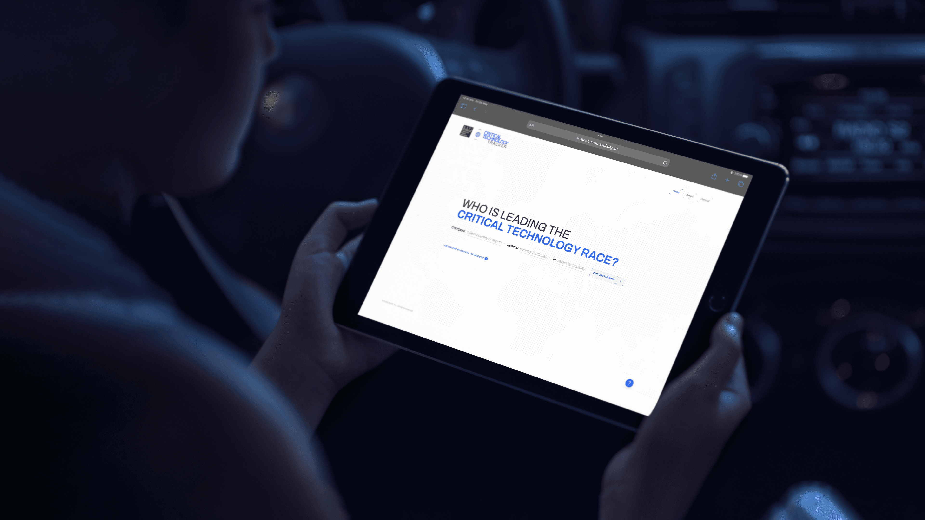
Custom dashboards, data visualisation, live data feeds, and reporting platforms, designed and built in-house. For ASPI we turned global disinformation operations and the critical tech race into platforms people explore voluntarily. Not a two-hundred-page PDF in sight.
Methodology
Our custom app development process runs as a Double Diamond: first we explore the problem and narrow to a defined brief, then we explore solutions and narrow to the build.
Diagnosis & Discovery
This is the first diamond of a Double Diamond: we explore the problem widely before narrowing to a defined brief. Stakeholder workshops, expert input and a sailboat retrospective surface where things really stand; an audit of whatever you’re running now sets the baseline the new build has to improve on; and a user prioritisation matrix ranks who the product is really for.
We work in the language of Jobs-to-Be-Done and Outcome-Driven Innovation: each prioritised user gets a jobs-to-do map that frames the job as a problem to solve, names the pain today and the gain wanted, and ties a desired-outcome metric to it.
The map doubles as a first feature list, with every item traceable to a real user and a measurable result. Success metrics such as adoption, data freshness, accessibility and support load are fixed in numbers during discovery, so later decisions can be measured against them. The output is a discovery report that the rest of the project refers back to.
UX Design
Our UX design process begins the second diamond here. We settle the structure before any visual design begins: we map the user journeys, set the information architecture as a tree of templates, and draw the screen-level flows, and you sign those off before design starts.
Working in a Lean UX way, we treat wireframes and a couple of distinct concepts as hypotheses to test, and we put the direction in front of people early, while it is still cheap to change. Accessibility starts at this stage: we design to WCAG 2.2 AA from the wireframes through, so the type ramp, colour contrast, focus order and component states carry the standard before anything is styled.
Building it in this early avoids an expensive retrofit later, and it lets your team extend the system afterwards without breaking the baseline.
UI & Visual Design
Brand applied to the approved structure, built the Atomic Design way: we start from tokens (colour, type and spacing) and components and build up to screens, so the result is a design system that scales
It ships in light and dark, with desktop and mobile at parity and the interactive components an app needs. The accessibility standard set in the wireframes is built into those tokens and components, so contrast, states and touch targets are correct by default wherever the system gets reused.
Before any production code is written, you click through an interactive prototype, which is where problems are cheapest to fix and where stakeholders test the build for the first time.
Development
The same team that designed the product builds it, so there is no handoff to a separate development team and the design moves into code without being reinterpreted.
We build custom mobile apps, web apps, portals and dashboards in-house, on the same design system, which keeps the build consistent with the design and quick to extend. For new products we build in a Lean Startup way: we scope a first working version that tests the core assumption in market, then iterate on what real usage and the success metrics tell us.
The engineering underneath is documented as we go (backend and data-flow maps, entity-relationship domain models, repository-pattern code, snapshot-and-restore runbooks).
Documentation, Training & Handover
By the end you have a product your team can run and change without us. A training wiki of step-by-step docs, walkthrough videos and in-person sessions hand over the design system, the content tools and the technical model: components and tokens, architecture and integration maps, the deployment process and the security model. Discovery continues after launch, with the success metrics still measuring and new features running on the same system.
We document everything for handover so your team is not dependent on us to operate or extend the product.
Frequently Asked Questions
The questions every app brief starts with
Depends on scope, the platforms it runs on, and the systems it connects to, so we price it during discovery once the requirements are clear. As a guide: a bespoke application with custom functionality, multiple user types, and third-party integrations typically runs $60k to $120k+ GST, in line with our other custom builds. A lean MVP that proves a single core idea can be scoped as a contained piece of work on a more modest budget, and a small, single-purpose tool built to a fixed spec can come in well under that. If the engagement bundles brand strategy and identity with the app, the total usually starts from $120k + GST.
Enough to understand the brand, the people who’ll use the app, and the job it has to do. The useful inputs are the business goals behind it, a sense of the target users, any existing brand guidelines or assets, the systems it needs to connect to, and a rough budget and timeline. Reference apps you admire help us calibrate direction quickly. None of it needs to be polished or complete, because discovery exists to fill in the rest.
Yes. We can take an app through strategy, UX, and interface design, then hand over production-ready files for another team to build: user flows, wireframes, and high-fidelity Figma screens on a documented design system, with the specifications a development team needs to build accurately. We run design-only when a client already has its own developers or an existing build partner. If you don’t, we’d rather build it too, because keeping design and build under one roof is how the detail survives the trip from concept to code.
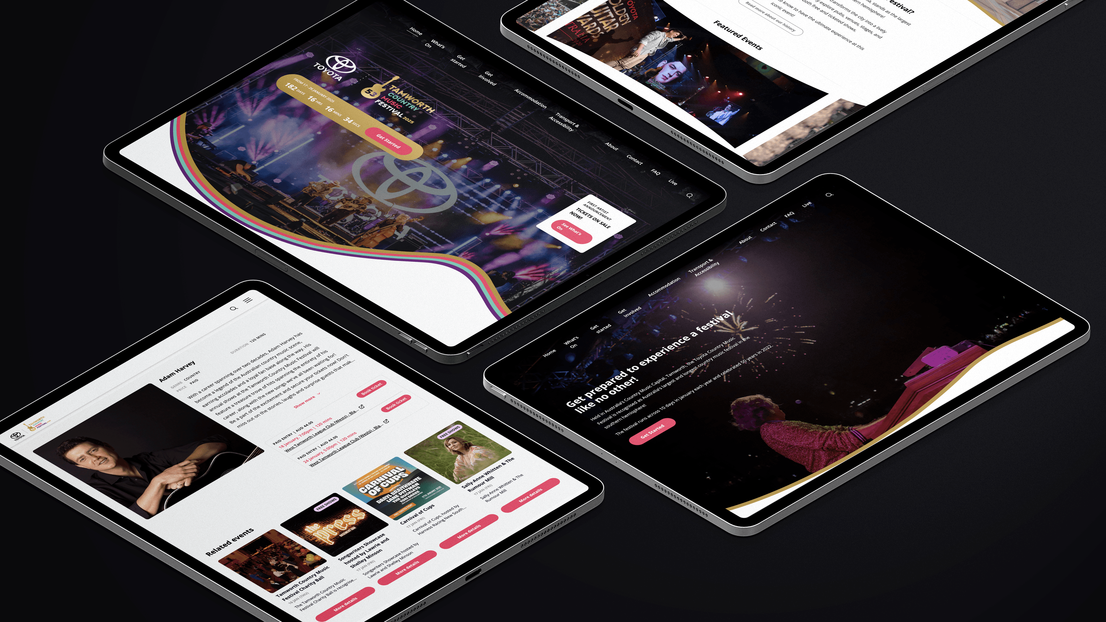
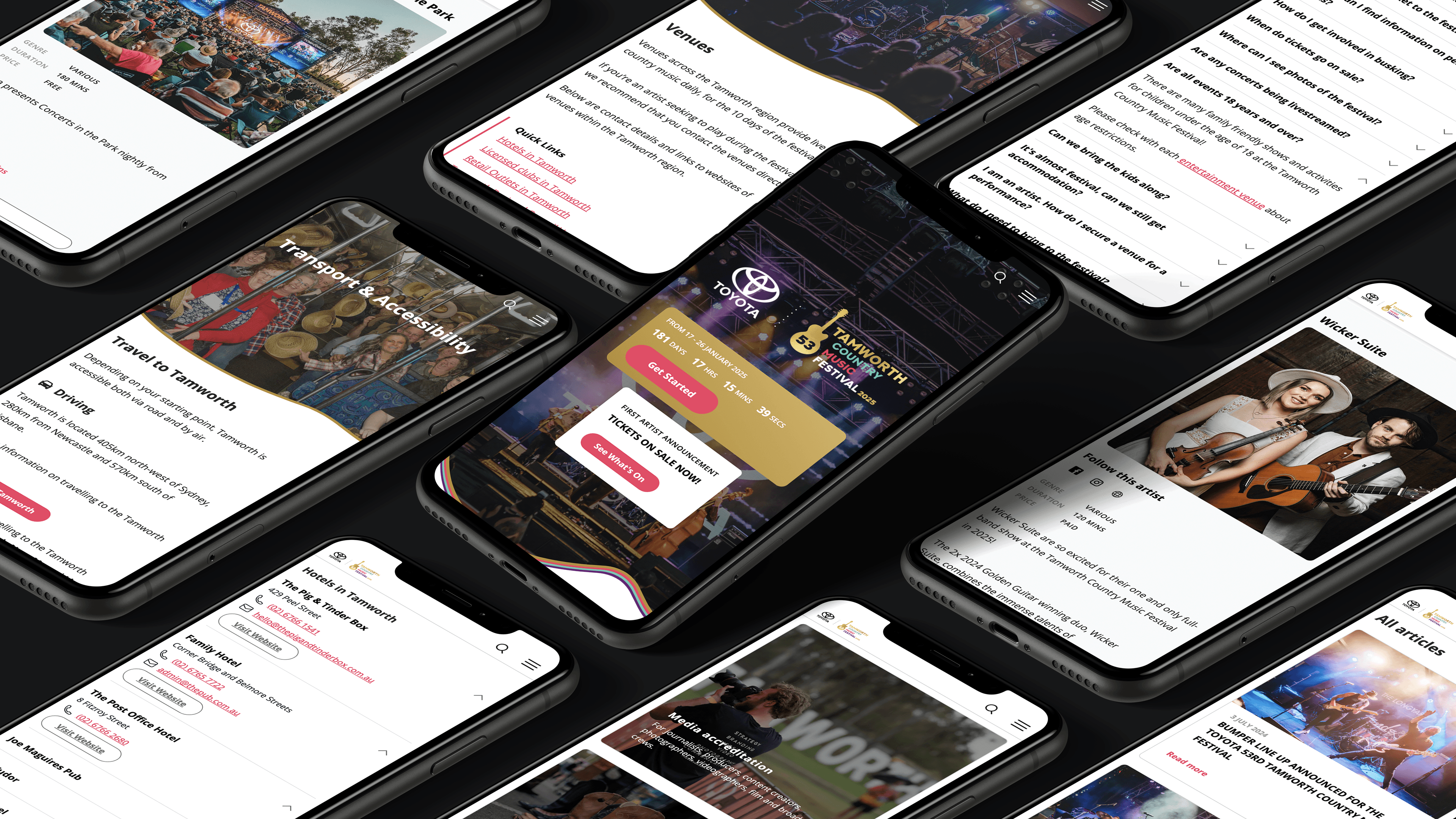
Discovery first, so the requirements are locked before any design or code begins. We open with stakeholder workshops to map the challenges, the technical constraints, and the needs of the people who’ll use the app, then turn those findings into user flows and a screen-by-screen blueprint. Detailed mockups follow in Figma, where you review and comment in real time, all built on a design system that keeps the work consistent and quick to extend. The Tamworth Country Music Festival app came out of this process, structured so a council team with no developer can run a programme of 2,800-plus events. A simple MVP can skip a fair bit of this, and we’ll scope it that way when the brief calls for it.
By designing it so the person using it barely notices the interface and just gets the task done. Every screen sits on a user flow mapped in discovery, on a design system that keeps controls, patterns, and labels consistent, so navigation behaves the way people expect it to. The Tamworth festival app puts 2,800-plus events behind a structure a visitor can filter down to a single day’s plan without instruction. Intuitive doesn’t always mean sparse, though. A dense product like the ASPI Critical Technology Tracker holds a lot on screen because its users come for the detail, and the design earns that complexity.
A minimum viable product: a pared-back first version of the app that proves its core idea with real users before further investment. We often recommend starting here. Build the one job the app has to do well, release it, learn from how people actually use it, then expand from evidence. It keeps early spend contained and stops a team committing months to features nobody has validated. The exception is an app replacing a critical system people already depend on, which usually has to launch as a complete product, and we’ll say so when an MVP is the wrong call.
Yes. Discovery maps your current ecosystem first, so the app is built to talk to the tools you already run through their APIs and sit inside your workflow from day one. The stack spans modern frameworks and databases for custom builds, and established platforms when those suit your team, with the choice following what the integration needs. A legacy system with no clean way in sometimes needs an interim connector or a phased approach, and we’d rather flag that during scoping than discover it mid-build.
We handle it. The build, the store listing, the icon, screenshots, and metadata get prepared to each store’s technical and content guidelines, then submitted through your developer accounts. Apple and Google run their own review, and we respond to their feedback until the app is approved and live. Review timing sits with the platforms rather than with us, so we build a buffer into the launch plan and keep you posted along the way.
Yes, as one cohesive set that meets both stores’ specifications and stays true to the brand. iOS works to fixed icon shapes at sizes up to 1024 by 1024 pixels, while Android uses adaptive icons built in foreground and background layers so the system can mask them into different shapes across devices. We supply the right variants for each platform, including dark and light versions, so the icon holds up wherever it appears. If the product is web-only, the same pass covers the favicon and progressive web app icon set.
It’s changing how the work gets made. AI is quick at the mechanical parts: generating interface variations, drafting code, pulling research together. The decisions that determine whether an app succeeds are still human work, though. What should it do, who is it actually for, how does it carry the brand, and where does it earn its place commercially. That’s the part of the job we’re hired for, and it needs judgement and someone accountable for the call.
Yes. We work from studios in Sydney and Canberra, and app projects run well wherever the client is based. The process runs through Figma and collaborative tools, so reviews, comments, and approvals happen in real time without anyone needing to be in the room. We’ve delivered digital work for national and government clients, from the ASPI Critical Technology Tracker out of Canberra to the Tamworth Country Music Festival app in regional New South Wales, and we’re set up to run a project end to end remotely.
Yes. The app can read its content from the same CMS that runs the website, so your team publishes once and both stay current. An update made in the CMS shows up in the app and on the site without anyone entering it twice. The Tamworth festival app works this way, reading from the same WordPress install that runs the festival website, which keeps the programme consistent across both. If the app has no companion website, or its content is specific to the app, it can hold its content on its own.
Yes, and it’s usually the right call. The APIs hold the business rules and the access to data, and the website and the app both call them, so a feature or rule added once behaves the same on the web and in the app. It also gives you one layer to build, secure, and maintain as the product grows. Where the app has to connect to a third-party or legacy system, that part sometimes needs its own connector, which gets mapped before the build starts.
Five stages. Discovery, where stakeholder workshops and user research set the brief and the success metrics. UX design, where the flows, information architecture, and screen structure get mapped and signed off. UI and visual design, where the brand is applied and the design system is built. Development, where the same team that designed the product codes it, so nothing gets reinterpreted in a handoff. And documentation, training, and handover, where you get the tools and docs to run it without us. The structure is set in discovery so every feature in the build traces back to a real user and a measurable outcome, and a lean MVP compresses the same stages into a shorter run.
Depends on complexity, so we set the timeline after discovery once the scope is clear. A lean MVP can run a couple of months from approved designs. A bespoke application with custom functionality, several user types, and integrations typically runs three to six months, with an established design system, real-time review in Figma, and an agile build keeping the schedule moving through design, development, and testing. The usual schedule risk is third-party dependencies and the integrations that sit on your side, and we name those at the start rather than absorbing them quietly into a slipping timeline.
You don’t need a spec. Most clients come to us with a goal and a rough sense of what they need, and discovery does the rest: workshops to understand the app’s future users, their needs, pain points, and behaviours, and the brand the app belongs to, so the requirements are clear before design starts. The Tamworth festival app handles a programme of thousands of events, and the requirements were mapped through exactly that process. If you do have a detailed spec, hand it over and we’ll fold it straight in.
Yes, and the work starts with finding what’s holding the current one back. We review how people use the app, where they drop off, and where the interface is letting them down, then rework the flows, the design, or the underlying build from there. An app with sound foundations may only need targeted fixes to navigation, performance, or visual identity, while one with structural problems can need a rebuild, and the audit shows which you’re looking at. And if the app is working well enough that a redesign isn’t worth the spend, we’ll say that plainly.
It’s what keeps the app aligned to the people who’ll use it, so we build it in from the start. Discovery workshops surface real needs, pain points, and behaviours before any screens get designed, and those findings shape the flows and interface decisions that follow, so the design answers to evidence rather than to whoever spoke loudest at kickoff. A small internal tool with one known user group only needs light research, and we scope it honestly when that’s the case.
By building it around a real need uncovered in research, so opening it feels worth the effort from the first session. The flows get someone to the point of value quickly, onboarding included, with friction stripped out of the steps that matter, and reliable performance and quick load times keep them coming back, because a slow or unstable app gets abandoned fast. The Tamworth festival app earns its use by solving a genuine problem on the ground, turning thousands of events into a plan a festival-goer can act on. Sustained use also depends on how the app is launched and supported, which we factor into the plan rather than leaving it at handover.
Depends what it has to do and where its users are. An app on the phone makes sense when the product needs to live on the home screen, use device features, or hold up offline, and we build these once in Flutter so a single codebase runs across iOS and Android. A web app makes sense when the product needs to reach any device through the browser, from one codebase that updates the moment it ships. The ASPI Critical Technology Tracker runs as a browser-based data platform reachable on any screen, while a festival app like Tamworth’s earns its place on the phone people carry through the event. Plenty of products run well as a responsive web app and never need an app store, and we’ll tell you during discovery which one you’re building.
Security and data handling are part of the design from the start rather than a pass at the end. That covers secure authentication, encrypting data in transit and at rest, limiting who and what can access the data, and collecting only what the app needs to do its job. Where the app handles personal information, the build is shaped to meet the relevant obligations, including the Australian Privacy Principles, and we work to whatever security and compliance requirements you already operate under. High-risk apps, the kind handling health or financial data, bring in specialist security review and independent penetration testing, scoped alongside the build.
The icon is the brand reduced to a single recognisable mark at thumbnail size, so we design it from your existing identity rather than inventing something new for the store. The work takes the logo or symbol and pares it back to what still reads at 60 by 60 pixels, holding the brand’s colour and form so the icon belongs to the same system as everything else you put in the world. Then it gets tested where it will live: a crowded home screen, the App Store, Google Play. A brand-new product with no identity yet needs that brand work done first, and we’d scope it alongside the app.
Yes, to recognised accessibility standards, so people using assistive technology can complete every task the app offers. That means colour contrast, scalable text, clear labels for screen readers, and navigation that works by keyboard or switch, checked against the Web Content Accessibility Guidelines through the build rather than audited at the end. Public-facing work for government carries this as a baseline, because those apps serve a broad public and the requirement is legal as well as ethical. A closed internal tool for a known team can scope accessibility to that team’s needs.
You do. We build the app as your asset from the outset, and on completion you get the code, the design files, and the documentation, so you can run it, change it, or move it to another developer without being locked in. Open-source libraries and any third-party services used in the build keep their own licences, so you own the custom work and use those components under their standard terms. The exact ownership and licensing terms sit in the project agreement before work starts.
Yes, from one codebase. We build cross-platform in Flutter, which compiles a single shared codebase into a native app for each platform, so the iOS and Android versions stay in sync and there’s one build to maintain as the product grows. The brand and the design system get applied once and carry across both, which keeps the app consistent across devices and quick to update. In the rare case a product depends on something only a hand-built native app can do, we’ll flag it early so you go in with eyes open.
Yes, and we keep them running and compliant on both stores. Apps need ongoing attention as Apple and Google release new operating system versions and update their store requirements, so maintenance covers OS and device updates, security and dependency patches, bug fixes, and resubmitting updated builds to both stores. It’s also where new features get designed, built, and released as the product grows. And because you own the app and its code, a team with its own developers can run all of this in-house instead, with the handover set up to make that possible.
Yes, when the website and the app share one database. Both read and write to the same backend through shared APIs, so there’s a single source of data and the two stay in step without anyone entering anything twice. For most products the change appears the next time the other one loads its data, and we can build live updates where a change needs to show on screen as it happens. An app used offline holds its changes and syncs them when the device reconnects, which we design for where the product has to work without a signal.