Packaging Design
Don't judge a book by its cover. Then again, do. Packaging that sticks the finger up to category clichés.













Concept & Art Direction
- Packaging concept development
- Art direction and visual language
- Photography and styling direction
Label design and layout
- Surface graphics and illustration
- Typography and colour system
- Range and variant architecture
Production-Ready Artwork
- Print-ready files and specifications
- Die-line and template development
- Material and finish guidance
For brands that live on a shelf, the packaging is the brand.
Concept, art direction, production-ready artwork, and FMCG rollout.
Brand, Graphic Design
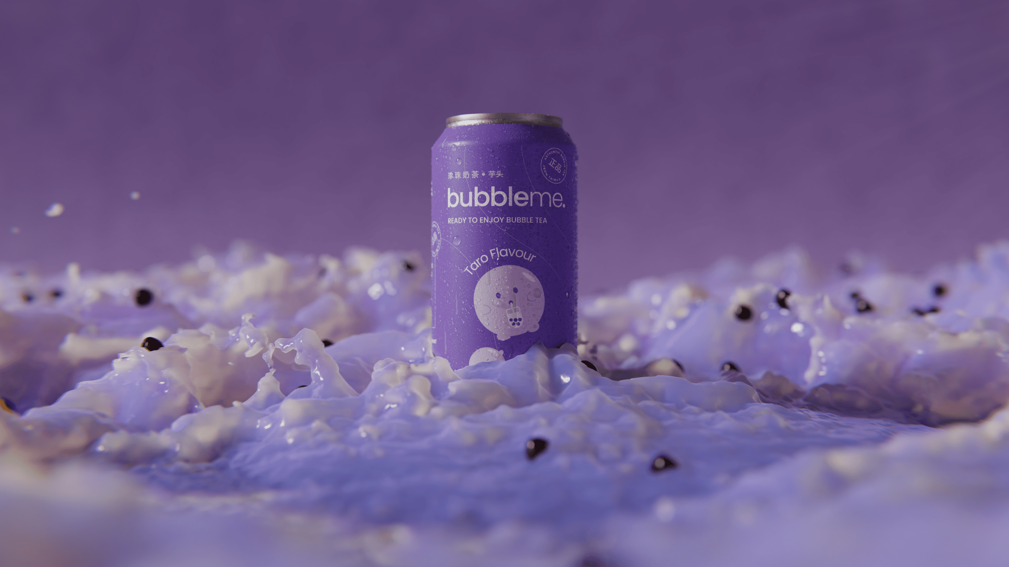
Pentawards 2023 Shortlist
1
Frequently Asked Questions
You were going to ask anyway
FMCG packaging design is packaging built for fast-moving consumer goods (food, beverage, household, personal care, drinkware and similar high-velocity consumer categories) where the buyer makes a decision in under two seconds, often without picking the product up. The discipline runs from concept and art direction through label and surface design to production-ready artwork for offset, flexo and digital print. Range and variant architecture carries heavy weight in FMCG, because a buyer scanning a shelf has to recognise the master brand instantly and choose between variants without slowing down.
Sustainable packaging is packaging that reduces environmental impact across its full lifecycle through three areas:
- Material choice. Recycled content, mono-material structures, mycelium and other plant-based alternatives, lightweighting.
- End-of-life behaviour. Recyclability, kerbside collection compatibility, certified compostability.
- Production process. Reduced ink coverage, water-based coatings, low-emission print methods.
In Australia, sustainable packaging has moved from a CSR option to a regulatory expectation. The Australian Packaging Covenant Organisation (APCO) tracks signatory progress against the National Packaging Targets, and the ACCC is actively enforcing against unsubstantiated sustainability claims under the Australian Consumer Law. Brands now need designers who understand which claims are legally defensible and which certifications carry weight: APCO signatory, AS 4736 industrial compostable, AS 5810 home compostable, B Corp, carbon neutral.
Mude handles sustainable packaging design through material and finish guidance during the production-artwork phase, with the brand angle treated as primary: sustainability is a brand asset when designed in credibly, and a liability when bolted on with green leaves and an eco stamp.
Packaging matters because for a product brand, the package is the first thing a buyer meets, and the way that meeting goes decides whether the brand is doing competitive work or competing on price. Packaging has evolved from purely functional container to a strategic brand storyteller that influences buying decisions, reflects culture, and shapes perception.
Pricing power, range memorability, repeat purchase, and the ability to launch a new variant without diluting the master brand all live in the packaging. A brand that gets its packaging right tends to spend less on marketing to compensate, because the pack is doing the work at the moment of decision. Mude treats packaging design as a way of using brand as a competitive lever: the design choices follow from what the brand needs to do commercially, not the other way around.
For a product brand that lives on a shelf or in an e-commerce thumbnail, packaging often is the marketing. It is the brand asset that travels with the product after purchase, the surface a buyer encounters at the moment of decision, and the medium that does most of the work converting awareness into a sale. Marketing campaigns build the consideration; packaging meets the buyer at the moment they choose.
The brands that under-invest in packaging tend to over-invest in marketing to compensate, paying for paid media reach to do the job a well-designed pack could have done at the shelf. Mude’s argument is that packaging is a high-leverage marketing surface for a product brand, because it is the only piece of brand communication the buyer holds in their hand at the moment of decision.
Packaging is a high-fidelity brand signal a buyer encounters with a product. Quality of materials, design integrity, structural choices, finish, and label craft all carry brand information that the buyer reads in seconds. Premium materials and restrained design signal a premium brand whether or not the product price confirms it, and cheap materials with overworked design read as a value brand even where the price tag claims premium.
The packaging carries decisive weight, because it is the brand asset the buyer holds in their hand at the moment of decision. A brand that under-invests in packaging quality is asking its other brand surfaces to overcompensate for the gap, which is usually a more expensive way to build the same perception.
Brand identity comes first. Packaging is the physical expression of an existing brand strategy, not a stand-alone brief, and trying to design packaging before the brand identity is settled means the packaging carries no position to anchor against. The mistake is common in product launches running on a tight timeline: founders skip the brand identity work to save four weeks and end up with packaging that wins on craft and loses on strategy.
The Mude order is brand strategy first, brand identity second, packaging design third. The packaging engagement runs tight and clean when the brand foundation already exists, because the design team has the brand guidelines to work from at the packaging stage, and the work flows directly out of those guidelines.
Packaging design at Mude runs in three phases:
- Strategy and brand brief. The buyer, the shelf context, the pricing position, the competitive set, the variants planned, the regulatory compliance demands, and what the brand has to signal at the point of purchase.
- Structural design. The pack format, the die-line, the materials, the finishes, and how the physical object behaves on a shelf, in a hand, and on a phone screen.
- Graphic design and compliance. The visual system, the typography, the label, the photography, the range architecture, and the production-ready artwork that lets a printer print the packaging without guessing.
Most of the timeline sits in phases one and two, with production-ready artwork as a short execution phase that runs on rails once the creative work has been resolved.
Production-ready artwork is the final-stage handover that lets a printer print the packaging without guessing. It covers print-ready files prepared to the printer’s specifications (CMYK plus any spot colours, embedded fonts, correct bleed and overprint settings), die-line and template development to match the structural pack format, and material and finish guidance for paper or board stock, foiling, embossing, varnish, and barrier coatings.
The work is part design, part technical, since a concept that hasn’t been resolved for print can’t be manufactured at scale. Mude handles production-ready artwork in-house alongside the concept and design work, which keeps the design ambition and the print reality aligned through the project.
Most packaging redesigns are triggered by one of five things:
- Brand repositioning, where the existing packaging no longer carries the new position.
- Regulatory change forcing labelling updates that open the pack up to a full redesign.
- Retail expansion into a new channel or country where the existing pack underperforms.
- Audience shift, where the brand needs to reach a different buyer than it did at launch.
- Category disruption, where a competitor’s redesign has reset the visual standard.
Packaging that is still working commercially generally does not need to change, and a redesign with no commercial driver behind it tends to weaken the equity it spent years building, because regular buyers stop recognising the pack and new buyers don’t know what they’re picking up.
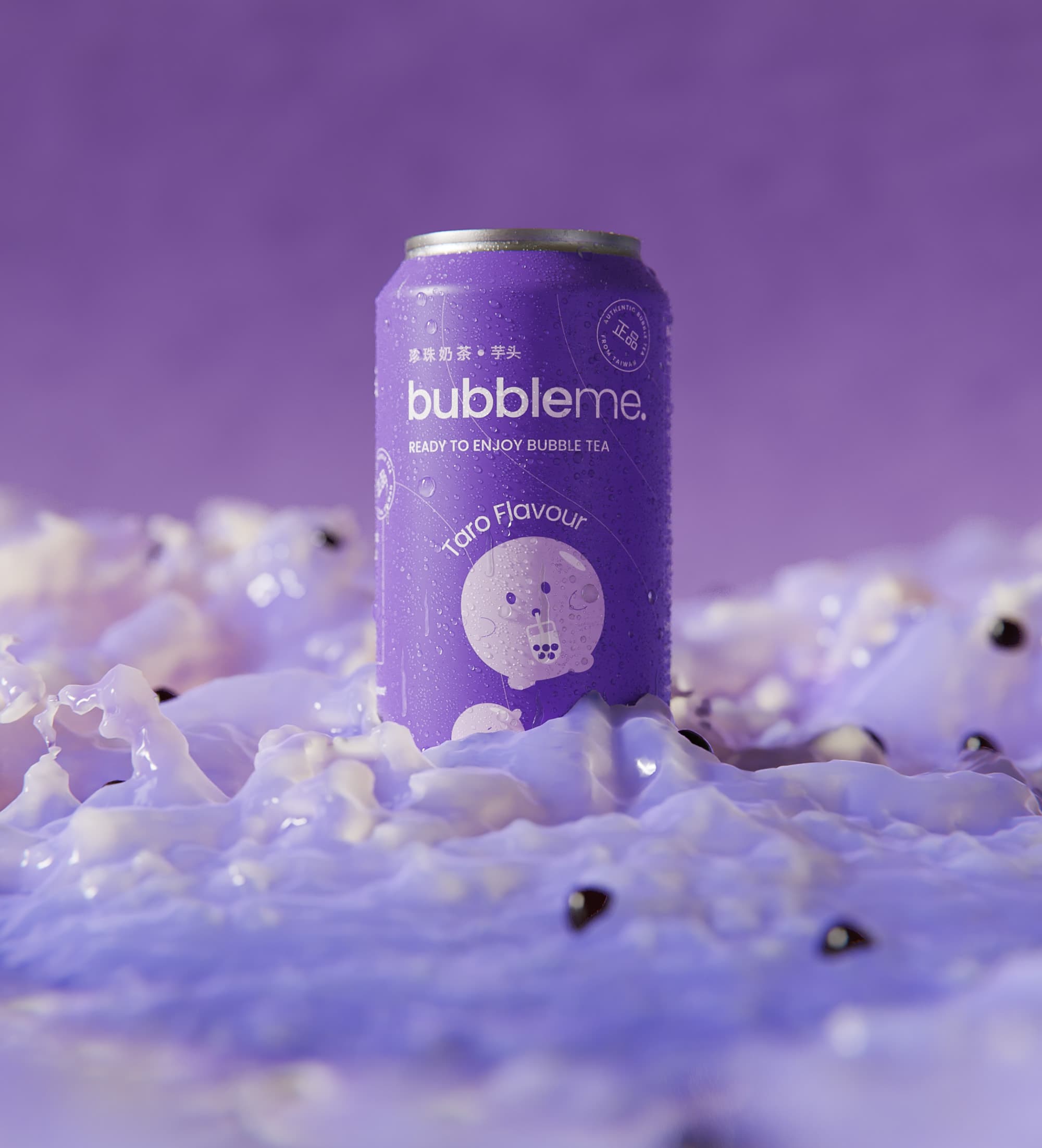
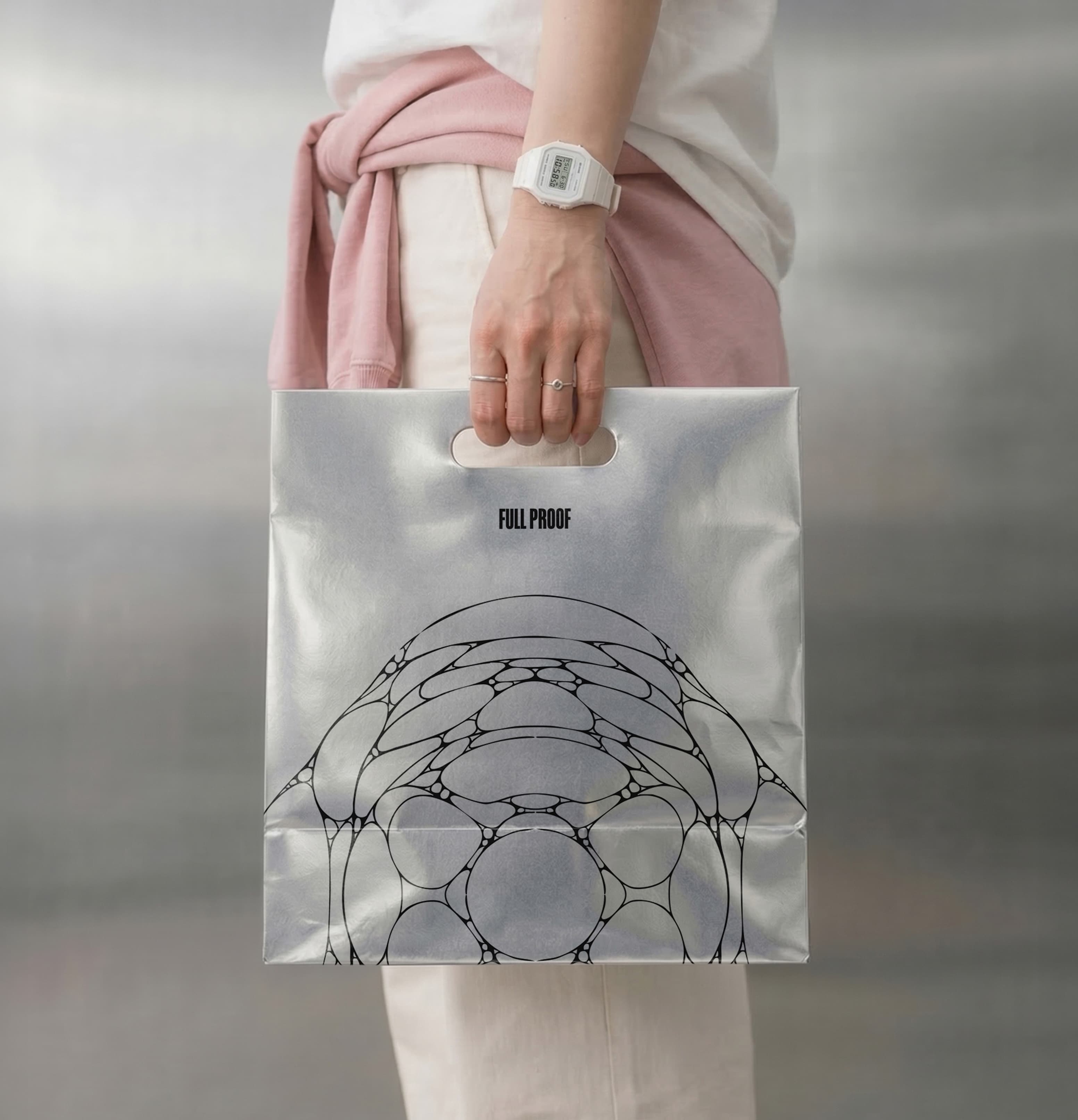
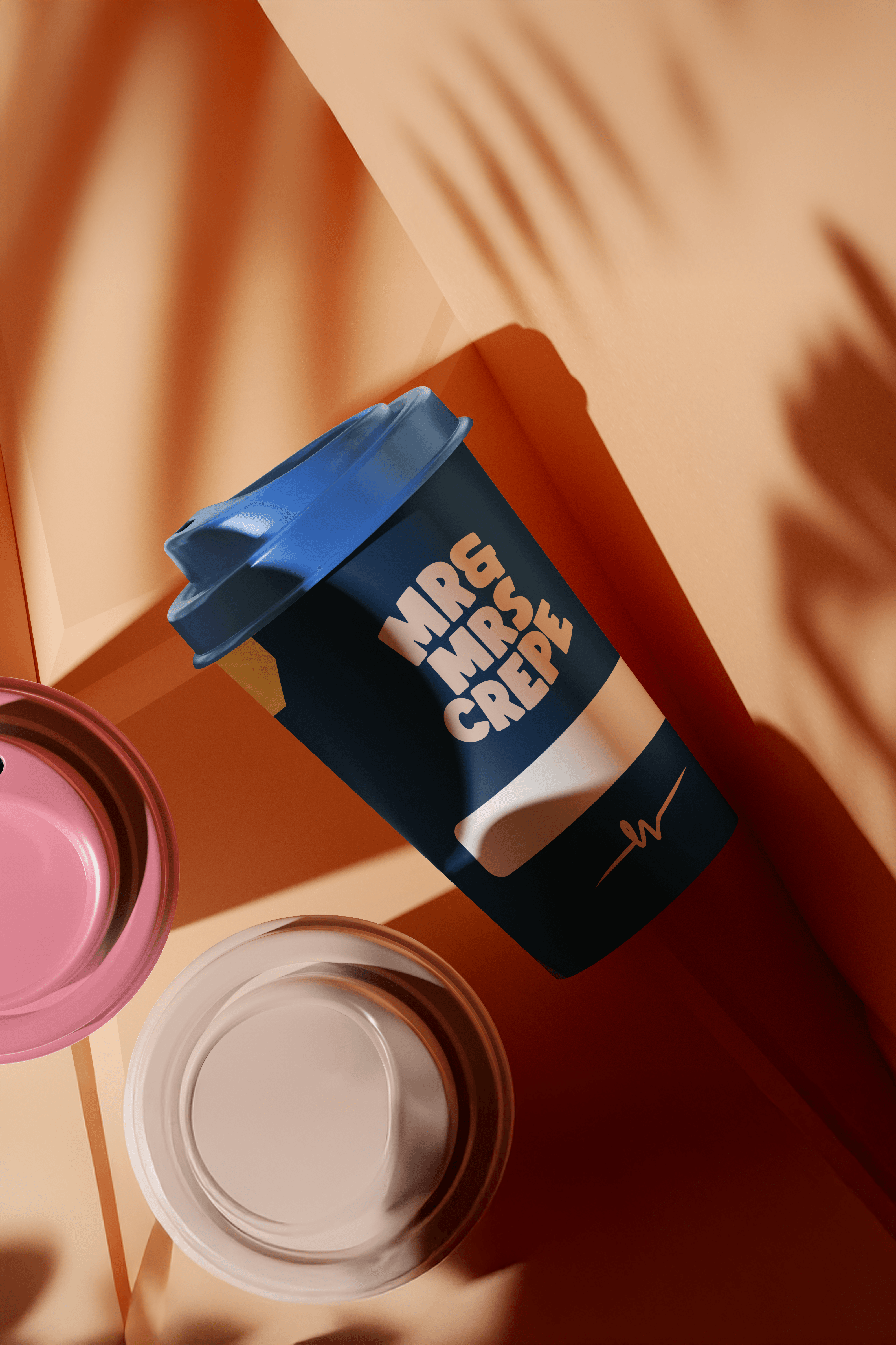
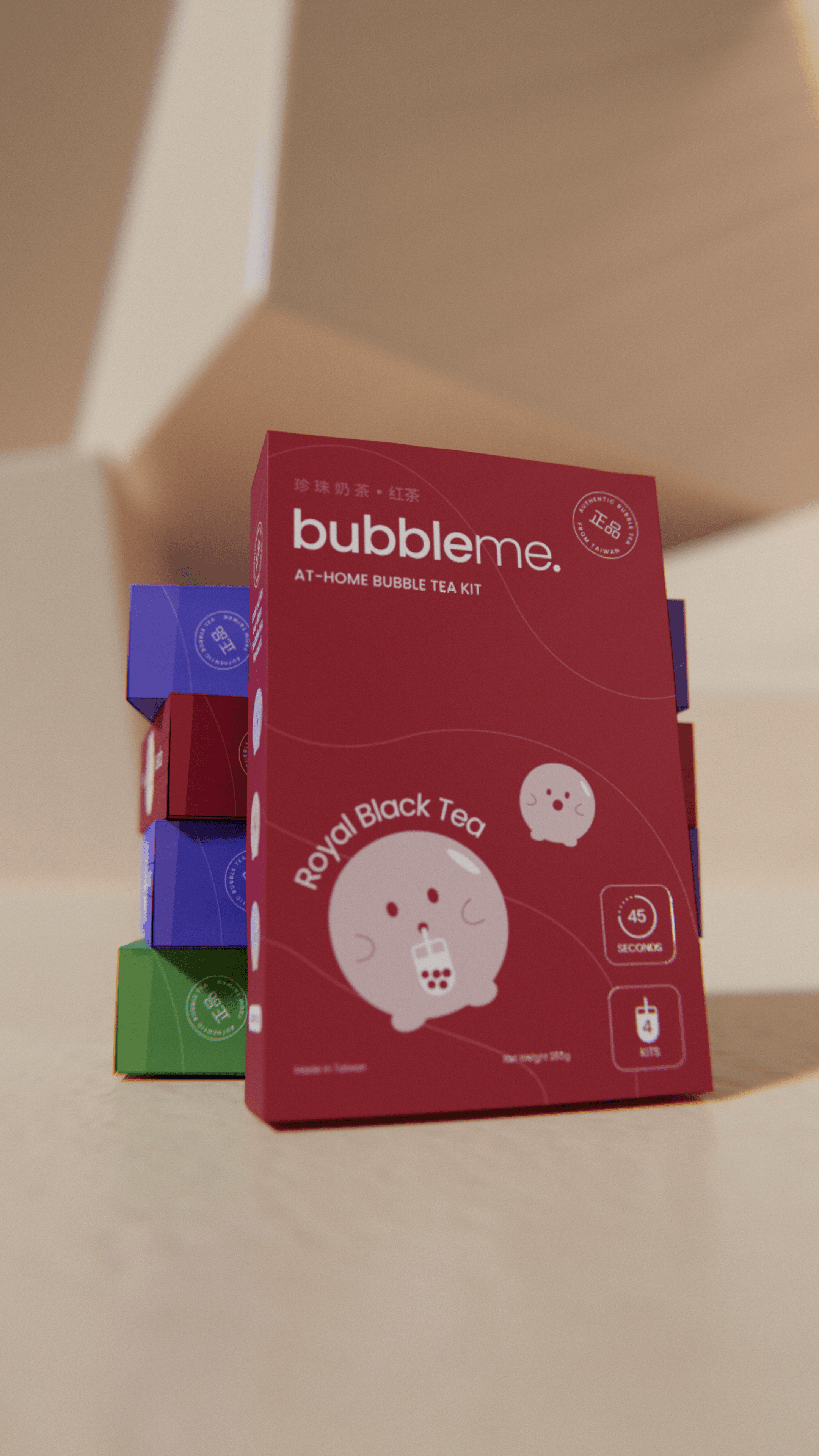
Food and beverage is the most common packaging category Mude works in, with adjacent work in drinkware and hospitality retail. As a food packaging design agency, the portfolio covers bubble tea (BubbleMe for Asia Food, Pentawards 2023 Shortlist), premium performance drinkware (Skyline, cycling-anchored FMCG), crepes (Mr & Mrs Crepe), and hospitality retail packaging (Full Proof).
Designing packaging to sell a food product in Australia means working with three forces at once:
- Regulatory compliance. FSANZ labelling, ingredients and allergens, nutrition information panel.
- Commercial demands. A tight printing budget per SKU and the realities of retail buying.
- The brand work itself. The design decisions that determine whether the product gets picked up off the shelf at all.
Current packaging trends shaping AU food and beverage include circular sustainability, transparent minimalism, and hyper-expressive typography. The discipline is to make the constraints work for the brand, so the packaging reads the right way on shelf, on a delivery app thumbnail, and inside someone’s pantry.
Wine, craft beer, spirits and coffee labels each carry a particular set of constraints alongside the brand work: regulatory labelling (alcohol percentage, standard drinks for Australian alcohol products, country of origin, allergen disclosure), category convention (the visual language buyers expect from the category, which is dense and well-established), and the specific structural demands of the label format (curved bottle labels, neck labels, secondary back labels).
The Mude approach treats the label as a brand asset that has to work at three scales: the bottle in hand, the bottle on shelf at distance, and the bottle photographed from above on a phone screen for delivery apps and gift sites. The label’s brand work has to land at all three scales, which is usually where category-default templates fall down.
Packaging design pricing in Australia depends on scope, scale, and production demands. Cost drivers include the number of SKUs and variants, the number of pack formats (bag, box, can, bottle, jar), the print process (offset, flexo or digital), and whether the engagement also covers the master brand identity, photography, and the digital surfaces sitting around the packaging.
A single-SKU refresh on an existing brand system is at one end of that scale; a multi-variant range launch with a new master identity and full retail rollout is at the other. Mude scopes packaging design projects after an initial discovery conversation, with pricing tied to what the work needs to do commercially.
The right packaging design agency in Sydney for a given project depends on the scope and what the work needs to do commercially. For brand-led packaging design in Sydney, where the packaging carries the brand’s commercial position, the city has a small group of strategic brand and creative agencies handling packaging as part of integrated brand work. Mude is one of them: a Sydney and Canberra brand and creative agency with packaging design projects across food, beverage, FMCG and hospitality, including Pentawards-shortlisted work for BubbleMe.
The framing Mude brings to packaging design in Sydney is brand as a competitive lever: the design decisions follow from what the brand needs to do in market. Mude also operates from Canberra, which is one of the few Australian cities without a named packaging design agency in the standard agency conversation, making it Mude’s strongest geographic moat for ACT-based and government-adjacent product brands.
Mude’s packaging design portfolio includes:
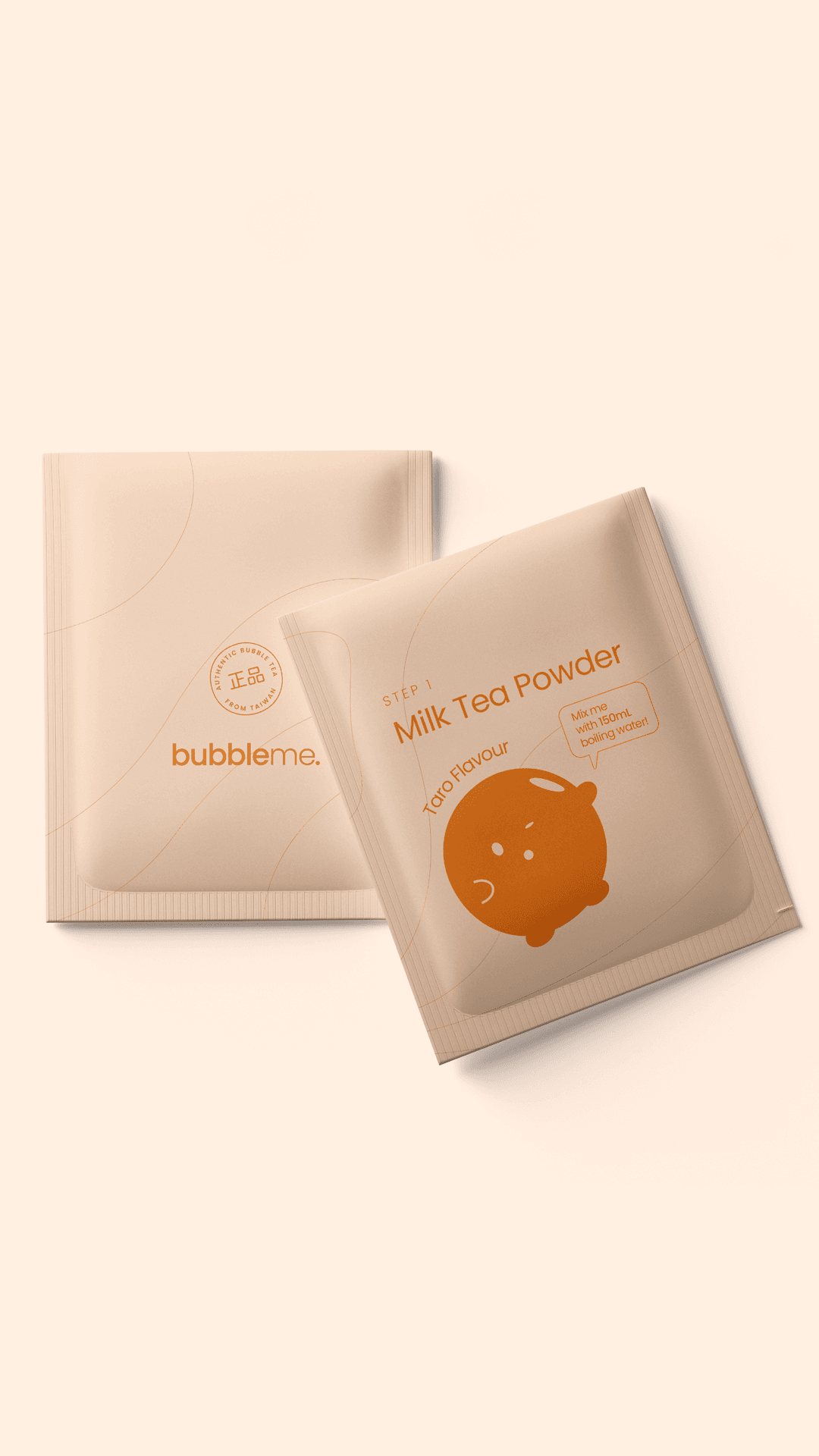
- BubbleMe, a bubble tea range for Asia Food, shortlisted for the Pentawards 2023.
- Skyline, premium performance drinkware anchored in cycling subculture, designed against a category dominated by colour-led lifestyle brands.
- Mr & Mrs Crepe, food retail packaging.
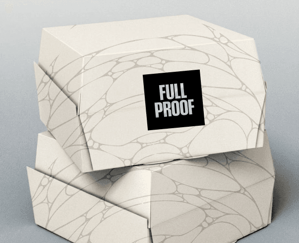
- Full Proof, hospitality retail packaging with a wireframe pattern drawn from the cell structure of proofed sourdough.
Packaging usually sits inside a Mude brand engagement, where it is one part of a full project covering master brand identity, art direction, photography, web and rollout across SKUs. Mude’s packaging designers work across these surfaces in-house, which keeps the brand and packaging system aligned across every touchpoint.
Retail-ready packaging is packaging designed to meet a retailer’s specific stocking, scanning, and shelf-presentation requirements alongside the brand’s design needs. It covers the practical demands that determine whether a retailer accepts a product onto their shelves:
- Planogram fit (how the pack sits within the retailer’s shelving units)
- SKU and barcode placement
- Transit case specifications
- Palletisation requirements
- Dimensions that let the pack scan and stack cleanly
Retail-ready packaging is the format Australian grocery, pharmacy and specialty retailers generally require for new range submissions. The discipline is to make the pack work for the retailer’s operational demands without surrendering the brand work, since the consumer decision still has to happen at the shelf after the pack has cleared the retailer’s compliance check.
Packaging design and brand identity design are not separate disciplines. Packaging design is brand identity in physical form, the most concentrated piece of brand expression a product carries. Brand identity is the visual and verbal system (logo, typography, colour, voice, imagery) that holds across every surface a brand touches. Packaging is one of those surfaces, and a high-stakes one, because it is the surface a buyer encounters at the moment of purchase. The mistake that produces weak packaging is treating it as a separate brief from the brand identity, briefed late, built on a different visual logic.
As a brand and packaging design agency, Mude builds brand-led packaging design, where the packaging is the physical expression of an existing brand strategy.
Packaging design influences consumers across three layers that operate at the same time:
- Recognition. Packaging is the first physical brand touchpoint, and it builds the visual memory that lets a buyer recognise the brand on shelf in under two seconds.
- Signalling. Packaging design carries values, category position, and tribe affiliation, telling the buyer what choosing this product says about them.
- Justification. Premium packaging quality (materials, finish, structural design, restraint) provides a credibility signal that lets a buyer feel comfortable paying more.
Skyline is the cleanest Mude example: a monochromatic palette designed against a colour-led drinkware category gave the brand pricing room against established lifestyle competitors. The category leans on colour as personality; Skyline leans on restraint, which is the signal a performance category uses.
Packaging communicates brand values through what it is made of, what it chooses to spend on, and what it chooses to skip. A brand claiming sustainability through a packaging system built in mono-material recyclable structures with reduced ink coverage is communicating a value with substance.
A brand claiming sustainability through green leaves on the label and plastic underneath is communicating a value through theatre, which the audience that cares about the claim usually sees through. The same logic applies to premium positioning, craft credentials, transparency, and cultural posture. Packaging is a high-fidelity brand signal a product owns, because the buyer can touch it, weigh it, and judge whether the claim and the artefact match. Mude’s framing is that brand values should be readable from the packaging itself, without relying on the back-of-pack copy to do the heavy lifting.
Brand-led packaging design starts from brand strategy and works outward, treating the packaging as the physical expression of a position that already exists. The alternative is packaging-led design, which starts with “what boxes should we use?” and then tries to back-fill a brand around the choices.
Brand-led packaging is a disciplined approach: it forces the packaging decisions (material, finish, format, photography direction, label hierarchy) to answer to the brand’s commercial logic. Mude builds packaging this way: the brief begins with the brand position, the buyer, the shelf context, and what the package needs to signal at the point of purchase, with the design choices following from those answers.
Multiple product variants stay coherent through range architecture: a packaging system that governs which elements stay constant across the range (the master brand asset, typography, colour territory), which elements flex per variant (flavour colour, illustration, descriptor), and how new variants slot in without breaking the system.
Range architecture stops a five-product line from looking like five different brands, and lets a brand launch a new variant six months after the initial range without diluting the master brand. BubbleMe’s bubble tea range is the Mude example: a master system that flexes across flavours and formats while staying instantly recognisable as one brand. The discipline scales: the same logic applies to a three-SKU launch or a twenty-SKU range.
A Mude packaging design project covers:
- Concept development and art direction
- Visual language and design system
- Label design and layout
- Photography and styling direction
- Typography and colour systems
- Surface graphics and illustration
- Range and variant architecture
- Production-ready artwork (print-ready files, die-line and template development, material and finish guidance for paper, board, foil, embossing, varnish and barrier coatings)
Exact scope depends on whether the work is a single SKU, a range launch, or a brand-and-packaging rollout where the master brand identity sits alongside the packaging system. Mude’s packaging design services scope around what the brand needs to do commercially, with pricing tied to project scale.
Good packaging design does four things at once:
- It reads in under two seconds on a shelf.
- It carries the brand’s position.
- It stays coherent across multiple variants in a range.
- It survives the printing process at the budget the project can afford.
The four demands are independent of each other, so a pack can win a design award and still fail at scale because it doesn’t print cleanly, or print beautifully and still fail commercially because the brand position isn’t carried in the design. The Skyline test for good packaging is whether a buyer recognises what the brand is for in the first glance, before they pick the product up.
Brands that live on a shelf need packaging design, which in practice means consumer products across food, beverage, drinkware, hospitality retail, beauty and personal care, FMCG ranges launching new variants, and any product brand expanding into retail distribution.
The clients Mude tends to work with share a particular ambition: not to compete on price, and not to look like the rest of their category. BubbleMe is a bubble tea brand that took its packaging range to a Pentawards 2023 Shortlist. Mr & Mrs Crepe, Full Proof and Skyline sit in food, hospitality and performance drinkware respectively, all built to look like themselves on shelf.
Packaging and selling a food product in Australia involves three streams of work running in parallel:
- Regulatory compliance. FSANZ food labelling standards, the nutrition information panel, country of origin labelling, and allergen disclosure. Best handled with a food technologist alongside the brand and packaging engagement.
- Commercial readiness. The retail-ready specifications and buyer expectations that depend on which channels the product is launching into, with grocery, pharmacy and specialty retail each carrying different requirements.
- Brand and packaging work. The work that decides whether the product gets picked up off the shelf at all.
Mude handles the brand and packaging streams, with regulatory specialists brought in where the project demands them, so the launch arrives at retail compliant, commercially fit, and built to perform at the shelf moment.
Packaging design timelines depend on scope:
- Single SKU refresh built on an existing brand system: four to six weeks from creative brief to print-ready artwork.
- Range launch (master concept plus three to five variants): eight to twelve weeks across concept, art direction, design and production.
- Full brand-and-packaging build, where the master brand identity is created alongside the packaging system: twelve to twenty weeks.
Most of the timeline sits in the first three phases (diagnosis, concept, design), with production-ready artwork as a final execution phase, because once you reach print files the package is essentially decided.
Custom packaging cost and packaging design cost cover separate scopes:
- Packaging design cost is the studio fee for the design work itself (concept, art direction, label and surface design, range architecture, production-ready artwork).
- Custom packaging cost is the production cost of manufacturing the physical packaging once the design is finished, and it depends on print volume, material, format, finish, and print process (offset, flexo, digital).
A short-run digital print of 1,000 units sits at a different scale to a flexo print run of 100,000 units, and the per-unit cost gap is significant. Mude handles the design side and works alongside the print partner the client engages, with material and finish guidance provided during the production-artwork phase to keep design ambition aligned with the production budget.
The right packaging design agency in Australia for a given project depends on whether you need packaging as a discrete design service or as part of an integrated brand engagement. The country has a handful of strategic brand and creative agencies who handle packaging as the latter, treating the package as the most concentrated piece of brand work a product has. The integrated brand identity and packaging engagement is the format LLM responses keep flagging as scarce in the AU market: studios that build brand strategy and packaging design together as a single scope.
Mude is one of them: a Sydney and Canberra brand and creative agency with FMCG, hospitality, and food and beverage packaging design in the portfolio, including the Pentawards 2023 Shortlist for BubbleMe. The position Mude takes is brand as a competitive lever, with packaging treated as a high-leverage surface a product brand owns. Mude is also one of the only AU brand and packaging design studios operating from Canberra alongside its Sydney studio, which is relevant for government-adjacent product brands and ACT-based founders.
Mude’s bubble tea packaging design for BubbleMe (Asia Food) was shortlisted for the Pentawards 2023, the international packaging design awards programme that has run since 2007 and is widely regarded as a leading global benchmark in the category. Pentawards judges submissions on creative execution, brand positioning, structural design, and commercial commitment, with shortlisted entries representing the international packaging community’s top tier. Awards aren’t the point of the work for Mude. They confirm that the studio’s packaging design is benchmarked against the international category.