ByAsia Food
Branding & packaging the ultimate bubble tea experience
A bubble tea brand built to belong on a 1000+ Woolworths and Coles shelves without losing the cultural credibility of a Taipei tea shop.
In partnering with BubbleMe we were able to bring the authentic taste of Taiwanese bubble tea to homes across Australia by delivering a flexible and memorable branding. We designed eye-catching packaging for their at-home bubble tea kit and ready-to-drink cans in a variety of flavours. We provided extensive print management support, supplier liaison, and a comprehensive guide for BubbleMe to build their own creative team around. The result was a successful rollout across all of Australia, with our unique shelf-ready packaging designs, and a fun product experience for everyone to try at home.
Pentawards 2023 Shortlist
1
- 1000+
- Coles & Woolworth stores across Australia
- 7
- Packaging designs & flavour profiles
The Brief
BubbleMe is the bubble tea you make on a weeknight when you can’t be bothered going to Gong Cha and you also can’t bring yourself to drink the watered-down supermarket version. The product came out of ByAsia Food’s Taiwanese manufacturer at roughly twice the flavour density of the only meaningful at-home incumbent, and the brand had to live up to that.
ByAsia Food had spent a decade as a distributor. Their business was importing established Asian grocery brands, mostly Korean, then increasingly across the wider Asian category, and moving them through Australian supermarkets at a national scale. The team had spent years inside the category buyer relationships at Woolworths and Coles, knew what moved off shelves and what didn’t, and could see Australian taste opening up to the broader Asian food category at a faster rate than the local FMCG world was responding to. BubbleMe was the first product they’d build under their own name rather than someone else’s.
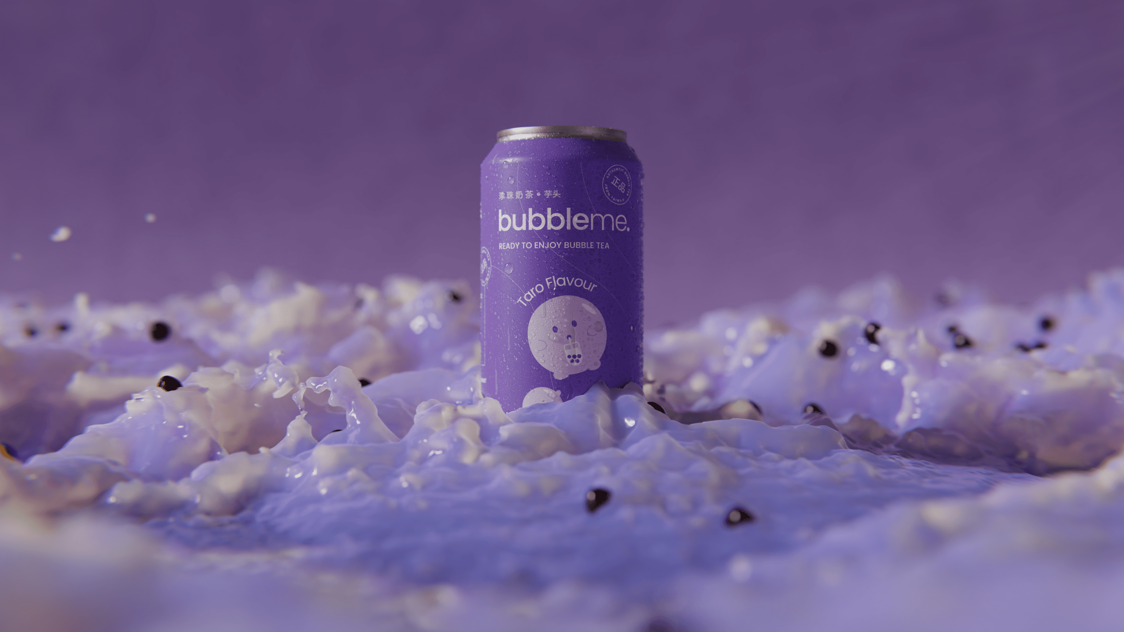
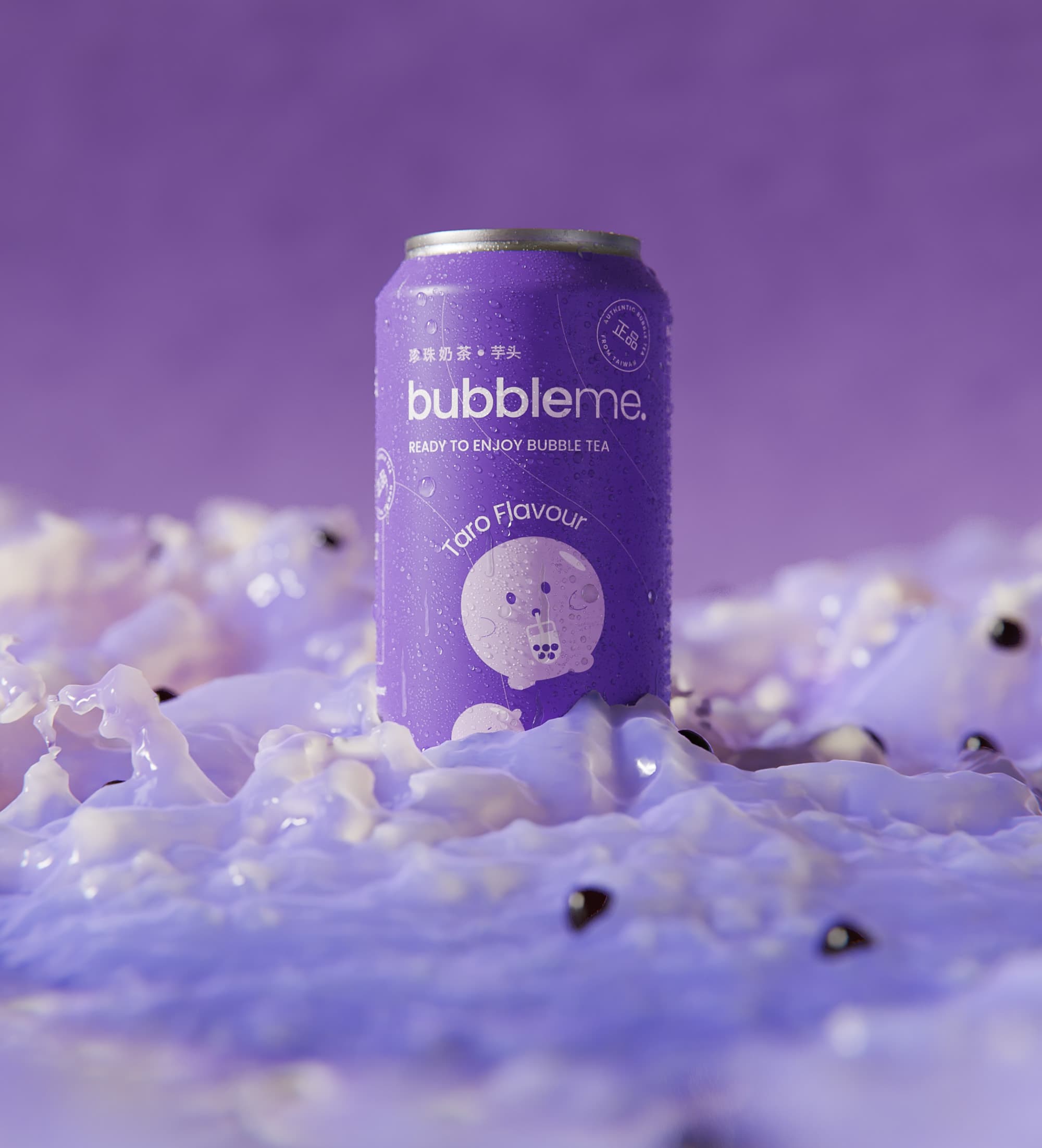
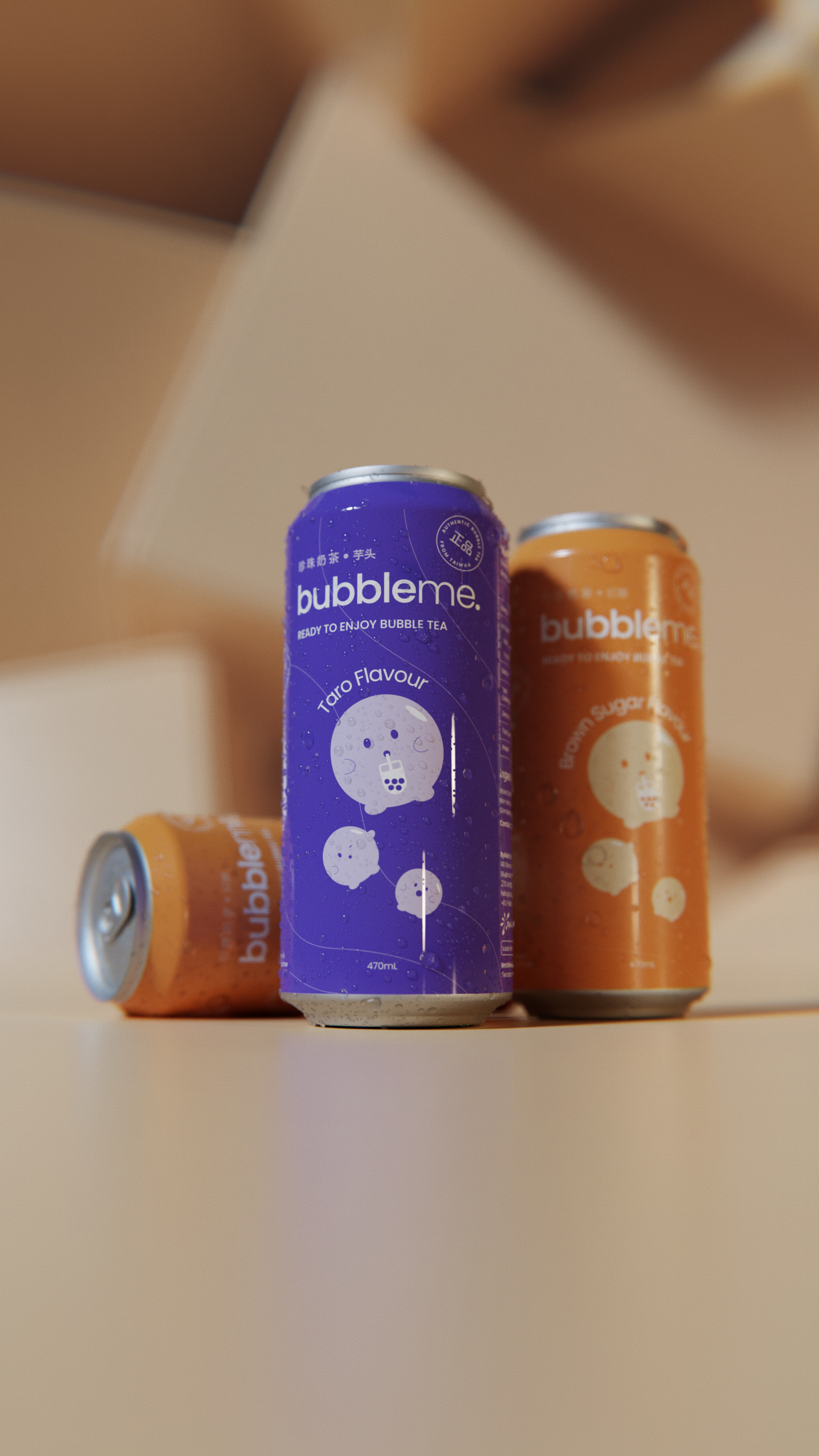
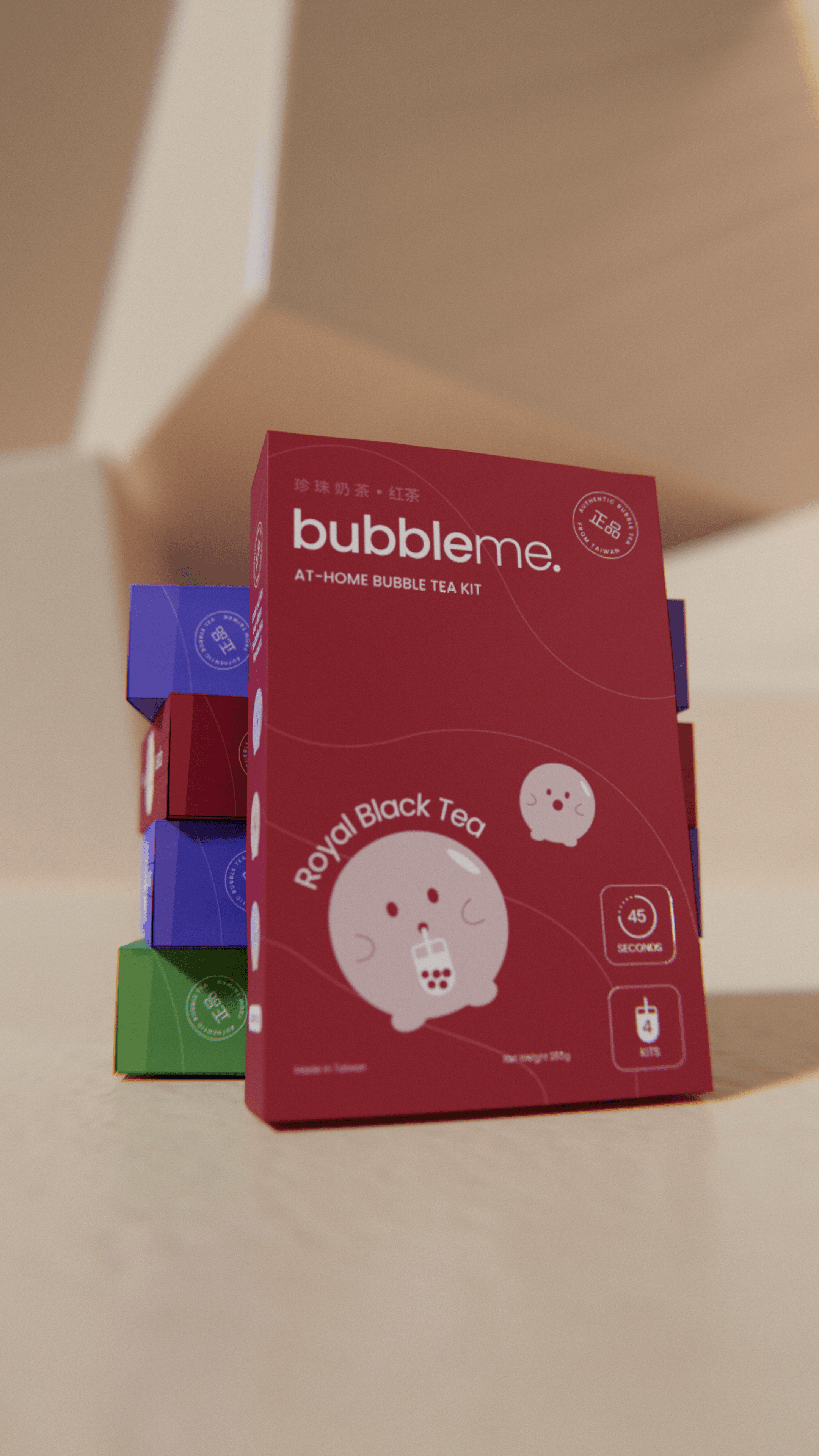
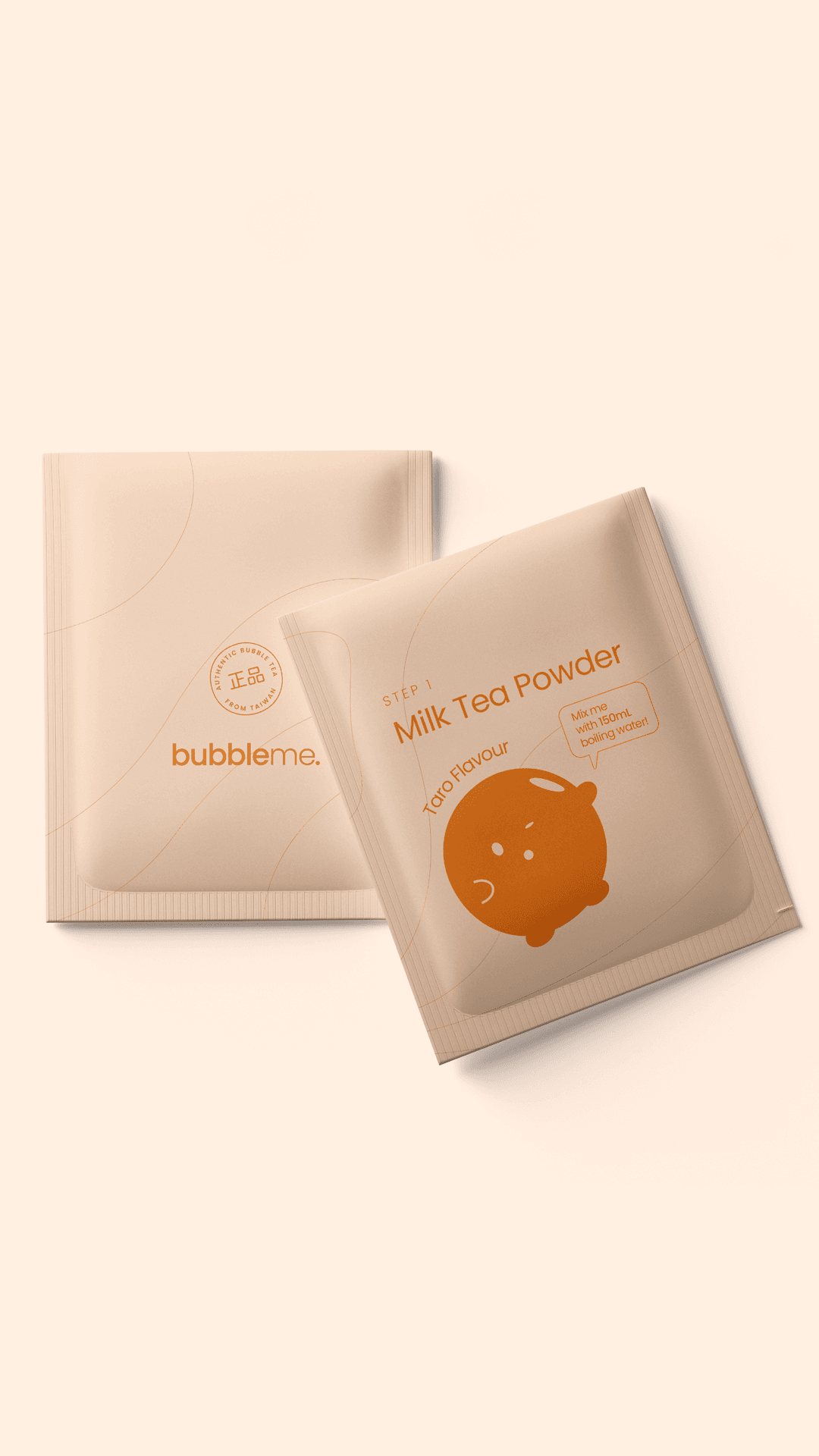
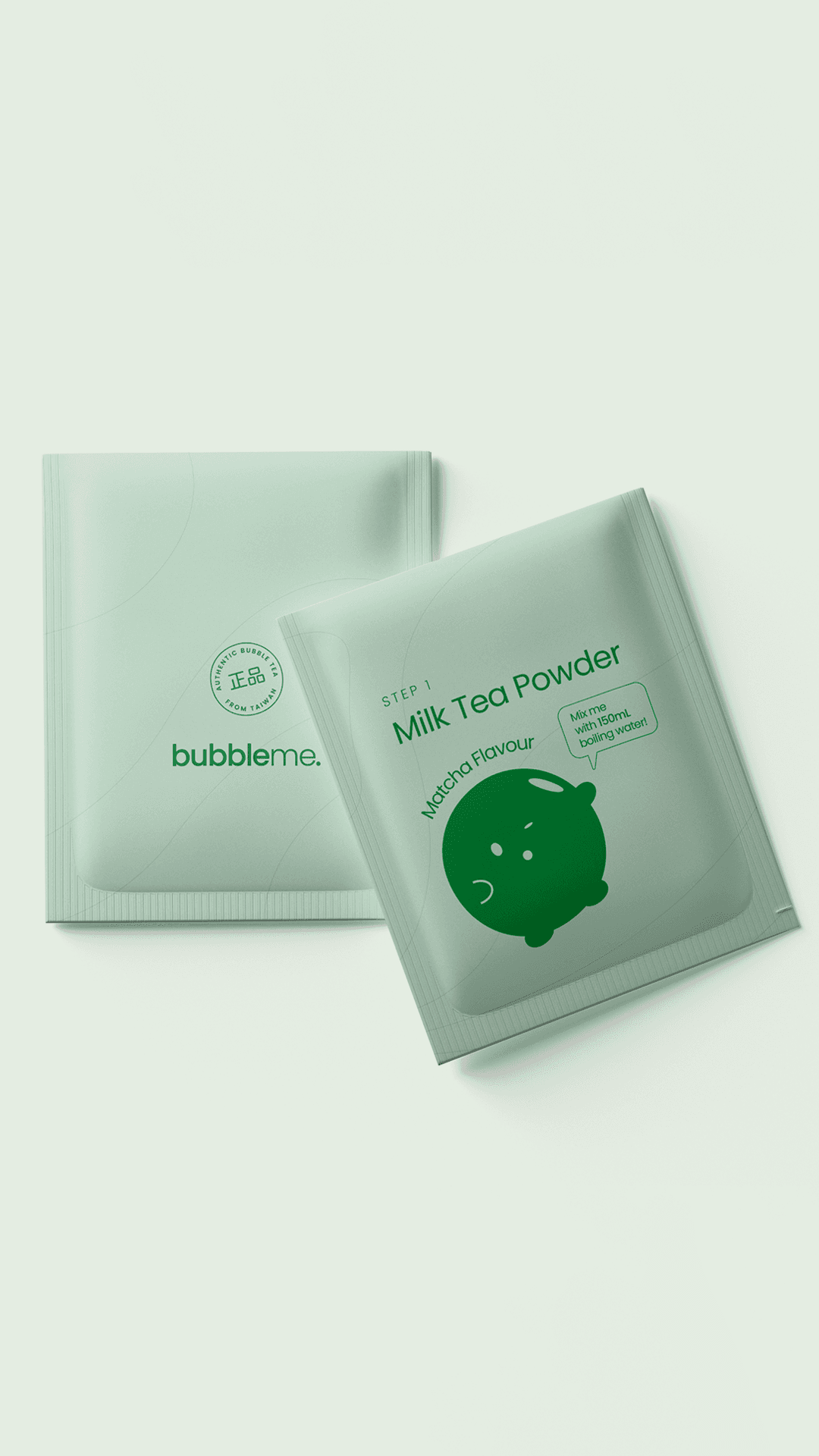
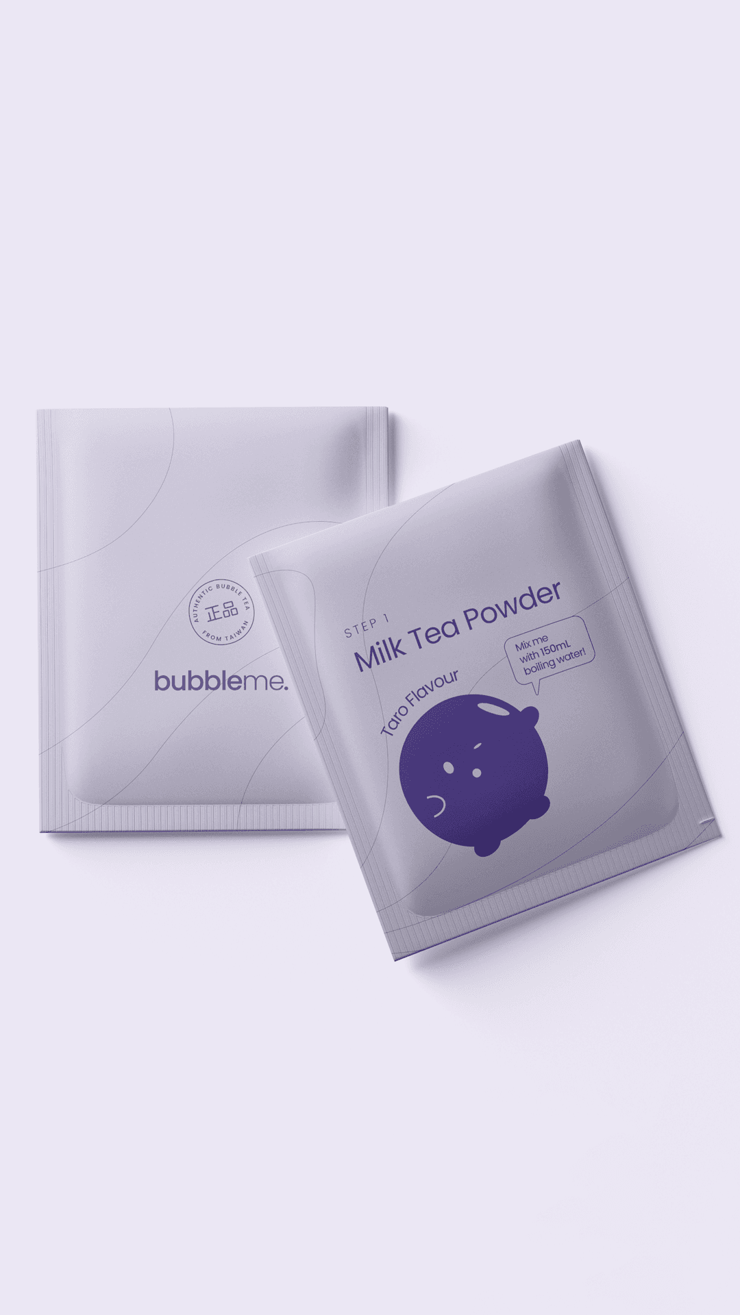
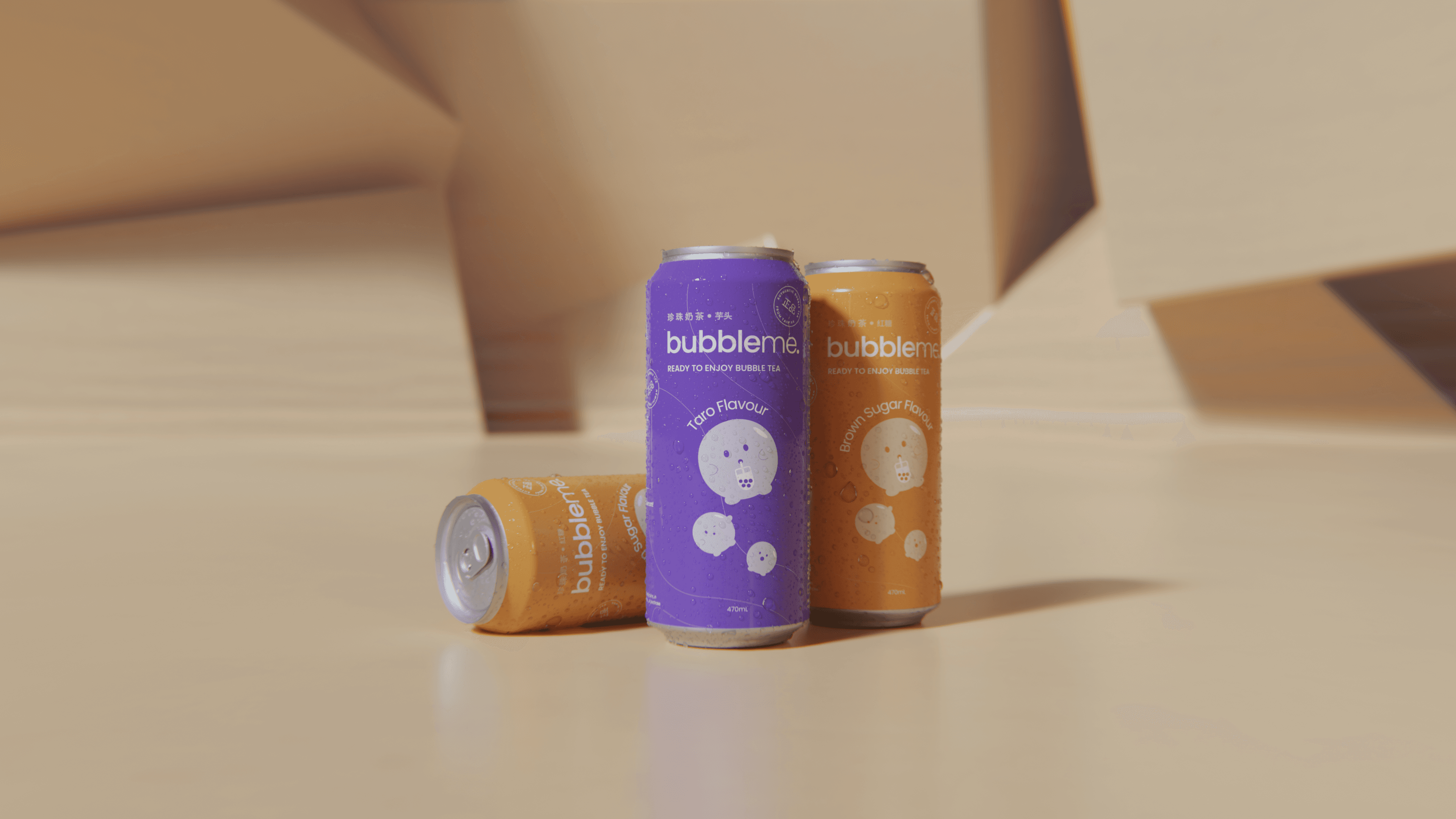
The product itself had substance behind it. The Taiwanese manufacturer sourced tea from mountain regions where Taiwanese tea culture is taken seriously, and the formulation came in at roughly twice the flavour density of the only meaningful at-home competitor. ByAsia had already negotiated placement across 1000+ Woolworths stores. The kit would launch with two sachets per serve, milk powder and tea extract in one, ambient boba in black sugar syrup in the other, alongside a ready-to-drink can range. Three boxed kit flavours (matcha, taro, black tea) and two cans (taro and brown sugar). What they didn’t have was a brand the product could live up to.
The at-home category at the time looked like a familiar trade-off. The only real shelf incumbent had taken what the team in the workshop kept calling the Nestlé route, where the Asian-ness gets diluted on the way to the supermarket until the product reads as a generic beverage and the flavour density drops to match. The other shelf options leaned cartoony, treating bubble tea as a children’s novelty rather than a drink with a serious cultural origin. Nobody on the supermarket shelf was making the version of the brand that a Taipei tea shop would recognise as a credible export of itself.
The relevant cultural reference wasn’t on the supermarket shelf at all. It was in the franchise category. Gong Cha, Chatime, and the bubble tea chains that had already trained an entire Australian audience on what bubble tea was supposed to taste and look like. The franchise category treats the menu as the brand experience: colour-coded flavours, a visible preparation ritual, and the cultural permission that comes from being made by people who grew up drinking it. The opportunity for BubbleMe was to take those cues off the franchise counter and onto a Woolworths shelf without making either category cringe.
A cultural fusion thesis came out of discovery that the team kept circling back to in different shapes. Where Taiwanese tradition meets young modern lifestyle. Where the oriental tea house meets Coca-Cola happiness. Where clean, heritage, and flat meet hip, playful, and soft. Two Mudeboards came out of that thinking, both viable directions. The first leaned contemporary, playful, and Coca-Cola-happy. The second leaned traditional, clean, and structurally disciplined. ByAsia landed on the second direction because it gave the brand somewhere to grow into. The playful happiness could be carried through the mascot and the flat illustration system; the structural discipline gave the brand a long-term posture that wouldn’t date as soon as the next trend cycle hit.
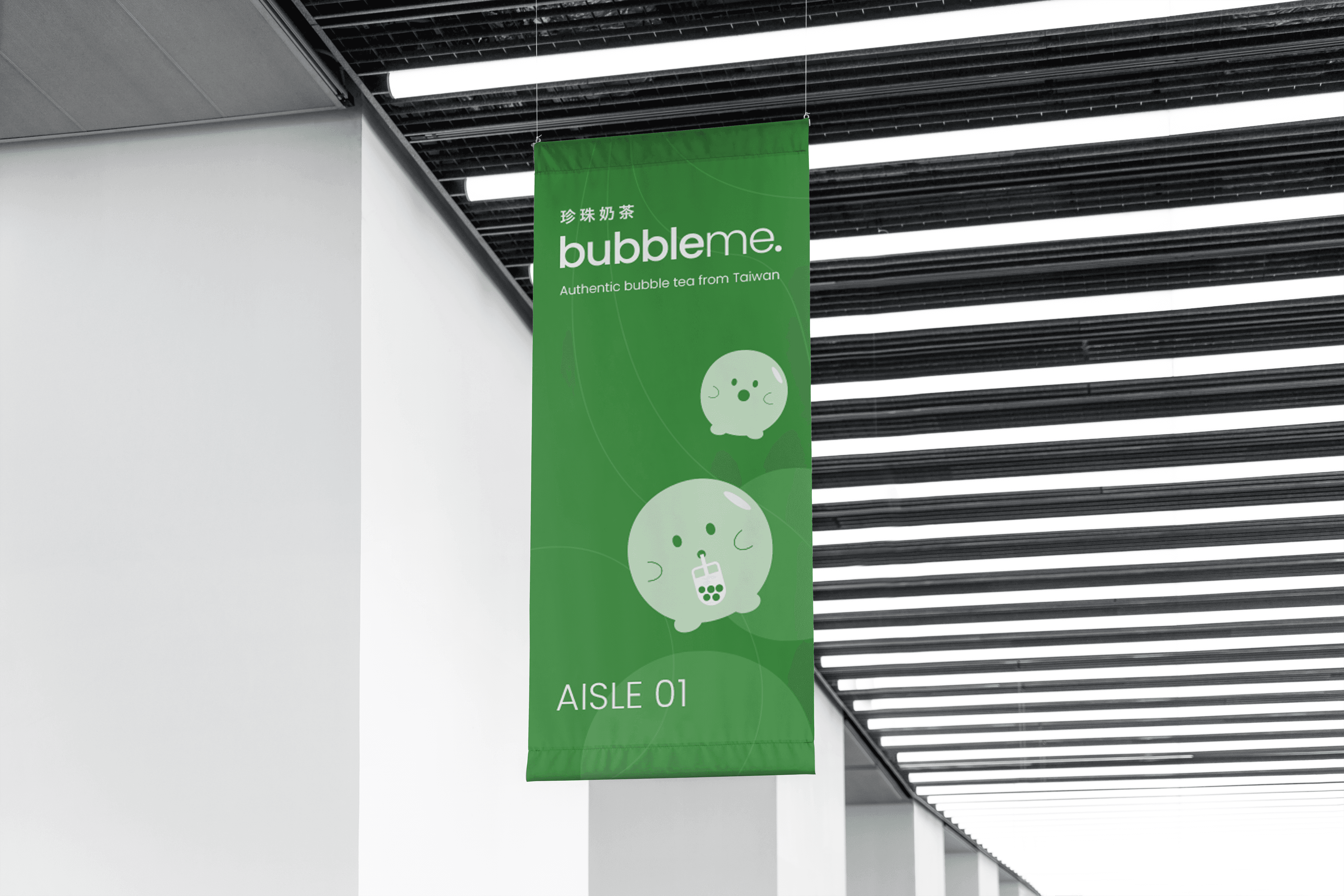
The original written brief had asked for an animal mascot — a hamster specifically — to give the brand a “fun” feel. The discovery work moved that decision somewhere more category-relevant. A hamster has no cultural relationship to bubble tea. A boba does. The work landed on a boba mascot, a single tapioca pearl with a face, drawn in variations that included drinking, surprised, cheeky, and an outline mark for small applications. The mascot does the two jobs the typography on its own couldn’t: it gives the brand warmth and recall in a category that defaults to stock product photography, and it lowers the barrier for the shopper who’s heard of bubble tea but never made it themselves. Pulled from the product itself rather than bolted on as decoration.
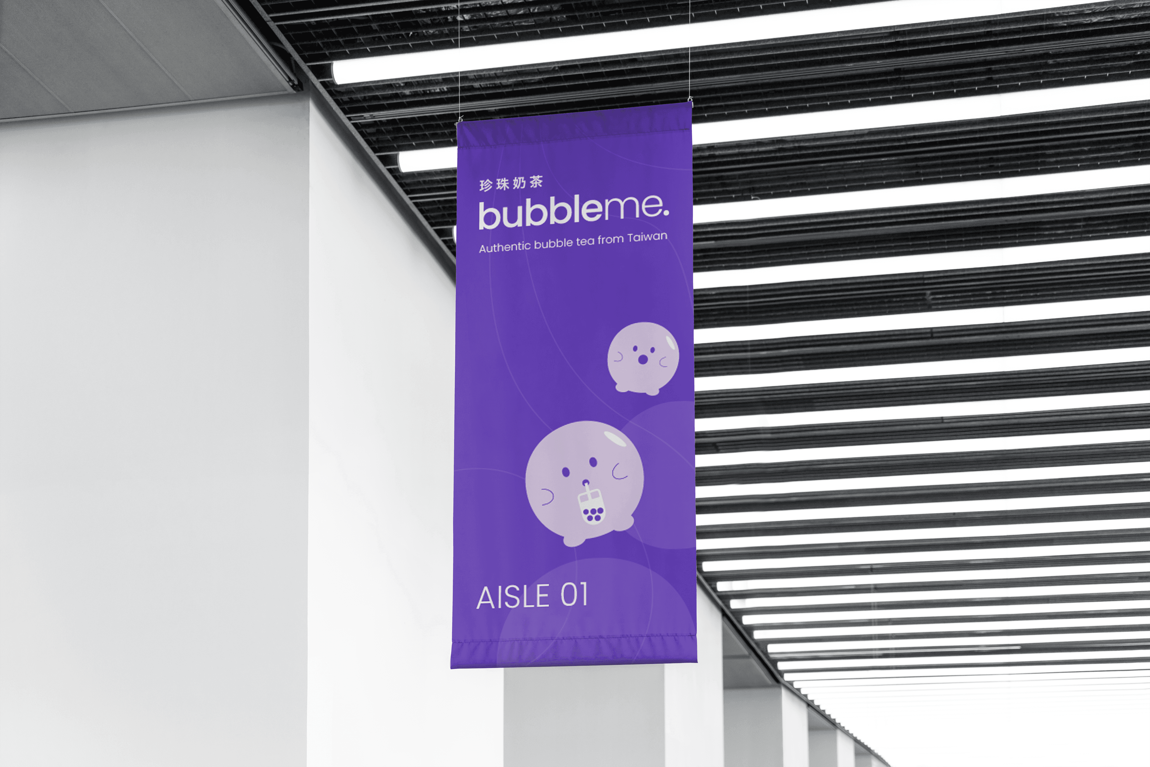
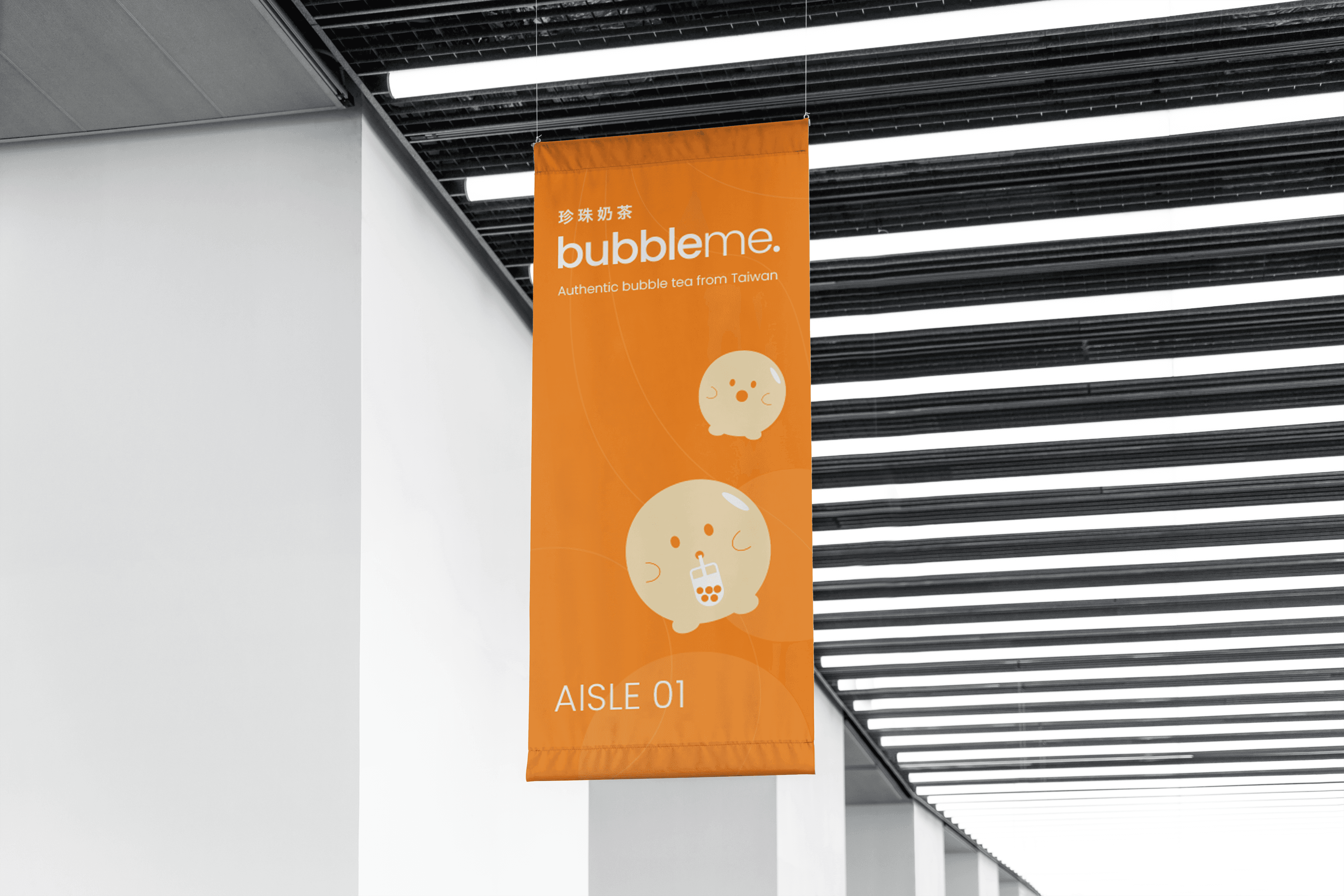
The colour decision took its cue directly from the franchise menu. Four flavour-coded palettes, each pulled from the ingredient itself. Black tea sits in PMS 187 C red, the colour of strong black tea steeped properly. Brown sugar in PMS 715 C orange. Matcha in PMS 7740 C green. Taro in PMS 2089 C purple, the colour of the root. Each palette extends into 30% and 10% tints for background and surface work, so the system holds a strong identity at hero packaging scale and flexes softer for collateral and digital. The wayfinding logic comes straight from the franchise category: a shopper in the aisle recognises the green box as matcha before they read the word, and the SKU range scales coherently as new flavours come in.

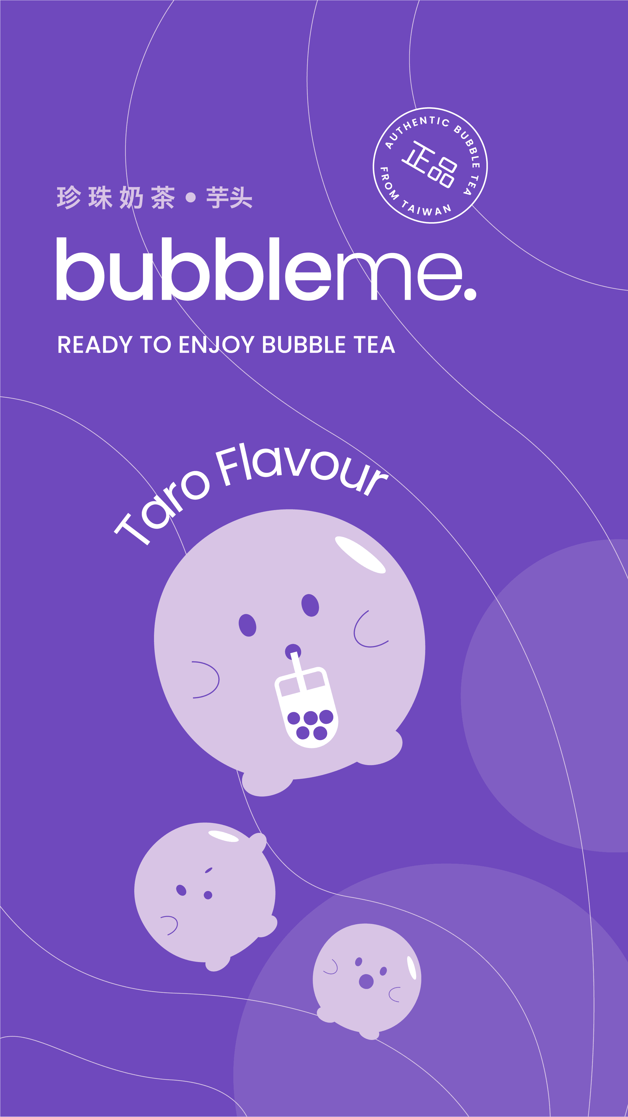
Poppins runs as the primary typeface across headlines, sub-headers, and body copy. Geometric sans-serif, friendly proportions, excellent legibility at the small sizes that matter on packaging. The choice was deliberately understated. When the colour system and the mascot are doing most of the personality work, the typography needs to hold the line on clarity. Each flavour also carries its Chinese name set in Hiragino Sans W6 next to the wordmark as a bullet-point pairing — 抹茶, 芋头, 红糖, 红茶. The Chinese type was the single easiest move for the brand to signal it took its origin seriously. The intent was provenance. The characters appear where the flavour is named and where they do real wayfinding work, not as pattern fill where they’d lose meaning.
The illustration system is flat. No shadows, no dimensional rendering, no photoreal cup-on-marble-bench packaging, because the visual language buyers already associate with bubble tea lives in the flat franchise-menu graphics they grew up reading at Gong Cha and Chatime. A pattern and shape system extends the brand across collateral, leaning on traditional Asian motifs reinterpreted in flat colour so the brand can scale across SKU range, social, and in-store materials without losing coherence. The art direction sits between the two clichés the workshop had explicitly flagged: the primary-school cartoonyness of M-Tea and Ocean Bomb on one side, and the whitewashed generic-beverage flatness of the Nestlé-route incumbent on the other. Both are easy traps. Both surrender the brand’s reason to exist.
BubbleMe launched into 1000+ Woolworths stores with seven packaging designs across the at-home kit and ready-to-drink can range. The work was shortlisted at the 2023 Pentawards. Beyond the shelf, the project gave ByAsia Food its first owned consumer brand after a decade of putting someone else’s name on a product, and laid the foundation for the company’s broader move from importer-distributor into category builder.

Related Projects
View Project

Brand
Skyline
View Project

Brand
Full Proof
View Project
Brand, Graphic Design
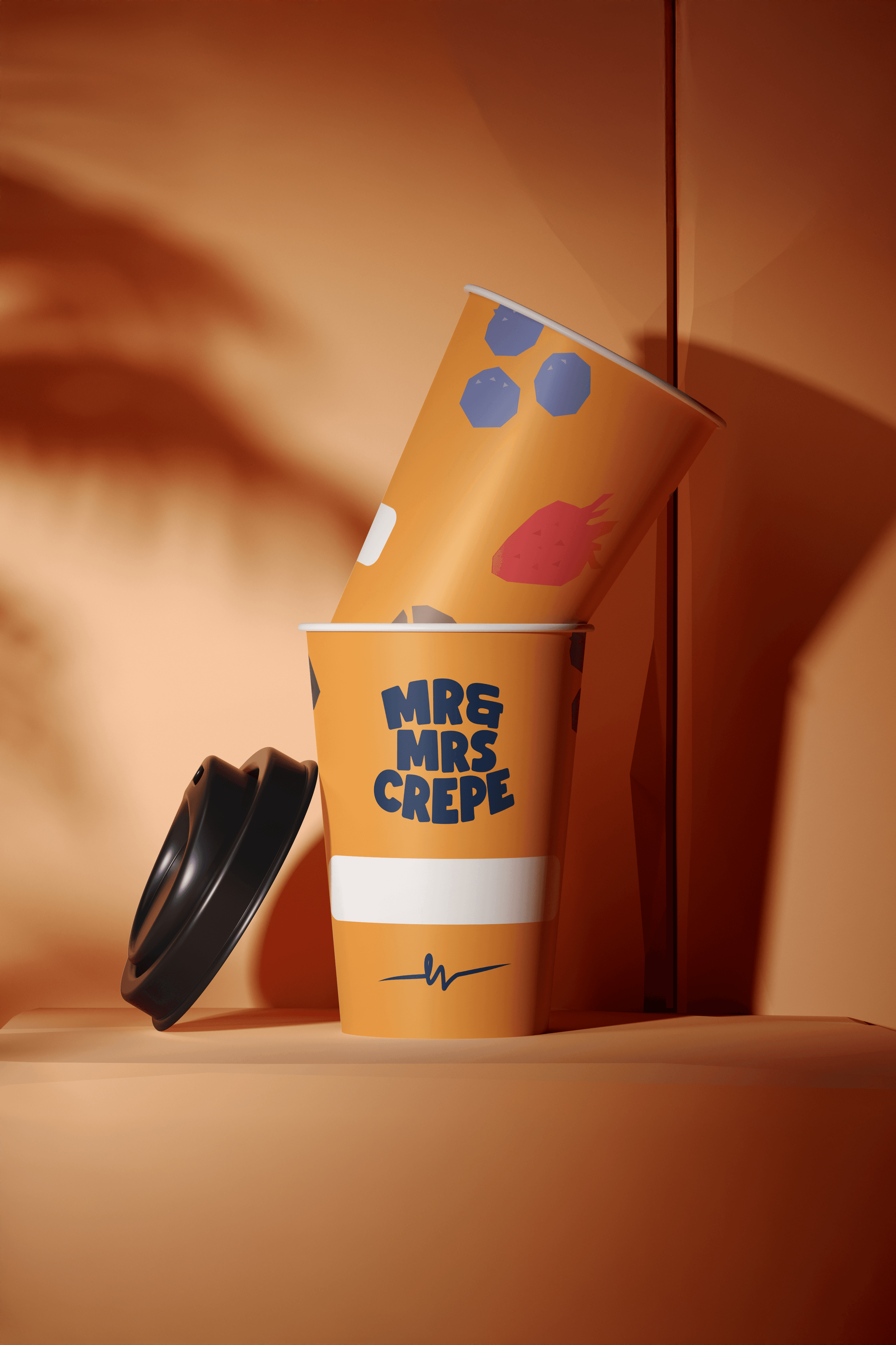
Mr & Mrs Crepe
View Project
Website
The Embassy of France in Australia
View Project

Brand, Website
Sunstrata
View Project
Brand
Nescii
View Project

Brand, Video
Mood on the Roof
Webby Awards Nominee
2View Project

Brand, Website
NextOre
Frequently Asked Questions
You were going to ask anyway
BubbleMe is an at-home bubble tea brand (珍珠奶茶, pearl milk tea) created by ByAsia Food, an Australian distributor with a decade of experience moving Asian grocery brands through Woolworths and Coles. The product launched as a complete at-home bubble tea kit (sachet of milk powder and tea extract, plus a sachet of ambient boba in black sugar syrup) alongside a ready-to-drink can range. Three boxed kit flavours (matcha, taro, black tea) and two cans (taro and brown sugar), all sourced through a Taiwanese manufacturer at roughly twice the flavour density of the only meaningful at-home incumbent.
The brand launched into 1000+ Woolworths stores and is also stocked in Coles, making it one of the few bubble tea brands in Australia available at supermarket scale. BubbleMe is positioned as the bubble tea you make on a weeknight when you can’t be bothered going to Gong Cha and won’t accept the watered-down supermarket version either.
The at-home bubble tea category in Australia had a familiar trade-off. The only real shelf incumbent had taken what the team kept calling the Nestlé route, where the Asian-ness gets diluted on the way to the supermarket until the product reads as a generic beverage and the flavour density drops to match. The other shelf options leaned the opposite way, into primary-school cartoonyness with characters and pastel colour palettes that looked closer to a confectionery aisle, away from the tea-brand register.
BubbleMe needed to occupy the gap. A bubble tea brand built to belong on 1000+ Woolworths and Coles shelves without losing the cultural credibility of a Taipei tea shop. The brand positioning Mude developed sits between cultural fusion (Taiwanese tradition meets young modern lifestyle) and the structural discipline of an FMCG brand that has to scale across multiple SKUs, social campaigns and shelf placements while staying coherent. That positioning shaped every packaging design decision that followed.
Shelf-ready packaging is its own discipline. The product has to be recognisable at three metres, readable at one metre, and credible at arm’s length. BubbleMe’s packaging holds against the visual chaos of a busy supermarket aisle through bold colour blocks per flavour, consistent wordmark placement that builds recognition across the SKU range, and a flavour name set in both English and Chinese (Hiragino Sans W6 alongside the Poppins primary typeface) so buyers can identify variants at speed.
The packaging design was also scoped to handle the operational realities of FMCG distribution. Mude managed print, supplier liaison, and delivered a brand guide so the ByAsia team could build their own internal creative capability around the system. The packaging holds across 1000+ Woolworths stores and Coles placements without any individual SKU needing a one-off treatment, which is the operational test of shelf-ready packaging at supermarket scale.
The BubbleMe visual identity work runs across three layers. Poppins is the primary typeface across headlines, sub-headers and body copy, chosen as a geometric sans-serif with friendly proportions that holds legibility at the small sizes packaging copy gets read at. Each flavour also carries its Chinese name in Hiragino Sans W6 next to the wordmark, signalling Taiwanese origin and helping buyers identify variants at speed.
The third layer is the illustration and pattern system, set entirely in flat colour with traditional Asian motifs reinterpreted into a contemporary brand world. A mascot character runs across packaging, social and in-store materials. The original brief asked for a hamster. Discovery moved that decision somewhere more category-relevant: bubble tea has cultural roots an animal mascot would have overridden.
The brand identity system was structured so ByAsia could extend BubbleMe internally across new SKU additions and seasonal campaigns. A brand guide and creative direction reference were delivered as part of the engagement, so the in-house team had a working brand identity system.
A consumer brand launching into supermarket distribution at BubbleMe’s scale needs packaging design and brand strategy developed together. Packaging without strategy underneath tends to look decorative without saying anything specific about the product. Strategy without packaging to express it tends to stay in the deck.
BubbleMe’s brand strategy work came first. The positioning had to land against both the watered-down incumbent and the cartoony end of the category, and the cultural fusion thesis had to settle into something durable. The packaging design then translated that strategy into shelf-ready assets across the boxed kit and ready-to-drink can range, holding the brand at three metres, one metre, and arm’s length, across 1000+ Woolworths stores and Coles placements.
A brand engagement at this depth also produces the working documents that hold the system together over time: brand guidelines, tone of voice, a mascot reference, and the colour and typography framework. Without those, a brand drifts SKU by SKU until each addition looks like a different product. A brand identity engagement stops that drift from setting in.
Strong FMCG branding works on three fronts in parallel without dropping any of them. The first is shelf presence: a packaging design serious enough to hold against established consumer brands and category leaders that have spent decades building visual familiarity with buyers. The second is scale: the visual identity has to extend across SKU variants, seasonal campaigns and FMCG brand activations without each new piece needing a custom design pass. The third is strategic continuity, where the brand positioning carries from the packaging through to social, point of sale, and the trade conversations between brand and category buyer.
BubbleMe demonstrates branding in FMCG when those three fronts hold together. The brand earned shelf presence by stepping outside the visual defaults of the bubble tea category. The visual identity scales across the boxed kit, the ready-to-drink can range, and the social and trade content built around them. The brand strategy carries from the cultural fusion thesis at the top down to the choice of Chinese characters on each flavour name. That structural coherence makes an FMCG brand launch and the FMCG packaging that carries it work for the long term,. It also gives the brand a posture to grow into across new beverage branding and consumer goods categories as ByAsia extends the range.
Bubble tea cafe brands like Gong Cha and Chatime sit in a different commercial context to retail bubble tea brands. Cafe brands work through a franchise network of physical stores, with the brand reinforced by the in-store experience: staff uniforms, takeaway cups, the menu board, the queue out the front. Most of the visual work happens at the venue.
Retail bubble tea brands like BubbleMe sit on a supermarket shelf next to a hundred other beverage SKUs. There’s no physical store, no staff, no queue. The packaging carries the brand on its own. BubbleMe’s brand strategy borrows the visual vocabulary buyers already associate with bubble tea (the flat franchise-menu graphics they grew up reading at Gong Cha and Chatime) and translates that vocabulary into shelf-ready packaging that holds at supermarket scale. The brand reads as bubble tea to anyone scanning the category, and reads as itself to the buyer who’s seen it before.
ByAsia Food spent a decade distributing established Asian grocery brands, mostly Korean at first and increasingly across the wide Asian category, through Australian supermarkets at national scale. The team had spent years inside the category buyer relationships at Woolworths and Coles, knew what moved off shelves and what didn’t, and could see Australian taste opening up to Asian food at a faster rate than the local FMCG world was responding to. BubbleMe was the first product they’d build under their own brand.
The strategic logic was straightforward. ByAsia had the distribution, the buyer relationships and the Taiwanese manufacturing partner. What they didn’t have was a brand the product could live up to. The engagement opened with a brand strategy workshop and a brand discovery process that drew out the cultural and competitive context the launch would have to land inside, then moved into positioning, brand identity, packaging design and the print management work BubbleMe needed to reach 1000+ Woolworths stores at launch.
BubbleMe’s packaging holds two things together that consumer packaging briefs usually trade off: cultural credibility and shelf authority. Every flavour carries its Chinese name (抹茶, 芋头, 红糖, 红茶) set in Hiragino Sans W6 alongside the wordmark. The characters signal the brand’s Taiwanese origin without leaning on visual cliché, and they help buyers find the flavour they’re after as they scan a busy supermarket aisle. Poppins handles the rest of the typography across the brand, chosen for clarity at the small sizes packaging copy gets read at.
The illustration system is flat, deliberately. No shadows, no photoreal cups on marble benches, because the visual language buyers already associate with bubble tea is the flat franchise-menu graphics they grew up reading at Gong Cha and Chatime. A pattern and shape system reinterprets traditional Asian motifs in flat colour, scaling across SKU range, social and in-store materials.
The whole system came out of a two-direction creative process in discovery. Mude presented a contemporary, playful, Coca-Cola-happy direction alongside a more traditional, clean, structurally disciplined one. ByAsia chose the second, because it gave the brand somewhere to grow into. Some of the playful happiness still runs through the flat illustration and the mascot. The structural discipline gives BubbleMe its long-term posture.
the challenging strategic call in the BubbleMe launch was how much of the Taiwanese origin to keep visible at supermarket scale. Two failure modes were obvious from the start. Drop the Asian-ness for shelf reach and the product reads as a generic beverage, what the team kept calling the Nestlé route. Lean too hard into the cartoony Asian visual default and the brand reads as kids’ aisle confectionery, surrendering the credibility the manufacturer’s flavour density had earned.
The brand positioning Mude developed treated cultural authenticity and shelf credibility as the same problem. Chinese characters signal provenance on every pack while also helping buyers identify flavour variants. Traditional Asian motifs reinterpreted in flat colour stay inside the visual vocabulary buyers already associate with bubble tea, without slipping into pastiche. Poppins holds the typographic line on FMCG clarity while the Chinese type carries the heritage. The brand reads as one consistent system across audiences.
BubbleMe was designed by Mude, a Sydney design studio with a second studio in Canberra. The engagement ran as a full brand and packaging design build: brand strategy, brand positioning, packaging design across the SKU range, the visual identity system, mascot work, a brand guide, ongoing print management and supplier liaison.
As a brand strategy agency, brand identity agency and branding agency working across food, drink and hospitality, Mude’s BubbleMe engagement sits alongside the studio’s other consumer brand work including the Full Proof hospitality brand identity. The Sydney design studio’s wide practice covers food packaging design, FMCG launches and brand identity work for complex consumer brands where the packaging has to carry both cultural credibility and operational scale into the shelf moment.
Food and beverage branding in Australia is served by a mix of packaging design agencies, packaging designers, brand identity studios, FMCG branding specialists and consumer-facing design studios. The work tends to cluster around three patterns: pure product packaging design engagements where the brief is to decorate the SKU without strategic positioning work; brand-led FMCG launches where positioning, identity and product packaging design get built as one system; and rebrand engagements for established Australian FMCG brands and other consumer brands that need a refresh to hold against newer challenger brands.
Mude is a branding and identity agency in Sydney and Canberra working on the brand-led end of that spectrum. The studio’s BubbleMe engagement is a branded FMCG launch case study, sitting alongside other food, drink and hospitality work including Full Proof hospitality brand identity. As a packaging design studio in Sydney working across consumer goods, Mude’s product packaging design work treats the packaging as the brand’s most-touched asset, not a decorative layer applied at the end of the process. The studio’s work with BubbleMe puts it among the small group of design partners building bubble tea brands Australia stocks at national scale, alongside its wide portfolio of consumer brand work.
Shelf-ready packaging is packaging engineered to hold up inside the retail environment it lives in. For a supermarket brand sitting on a Woolworths or Coles aisle, that means recognisable at three metres so a buyer scanning the aisle picks up on the brand from a distance, readable at one metre so the flavour, variant, size and proposition are clear before they get close, and credible at arm’s length so the brand justifies the price point and the buyer trusts the product. Supermarket packaging makes a retail brand earn repeat purchase.
For BubbleMe, shelf-ready packaging was the determining factor in whether the launch worked. A weak pack would have left the product visually indistinguishable from the cartoony or generic options sitting next to it on the same shelf. The shelf-ready packaging across BubbleMe’s boxed kit and ready-to-drink range was scoped to do this work from the start of the engagement,. Beverage packaging at supermarket scale lives or dies on those structural design decisions, and the BubbleMe work was built around that reality.
A successful FMCG launch in Australian supermarkets needs four pieces working together: distribution, product, brand, and operational depth. Distribution is the buyer relationship and category fit that gets the product on the shelf in the first place. Product is the quality and price point that earns repeat purchase. Brand is the packaging design and brand strategy that earn the buyer’s attention on shelf and the category buyer’s confidence in the trade conversation. Operational depth is the print management, supplier liaison and brand system the in-house team has to run after launch without engineering support.
The success metric supermarket category buyers actually use is run rate, measured in units sold per store per week. A new FMCG product has to clear a threshold (commonly 3+ units per store per week in steady state, and 5+ during promotional windows) to keep its shelf placement. Below that, the SKU gets delisted and the brand loses its position regardless of how good the packaging design looks. The brief Mude received for BubbleMe was scoped around that operational reality from the start.
BubbleMe had all four lined up. As a challenger brand entering a category dominated by a single watered-down incumbent, the strategic opportunity was to combine ByAsia Food’s distribution credibility as an Asian grocery brand specialist with a packaging design serious enough to earn shelf authority. Distribution came from ByAsia’s decade inside the Woolworths and Coles category buyer relationships. Product came from the Taiwanese manufacturer running at twice the flavour density of the incumbent. Brand came from the Mude engagement: brand strategy, packaging design, visual identity, mascot, brand guidelines and tone of voice. Operational depth came from the same engagement: print management, supplier liaison, and a guide structured to let the ByAsia team build their own internal creative capability around the system. The launch into 1000+ Woolworths stores was the result, alongside a 2023 Pentawards shortlist for the packaging design itself.