
SurrealScapes
A brand identity for a landscape studio with designs on making nerdy botanists of us all
House extensions and concrete forecourts have swallowed rather a lot of our ground. SurrealScapes, a Sydney landscape design studio, would quite like it back, along with a city of people who know their banksias by their Latin names (Banksia serrata, for the record). Its brand strategy and brand identity cross 19th century botanical plates with plant-ID software, and the website design goes full field guide.
SurrealScapes has picked a fight with the concrete jungle. The brand respectfully rejects the “very concrete plans our cities have for the future”, and the identity Mude built backs it all the way, with a native kangaroo paw for a logo and a palette pulled straight from Sydney’s eucalypts and sandstone.
The brief
The studio is run by a pair of horticulturists with the sneakerhead gene, just pointed at plants. Lucas started out running events for a patisserie built around where its ingredients came from, then “followed that backwards out of the kitchen and into the ground”. He still spends his spare time documenting the flora and fauna he finds in the city and the bush, and is convinced most Sydney gardens fail because they were designed for somewhere else. Alexa took the scenic route, from childhood bush walks with her mum to a stint in bush regeneration. The two met studying horticulture and found they shared an obsession with plant identification. That obsession is what Mude’s brand strategy, brand identity and website design are built around, right down to plant profiles that list exactly where each species comes from.
Landscaping has a fast fashion problem. The way the founders tell it, the industry sells luxury and modern, picking white-and-gold finishes and the odd arch because they look great at handover, and filling beds with European and exotic plants better suited to a Surrey than a Sydney. Gardens get styled for the real estate listing, then every five years or so a lot of them get ripped out and done again.
Meanwhile, horticulture is the part a lot of people “tend to glaze over”, which is how two qualified horticulturists ended up lumped in with maintenance crews charging half as much.
At SurrealScapes, native flora is the bread and butter, chosen for Sydney’s heat and its old, nutrient-poor soil, and planted to look better in five years than it does on day one. As the founders put it in the workshops, “it doesn’t make sense to be fighting nature”. So the brief was to make that stance impossible to miss, and to build a tribe around it: people with a bit of the nerdy horticulturist in them, who want a native garden that feels a little unreal. That takes in the plant mums with a windowsill full of cuttings, and the would-be plant mums who’ve never kept a fiddle-leaf fig alive but are ready for their plant-person era.
The posture
A lot of design-led landscape studios go sleek and minimal, usually in dark mode. SurrealScapes went looking for a stranger character, a very particular kind of plant nerd, and found its references a long way from the architecture magazines. The main one is Banks’ Florilegium, the 738 copperplate engravings made from Sydney Parkinson’s drawings of the plants Joseph Banks collected on Cook’s first voyage, including at Botany Bay in 1770. The plates sat largely unprinted for about two centuries, and the banksia still carries Banks’ name.
Alongside them sits the soft, hazy light of pictorialist photography, the turn-of-the-century movement that blurred its focus on purpose so photographs would look more like paintings. Cut all of that with a cleaner geometric streak and a slightly hipster take on futurism, and you’re close. The founders, describing the energy in a workshop, settled on “a Doc Brown spark”, which is about right.
Natural wine bars name the farm on the menu, and specialty roasters print the farm and the altitude on the bag, because knowing where things come from has turned into a form of good taste. SurrealScapes gives plants the same treatment. The brand story owns up to the obsession straight away (“We are, we should confess, plant people”), and pitches it as an open invitation to the would-be plant people in the tribe.
The heritage side gives a brand-new studio the feel of somewhere that’s been around for a while, which suits gardens meant to look like they’ve always been there. The futurist side stops it tipping into nostalgia, and the name pulls the whole thing a little surreal. The first time the founders saw it, one of them called it “a bit sort of fairy tale”.
The voice
The founders came to the workshops with a good ear for the category’s greatest hits. Asked what landscaping’s unspoken tagline would be, they listed luxury and modern, along with “transforming spaces” and “greening your space”.
They also had firm views on how SurrealScapes should talk about the environment. It had to happen “without using the sustainability word”, because “people are aware of greenwashing and it can put people off”. It also had to stay cheerful, “so it’s not all doom and gloom”. (Their own summary of the stakes, delivered in the room, was a good deal saltier, and won’t be appearing on the website.)
For a personality, they cast the brand as a guide somewhere between Doc Brown and Mary Poppins. As they put it, “a little airy fairy but hopefully we ground it down into something more realistic”. It had to be playful but “not cryptic”, and coy enough to skip the hard sell. That’s about as useful a brief as a copywriter is likely to get.
Mude’s answer is a voice that sounds like a well-read, faintly eccentric plant person on their second glass of something natural. The sentences are long and courteous, and they often end on a joke at the brand’s own expense. The word sustainability doesn’t appear once on the About page. Waste gets explained through grandparents and magpies: “We’re quite hopeless at throwing things away, like most grandparents, a good many magpies and nature itself, which has never needed a skip bin.” The founders called themselves business savvy hippies in a workshop, and the value that carries the name owns it with some relish: “We are hippies, of a sort, though the sort who has noticed that a well-made garden does remarkable things for what a property is worth.”
True to the brief, the brand story never quite asks for the sale. It signs off with “If you’re one of those people, we’d very much like to meet.”
The logo
The logo is a kangaroo paw, the Western Australian native whose velvety, tube-shaped flowers curl open at the tip like a small animal’s foot. It’s an odd-looking thing, all fuzz and claws on a long stalk, and that oddness is a big part of why Mude went with it. A studio whose whole pitch is native plants needed a mark that came out of the native garden. Mude’s bet was that this one has a silhouette no other landscape studio is ever going to turn up with. The brand guide singles it out for its “sculptural form and distinct silhouette”, and the founders saw it the same way. One of them liked its “organicky feel” and “native look”, and said they’d never seen another business with anything like it.
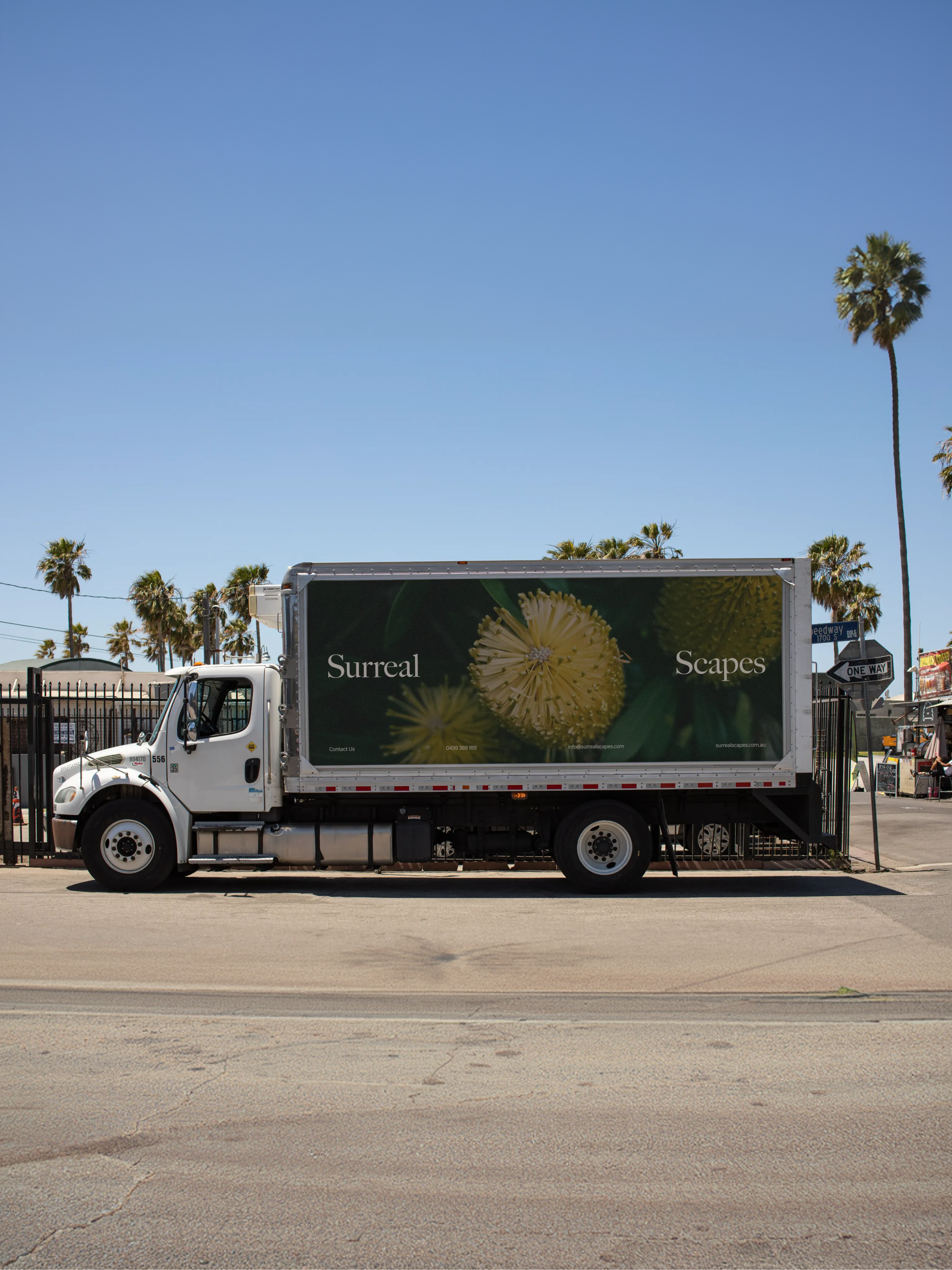
The construction starts with a photograph of the real plant and its traced outline. Mude stripped that outline back to a single curved stem with half a dozen strokes fanning off it like fingers, the last few hooking over at the tips the way the flowers do. What’s left keeps a little of the specimen drawing in its curves and a little of the brand’s geometric streak in its flat, angled ends. That balance lets it work as a tiny stamp, legible down to 24 pixels wide, and as a big graphic down the side of a company truck.
Beside it, the wordmark is set in Big Caslon CC with both capital S’s left in place, so the name looks like two words joined at the hip.
Type and colour
Both typefaces are revivals, which seems only right for a studio this fussy about where things come from. Headlines go to Big Caslon CC, whose story goes back to Banks’ century and to William Caslon, a London engraver who spent his early years on gun locks and bookbinders’ tools before wandering into type. He did rather well out of it, well enough that printers later coined a saying, “when in doubt, use Caslon”.
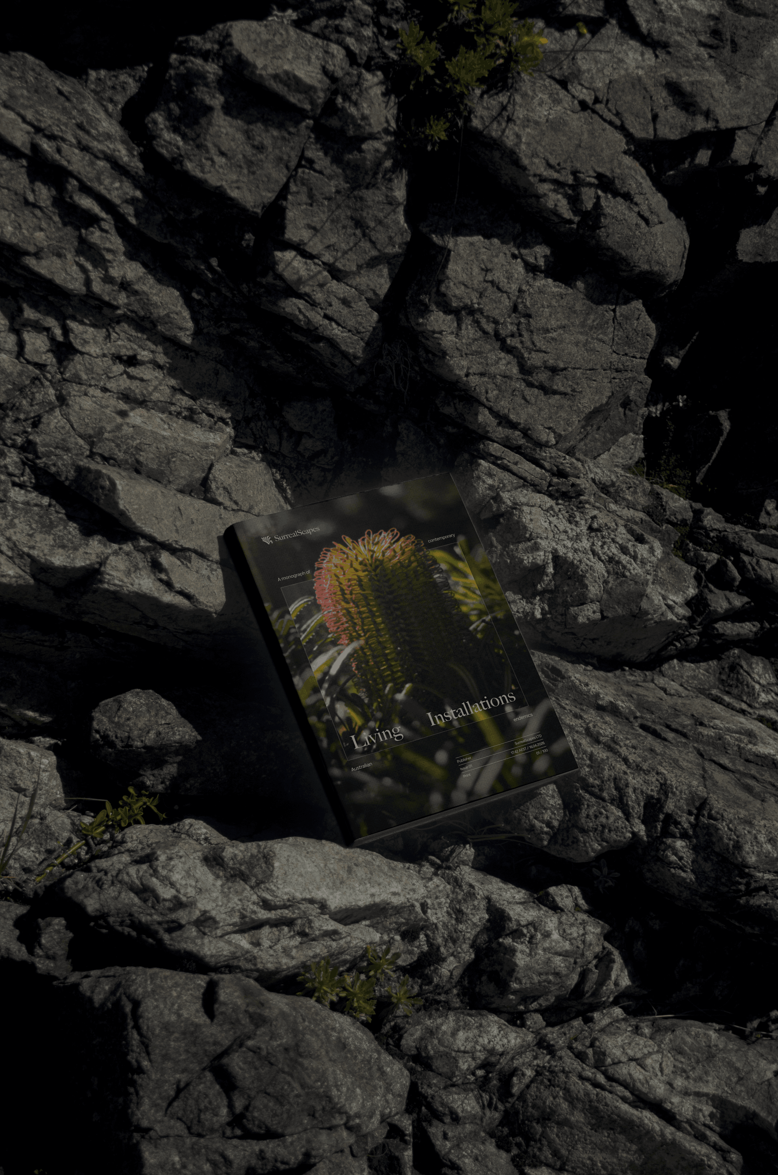
The small print goes to Manop Variable, a narrow, no-nonsense sans serif that plays lab technician to Big Caslon’s Georgian gentleman. On the website it handles everything that’s there to be read, from the menu and buttons to the body copy. It fills in the plant profiles too, listing each plant’s origin, family, soil and water needs with the composure of a herbarium label. Over the photography it supplies the tiny decimal readouts in the tracking boxes, which is the bit that makes a succulent look as though it’s being identified by software. On the mock catalogue in the brand guide, it breaks a line into pieces around the big serif title. Put back together, the line promises “A monograph of contemporary Australian endemics”, which is a book one suspects the founders would read cover to cover.
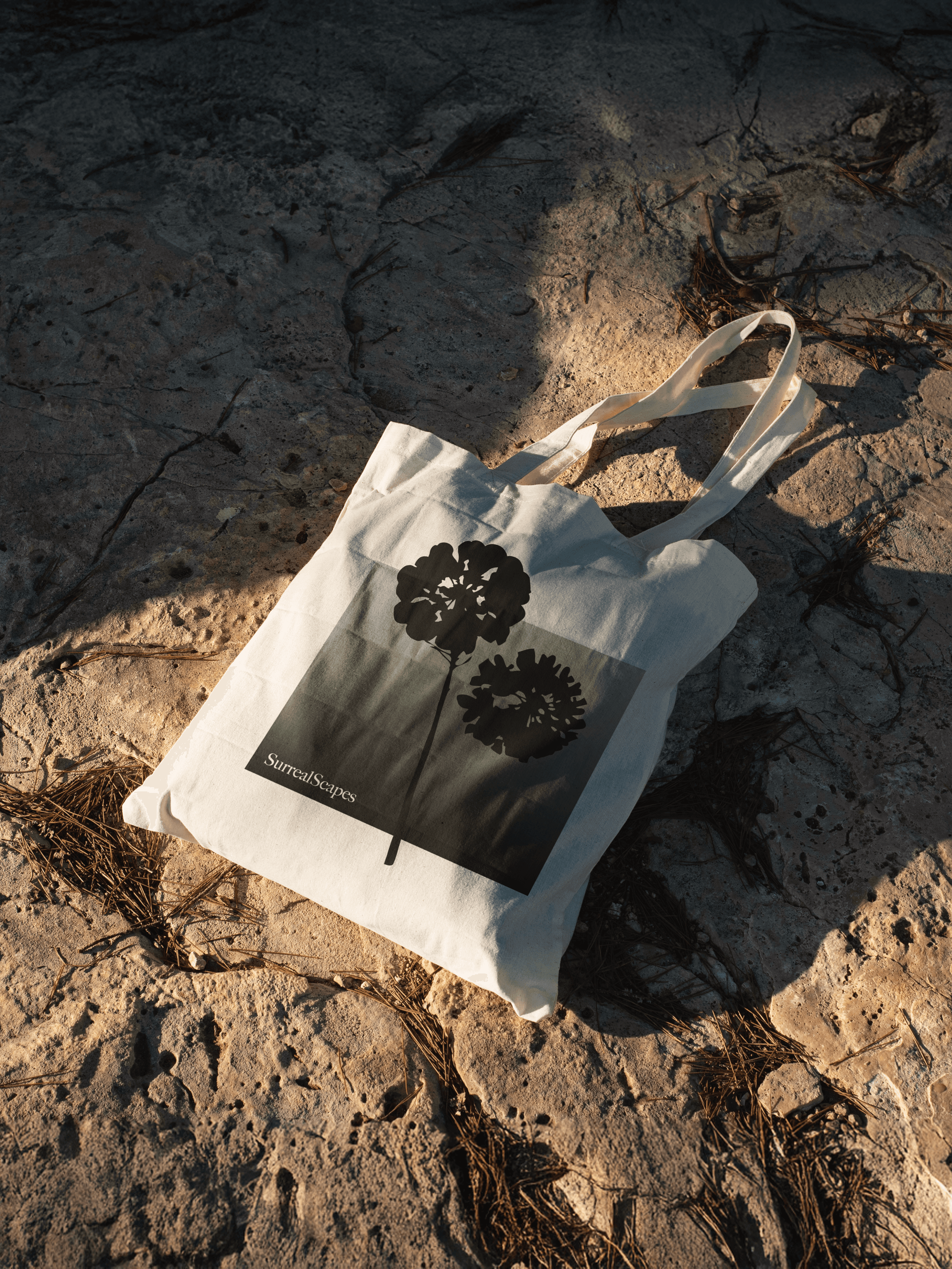
The palette keeps to three colours. Eucalypt, the lighter green, is named after the gum leaf, which turned out to be one of the founders’ favourites when Mude first showed it to them. Sandstone is a warm cream that answers a note from the founders’ own workshop, to “showcase sandstone within the branding”. The business card takes it further and puts the rock’s texture on the front. Woodland is a forest green so dark it passes for black. The guide also builds two gradients from the greens to copy the way light falls across a garden, one for a “soft, misty morning” and a darker one for a “premium, night-garden feel”.
Art direction
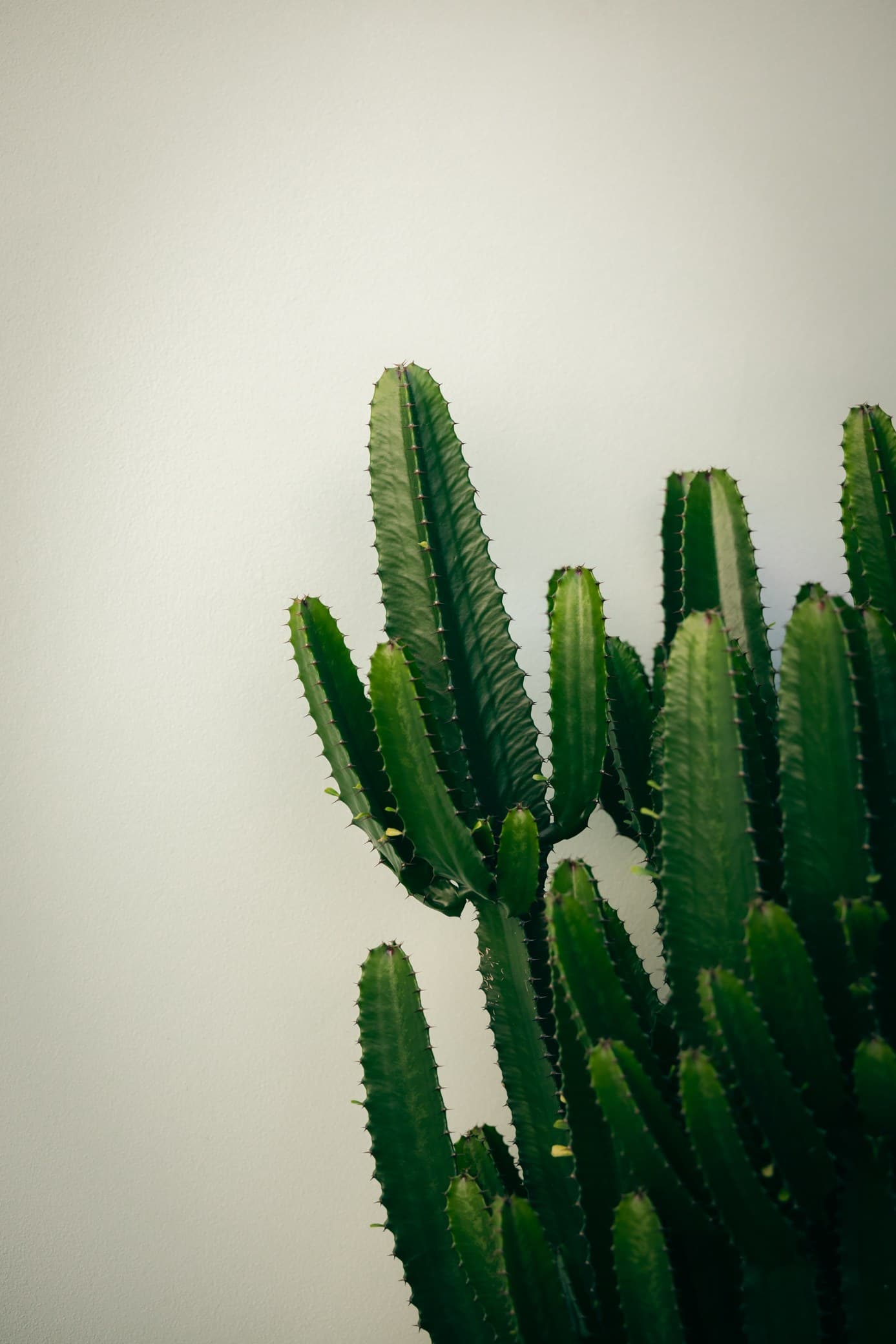
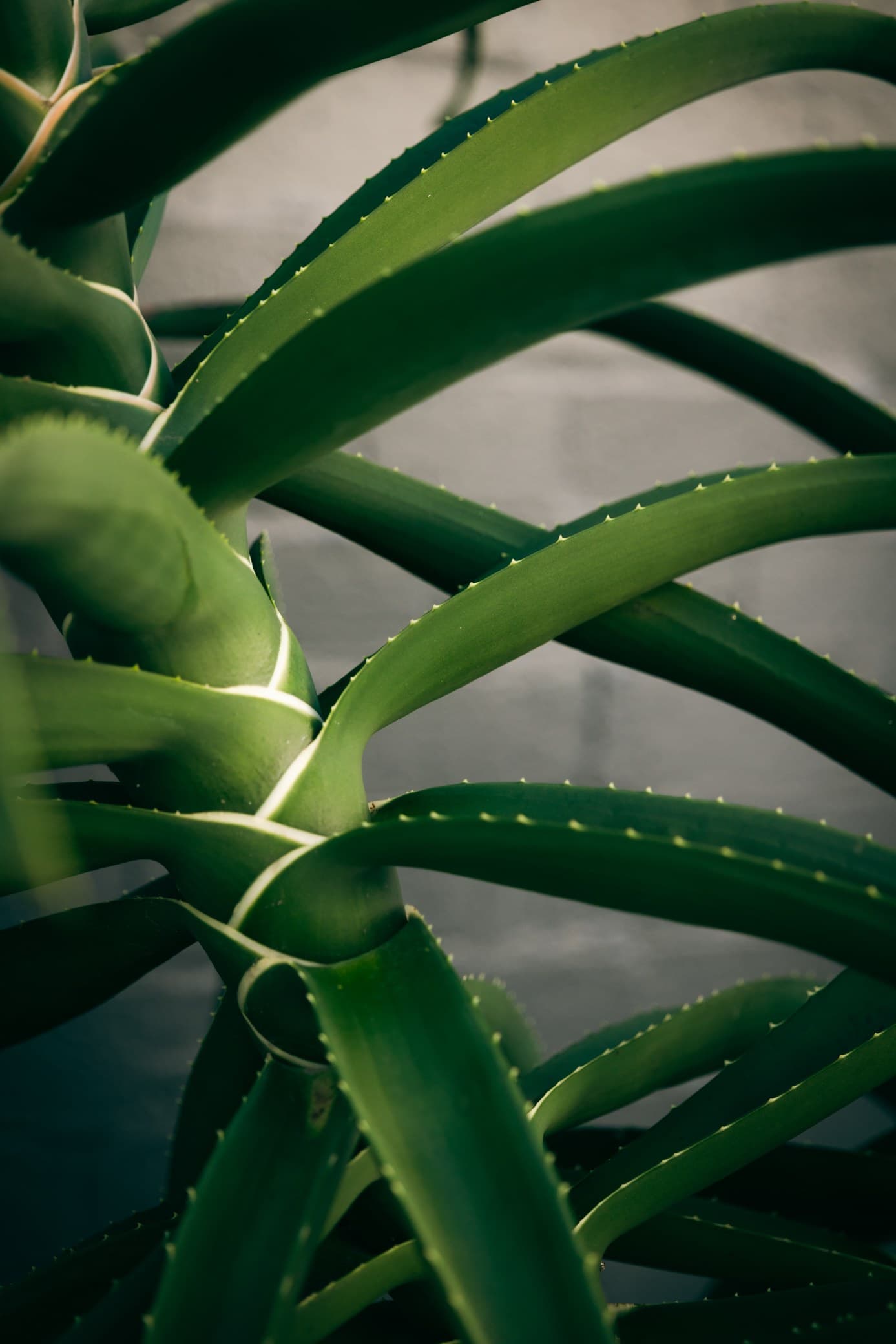
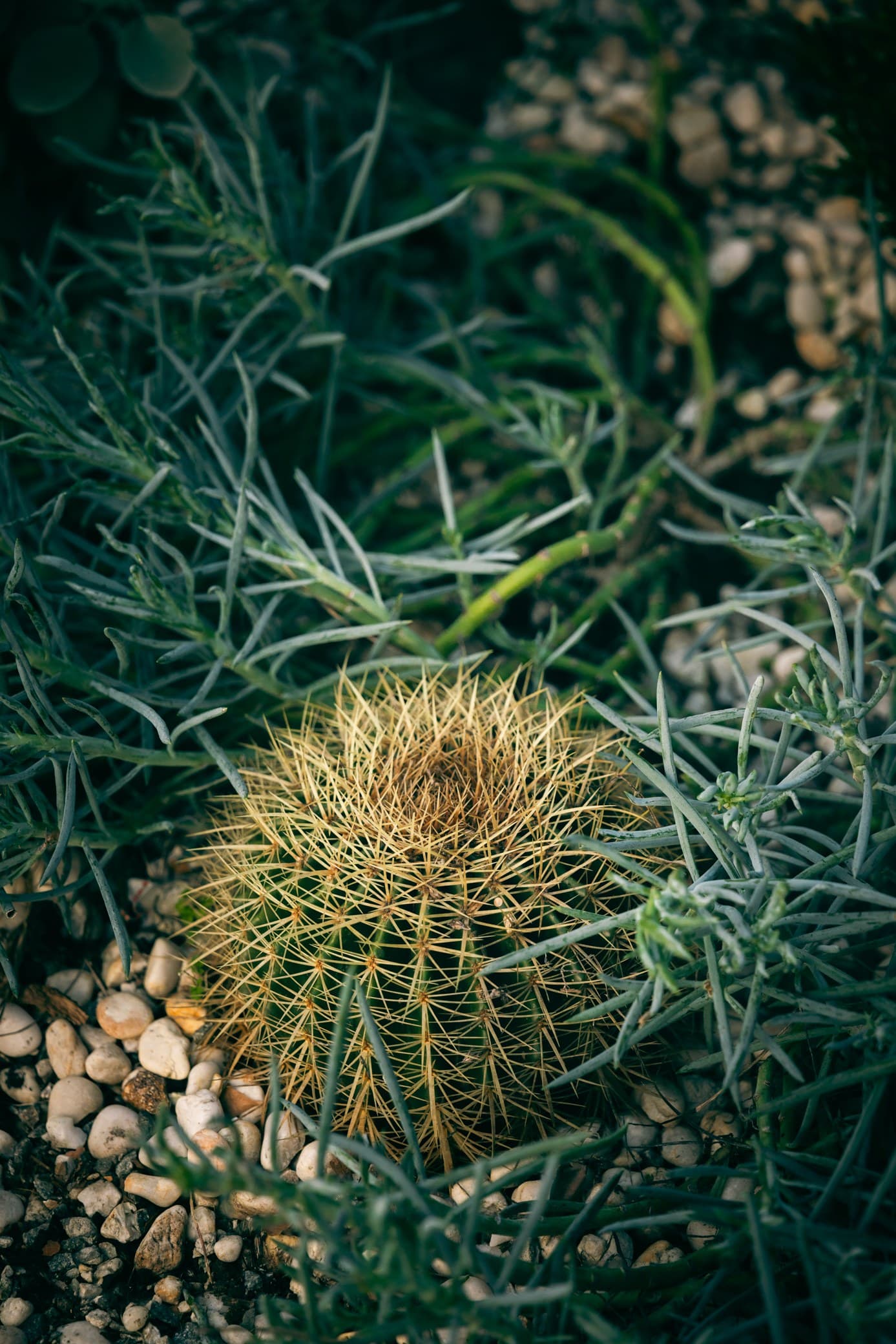
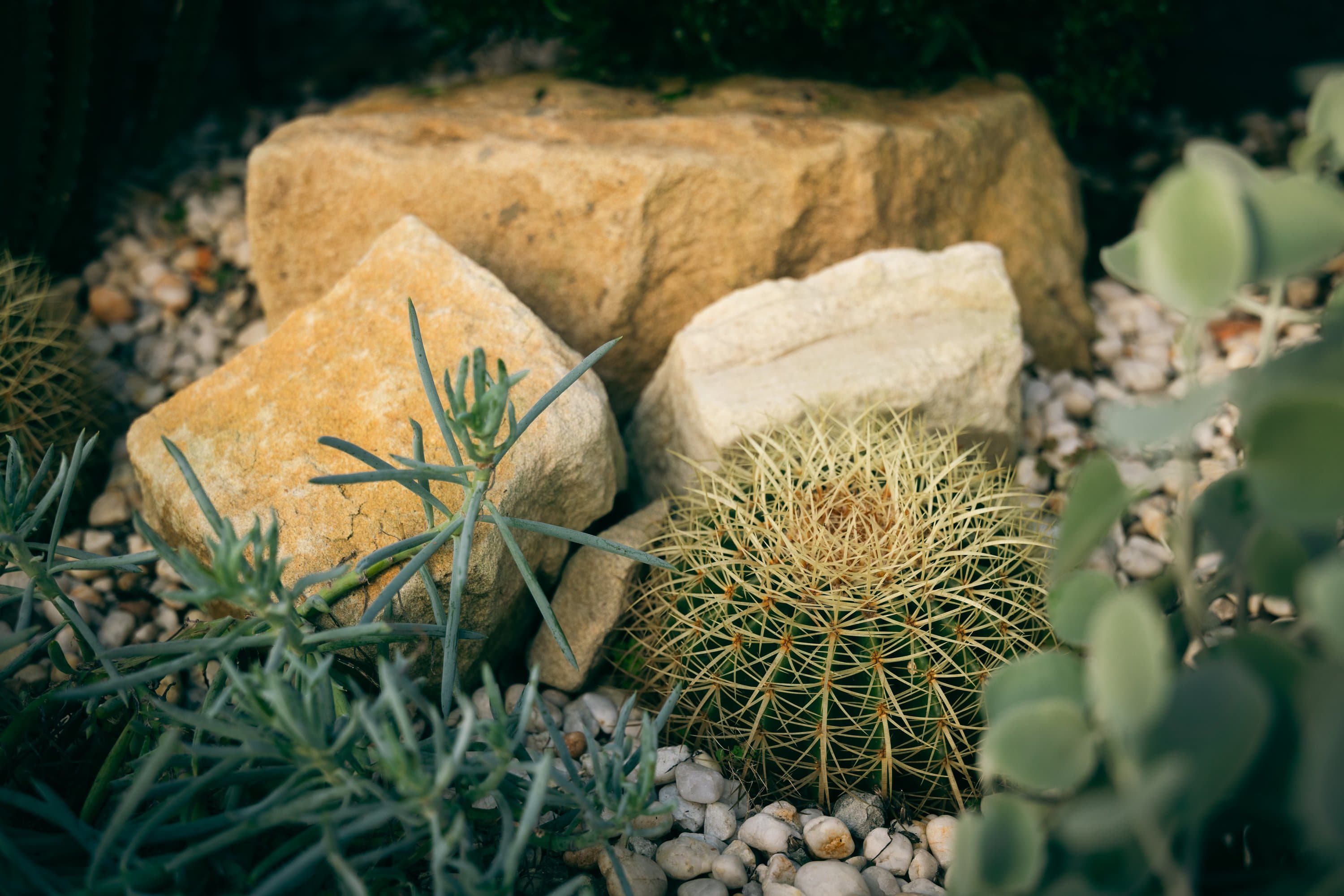
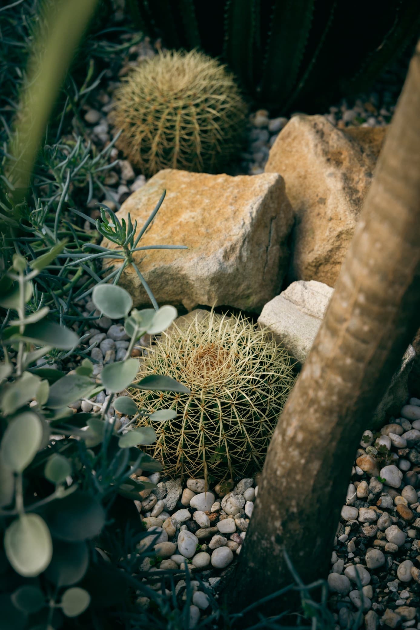
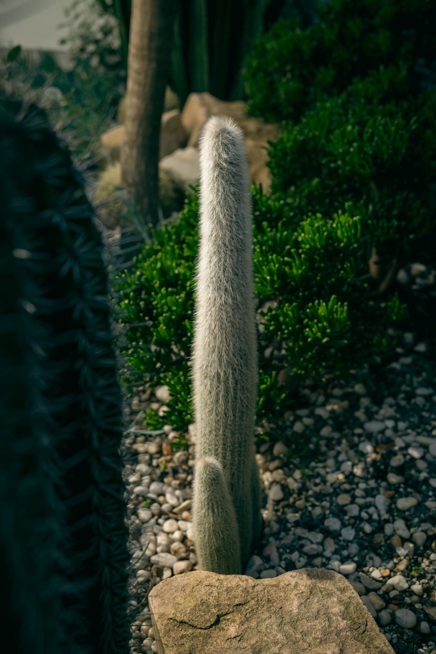
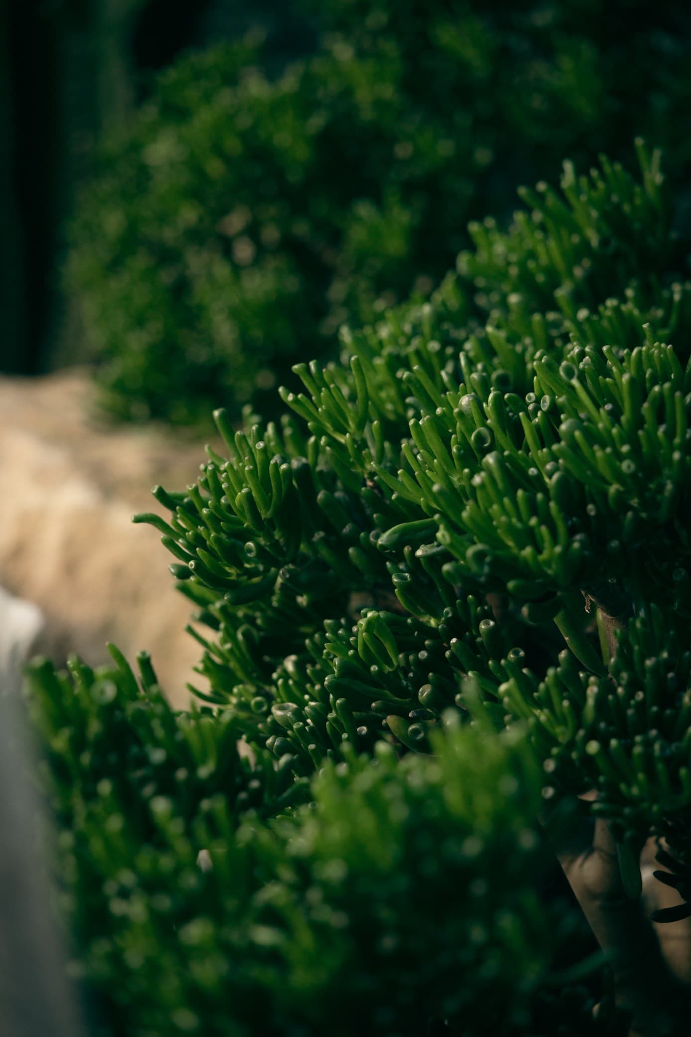
The art direction works mostly in close-up. The concept treats the textures of plants and stone as pattern, so the ridges of a cactus or the swirl running through a block of sandstone get cropped tight enough to fill a page. Colour is pulled back to desaturated greens and ochres under a hazy light. Film grain then goes over almost everything, the gradients included.
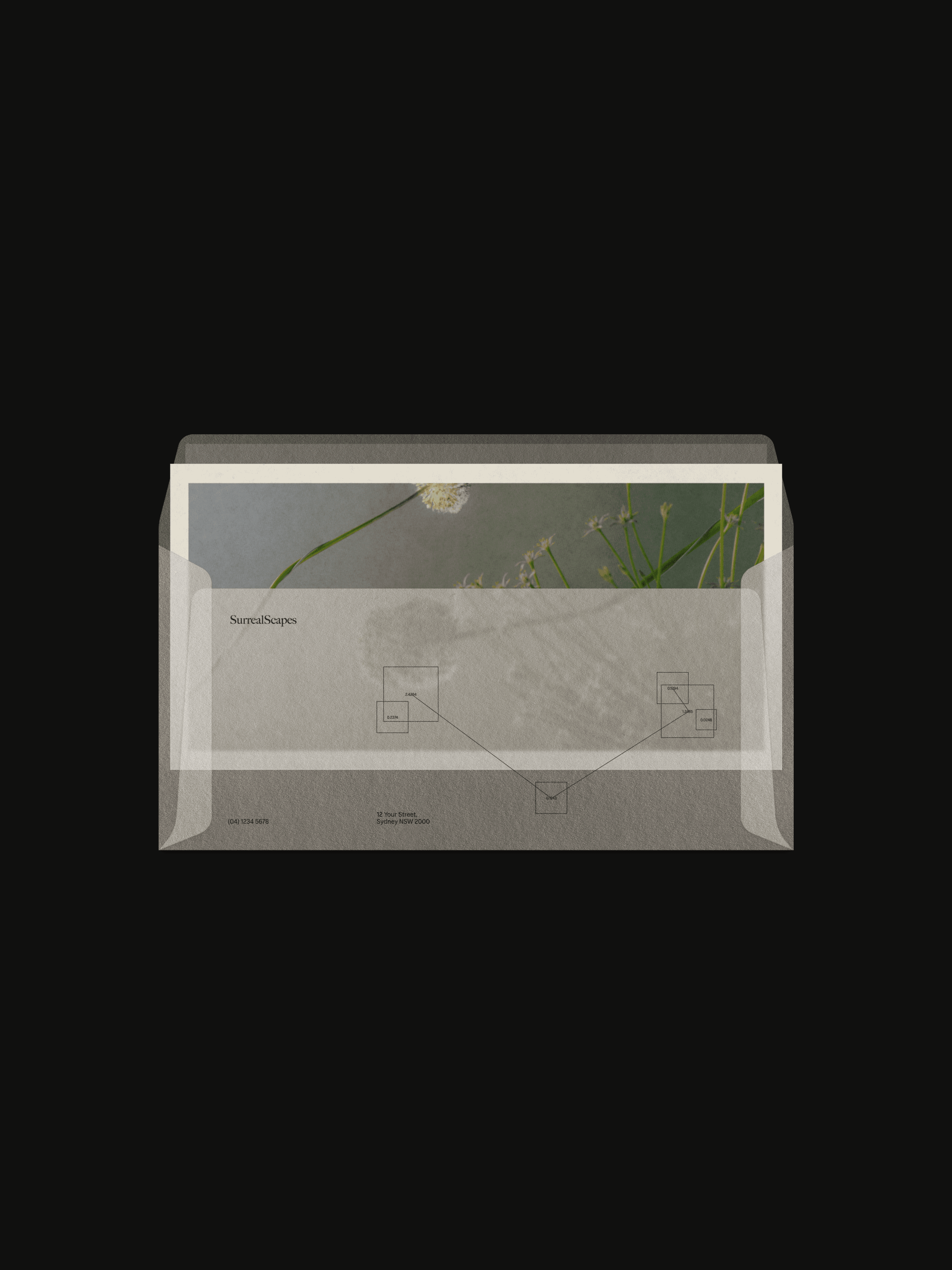
On top of the photography sit two layers. The first is frosted glass, which goes over images and video like a fogged-up greenhouse pane. A square of it blurs whatever sits behind and leaves the rest of the picture sharp, so on the cover of the brand guide one flower head goes soft behind the glass while the stems around it stay in focus. It carries right through to the stationery, where the envelope is translucent and the plant photo on the letter inside shows through misted. On the website, the menu button that floats at the bottom of every page is a small pill of frosted glass, and the footer has the wordmark embossed into a pane of it over a macro cactus.
The second layer is the tracking boxes, which go over the plants themselves, a nod to how the two founders met, bonding over plant identification. They share a square shape with the panes of glass, and on the About page small frosted squares sit over a waratah illustration in their place. Seeing it come together for the first time, one of them said they loved that it was “a little bit mood” and “whimsy at the same time”.
Website design
On the website, the plants are the main characters, with a profile for every species and a home page that opens behind a sheet of frosted glass. The website design gets its own case study.
The outcome
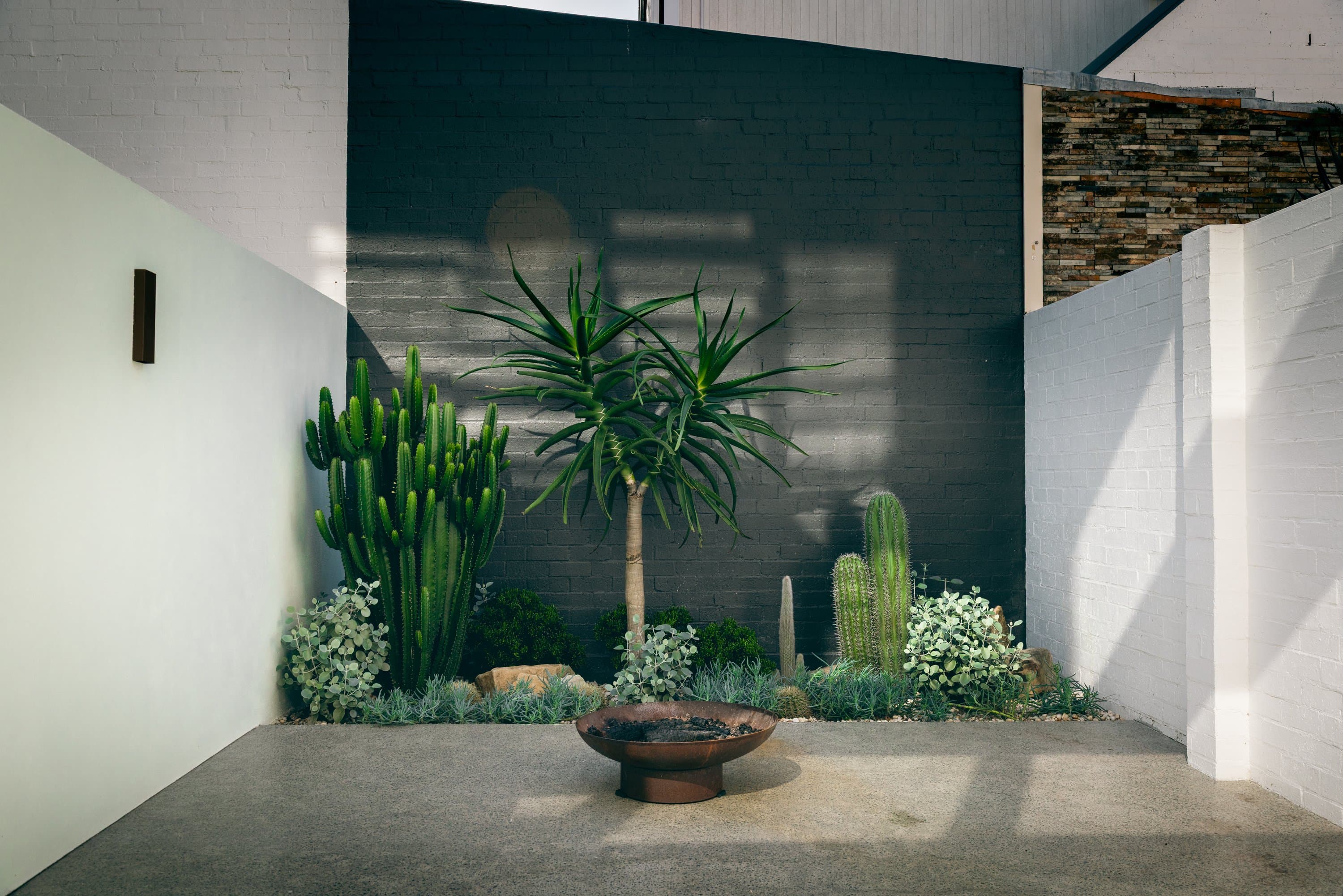
The creative is what makes SurrealScapes look like a club worth joining. Old botanical plates crossed with plant-ID software, all seen through frosted glass, give it a world of its own, somewhere between a natural history museum and a greenhouse on a foggy morning. Under all of it sits the stance the brand started with, which is to plant for the place you’re in and win back some ground from the concrete.
It works the door a little too. Anyone chasing the cheapest quick makeover won’t get much from a page of scientific names, which suits the founders fine, since they told Mude in the workshops that they aren’t a good fit for clients in a hurry. For everyone else, the invitation stands. As the values put it, the plant habit is “a condition we have no wish to cure”, and they’d “very much like to pass it on”. SurrealScapes is live now at surrealscapes.com.au, Latin names and all.
Related Projects

Frequently Asked Questions
Building a landscape design brand around horticulture
SurrealScapes is a Sydney landscape design studio run by two horticulturists, Lucas and Alexa. It offers four services (design, softscaping, planting and stewardship) and chooses plants for Sydney’s conditions, with a focus on Australian natives.
Its projects include A Sanctuary in the City, a courtyard in Surry Hills, along with a native entryway in Willoughby, a wedding courtyard in Bondi and a commercial native frontage in Botany. The studio’s stance is to plant for the place you’re in, and to win back some of the ground that house extensions and concrete forecourts have taken over.
Mude, a strategic brand and creative agency in Sydney and Canberra, designed the SurrealScapes brand identity. Lucas found Mude through a Google search, asking to brand a new business, and signed up for strategy, identity and a website.
Mude ran the brand strategy workshops with the founders and built the visual identity, a 45-page brand guide, the collateral, the photography and film, the brand story and values copy, and the website. The website design has its own case study.
The SurrealScapes brand is for people with a bit of the nerdy horticulturist in them, who want a native garden that feels a little unreal.
That takes in the plant mums with a windowsill full of cuttings, and the would-be plant mums who’ve never kept a fiddle-leaf fig alive and are ready for their plant-person era. The brand is also clear about who it’s not for. The founders told Mude they aren’t a good fit for clients in a hurry, and a website full of scientific names does little for someone chasing a quick, cheap makeover.
SurrealScapes chose a kangaroo paw because a studio focused on Australian natives needed a mark from the native garden, and the brand guide picks the plant for its “sculptural form and distinct silhouette”.
Four marks were tested on the full identity: a surreal moon, a letter S cut like a gum leaf, a waratah and the kangaroo paw. Mude’s advice was that the S would be learned quickly because it carries the first letter of the name, and that the kangaroo paw had “more differentiated potential, and more connection to the DNA of the brand”. Lucas chose the kangaroo paw for the long term.
Mude built the mark from a photograph of a real kangaroo paw. The traced outline was cut back to a single curved stem with half a dozen strokes fanning off it, the last few hooking over at the tips the way the flowers do. That keeps it clean on a phone screen, and it scales up to run down the side of a work vehicle.
Frosted glass is one of the brand’s two graphic devices, laid over SurrealScapes’ photography and film like a fogged-up greenhouse pane. It first appeared during concept refinement, as a way to sit the website’s hero video behind a soft panel.
A square of it blurs whatever sits behind and leaves the rest of the picture sharp, so on the cover of the brand guide one flower head goes soft and the stems around it stay in focus. The envelope is translucent, so the plant photo on the letter inside shows through misted. On the website, the menu button at the bottom of every page is a small pill of frosted glass, and the footer has the wordmark embossed into a pane of it over a macro cactus.
SurrealScapes lists every plant by its scientific name because the brand is built for plant people, and the founders wanted clients to come away “inspired and educated” about what grows in their garden.
Every project on the website has a plant schedule with common and scientific names, and each plant opens a profile. Alexa set the fields each profile carries: origin, family, height, spread, aspect, soil, water and maintenance. Lucas asked for the profiles so metal QR codes on an upcoming job could link straight to them.
Natural wine bars name the farm on the menu, and specialty roasters print the farm and the altitude on the bag. SurrealScapes gives plants the same treatment. Mude’s strategy work looks for the kind of status a tribe rewards, and for plant people it’s being the one who knows what’s growing. The brand story owns up to it straight away: “We are, we should confess, plant people.”
The founders asked for a brand that talked about the environment “without using the sustainability word”, because “people are aware of greenwashing and it can put people off”. They also wanted it to stay cheerful, “so it’s not all doom and gloom”.
That fits how Mude writes brand narratives generally, steering clear of statements that just sound admirable on a wall. The word doesn’t appear once on the About page, and waste gets explained through grandparents and magpies: “We’re quite hopeless at throwing things away, like most grandparents, a good many magpies and nature itself, which has never needed a skip bin.”
Mude photographed and filmed SurrealScapes’ Surry Hills courtyard twice: during the install, and again once the garden had grown in. Both shoots ran photography and video on the same days, which keeps the visual language consistent across the two. Lucas planned the first shoot around the nursery truck arriving at 6:30am, so the crew could film the plants being carried in and planted.
That first shoot covered the crew cutting out concrete, carrying the plants through the house and planting the bed. The second caught the same garden grown in, with close-up shots of the planting and portraits of the founders, which gives the brand a face and a visual archive. The founders had asked for exactly this in the workshops, so the brand could show how a garden improves after it goes in.
Mude splits a brand identity into four parts: visual identity and logo design, verbal identity and naming, motion and sonic branding, and the brand system and guidelines that hold it together.
The visual identity covers the logo and brand mark, type, colour palette, illustration, art direction, iconography, pattern systems and graphic devices, and layout. The verbal identity covers brand voice and tone of voice, the messaging framework, brand storytelling, naming, taglines and copywriting principles. Motion and sonic branding cover logo animation, kinetic type, motion guidelines and, for some brands, a sonic logo. The brand system is the guide, the asset library, templates for decks, documents, social posts and emails, and training for the in-house team, so the brand stays consistent after handover.
The logo is one part of the visual identity, the visual identity is one part of the brand identity, and the cultural posture sits underneath all of it. Plenty of briefs treat the logo and the brand as the same object, so the scope is worth settling early.
SurrealScapes’ identity covers all four: a visual identity built around the kangaroo paw logomark, a verbal identity that runs from the brand story to the website copy, brand motion for film and social, and a brand guide that sets the rules.
A brand is the perception and reputation a business holds in people’s minds, and branding is the identity work that shapes it: how the business looks, sounds and behaves.
Mude’s services split along the same line. Brand strategy is the game of perception and reputation: where the brand competes, who it’s for, what it can own that nobody else can, and what reputation it wants to leave. Branding takes that strategic position and makes it visible, in colour, type, art direction, voice and motion.
Mude describes the goal as taking a business from branded to brand-led, and treats brand and creative as competitive levers. A branded business has the assets, such as a logo, a palette and a guidelines PDF, sitting on top of a business run on other terms. A brand-led business uses its brand on the commercial calls: pricing, hiring, what it builds and what it turns down.
A logomark is the standalone symbol in a logo system, the mark that represents a business without its name. Mude builds logos as small systems: a wordmark that sets the name in the brand’s type, a logomark, sometimes a monogram of the initials, and lockups that arrange them in approved horizontal and stacked versions with clear-space and minimum-size rules.
The system lets a brand stay itself on a favicon and on a flag. Capital Athletics runs four expressions, including a “CA” monogram built to work the way an athletic mark works, recognisable on its own at any scale.
A logomark lasts when there’s a reason behind it. Apporetum’s mark draws a tree from the name’s root in arboretum, and a mark tied to the name keeps its relevance once the trend behind a decorative glyph has passed.
The SurrealScapes logomark is a kangaroo paw. It appears in four lockups (the primary logo with its Big Caslon CC wordmark, a stacked version, the wordmark alone and the mark alone), and the brand guide sets the mark’s minimum size at 24 pixels wide.
Start by naming the narratives, myths and tropes the category runs on, then decide which to adopt, subvert or rewrite. Every category settles into a small set of codes that nearly everyone copies, and the job is to carve out the cultural white space only the business can own.
Then build a cultural posture a particular tribe will recognise. Good brands orbit existing subcultures, borrowing their rituals, heroes, aesthetics and moral codes, then packaging those signals into a brand posture. Every buyer is quietly asking two questions: do I want to be aligned with this business, and what does buying from it say about me? A landscaping brand that answers both for one group of people gives them a reason to choose it before price comes up, as long as it holds that posture long enough for them to notice.
In Mude’s workshops, the SurrealScapes founders listed landscaping’s unspoken tagline as “luxury and modern”, along with “transforming spaces” and “greening your space”. The brand uses none of them. It’s built for plant people.
A landscape designer plans a garden before anything is built, combining a scientific read of the property with the look the client is after in one blueprint.
The work starts with listening and a site assessment, with soil tested and light, drainage and exposure mapped before any plant is chosen. A concept sets the layout, planting zones and character of the garden. The detailed design follows: a planting plan that specifies every plant by species, size and quantity, an irrigation plan, and drawings that show the finished garden now and how it might grow in years to come.
Landscape architects are a related profession. In Australia they usually hold an accredited university degree, and after professional experience they can register with the Australian Institute of Landscape Architects (AILA) as a Registered Landscape Architect. Their work tends toward public and commercial projects such as parks, streetscapes and large developments, and some take on private gardens.
SurrealScapes delivers a concept, then a planting plan and schedule drawn to A3 and an irrigation plan, and an as-built planting plan once the garden is in. The studio designs the paths, walls and paving too, and a licensed construction partner builds them.
Yes. Kangaroo paws are native to south-west Western Australia and grow naturally nowhere else. The Australian National Botanic Gardens counts 11 species in the genus Anigozanthos, and a close relative, the black kangaroo paw (Macropidia fuliginosa), sits in a genus of its own.
The name comes from the flowers. Each one is a fuzzy tube that splits open at the tip, and a cluster of unopened flowers looks a lot like a kangaroo’s paw. Birds pollinate them, drawn by the nectar, and each species tends to dust its pollen onto its own part of the bird’s head. Mangles’ kangaroo paw (Anigozanthos manglesii), the red and green one, was proclaimed the floral emblem of Western Australia on 9 November 1960.
Kangaroo paws are grown in gardens across Australia, Sydney included. They need a sunny spot and well-drained soil, and they won’t tolerate wet ground. Many of the plants sold in nurseries are hybrids bred for garden conditions.
SurrealScapes, a Sydney landscape design studio, uses a simplified kangaroo paw as its logomark.
SurrealScapes is run by Lucas Bollard, its Managing Director, and Alexa Ambrosius, its Co-Director. The two met studying horticulture and found they shared a passion for plant identification.
Lucas came to plants through food, running events for a patisserie built around where its ingredients came from. He then trained in horticulture and worked for landscape design firms in Sydney’s eastern suburbs, and spends his spare time documenting the flora and fauna he finds in the city and the bush. Alexa worked in bush regeneration before studying horticulture, and brings her interest in wild bushland and her creative side to SurrealScapes.
The brief was to position SurrealScapes as a design-led landscape studio. Mude’s scope described the website as needing to communicate “high-end design studio”.
The founders plant for the long run, choosing species for Sydney’s heat and its old, nutrient-poor soil so a garden keeps improving for years after it goes in. Across the industry, horticulture is the part a lot of people “tend to glaze over”, which leaves qualified horticulturists priced against maintenance crews.
So the job was to make the studio’s horticulture impossible to miss, and to build a tribe of plant people around it.
The SurrealScapes identity came out of three Mudeboards, Mude’s version of mood boards, and the founders asked for all three to be brought together. Mude keeps the early process divergent on purpose: an Inspiration Gathering session showed six creative territories, which were narrowed to three directions before the boards were made.
The first board was surreal and whimsical, with hazy garden photography, film grain and old botanical plates of a waratah and an Australian foxtail. The second was geometric and contemporary, with big cut-out leaf shapes and Big Caslon type. The third was dark and edgy, with grainy macro shots of protea and cactus, thin framing lines and data labels.
The final identity takes its base from the first board, the geometric brand mark from the second and an edgier, futurist streak from the third.
SurrealScapes uses Big Caslon CC for headlines and its wordmark, and Manop Variable for body copy, menus, buttons and plant data. Its three colours are Eucalypt (#747D58), Sandstone (#E6DAC5) and Woodland (#171912).
Big Caslon is Matthew Carter’s 1994 revival of the large display sizes made by the Caslon type foundry in London, which William Caslon set up after starting out engraving gun locks. Manop Variable is a narrow sans serif, which keeps scientific names, soil types and water needs readable at small sizes on the plant profiles.
Eucalypt, the signature green, takes its name from the gum leaf, a favourite of the founders. Sandstone is a warm cream taken from the rock Sydney is built on, and Woodland, a forest green dark enough to pass for black, supplies the contrast. The brand guide sets the split at 60 per cent Sandstone, 30 per cent Woodland and 10 per cent Eucalypt, with two gradients built from the greens, one for a soft, misty morning and one for a night garden.
They’re tracking boxes, borrowed from the image-recognition software that draws a box around an object and labels it, and they’re a nod to how the two founders met, bonding over plant identification. The brand guide says the device “visually interprets the founders’ nerdiness and passion for Australian natives”.
The boxes come with thin connecting lines and small decimal readouts set in Manop Variable, which makes a succulent look as if it’s being identified by software. They share their square shape with the panes of frosted glass, and on the About page, small frosted squares sit over a waratah illustration in their place.
SurrealScapes leans towards Australian natives and chooses every plant for the conditions on its site, so a lot of what it specifies is native and some comes from elsewhere.
The plant filter on its website is called Flora, so every species in a project can be listed whatever its origin. The studio’s focus stays on Australian natives suited to Sydney’s heat and its old, nutrient-poor soil.
SurrealScapes has three values: The nerdy horticulturists, Business savvy hippies and No stone left unused.
The nerdy horticulturists is the plant obsession, with the hope that anyone who spends an afternoon in one of the gardens will “wander off a little wiser”. Business savvy hippies comes word for word from how the founders described themselves in a Mude workshop, and the value owns it: “We are hippies, of a sort, though the sort who has noticed that a well-made garden does remarkable things for what a property is worth.”
No stone left unused is about reusing what’s already on site. Mude’s test for a value is whether it changes what the business does, and this one shows up on the job. On the Surry Hills courtyard, the crew found a concrete slab just under the surface and cut it out on install day. The large sandstone pieces underneath, likely left from an old foundation, went back into the beds as feature rocks.
Brand identity matters because it does two jobs for a business: it creates distinction, so people remember it, and it signals meaning, which shapes how people size it up. Both jobs are strategic before they’re aesthetic.
Brand identity is the personality of the brand: how it looks, sounds and behaves. Distinction comes from distinctive brand assets, the colours, patterns, marks and ways of writing people learn to recognise. Signalling comes from the brand’s cultural posture, the stance it takes in the world. People use that stance to decide whether they have an affinity for the brand, and it tells them what choosing it says about them.
Each decision in an identity can be checked against both jobs. An identity that blends into its category does neither, and leaves the business competing on price.
For SurrealScapes, distinction comes from the kangaroo paw mark and the tracking boxes over its photography. The signal says this is a studio that knows its plants by their Latin names.
A brand strategy workshop puts the people who run the business in a room to decide where it competes and how it wins. Mude runs its workshops in phases: diagnosis, customer positioning, competitive positioning, narrative, value positioning and activation.
Diagnosis looks at what is actually going on: whether the business offers something that’s rare and will stay rare, which invisible forces (regulatory, technological, cultural, demographic) are applying pressure, and which sacred cows are quietly costing it money. Customer positioning maps the tribes the brand could serve by psychographics: what frustrates them and what they want to be part of. Competitive positioning finds the open territory, and the category tropes worth adopting, subverting or rewriting. Narrative gives customers, staff and partners an organising centre to orbit. Value positioning traces features to benefits to meaning until it finds the point of difference that earns pricing power. Activation decides how the brand will show up and where it puts its effort.
Mude usually runs four to six sessions, depending on how complex the business is. The people in the room need to be senior enough to make decisions on the spot.
Mude ran four strategy workshops with the SurrealScapes founders, and several of their answers show up directly in the identity. “Botanical illustration influences in the branding” became the waratah plates, “showcase native plants with a closer lens” became the macro photography, and “showcase sandstone within the branding” became the Sandstone colour and the stone texture on the business card.
Brand positioning decides what customers compare a business on, and you know a brand is positioned well when people stop comparing it on the lowest common denominator, which is price.
Positioning is the territory a brand occupies in the market, and in the minds of the people it’s trying to orbit. A brand owns a territory when the people choosing between it and something else can get something from it they can’t get anywhere else, whether that’s functional or emotional. Aesop and Palmolive both sell soap, and Aesop sells for thirteen times the price because it built status around the product, which makes the price feel defensible.
A surprising amount of positioning work is getting a leadership team to commit to what the company is not for. Businesses that struggle with it are usually holding onto several mediocre territories, because letting go of any of them feels like leaving revenue on the table.
SurrealScapes’ positioning puts horticulture and native planting first, so clients judge the studio on its plant knowledge.
A brand voice guide is the part of the verbal identity that sets out the personality a brand expresses in language, and Mude builds it as two lists: the We Are traits the brand commits to, and the We Aren’t traits it rules out.
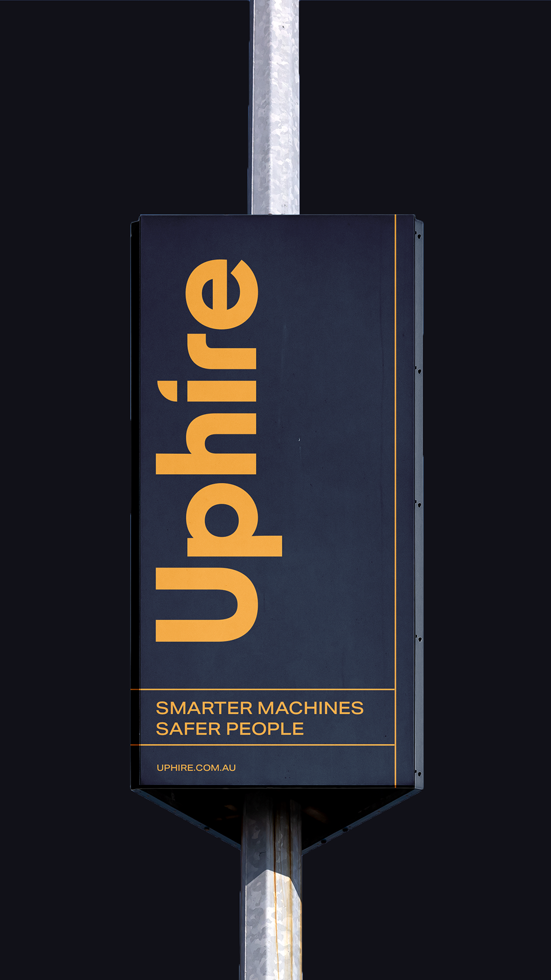
Uphire’s voice is Safety Champions, Always Available, Helpful and Educational, and Accountable, set against Dogmatic, Flimsy, Condescending and Dishonest. Every piece of Uphire’s collateral, from billboard headlines to quote emails, gets tested against those eight reference points. Mude calibrated that voice against one key customer, the safety manager on a Tier 1 construction site.
The voice has to hold in the boring documents too. Contracts, quotes, emails and reports make up a large share of what a brand writes, and a brand that switches to corporate boilerplate in its emails teaches people to doubt its website.
The SurrealScapes founders cast their brand as a guide somewhere between Doc Brown and Mary Poppins, playful and “not cryptic”. Mude wrote the voice as a well-read, faintly eccentric plant person, in long, courteous sentences that often end on a joke at the brand’s own expense.
A good landscaping logo makes the business recognisable on its own, holds its shape everywhere it appears, and has a reason behind it.
Holding its shape means staying simple enough to read on a ute door from across the road, embroidered on a work shirt and as a small avatar in a social feed. At thumbnail size, fine detail disappears and thin lines break up, so the shapes need to be bold.
Having a reason behind it means tying the mark to something specific about the business, such as a plant it’s known for, a material it works with or the place it works in. A mark with a reason behind it keeps its meaning once a passing trend has dated.
The SurrealScapes logo is a kangaroo paw, chosen because a studio focused on Australian natives needed a mark from the native garden. Mude’s bet was that it has a silhouette no other landscape studio is ever going to turn up with.
Softscaping, or soft landscaping, is the living, non-structural part of a landscape: the plants, soil and organic materials that bring colour, texture and seasonal change to an outdoor space. The structural part, such as paths, walls and paving, is called hardscaping.
The work runs from site analysis (soil, sun, drainage, existing vegetation and how the space will be used) through a planting plan, soil preparation and installation, to irrigation and aftercare.
Softscaping decides how a garden looks for years after it goes in, because the plants keep growing. Planting for the long run means spacing for mature size, so a new garden can look sparse on day one and fill in over the following seasons.
Softscaping is one of SurrealScapes’ four services, alongside design, planting and stewardship. The studio’s own definition takes in all the living garden elements: plants, turf, soil, mulch and compost.