

Sunstrata
Rebranding a solar disruptor taking on Big Energy
Rebranding a smarter, sharper energy brand ready to take on Big Energy and put power back in people’s hands.
Mude partnered with Sunstrata to evolve their brand into something sleeker, smarter, and more confident. The rebrand spans brand strategy, visual identity, tone of voice and brand guidelines, bringing a little bit of attitude to a sector that desperately needs it.
This refreshed identity flowed into a refresh on the current website, with a restructured site architecture that improves how each audience moves through the site and surfaces the core offerings clearly. Mude also rolled out a full suite of digital marketing creative, from organic social content to paid Meta campaigns, designed to challenge outdated energy narratives, and position Sunstrata as the smart choice for Australians ready to take control of their power.

The solar category in Australia is highly commoditised. Years of competing on price and rebate have flattened the brand layer across the category. Capable operators were getting visually confused with weaker brand work because the visuals didn’t signal that anyone was any different. Customers had learned to compare on cents per kilowatt-hour and warranty length because nothing else looked different enough to compare on.
Sunstrata’s brand positioning opportunity was to step out of the category’s visual vocabulary altogether, and the brand strategy work behind the rebrand started from there.
The rebrand sits underneath a real commercial shift. Sunstrata had grown across four offerings: apartment solar sharing through SolShare hardware, commercial energy work for 100kW+ systems on warehouses, depots and multi-tenant portfolios, residential home solar, and a B2B consultancy line for other commercial solar businesses. Each is a different buying conversation with a different audience, and the previous brand strategy wasn’t built for any of them in a deliberate way.
The category had trained buyers to treat solar as a commodity, and that commodity expectation followed Sunstrata into the rooms it was trying to be considered seriously in. Mude’s brief was to give the business a brand system serious enough for commercial decision-makers and strata committees alike, while keeping the residential side running through the same system rather than a parallel set of templates. That was a B2B brand strategy problem with a B2B brand identity solution, and the result is a challenger brand positioned against Big Energy rather than against other solar installers.
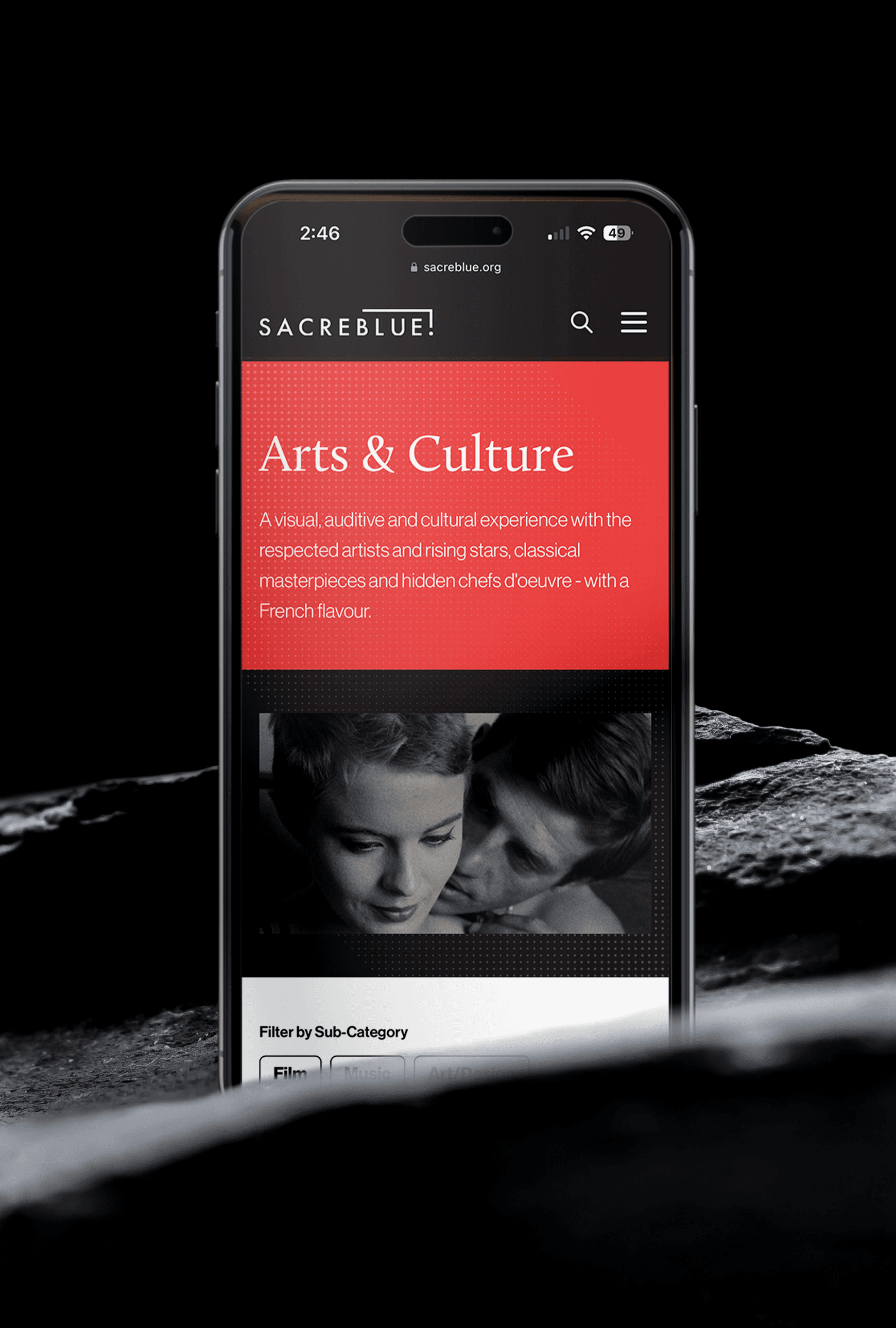
The Sunstrata visual identity system is built from grids of small squares that gradually distort and dissolve as they radiate outward. The pattern reads as modular components forming larger structures, the visual metaphor for what Sunstrata actually builds. Its job is as the recurring motif across the website, poster work, apparel and the social campaign system.
The visual identity work was deliberately designed to keep the brand clear of the category’s most worn-out tropes: the virtue-signalling, the greenwashing dressed up as values, the “be the change” homilies. Sunstrata is a solar company, and the brand looks like one. It just doesn’t look like all the other ones, because the brand strategy underneath it commits to looking different.

The brand identity flowed directly into the website rebuild. The previous site collapsed the residential and commercial journeys into the same templates, with a content hierarchy weighted toward residential. Mude rebuilt the information architecture around the two buying conversations, with the commercial and residential journeys separated cleanly. The site is built brand-first, with every page shaped by the brand system rather than the spec sheet.
Underneath sits the ongoing digital work that keeps the brand running across the channels that matter: paid Meta creative on the residential side, organic social, and the technical SEO foundations the previous site was missing. The relationship continues past launch. Mude keeps stewarding the brand through ongoing campaign work and iteration as the business goes to market.
The perception shift the new branding gives the business a lever it didn’t have before: the room to look and behave like an infrastructure-grade operator rather than just another installer. On the commercial side, Sunstrata now has a brand that holds up alongside the operators it wants to be considered with. On the residential side, homeowners get a brand to choose that doesn’t make them feel like they’ve taken either the cheap option or the precious one.
Related Projects
View Project

Video
Amazon Music
Webby Awards Nominee
1View Project

Brand, Website
NextOre
View Project

Brand
Rosella St
View Project

Video
Sport Integrity Australia
View Project
Website
The Embassy of France in Australia
View Project

Brand, Video
Department of Education, Skills and Employment
View Project
Brand
Apporetum
View Project

Video
Sensori+
Frequently Asked Questions
You were going to ask anyway
Sunstrata is a Sydney-based solar operator that designs and delivers solar systems across four offerings: apartment and strata buildings, commercial properties, residential homes, and a B2B consultancy line that helps other commercial solar companies step up into large-scale solar and battery projects.
The lead product is apartment solar sharing, where a single rooftop system serves an entire strata building of owner-occupiers, investors and tenants through SolShare hardware.
The brand strategy underneath the business, developed by Mude during the rebrand, steps Sunstrata out of a category that has been trained to compete on cents per kilowatt-hour and warranty length. Sunstrata’s brand positioning is built around behaving like an infrastructure-grade operator.
Big Energy is the framing that anchors Sunstrata’s challenger brand positioning: the legacy energy incumbents, retailers and infrastructure operators that hold the existing market and price expectations. Sunstrata’s position is built around moving customers off that default and onto a smart, sharper, more confident alternative that puts power back in people’s hands.
The phrase does two jobs at once. The first is positioning: it gives Sunstrata an opposition to define itself against without naming individual competitors, which is the same posture David takes against Goliath in challenger brand strategy. The second is tone: Big Energy is wry.
One of the hard problems in the Sunstrata rebrand was the audience spread. Apartment strata committees, owner-occupiers, residential homeowners, commercial procurement teams and other commercial solar businesses are five different buying conversations, with different price points, different decision criteria and different content needs. The previous Sunstrata brand had collapsed most of those into the same templates with a residential-weighted hierarchy, which meant decision-makers across the other segments were arriving at a brand designed for someone else.
Mude rebuilt the brand positioning to flex without becoming five brands. The visual identity system, tone of voice and brand language hold consistent across all segments. The flex happens at the application layer: the website information architecture gives each segment its own journey, the messaging weight shifts depending on the audience, and content depth is calibrated for the buying conversation. One brand system, multiple clean audience experiences.
The renewable energy category has a particular brand strategy challenge: environmental virtue is a difficult thing to claim without sounding like everyone else, because the vocabulary of “sustainable future” and “be the change” has been used so widely that genuine operators can sound indistinguishable from any others.
Sunstrata’s brand strategy was deliberately built to step around that challenge. The visual identity system doesn’t lean on green or solar-yellow as primary colours, the tone of voice doesn’t borrow activist language, and the brand world doesn’t promise to save the planet. Instead, Sunstrata operates from a grounded posture: this is a solar business, the technology works, the commercial logic stacks up, and the brand looks like what it is.
Sunstrata is a Sydney-based solar operator headquartered in the Inner West. The brand was designed by Mude, a brand strategy and brand identity agency based in Sydney and Canberra with a practice in regulated industries: energy, climate technology, government and high-trust organisations. The Sunstrata engagement was led by Mude’s Sydney brand strategist team and brand identity specialists, covering brand strategy services across positioning, identity, tone of voice, and the website redesign that put the brand identity system into application across every Sunstrata touchpoint.
The case study sits inside Mude’s energy and climate-technology practice alongside other work from the design studio. Mude’s brand strategy Sydney work spans Sunstrata, the Sydney Energy Forum creative work for the Department of the Prime Minister and Cabinet on Australia’s first international clean energy summit, and the NextOre brand strategy work for the CSIRO-commercialised mineral extraction technology under MagnaTerra Technologies that helps mining operators reduce energy and water consumption.
SolShare is the apartment solar sharing hardware that lets a single rooftop solar system serve every apartment in a strata building,. It’s a world-first technology developed by Allume Energy, and Sunstrata uses it as the spine of its apartment offering. One system, shared dynamically across owner-occupiers, investors and tenants, with each apartment seeing real savings on their own bill.
For Mude’s brand strategy work on Sunstrata, SolShare was a defining product fact: the apartment offering needed brand language and a visual identity that explained a structural innovation, beyond a product fact. The rebrand had to make the technology feel as serious as it actually is, and make strata committees, owner-occupiers and investors all understand why this isn’t the same conversation as a standard rooftop install. Sunstrata combines the hardware with financing through Lannock Strata Financing for buildings that want a zero-upfront path, and runs the whole engagement under New Energy Tech Approved Seller accreditation from the ACCC.
Australian energy and renewable branding work is served by a mix of brand strategy agencies, brand positioning agencies, brand identity agencies, B2B branding specialists and creative studios working across the regulated sectors. The work tends to cluster around brand refreshes for energy retailers, B2B brand identity systems for commercial operators, brand strategy services for businesses entering new market positions, and brand-led repositioning for challenger brands. a strong agency brand identity work in this space tends to come from studios that can turn complex, technical businesses into simple, charismatic brands buyers actually understand. A specialist brand positioning agency does its best work when the business has a real shift to anchor against, the way Sunstrata’s commercial pivot anchored Mude’s work.
Mude is an Australian branding and identity agency with an energy and climate-technology practice that includes Sunstrata’s apartment, commercial and consultancy solar rebrand, the Sydney Energy Forum creative work for the Department of the Prime Minister and Cabinet on Australia’s first international clean energy summit, and the NextOre brand strategy for the CSIRO-commercialised mineral extraction technology under MagnaTerra Technologies that helps mining operators reduce energy and water use. As a brand identity agency working across regulated industries, Mude’s brand consultancy work sits inside a wide practice across trust-heavy and infrastructure-adjacent organisations.
Rebranding is the work of reshaping how a business is positioned and presented, from its strategy and messaging through to its visual identity and tone. It goes past a new logo. A rebrand usually answers a change in the business itself: a company that has outgrown its old brand, moved into new markets, added audiences it was never built to speak to, or ended up looking like everyone else in its category.
Sunstrata is a clear example of when a rebrand earns its place. The solar company had grown across four offerings, from apartment solar-sharing to commercial systems, residential installs and a consultancy line for other solar businesses, and each one is a different buying conversation with a different audience. The earlier brand had not been built for any of them deliberately. On top of that, the solar category had trained buyers to treat the product as a commodity, and that expectation followed the business into rooms where it wanted to be taken seriously. Mude rebuilt the brand strategy first, then the identity, tone of voice and guidelines on top of it.
The signal, in short, is misalignment: when the brand a business presents no longer matches the business it has become or the position it needs to hold, a rebrand is usually the honest fix.
A website is usually where a brand does the most work, because it is where most people meet the brand and make a decision. Carrying an identity through to a site means more than dropping in the logo and the brand colours. The typography, the colour system, any motif, the tone of the writing and the way pages are structured all come from the brand, so the whole site reads as one coherent expression of it.
Sunstrata shows this directly. The brand identity flowed into the website rebuild, and the recurring motif, a grid of small squares that distort and dissolve as they radiate outward, runs across the site the same way it runs across posters, apparel and social. Mude built the site brand-first, with every page led by the brand system, down to how the product detail is presented, so the experience of the brand holds from a social ad through to the page where someone weighs up a solar system.
Done this way, the website stops being a separate deliverable and becomes the leading, most-used surface the brand identity lives on.
A commoditised market is one where buyers have been trained to compare on price and specification because nothing else looks different enough to weigh up. Standing out starts by changing what you get compared on. That means committing to a clear position the category does not already own, then building a visual language and tone distinctive enough that the brand stops being read as one more interchangeable option.
Solar in Australia is a textbook case. Years of competing on price and rebates taught buyers to compare on cents per kilowatt-hour and warranty length, and Sunstrata inherited that commodity expectation. Mude’s strategy was to step out of the category’s visual vocabulary altogether and position Sunstrata as a challenger taking on Big Energy, which moves the brand off the footing every other installer competes on. The identity deliberately avoids the category’s worn tropes, the greenwashing and the be-the-change homilies, so the brand still reads as a solar company while looking like none of the others. That point of difference is backed by strategy, which keeps it from being decoration.
Differentiation that lasts is built on a real position, so the distinctiveness has something underneath it to defend.
Sunstrata rebranded because the business had grown into a multi-audience operator and the existing brand wasn’t built to flex across all of it. The lead product is apartment solar sharing, a segment of the Australian solar market many other operators don’t serve well. Alongside that sit commercial energy work for 100kW+ systems, residential home solar, and a B2B consultancy line for other commercial solar companies stepping up into large-scale projects. Each segment has its own buying logic and decision criteria. They all run through the same brand.
The rebrand started with a brand strategy workshop and a brand audit in Sydney that surfaced a category-wide pattern Sunstrata had been operating inside: years of competing on price and rebate had flattened the brand layer across the Australian solar sector. Capable operators were getting visually confused with weak brand work because the visuals didn’t signal that anyone was any different. For most businesses, the question of whether rebranding is a good idea comes down to whether the brand is keeping up with where the business is actually heading. In Sunstrata’s case it wasn’t, and the rebrand gave Sunstrata a brand system serious enough for commercial decision-makers and strata committees alike, while keeping the residential side running through the same system.
The Sunstrata visual identity system is built from grids of small squares that gradually distort and dissolve as they radiate outward. The pattern reads as modular components forming large structures, which is the visual metaphor for what Sunstrata actually builds: solar arrays assembled from individual cells into commercial-scale installations.
The grid pattern works as the recurring motif across the website, poster work, apparel and the social campaign system. Within the broad brand identity system, codified in the brand guidelines and tone of voice document Mude delivered with the rebrand, the grid does identifying work independent of the wordmark, the same way the Full Proof wireframe pattern does for that identity. A regular customer starts to recognise the grid pattern before the logo arrives, which is the most efficient identifying work a brand element can do.
Commercial solar buyers, people procuring 100kW+ systems for warehouses, depots and multi-tenant portfolios, expect to be selling to a brand that looks like an infrastructure-grade operator. Until the rebrand, Sunstrata was being read as a residential installer that also did commercial work, because the brand language was weighted toward homes. That’s a B2B brand strategy and corporate branding problem with a B2B brand identity solution, and Mude’s rebrand addressed both.
The visual identity system carries the precision and technical credibility that commercial procurement and corporate branding contexts respond to: the colour palette holds against industrial settings, the typography sits in the technical-confident register. The website architecture also splits the commercial journey out from residential, so commercial buyers arrive at a Sunstrata that takes them seriously. The B2B brand strategy work is the lever; the visual identity is how it gets felt.
Australian energy sector rebranding has been a steady drumbeat over the last decade, driven by industry consolidation, regulatory shifts and the residential energy transition. Origin Energy and AGL have both run brand refresh work at the retail layer. On the renewable and solar specialist side, the rebrand pattern has been less consistent because the category is still fragmented, with much of the category competing on price and rebate.
Sunstrata’s rebrand sits in that gap. It treats solar as a category that deserves brand investment at the same level as the energy retailers and the infrastructure-grade operators,. The case for that move is straightforward: residential customers compare brands before they compare cents per kilowatt-hour, and commercial procurement teams need to see a brand that signals technical depth before they engage.
The consultancy line is Sunstrata’s B2B service for other commercial solar companies that want to step up into large-scale solar and battery projects and lack the in-house capability yet. It’s a B2B branding move alongside a service offering, with Sunstrata extending its brand strategy and technical stack to allied installers. Sunstrata provides project scoping and insights, financial and technical modelling through Orkestra, battery orchestration and energy market integration through PowerSync, 10-year maintenance contracts, and client-ready presentation materials. The arrangement lets a small installer go to its existing client base with a complete large-scale proposition, without having to build every capability internally.
It’s a quietly clever brand positioning move. By packaging a commercial capability as a partner service, Sunstrata is designed to seed a network of allied installers across Australia who can pitch Sunstrata’s technical stack alongside their own brand. The case for it sits in the same logic as the rest of the rebrand: the business deserves brand investment, B2B brand strategy depth and an infrastructure-grade posture. The consultancy line is brand-led B2B growth, executed as a service.
Brand positioning is the strategic work of deciding what a brand stands for, who it competes against, and what makes it the obvious choice for a specific buyer. It’s the layer above visual identity, sitting between business strategy and creative execution. A brand without positioning is a brand competing on price, which is why brand positioning services often start with defining the company’s unique market space before any visual identity work begins. Working with a brand positioning agency or a rebranding agency tends to make the difference between a complete repositioning and a logo redesign.
Sunstrata’s rebrand is a brand positioning case study built around four moves. The first was deciding to compete as a challenger brand against Big Energy. The second was building one brand system that flexes across multiple audiences (apartment strata committees, commercial procurement teams, residential homeowners and other commercial solar businesses) without becoming four different brands. The third was stepping out of the visual default of the solar category, the pastels, virtue-signal language and “be the change” imagery, to look like an infrastructure-grade operator. The fourth was making the brand world hold across every application from a paid Meta ad to a commercial procurement pitch.
Brand positioning lets Sunstrata behave as one brand serving multiple distinct audiences with one coherent story. Without it, the rebrand would be a logo refresh. The brand consultancy and rebranding agency work behind the rebrand makes the visual identity stick.
Rebranding is the strategic work of updating a brand’s positioning, identity and behaviour to match where the business is actually heading, beyond where it started. Australia has had a steady drumbeat of significant rebrands over the last few years. Arnott’s quietly refreshed several heritage product lines including Chocolate Wheaten. Aldi Australia ran the ALDIcore campaign and Project Fresh store refresh to evolve its premium positioning. Scyne Advisory was created out of PwC Australia’s government consulting business in the wake of PwC’s reputation challenges, launching as an independent entity in late 2023. Coles Liquor consolidated First Choice Liquor Market and Vintage Cellars under the Liquorland banner. These are different scales and different reasons, and the underlying logic is consistent: each business needed its brand to do something its old brand was not built for anymore.
Sunstrata’s rebrand sits in that company. The trigger was a real commercial shift, the move into 100kW+ commercial solar work and the B2B consultancy line,. The previous brand was built for one audience and one register, and the new one had to hold across multiple buying conversations with no loss of coherence. A successful rebrand is rarely about a new logo. It’s about reshaping the brand positioning and brand identity system to match what the business is actually becoming.
For Sunstrata that means a brand system that holds across apartment solar sharing, commercial solar, residential acquisition and B2B consultancy, a visual identity that reads as infrastructure-grade.
A brand refresh and a rebrand sit on the same spectrum, separated by how deep the change goes. A refresh keeps the core of the brand intact and updates its expression: tidying the logo, modernising the colours and type, and sharpening the look without changing what the brand stands for. A rebrand goes further down, reworking the strategy and positioning first, so the identity that comes out the other side reflects a genuinely different stance in the market.
Sunstrata sat at the rebrand end. Mude started with the brand strategy, repositioning the solar company as a challenger to Big Energy and building a deliberate approach to its four audiences, then carried that through into a new visual identity, tone of voice and guidelines. The website was a lighter touch by comparison, a refresh of the existing site that took on the new identity and a restructured architecture, which shows how the two can run together inside one project.
A useful test is to ask what is actually changing. If it is mainly the surface, that is a refresh. If the strategy and position underneath are moving, the business is in rebrand territory, and Sunstrata is squarely the latter.
When a business serves several audiences with different needs, the website has to give each one a clear path without splintering into separate brands. The work is mostly in the information architecture: deciding how someone self-selects early, what each journey needs to show, and how the navigation surfaces the right offering quickly, while a single brand system holds the whole thing together visually.
Sunstrata is a good worked example, because it sells to four quite different audiences, from homeowners and apartment buildings to commercial operators and other solar businesses. Mude restructured the site architecture so each audience moves through the site cleanly and the core offerings are easy to find, with the commercial and residential journeys kept on clean, separate paths. A homeowner comparing a home system and a facilities manager scoping a 100kW commercial install are looking for different things, and the site is built to take them in their own directions while keeping them inside one recognisable brand.
The aim is both at once: a clear route for each buyer, with all of them unmistakably the same company.
B2B and B2C branding differ mainly in who is deciding and how. A consumer decision is usually made by one person, fairly quickly, with a strong emotional component. A business decision tends to involve several stakeholders, a long evaluation and a more rational weighing of credibility, capability and risk. So a B2B brand has to signal expertise and seriousness to the people accountable for the choice, while a B2C brand has more room to move on feel and immediacy. The underlying craft is the same; the emphasis shifts.
Sunstrata is interesting because it has to do both. Mude treated the rebrand as a B2B brand strategy and identity problem first, giving the business the room to look and behave like an infrastructure-grade operator that commercial buyers and property operators would take seriously. The same brand also has to work for homeowners choosing residential solar, where the decision is more personal. The system is built to hold up in a commercial procurement conversation and on a residential landing page, which is a hard brief than a brand that only speaks to one of those.
That dual demand is exactly why the strategy came first: get the positioning right, and a single brand can carry audiences that buy in very different ways.