Artisan GF Co.
A brand identity for a chic gluten-free flour whose bread comes without the asterisk
Gluten-free flour has spent rather a long time at the practical end of the shelf, and Artisan GF Co., a Sydney gluten-free flour brand, would quite like it moved to the good end. Its brand identity and packaging design cross a Lebanese corner bakery with a fashion atelier, and its product renders shoot a bag of flour the way a fragrance house shoots a bottle of perfume.
Artisan GF Co. is gluten-free flour for bread that tastes like great bread, minus the usual asterisk, packed in a bag that can sit on the open shelf next to the good olive oil. Lebanon-raised founder Lama Sultan spent five years in the kitchen with her mum (coeliac for 25 years) until the bread stopped tasting gluten-free, and it’s on its way to shelves.

The brief
Lama came to Mude with three blends already worked out (Bread & Pizza, Cake, and Pastries & Cookies), each one a complete mix so a home baker doesn’t need to buy extra starch to make it work. What she was missing was a brand to put them in, and Mude built her the brand identity and brand guide, the packaging for all three flours, a set of product renders, the motion and the website.
Gluten-free is still mostly sold as the practical option, which on the flour shelf means farmhouse nostalgia on one bag and organic box-ticking on the next, and whichever one you pick up, the bread still gets treated like the decaf of the bakery.
In the workshops, one of the goals was for the brand to both carry a posture that oozed craftsmanship and a bit of elegance, whilst functionally also making it obvious the flour was gluten-free. When Mude scored the audiences, the friends and family of people with coeliac disease came out on top, so a lot of the people buying the flour are baking for someone else and read the pack carefully (because the stakes of serving someone gluten can be quite high).
So the brief was a flour a careful cook could trust at a glance and a venue would be happy to name on its menu as its flour supplier, in a bag good enough to leave out on the bench.
The posture
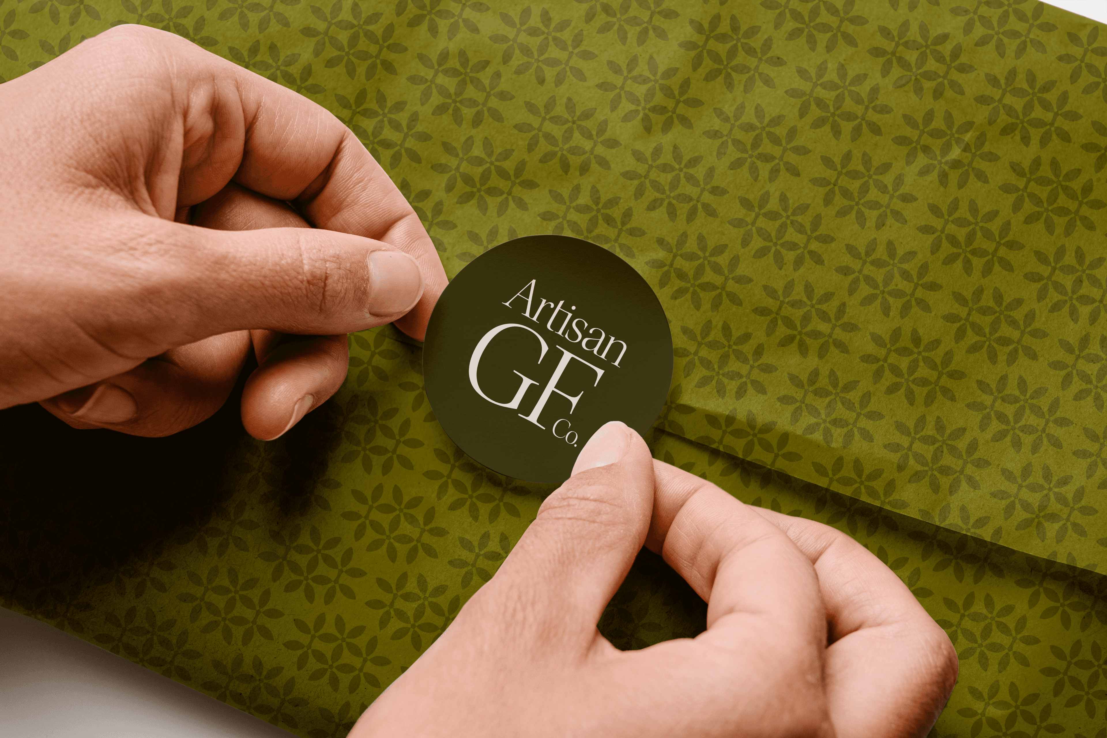
The identity is a remix of the Lebanese corner bakery and an atelier, with all the generosity of the extra one slipped into your bag by someone who’s pleased you’re eating it, finished with fine serif type and patterned tissue paper that hand a bag of flour over like a boutique pickup. It’s chic enough for the good shelf and still smells like it came out of somebody’s kitchen, which it did.
The atelier half came from Lama’s own taste. Asked in the workshop which brands she admired, she named Saint Laurent for its French elegance and Kayali, the Dubai fragrance house founded by Mona Kattan, for its rich Arabic posture, and the notes from that session took the hint and suggested Artisan “could behave like a high-fashion or perfume brand”. Of the three routes Mude then took to her, the one she chose was called, fittingly, the high-fashion atelier, and its line, “Gluten-free doesn’t have to mean flavour-free”, now sits on the home page of the website.
Even the name has two jobs, and the brand guide insists both have to hold, since Artisan has to read as elegant while still feeling like it came out of someone’s kitchen.
The wordmark
There’s no symbol in the system, so the wordmark and the pattern carry the brand between them, with the wordmark arranged three ways. The primary runs on one line in sentence case, with a full stop on the end as if the name were the last word on the subject, while the secondary stacks Artisan over GF Co. for square spaces like social profiles.
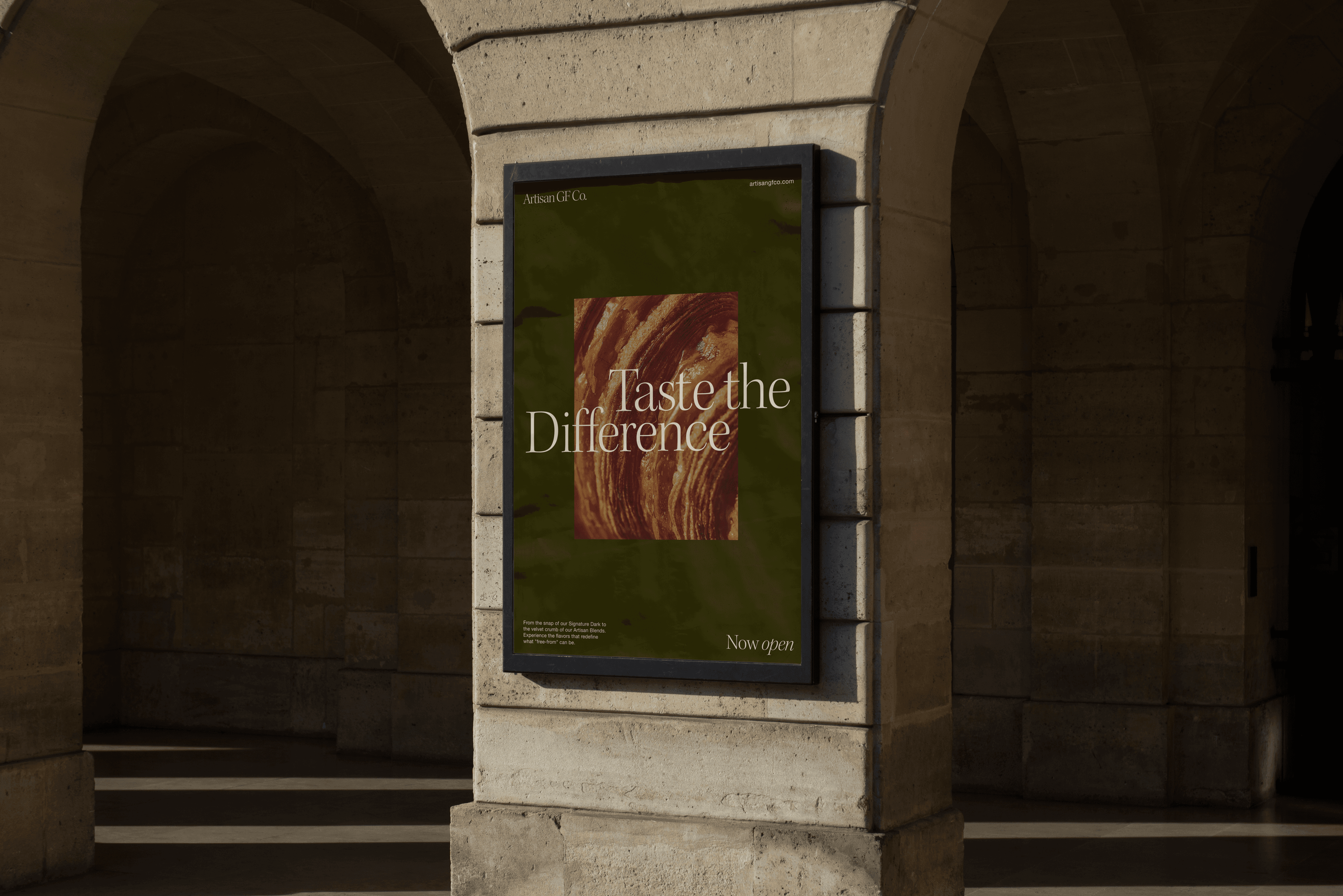
The tertiary sets Artisan over a GF so oversized that it’s the first thing anyone reads, which suits a shopper checking every label, and it’s the one printed on the aprons in Artisan’s own photo shoot.
Type and colour
Headlines go to Kepler, which Robert Slimbach drew for Adobe in the tradition of the classic modern typefaces of the 18th century, with a hint of old-style proportion to soften it (the brand guide calls the result a mix of elegance and artisanry). It takes its name from the astronomer Johannes Kepler and comes in optical sizes, so the headlines use the display cut, drawn for setting large. Beside it, Helvetica Neue, the 1983 reworking of Max Miedinger’s 1957 Helvetica, plays straight man and keeps the labels and recipes easy to read.
You could order most of the brand colours at a Lebanese café (the cream is Ashta, the coffee is Kahweh). Ashta is the cream made by simmering milk and skimming off what rises to the top, the same cream that goes into knafeh and qatayef. The rest of the menu runs to Souri for the dark olive (after one of Lebanon’s main olive varieties), Sumac for the berry red and Shokolata for the chocolate. The deep blue is Shankleesh, an aged cheese rolled in za’atar, which may take some explaining at the counter.
Lama wanted the three flours to stand apart on the shelf through colour, “rather than adding additional content”, so Bread & Pizza went dark olive, Cake dark red and Pastries & Cookies turmeric gold. Mude tested three colour treatments by dropping the packs into a photo of a baking aisle before the range went ahead in full colour.

The pattern
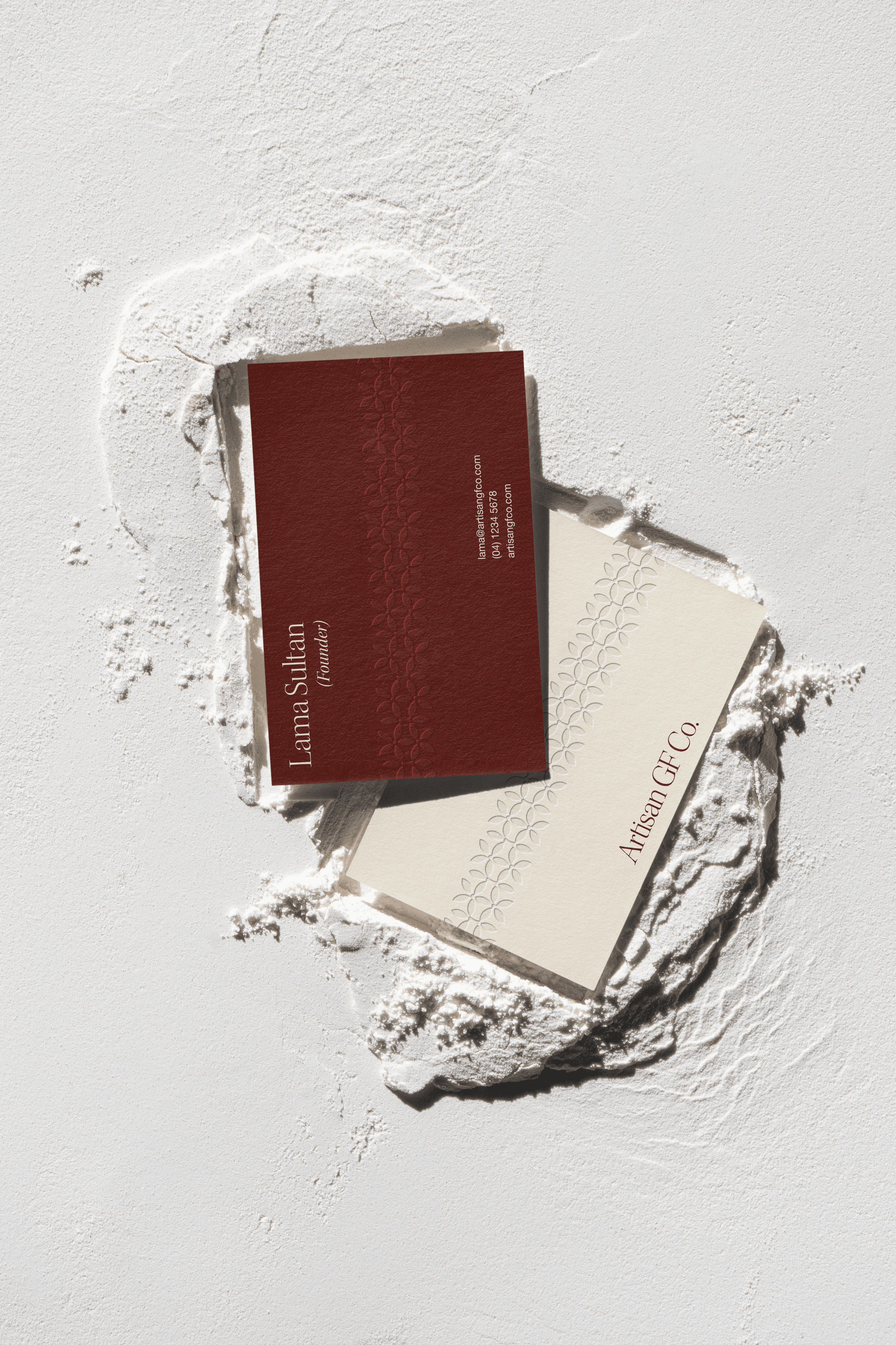
Every bag carries a tone-on-tone pattern drawn from the Lebanon cyclamen, a wildflower found on one stretch of Mount Lebanon and nowhere else in the wild. Its outline is crossed with traditional Lebanese woodwork and mashrabiya screens, the carved wooden lattices set over windows to let the light and air in and keep the neighbours from looking in.
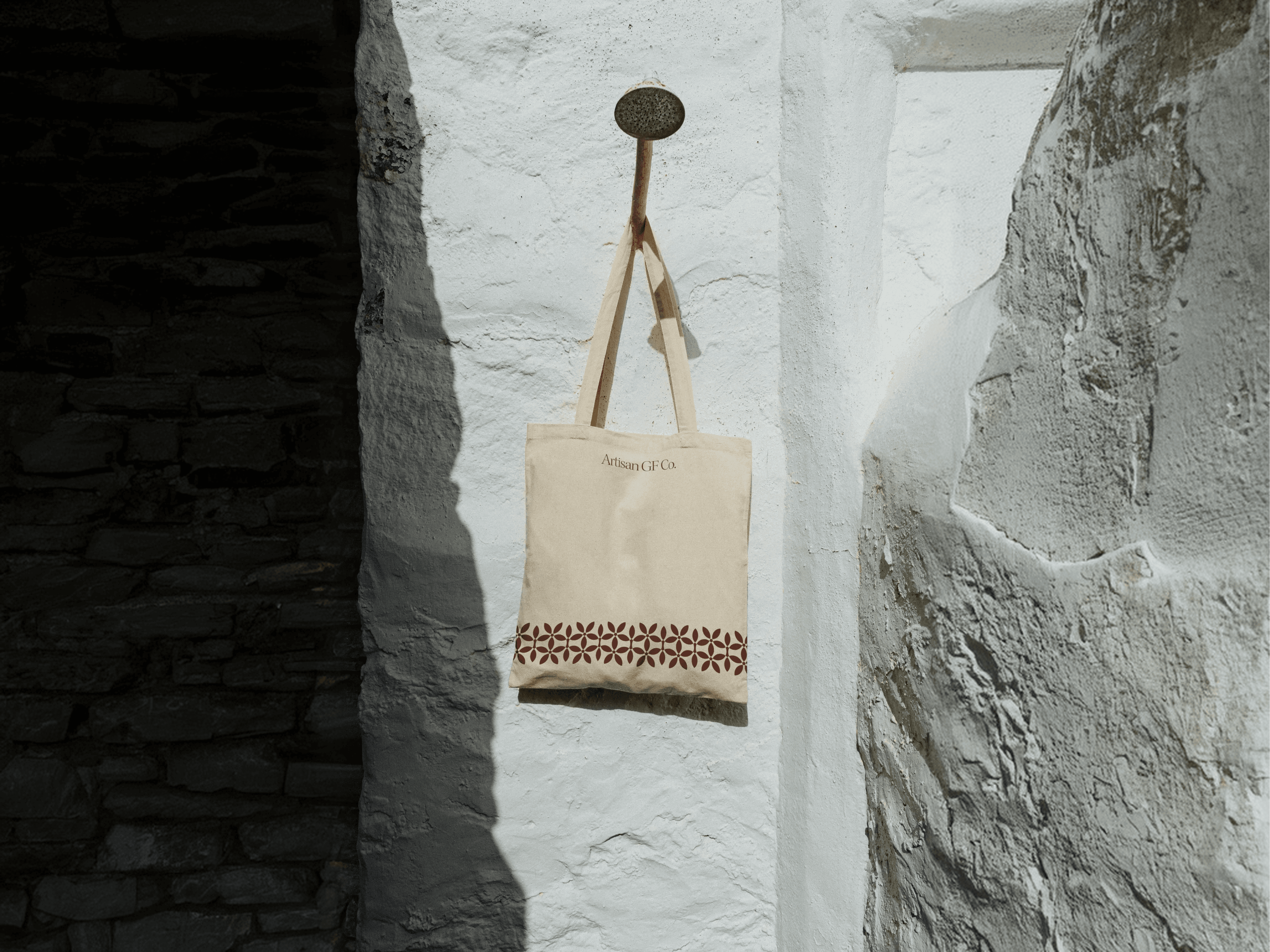
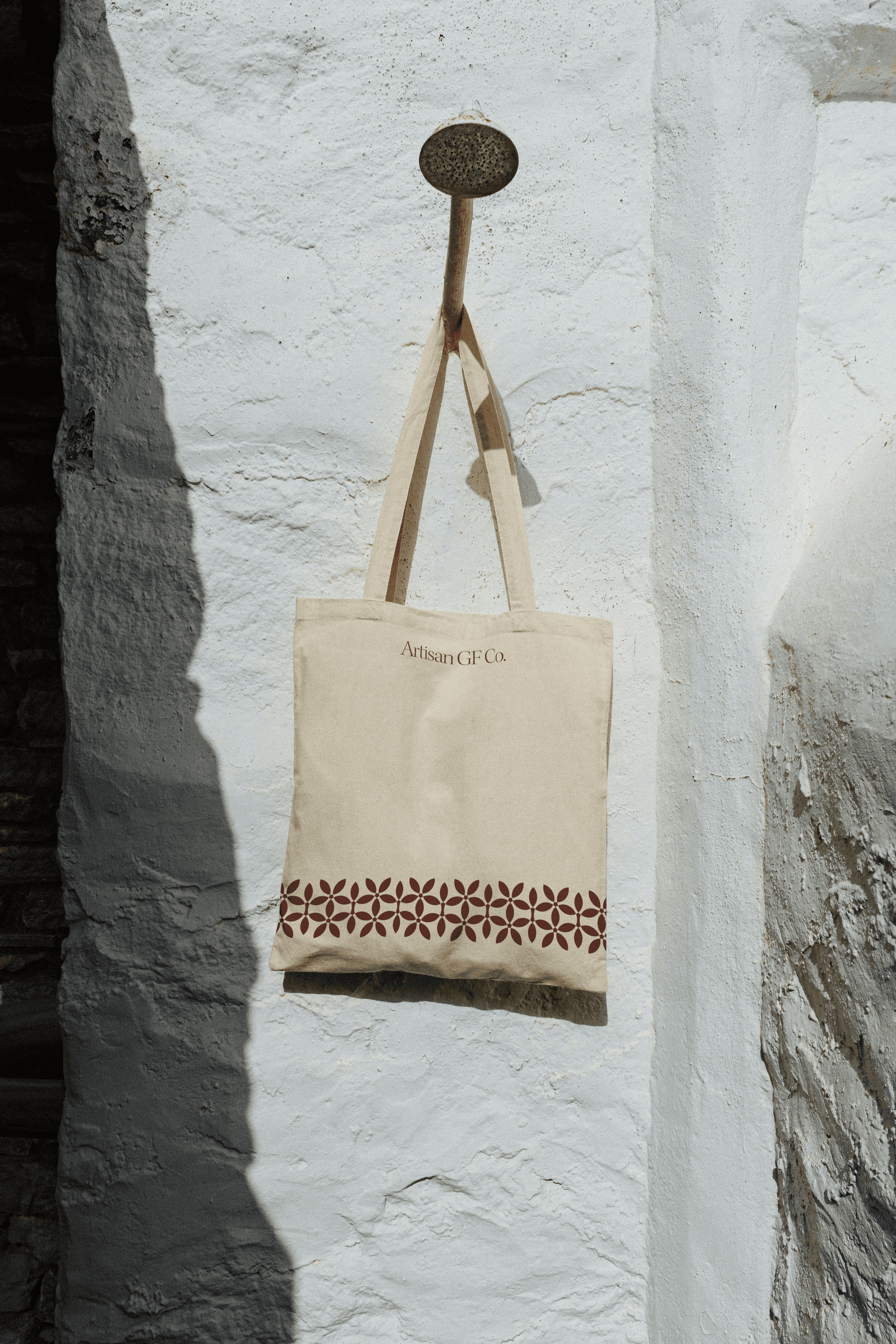
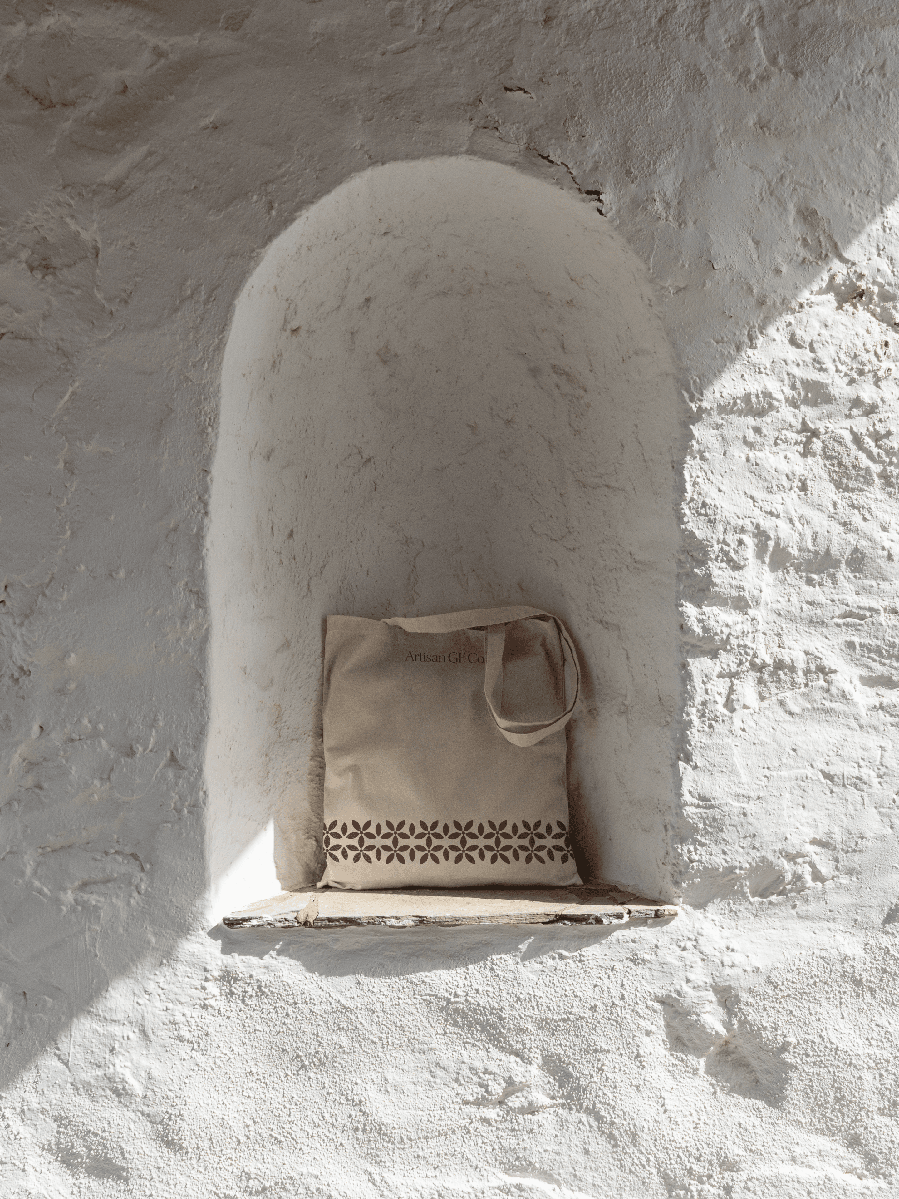
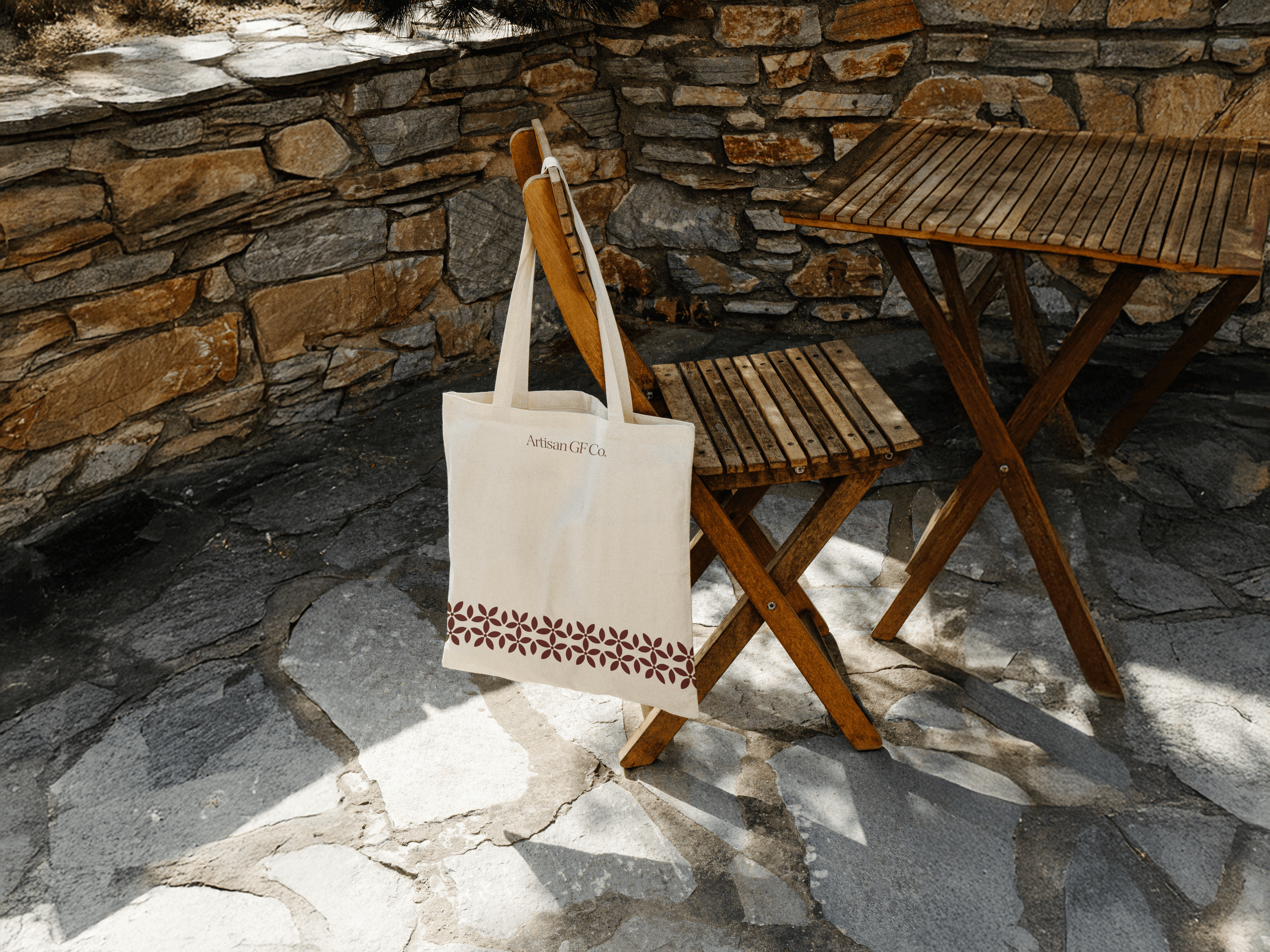
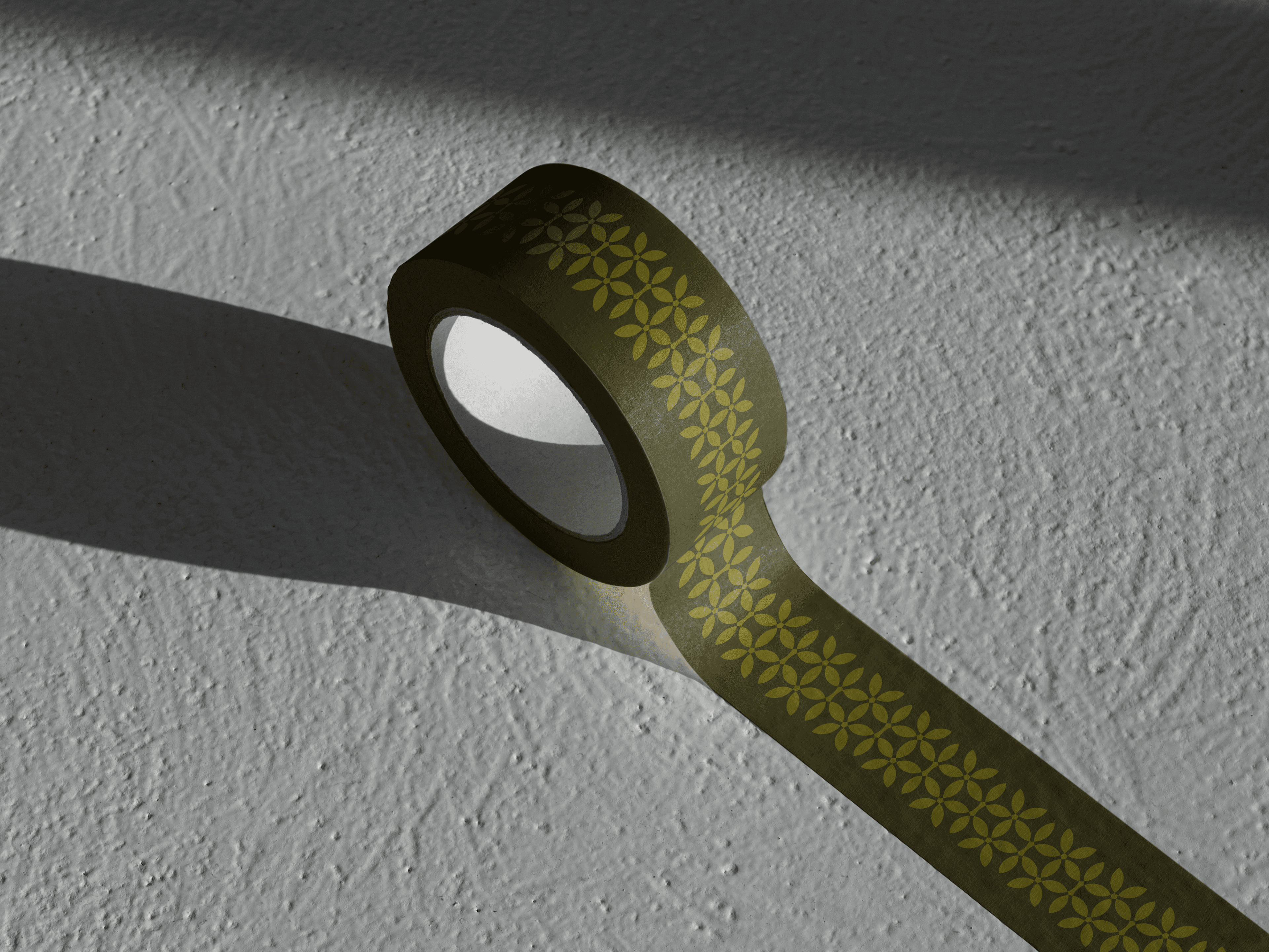
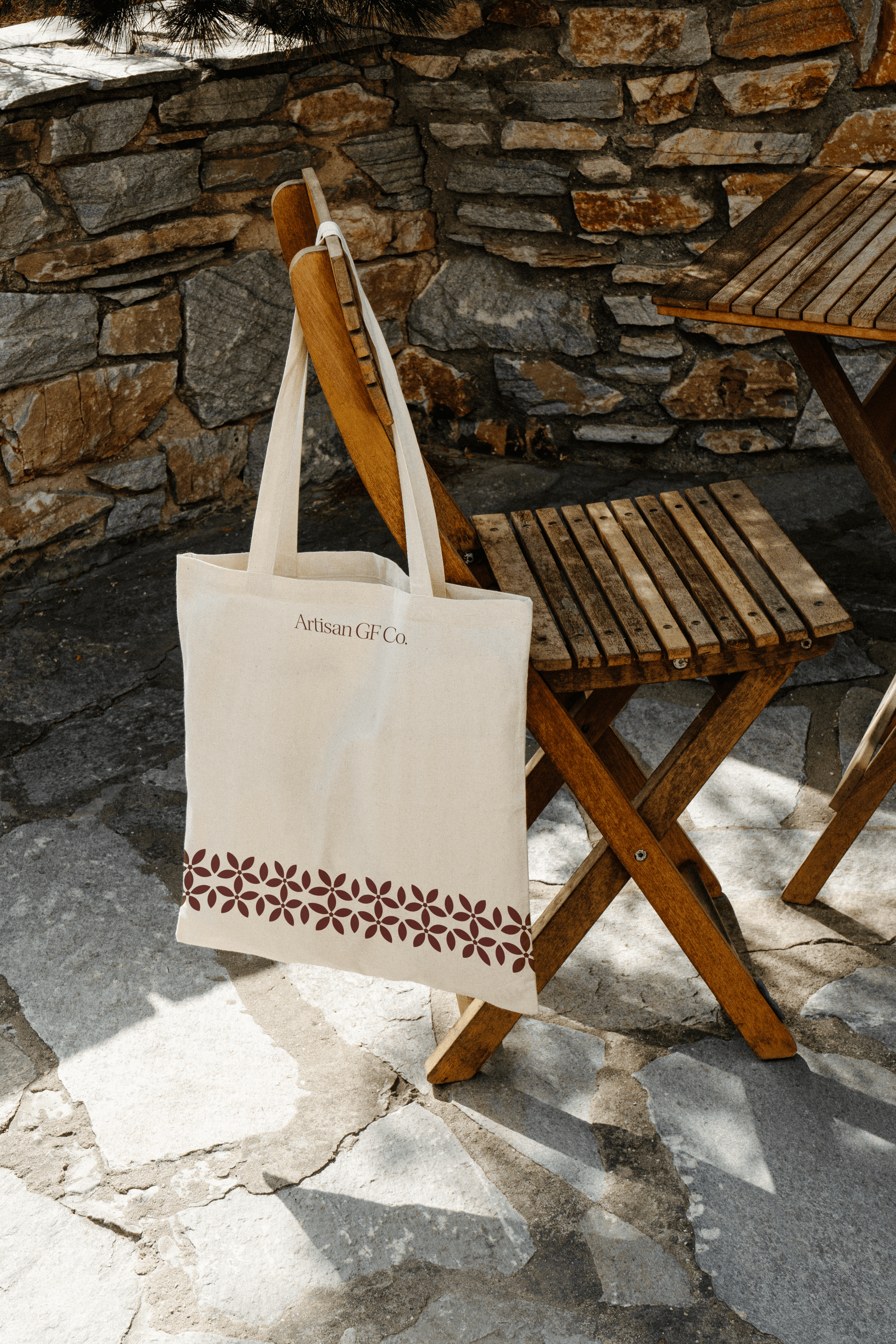
It comes in two versions, starting with a horizontal border that runs across packs and print, including along the bottom of the tote bag. The surface pattern sits faintly in the background, printed into the colour of each bag and across the tissue paper and packing tape, so the reference is there for anyone who looks closely.
Art direction
The art direction is mostly hands, flour and stone, and the brand guide splits the photography into two modes, with process and place shot in black and white under light falling through screens, and the food shot close up in warm earth tones. In the guide’s own words, “Let the warm texture shots bring the appetite; let the black-and-white frames hold the calm.”
The mockups stay in the same world, with a tote hung from a wooden chair against a stone wall and business cards pressed into a drift of flour. The product renders take the fashion-house idea furthest, putting the flour bag where a perfume bottle would normally go, on marble pedestals and stone balustrades in warm late sun, the way a fragrance campaign would shoot it.
Po’s motion pieces then take the identity apart and put it back together, building the wordmark letter by letter and growing the pattern out of its arcs.
Packaging
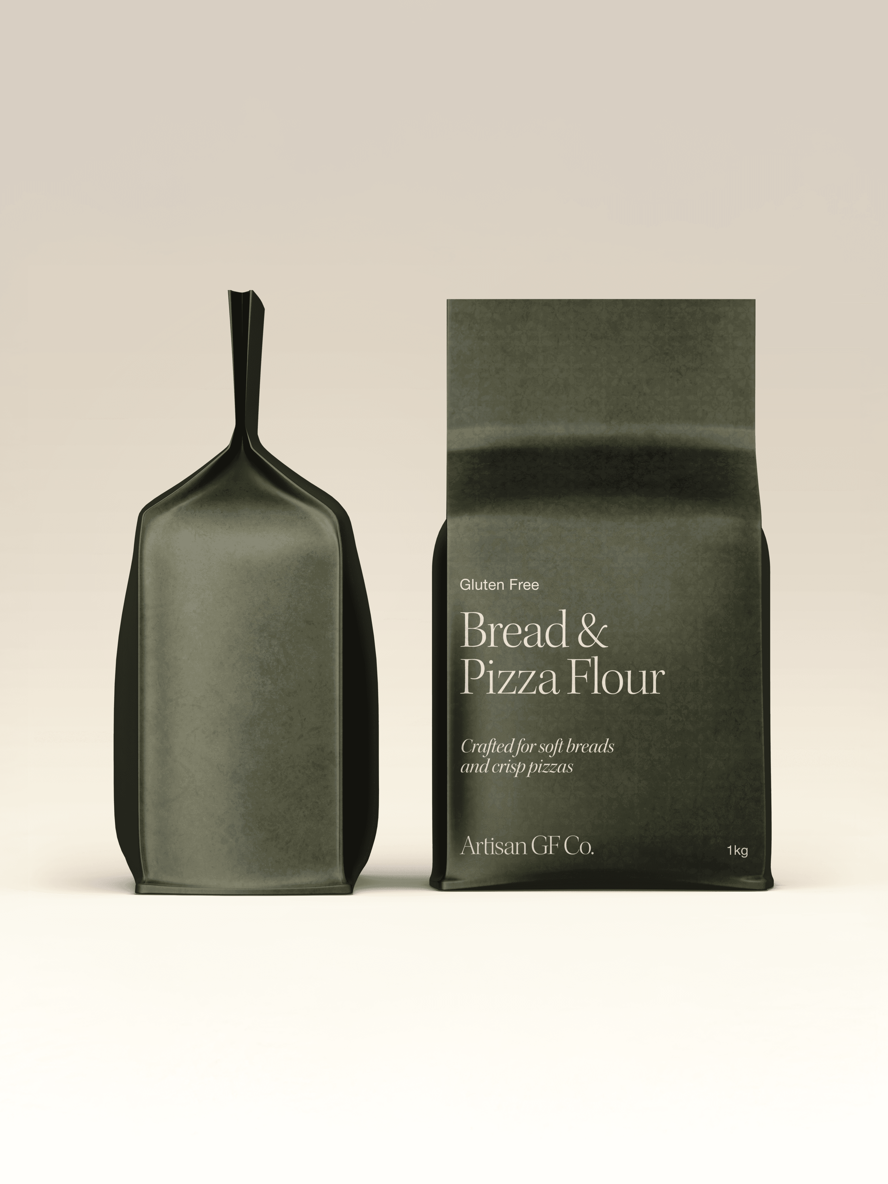
The packs are flat-bottom zip bags in a fully printed matte finish, with the pattern printed faintly into each bag’s colour and gloss UV kept to the flour’s name and the wordmark, so the light picks out the two things a shopper reads first. The front carries the wordmark, the flour’s name, a short “Perfect for” list, the weight and the words Gluten Free, and the product claims go on the back, because in Mude’s eye a crowded front cheapens a pack.
The recipes on the back were Lama’s idea, since gluten-free dough behaves differently and she wanted to help “those who are new to gluten-free baking”. Each back holds the full product information on the left and a chef-suggested recipe for that flour on the right, which is a lot for one panel. Mude shortened the units (grams to g, teaspoons to tsp) and let each recipe set its own layout, so the mini pizza on the Bread & Pizza pack sits comfortably beside the nutrition panel.
Website design
The brand site is in Framer, connected to Shopify for the eCommerce side, and Mude did it this way because Framer has more interesting animation and micro-interactivity capability than Shopify. Ellie linked the two so the shop runs on its own subdomain and still reads as part of the same site. Of the five main pages, the stockist page is the one built for trade, walking a buyer through four steps from first contact to stock on the shelf.
The outcome
The creative is what gets a bag of gluten-free flour onto the good shelf, with café colours and renders lit like a fragrance campaign giving Artisan a world of its own, somewhere between a Lebanese corner bakery and a fashion house. Under all of it sits the promise the brand started with, which is bread that tastes like great bread, and the three flours are on their way to shelves with Gluten Free on the front of every bag.
Related Projects
View Project
Brand
Skyline
AGDA Awards 2026 - Finalist
1View Project
Brand
Full Proof
View Project
Brand, Graphic Design
ByAsia Food
Pentawards 2023 Shortlist
1View Project
Brand, Graphic Design
Mr & Mrs Crepe
View Project
Website
The Embassy of France in Australia
View Project
Brand
Nescii
View Project
Brand, Website
MagnaTerra Technologies
View Project
Brand, Website
Sunstrata
Frequently Asked Questions
Building a gluten-free flour brand around a Lebanese bakery
Artisan GF Co. is a gluten-free flour brand from Sydney, founded by Lama Sultan. It makes three blends, Bread & Pizza, Cake, and Pastries & Cookies, for home bakers and for distributors and venues in Australia and the Gulf.
Each blend is a complete mix, so there’s no extra starch to buy. The brand takes its warmth from Lama’s Lebanese background, and its line is “Gluten-free doesn’t have to mean flavour-free”.
Mude, a strategic brand and creative agency in Sydney and Canberra, designed the Artisan GF Co. brand identity. Mude ran the brand workshops with Lama, then designed the visual identity, the brand guide, the packaging for all three flours, the product renders, the motion pieces and the website.
The identity mixes the warmth of a Lebanese corner bakery with the finish of a fashion atelier: fine serif type, a pattern drawn from a Lebanese wildflower and tissue paper that hands a bag of flour over like a boutique pickup.
Artisan GF Co. is for home bakers cooking for someone who can’t eat gluten, and for trade buyers such as distributors and venues.
When Mude scored the audiences in the workshop, the friends and family of people with coeliac disease came out on top, because Artisan makes baking for them easy. The home baker Mude mapped in detail cares how a product looks as well as what’s in it.
The Artisan GF Co. identity is inspired by fashion and fragrance houses, combined with the warmth of a Lebanese bakery.
Lama named Saint Laurent for its French elegance and Kayali, the Dubai fragrance brand, for its rich Arabic posture, and in the workshop the team raised the idea of Artisan behaving like a perfume or fashion house. Mude’s reference boards added Arabic lettering, Middle Eastern packaging, bakery bags and patisserie boxes.
Of three creative routes, Lama chose the high-fashion atelier, and its line, “Gluten-free doesn’t have to mean flavour-free”, now sits on the home page. The product renders carry the idea through, setting the flour bag on marble pedestals in warm late sun the way a fragrance campaign would shoot a bottle.
Artisan GF Co. uses Kepler Std for headlines and Helvetica Neue for everything else. Its core colours are Dark Olive (#302D00) and Coffee (#1F130E) on Cream (#F9F0E1), with Berry, Chocolate and Deep Blue in support.
The brand guide describes Kepler as a mix of elegance and artisanry, and Helvetica keeps the labels and recipes easy to read. The six main colours carry Arabic food names, so Coffee is Kahweh and Cream is Ashta, and you could order several of them at a Lebanese café.
A wider set of olive, orange, turmeric and blue tones covers range extensions and merchandise. The guide sets the mix at 60 per cent core colours, 30 per cent supporting and 10 per cent accents.
Each Artisan GF Co. flour comes in its own colour: Bread & Pizza in dark olive, Cake in dark red and Pastries & Cookies in turmeric gold.
The colours let a shopper pick the right flour off the shelf at a glance. Mude tested three colour treatments in a photo of a baking aisle, and the range went ahead in full colour.
On the gold pack, the accent colour is the red from the Cake pack, because gold on gold would disappear.
Mude, a brand and creative agency in Sydney, designed the packaging for all three Artisan GF Co. flours as part of the brand identity.
The packs are flat-bottom zip bags in a fully printed matte finish, with the surface pattern printed faintly into each bag’s colour and gloss UV on the flour’s name and the wordmark. The front stays clean, and the product claims sit on the back.
The packaging carries into the unboxing too. Patterned tissue paper and packing tape mean an order arrives the way a boutique purchase would.
Yes. Gluten-free dough rises with yeast the way wheat dough does, and binders take on the job gluten would do, holding in the gas so the dough keeps its shape.
Gluten is the protein network that gives wheat dough its stretch. Without it, each gluten-free blend has its own feel in the hands, so a recipe written for that blend helps a baker coming from wheat flour.
Each Artisan GF Co. pack carries a recipe written for that flour on the back.
Design the front of a food pack around the brand, the product’s name and the one or two things a shopper needs to decide, and leave everything else for the back.
For brands that live on a shelf, the packaging is the brand, and a shopper reads the front in a couple of seconds. Every extra claim, icon and badge on the front competes with the name, and a busy front tends to make a pack look cheap. The ingredients, allergens, nutrition panel and supporting claims belong on the back, along with anything that helps someone use the product.
Artisan GF Co.’s fronts carry the wordmark, the flour’s name, a short “Perfect for” list, the weight and the words Gluten Free. The product claims sit on the back with the rest of the product information.
A logo lockup is an approved arrangement of a brand’s wordmark and any symbol, usually in a horizontal and a stacked version, with clear-space and minimum-size rules so the logo holds together at any size. The logo is the mark itself, and a lockup is a fixed arrangement of it with the brand name or a tagline.
Lockups exist because one arrangement can’t fit every space. A long horizontal version suits a website header or the side of a van. A stacked one suits a square social profile or a small label. The brand guide sets which lockup goes where, so nobody has to improvise.
Artisan GF Co. runs three lockups: the primary on one line, a secondary that stacks Artisan over GF Co. for compact spaces, and a tertiary that sets Artisan over an oversized GF.
Make the gluten-free claim impossible to miss, then give the pack a character of its own, because the claim alone doesn’t tell a shopper what kind of brand they’re buying.
A shopper who can’t eat gluten checks for the claim first, so it needs a clear, consistent place on every pack. After that, the pack carries the brand’s position the way any food pack does, through its colour, type, finish and how much it leaves off the front. A gluten-free pack can borrow from a bakery, a deli or a patisserie, the same as any food brand.
Artisan GF Co. puts the words Gluten Free on every front and an oversized GF in one of its lockups. The rest of the pack borrows a Lebanese posture, so the flour reads as a bakery product.
Artisan GF Co. was founded by Lama Sultan, who grew up in Lebanon and lives in Sydney. She worked through the brand workshops with Mude and chose the high-fashion atelier route the identity is built on. The brand’s Lebanese colours and pattern come from her background.
The brief was a gluten-free flour brand that felt expensive and made the gluten-free promise clear at a glance, for coeliac and health-conscious shoppers alike. The goal was a brand that lets people who can’t eat gluten get back to the food they grew up with.
It also had to work for trade buyers. A venue that names its flour supplier on the menu wants a brand that earns trust and carries status.
Artisan GF Co. is a Sydney brand that borrows from Lebanon, where founder Lama Sultan grew up. On the gluten-free shelf, that gives the flour the look of a bakery product.
From Lebanese baking it takes the warmth of a good bakery, which the brand guide describes as the feeling of being handed something by someone who’s pleased you’re eating it. The colours come from the Lebanese flag and Lebanese food, and the pattern from a wildflower that grows wild only in Lebanon.
GF stands for gluten free. One version of the logo sets Artisan over an oversized GF, so the gluten-free promise is the first thing people read, and every pack carries the words Gluten Free on the front.
The primary logo sets the full name on one line in sentence case, full stop included: Artisan GF Co.
Artisan GF Co.’s pattern combines the outline of the Lebanon cyclamen, a wildflower, with traditional Lebanese woodwork and mashrabiya screens.
The Lebanon cyclamen (Cyclamen libanoticum) grows wild only on the western slopes of Mount Lebanon. A mashrabiya is the carved wooden lattice screen set over windows in traditional Arab architecture, which lets light and air through and keeps the room private.
The pattern comes in two versions. A horizontal border runs across packs and print, including along the bottom of the tote bag. A surface pattern sits faintly in the background, printed into the colour of each bag and across the tissue paper and packing tape.
Yes. Every Artisan GF Co. pack carries a chef-suggested recipe for that flour on the back, and the website has a recipes page.
The back of each pack is split down the middle, with the product information on the left and the recipe on the right. On the Bread & Pizza pack, the recipe is a mini pizza.
Gluten-free dough handles in its own way, so a recipe written for the blend helps anyone new to baking with it.
The Artisan GF Co. website is built on Framer, with the store on Shopify, on a shop subdomain styled as part of the same site.
Mude designed and built the site. It has five main pages (home, about, recipes, stockist and contact), and the stockist page walks a trade buyer through four steps, from first contact to stock on the shelf.
Gluten-free bread flour is a blend made for yeasted doughs such as bread and pizza, mixed so the dough can rise and hold its shape without gluten.
Each kind of bake asks its own thing of a flour. Bread and pizza need a dough that holds its shape as it rises, and cakes and pastry need a tender crumb, so many gluten-free brands sell a separate blend for each.
Artisan GF Co. makes a Bread & Pizza Flour, along with a Cake Flour and a Pastries & Cookies Flour. Each one is a complete mix, so there’s no extra starch to buy.
Luxury packaging usually uses matte or soft-touch coatings, spot gloss, foil and embossing, applied sparingly on a good stock.
A matte surface soaks up light, so spot gloss over a few elements, such as the logo or the product name, catches the light against it and draws the eye there. Foil adds a metallic shine, and embossing raises part of the design so a shopper can feel it. Each finish earns its place on one or two elements, and a pack that uses all of them at once loses the effect.
Artisan GF Co.’s packs are fully printed matte bags with the pattern printed in and gloss UV on the flour’s name and the wordmark, so the light picks out the two things a shopper reads first.
Yes. A common setup runs the brand site on Framer and the store on Shopify, on a shop subdomain styled to feel like part of the same site.
Framer gives a design team room for animation, micro-interactions and storytelling on the brand pages. Shopify handles products, checkout, payments and orders. Mude matches the stack to how the client’s team will run the site day to day.
For Artisan GF Co., Mude kept the brand site on Framer and put everything commercial on Shopify, with the two connected directly.
Yes. One agency can run the brand strategy, identity, packaging and website for a food brand, so the pack, the online store and the trade pitch all work from the same position.
Mude treats packaging as part of the brand identity. Brand-led packaging starts from the brand strategy and works outward, so the pack expresses a position that already exists, and the website picks up the same type, colour and imagery. Mude handles production-ready artwork in-house too, so the files that go to the printer come from the same team.
For Artisan GF Co., Mude ran the brand workshops, then designed the identity, the packaging for all three flours, the product renders and the Framer and Shopify website.