MagnaTerra Technologies
Building a parent brand for MagnaTerra, two CSIRO spinouts running on one sensing technology
Branding the $150m company built on two decades of CSIRO sensing technology
MagnaTerra Technologies is the company behind the worlds most advanced magnetic resonance technology, and pointing that tech at two very different problems. Through NextOre, sensors hang over conveyor belts at copper mines and read the grade of every tonne going past. Through MRead, a hand-held scanner finds the explosive sitting inside a buried landmine. Both work on magnetic resonance, a close cousin of the hospital MRI, developed over two decades at CSIRO research.
Mude built the brand and the website the group took to investors. MagnaTerra sells nothing itself: it holds the CSIRO licences, employs the scientists and takes the investment, while the customers belong to the divisions. Mude branded the new parent company and pulled together the website for the group prior to the two spinouts merging in July 2025 whilst pulling off a $11 million raise at a $150 million valuation.
- $150m
- Valuation at launch
- $11m
- Raise the brand went to market for
- 2
- CSIRO spinouts merged into one parent
Background
The two companies underneath MagnaTerra had been running in parallel for years on the same science, with the same investors on both registers.
NextOre started in 2017 as a joint venture between CSIRO, RFC Ambrian and Worley, and by the time of the merger it had a working track record in some difficult places. Its analysers sit above conveyor belts and read the mineral grade of the ore passing beneath them, which lets an operator reject waste rock before it reaches the processing plant and save the water, power and chemicals that would have been spent on it.
MRead started in 2023, aimed at a problem the world has been losing ground on for decades. Deminers work with metal detectors, and former battlefields are full of metal, so in Angola it takes an average of 136 excavations to find and clear a single landmine, with each item taking half an hour or more to identify by hand.
MRead’s scanner reads the molecular signature of the explosive instead. Trials with The HALO Trust in Angola in 2024 indicated clearance could run at least 30 per cent faster, and that operators were effective on the device after about thirty minutes of training.
The parent company holds the technology licences from CSIRO, employs the science and engineering team, sets group strategy and takes in the capital. Every customer relationship sits one level down. So the identity had a narrow audience and a clear order: investors first, and the scientists and engineers the group needed to hire second. Mining customers stay with NextOre. Demining organisations and defence buyers stay with MRead.
Mude had worked inside the group before the parent existed. In 2024 we ran NextOre’s brand strategy, identity and website, across three workshop phases plus an identity workshop and a website discovery, about eleven hours of structured workshop time. That produced a positioning statement, brand purpose and vision, four values, a three-pillar messaging architecture and an evolved identity built on what NextOre already had.
It also mapped the five audiences the business sells across, from mine general managers and technical services managers through to the boards approving the capital. The brand voice that came out of it was deliberately understated, which the team had asked for in plain terms: back the claims up, and skip the arm-waving.
The brandmark
Three pillars stand in a row, one for each company in the group. They share a baseline, and each one is sliced off across the top at the same angle. Read as a set they resolve into a lettermark M.
The wordmark sits against it in a high-contrast display serif, fine hairlines and a slightly calligraphic g, noticeably more classical than the geometry beside it. We liked how the two read together and it was approved on that basis.
Colour
Magna Orange is #F65B1B, and it came from copper, the mineral NextOre’s sensors were built to sort.
It sits against Obsidian Black at #0B0B0B and White Stone at #EEEDED, with the proportions set at roughly 40 per cent black and a quarter each of orange and off-white. A steel blue, a pale blue and a deep iron red are held back to three or four per cent for charts and secondary graphics. In print the black is specified as a rich black at C60 M40 Y40 K100 rather than a flat K100, which is what gives it depth on a printed cover.
Twelve colour pairings are approved across the system and anything outside those twelve is unauthorised. It is a tight allow-list for a brand with six colours in it, and it is what keeps the palette from drifting once the guide is in other people’s hands.
The signature asset is a set of liquid gradients, out of focus and warm, with no hard edge anywhere in them. They look like poured metal caught halfway through moving, and they are magnetic resonance made visible.
There was a practical problem underneath that decision. Magnetic resonance travels as radio waves, which leaves a camera with very little to point at, and a company raising capital on the strength of an invisible technology still needs something to put on a cover, a slide and a letterhead.
The guide sets the gradients primarily as backgrounds, with a standing instruction to prioritise the legibility of anything laid over them, and it defines five distinct treatments: a deep black S-curve through burnt orange, a cool silver-and-white fold over a hot base, parallel diagonal ribbons like brushed metal under raking light, a warm orange fold with a soft crease, and a dark void with orange wrapping around it.
Typography
Forma DJR Text carries headlines, body copy, labels and interface, running across four levels of hierarchy. It is David Jonathan Ross’s revival of a neo-grotesque, with slightly soft terminals that hold up at small sizes.
Scheherazade New handles subheadings and captions, an open old-style serif released through SIL, and the guide gives it the only page in 45 that departs from black, which signals that the face plays a different role from the rest of the system. Inter Tight sits underneath as the fallback. Line height runs 120 to 140 per cent on body copy and 95 to 105 on headings, tightening as the type gets larger.
Where it landed
The identity was codified into a 45-page guide, running the system through business cards, letterhead, internal reports, presentations and digital communications.
Its own sample copy describes the group as delivering tough tech for tough industries, and sets out an ambition to grow into a self-sustaining global leader recognised as an employer of choice for scientists and engineers.
MagnaTerra’s site was rebuilt on the identity in 2026. NextOre’s was rebuilt alongside it, in Spanish as well as English for the Latin American operations, and now signs off as a MagnaTerra company. MRead holds a $1.6 million Australian Government Industry Growth Program grant to take its MineReader from prototype to first sales, NextOre has development agreements with CSIRO and an Australian miner to extend the sensing into lithium and iron ore, and the group is working toward a listing.
Related Projects
View Project
Brand, Website
Sunstrata
View Project
Brand, Website
NextOre
View Project
Brand
Apporetum
View Project

Video
Amazon Music
Webby Awards Nominee
1View Project

Brand
Rosella St
View Project
Video
Sport Integrity Australia
View Project
Website
The Embassy of France in Australia
View Project
Brand, Video
Department of Education, Skills and Employment
Frequently Asked Questions
Parent brands, brand architecture and investor identity
A parent brand is the brand sitting above the others in a group, lending them its name or its endorsement. It is a brand structure question, so it does not have to match the legal structure underneath, and often it does not.
MagnaTerra Technologies is the parent brand in its group. It carries the group name, holds the magnetic resonance technology licences from CSIRO and employs the science and engineering team. It sells nothing itself. The customers belong to the two divisions: NextOre, which sorts copper ore, and MRead, which is taking a landmine detector to market.
That arrangement decides who the brand talks to. A brand facing mine general managers has a different job to one facing a fund manager reading a term sheet. MagnaTerra’s audience order runs investors first, then the scientists and engineers the group wants to hire. The mining and demining buyers stay with the divisions.
Because it has investors and staff, and neither of those relationships runs on price.
Capital, senior hires, research partnerships and a listing get decided by people who form a view of the company from documents, a website and a meeting. None of that is a sale. All of it is someone working out whether the business is serious before the numbers get opened.
There is also an argument that has nowhere else to live. A group raising money on a platform story is selling what the technology does next, and neither operating company can carry that, because each one is busy selling its own product to its own buyers. MagnaTerra’s case to an investor is that one sensing technology pointed at copper, landmines, lithium, iron ore and narcotics at a border is worth more held together than the two businesses added up. That case sits with the parent because there is nowhere else to put it.
We reckon this is the part groups underrate. The parent gets set up as a compliance entity, and then somebody has to raise capital against it.
A branded house runs one master brand across everything, and the divisions carry that name. A house of brands runs separate brands with their own names, positioning and buyers, where the parent’s name may not appear on any of them.
Wesfarmers is the Australian version of the second one. It owns Bunnings, Kmart and Officeworks, each running as its own brand with its own customers, and it also has divisions that carry the Wesfarmers name. That mix is normal. Pure examples of either model are rarer than the textbooks make out.
Two structures sit between the ends. Sub-brands keep the parent dominant and add a name underneath it. Endorsed brands let the division hold its own identity while the parent signs off underneath, which is the arrangement NextOre’s footer now describes.
What drives the choice is rarely one thing. Audience overlap matters, and so does the equity already built into existing names, the history of how the businesses were acquired, and the corporate structure they sit inside. Our view is that audience overlap decides most of it, because a shared master brand has to speak past one set of buyers to reach the other.
Start with what the merged entity is asking the market for, because that shapes the name decision. A merger chasing scale in one category has an argument for retiring one name. A merger creating a group that will run two businesses in two markets has an argument for keeping both.
MagnaTerra is the second kind. The two companies underneath it ran on the same science with the same investors on both registers, and they sold to buyers with nothing in common. NextOre had a working track record: a 2,800 tonne-an-hour installation at First Quantum’s Kansanshi mine in Zambia, and a bulk sorting trial at Capstone’s Cozamin mine in Mexico that reported 7.5 per cent more copper with no additional tonne mined. MRead had trial results published by The HALO Trust.
So the work was an identity for a parent sitting above two names that stayed. It had to read as the owner of the technology, and it had to stay off the divisions’ customer relationships.
Not in a way anyone can trace. What can be stated about MagnaTerra is the sequence. Mude built the identity and the first MagnaTerra website. The merged group launched publicly on 4 July 2025 with an $11 million raise led by RFC Ambrian Funds Management’s QCM Fund and Shaw and Partners, and Forbes Australia reported the valuation at $150 million.
What a brand does inside a raise is narrower than persuasion. Before the parent existed there were two companies with their own names, their own logos and their own websites, licensing the same science from CSIRO. The identity gave the group one name, one set of assets and a website presenting it as a single company with one technology and two markets. Whether an investor liked the orange is beside the point. There was one entity to look at where there had been two, and something to hand over when somebody asked what MagnaTerra was.
The register and the calendar.
A startup brand can be built around a founder and a product that did not exist last year. A science spinout starts from research that predates the company, held under licence, with the research institution on the share register. CSIRO is on MagnaTerra’s. The magnetic resonance work behind the group began at CSIRO in 2001, sixteen years before NextOre was formed.
That changes what the brand has to establish. A startup argues the idea will work. A spinout has published results already and is arguing that the commercial version scales, and that the institution’s involvement comes with a research team attached. It also means the story starts before the company, which is why MagnaTerra’s site carries a two-decade CSIRO timeline covering the research that produced both divisions. For an investor weighing whether one sensing technology can serve several markets, that timeline is the evidence.
You make an asset and then treat it like photography.
Magnetic resonance produces a number. The hardware is an enclosure over a conveyor belt at a mine, or a briefcase with a wand in a minefield, and neither of those photographs as the technology. A company raising capital still needs something for a cover, a slide and a letterhead.
MagnaTerra’s answer is a set of liquid gradients: soft-focus, warm, no hard edge in them, looking like poured metal caught halfway through moving. They are cropped and placed the way photography would be, with a standing instruction to protect the legibility of anything laid over them. The guide specifies five treatments, from a deep black S-curve through burnt orange to parallel diagonal ribbons that read like brushed metal under raking light.
Software, chemistry, sensing and biotech all hit this. Our answer is usually an asset the company has made itself, because a stock library hands every competitor in the category the same picture.
The terms get used interchangeably, and in publishing a style guide means something else again. The way we use them: a style guide records what the artwork is, and brand guidelines govern how it gets used.
MagnaTerra went through both, in that order. Two style guide versions were produced in late 2025, codifying an identity that was already live on a website. The 45-page guidelines followed in May 2026 and added the rules: proportions, approved pairings, minimum sizes, clearspace, the angle devices, the gradient treatments and the applied collateral.
The distinction earns its keep once a brand starts being made by people outside the studio that built it. A style guide gets you a correct logo. Guidelines are what hold a group together when a parent, two divisions, an investor deck and a print run are all being produced by different hands.
A company created to commercialise research done inside CSIRO, Australia’s national science agency. CSIRO licenses the technology to the new company, and in these two cases it also took equity, so it stays a shareholder and a research partner while the company runs as a business.
MagnaTerra’s group contains two of them. NextOre was formed in 2017 as a joint venture between CSIRO, RFC Ambrian and Worley, to commercialise magnetic resonance ore sorting. MRead was formed in April 2023 as a joint venture between CSIRO and RFC Ambrian, for explosives and narcotics detection. Both sit on research that began at CSIRO’s Lucas Heights laboratory in 2001, where two research groups covering magnetic resonance and X-ray technology employ around 28 staff.
The wording matters, because it describes a real commercial relationship. These are CSIRO spinouts commercialising CSIRO technology under licence. They are not CSIRO companies and CSIRO does not run them.
It reads the explosive itself. Metal detectors find metal, and former battlefields are full of scrap, so a deminer spends most of the day digging up things that are not mines. The HALO Trust puts Angola at an average of 136 excavations to find and clear a single landmine, with each item taking 30 to 45 minutes to identify by hand.
The technique is nuclear quadrupole resonance, a relative of MRI that needs no static magnetic field at all. CSIRO’s published work on magnetic resonance landmine detection puts direct RDX detection at depths of up to 13 centimetres, using a 5.192 megahertz transition in nitrogen-14. MRead describes excitation and detection as typically completed in milliseconds, then averaged across a number of measurements to lift the signal clear of the noise.
MineReader is a briefcase-sized unit with a detection wand, light enough for one person to carry and built for heat, humidity, dust and shock. Two working devices were built in 18 months. In 2024 it was trialled with The HALO Trust in Angola and detected No.8 and R2M2 landmines. HALO’s published assessment of the trial was that clearance could run at least 30 per cent faster than traditional technology. MRead reports that operators were effective after as little as 30 minutes of training, against a usual four weeks. TNT, the explosive in most landmines, was identified in Australian laboratory testing in 2025, and a prototype detecting both RDX and TNT is in development.
MRead holds a $1.6 million Australian Government Industry Growth Program grant to take MineReader from prototype to first sales, and cargo screening, border security and defence are named applications.
A holding company owns shares in other companies and does nothing else. No trading, no products, no customers, sometimes no staff beyond the directors it is required to have. It exists for ownership, tax and liability reasons.
A parent company owns subsidiaries and also runs things itself. It employs people, holds assets, sets group strategy and deals with the capital markets. It is an operating business with an ownership structure attached to it.
That difference decides whether there is brand work to do. A holding company has no audience, so a registered name will hold. A parent company has investors, staff, partners and regulators, and each of those relationships involves someone forming a view of the company. That is brand territory whether anyone designs it or not.
Australian usage blurs the two, because in company law here the term holding company covers any company that has a subsidiary. Plenty of working parents are legally holding companies. The commercial question is the useful one: does the entity do anything, or does it only own?
MagnaTerra does plenty. It holds the CSIRO licences, employs the research and engineering staff, runs group strategy and took the $11 million raise in July 2025.
Brand architecture is the structure of a company’s brands. Which names exist, how they relate, and what job each one does in its market.
It becomes a live question after an acquisition or a merger, when a business launches into a category its existing brand has no permission to enter, or when divisions start serving buyers with nothing in common. Stretching one brand across more categories means taking on more competitors in each of them, which is the usual argument for letting a division keep its own name.
MagnaTerra’s two divisions sell to buyers who barely overlap. NextOre sells ore analysers to copper miners and runs its site in Spanish as well as English for its Latin American work. MRead is taking a landmine detector to humanitarian demining organisations, with defence and border security named as further markets. Both names survived the merger, and NextOre’s footer now carries a MagnaTerra Technologies endorsement.
The board. Anything structural carries legal, tax and shareholder consequences, so it gets settled in a board paper, usually before anyone opens a design file. An agency can map the options, show what each one costs to run and say which the market will read most easily. The decision is not the agency’s.
Two things get muddled here and are worth separating. Corporate structure is which entities exist and who owns what. Brand architecture is which names the market sees and how they relate. Different people decide them, for different reasons, and they do not have to match.
MagnaTerra’s structure was set by MagnaTerra. Mude built the parent identity, the guidelines, and the MagnaTerra and NextOre websites the structure runs on. How NextOre and MRead relate to the parent was never ours to resolve, and this case study does not claim it.
Where design does carry the structure is in what shows: a footer endorsement, a shared colour, a common typeface, a consistent lockup. Those are design decisions serving a structural one already made.
An identity built for an audience that will not buy the product. An investor is working out whether the business is run properly, whether the technology does what it says and whether the market is bigger than the current revenue line, and most of that view gets formed from documents, a website and a meeting.
The effect on MagnaTerra’s design is restraint. The system runs about 40 per cent Obsidian Black, a quarter each of Magna Orange and White Stone, and holds its three secondary colours to three or four per cent for charts. Twelve colour pairings are approved and anything outside those twelve is unauthorised. There is no field photography in it and no product detail.
Our stated rationale for that is the audience order. With investors first and the scientists the group wanted to hire second, nothing in the system is trying to persuade a mine site or a demining team, because those buyers meet NextOre and MRead instead. Mude ran NextOre’s brand strategy, identity and website in 2024, and that engagement mapped the audiences inside the mining sale. The parent brand carries none of them.
Brand work done while a company is preparing to list. The audience shifts toward institutions, the scrutiny goes up, and material that used to be a sales deck starts getting read the way a prospectus gets read.
A group approaching that point needs one visual system across the parent and the divisions, a guide tight enough that outside vendors cannot drift from it, and a corporate site carrying the group’s history and announcements alongside the division pages.
The Australian version of this has a wrinkle worth naming. MagnaTerra’s July 2025 round was led by a fund manager and a stockbroking and wealth management firm, and the share register includes CSIRO, RFC Ambrian, Worley, Codan, Gebr. Pfeiffer SE and Shaw and Partners. That is a different document to a founder-led cap table, and we built the brand for the people reading it.
The buyers are specialists and the technology is often invisible.
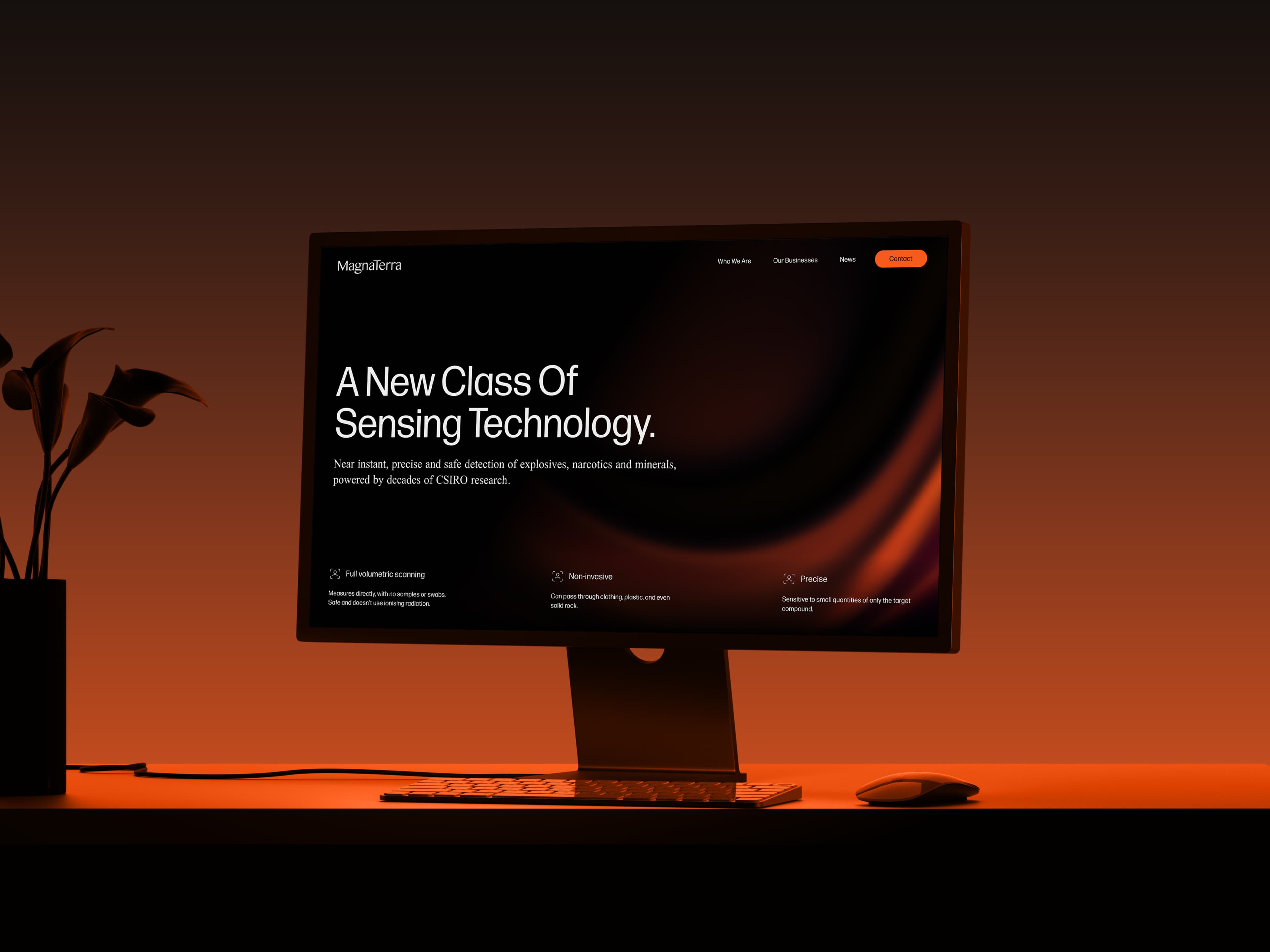
A specialist buyer checks. An overstated claim gets tested by someone who reads the trial data, which puts a ceiling on what the brand can promise and moves the work onto evidence. MagnaTerra’s own site opens on the class of sensing technology and lists three properties of the sensor: full volumetric scanning, non-invasive, precise. Each of those is something the sensor either does or does not do.
The invisibility is the harder half, and it is a design problem before it is a strategy one. Radio-frequency sensing gives a camera almost nothing to point at, which is the next answer.
Enough for somebody who has never met you to build something correct without asking. That means the artwork rules and the thinking behind them.
MagnaTerra’s guidelines run 45 pages, delivered in May 2026 at 1920 by 1080 for reading on screen. They cover the symbol and its construction, clearspace set at the full width of the symbol on all four sides, and minimum sizes down to 15 pixels for the symbol and 100 for the horizontal lockup. Then the palette with its proportions and twelve approved pairings, the typography with line height running 120 to 140 per cent on body copy and 95 to 105 on headings, the five gradient treatments, the three devices built on the logo’s 17.6 degree angle, and the collateral: business card, letterhead, internal report, presentation and digital communications.
The thinking is the part worth arguing for. A vendor who knows the three pillars stand for the three companies in the group has a reason to keep them equal. Given only the artwork, they have a shape. Later versions of a guide are where photography direction, motion, iconography and interface components get added.
Mude, a strategic brand and creative agency in Sydney and Canberra. The engagement covered brand discovery and strategy, the visual identity, the brand guidelines, and website design and development.
The identity and the first MagnaTerra website were built before the merged group launched publicly in July 2025. The identity was codified into a 45-page guide delivered in May 2026, and the MagnaTerra and NextOre sites were rebuilt on it across 2026, with NextOre carrying Spanish alongside English for its Latin American work.
Mude had also worked inside the group before the parent existed, running NextOre’s brand strategy, identity and website in 2024 across three workshop phases plus an identity workshop and a website discovery. That produced NextOre’s positioning, purpose and vision, four values and a three-pillar messaging structure. By the time the parent came along, the science was familiar and so were the mining audiences.
The same family of physics as a hospital MRI, with the giant magnet taken out.
A sensor fires pulses of radio waves tuned to the frequency at which one particular substance resonates. That substance answers with a faint radio signal called a spin echo, and the size of the echo says how much of it is there. Because the measurement reads the substance itself, it infers nothing from shape, size, density or metal content, and it reads the whole volume passing through the sensor.
Taking the magnet out is what made it usable on a mine site, and it is also the current frontier. Lithium needs the magnet back, so the CSIRO team is working out how to put a large electromagnet into a processing plant.
Two decades went into it for reasons of physics and of funding. The process runs at 50 to 100 kilowatts of pulsed power and then listens for a very small signal coming back, which real-world radio noise interferes with, and CSIRO worked the problem in short funded bursts across twenty years. The sensors that came out are around a thousand times larger than anything built for the technique before, which is the figure MagnaTerra’s CTO gives for the scale jump.
If the parent has jobs the division sites cannot do, yes.
MagnaTerra’s own site is the test. It routes people to the two divisions through an Our Businesses section, carries a history page, a team page and a news feed, and shows the group’s partners: CSIRO, Worley, Minelab, Gebr. Pfeiffer, RFC and The HALO Trust.
The history page is the clearest case for a separate site. It runs the two-decade CSIRO research story as one narrative covering the work that produced both divisions, which is the diversification argument the investor audience came for, and it is a piece of content neither division could publish about itself. On nextore.com.au it would sit in front of a mining buyer who arrived to read about ore sorting.
Where a parent has none of that to carry, a page on one of the division sites will hold.