
Nescii
Crafting a cosmetic accessories brand identity that believes in life’s little must-haves
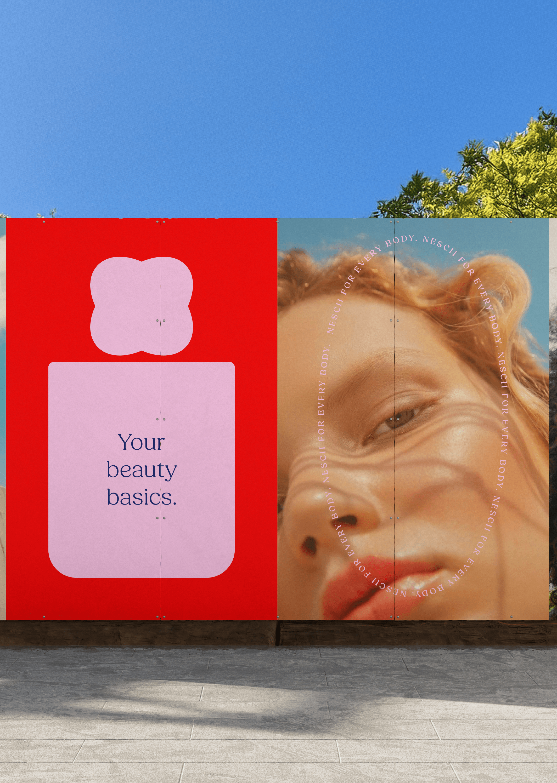
Nescii was a brand built for the things you reach for that you can’t live without.
The little tools that make the routine work. The name itself comes from “the necessities” and that specific feeling of “I can’t live without my eyelash curler”. It’s the essentials, framed with a bit of attitude. Our task was to shape how Nescii shows up visually and verbally, and give form to a brand built around function, familiarity, and modern usefulness.
That idea shaped the brand’s posture. Nescii doesn’t show up like a clinical aisle of “beauty tools”, and it doesn’t lean into the usual ultra-feminine packaging codes either. It’s confident, playful, and modern. It feels like it belongs in real life: on a bathroom shelf, in a makeup bag, in a carry-on, in a gym kit. The tone stays direct and easy without the transformation promises. Nescii is for the tools that do their job and look good doing it.

Nescii is a cosmetic accessories brand: the small tools that make a beauty or grooming routine work, like nail files, scissors, tweezers, travel bottles and makeup bags. The name comes from “necessities”: the things you reach for without thinking and notice straight away when they are missing. Mude was brought in before launch to build the brand, both how it looks and how it sounds.
The cosmetic accessories category is crowded but disjointed. Plenty of brands sell the products, but no single brand pulls them together, and a lot of the range is generic. Nescii wanted to be the brand that joins it up, starting with nails and adding categories over time.
It also had two things it wanted to get right. It wanted to feel affordable without reading as cheap. And it wanted to stand out in a category that mostly defaults to one of two looks: the clinical, white pharmacy aisle, or the ultra-feminine packaging that has become shorthand for beauty. Nescii wanted to look like neither.
Look and tone
The identity Mude built reads as confident, playful and modern. It is made to look at home in real life — on a bathroom shelf, in a makeup bag, in a carry-on, in a gym kit — rather than in a beauty cabinet. The tone of voice is direct and easy. It avoids the big promises the beauty category tends to make about changing how you look, and talks about the products plainly: useful tools that are good at their job. Mude shaped the verbal identity alongside the visual one, so the brand sounds the same wherever it appears, from packaging to social to the website.
The product range
The range is deliberately narrow: cosmetic accessories only, no cosmetics and nothing ingestible. It starts with nails (files, oil, glue and tabs, scissors), then extends into travel (bottles, toothbrush covers, makeup bags, brush holders) and body care (exfoliating gloves, tweezers and similar tools).
Because the plan is to keep adding categories, Mude built Nescii as a single masterbrand: one name and one identity across every product, instead of a set of separate brands. As the range grows, each new product adds to the same brand and the same recognition. In a category this disjointed, building recognition in one place is worth more than scattering it across sub-brands.

Retail
Retail shaped the design. Nescii needs to work on very different shelves: a busy, price-led pharmacy aisle in Chemist Warehouse or Priceline, smaller boutique pharmacies, and the calmer, quality-led shelves of David Jones or Myer. Those shelves ask for different things, and designing for one can work against the other.
Mude designed one set of packaging to handle both: it stands out on a crowded pharmacy shelf and still holds up next to established names in a department store. The aim was packaging that looks well made at the price, so a shopper trusts it on sight and buys it again.
Mude delivered the strategy and identity, the visual and verbal system, packaging, and the work to launch it: outdoor advertising, posters and product photography. Nescii starts with nails, and the rest of the range is built to follow under the same brand.


The product strategy stays tight: cosmetic accessories only. No cosmetics, nothing ingestible. The launch range starts with nails (files, nail oil, glue and tabs, nail scissors), then expands into travel (bottles, toothbrush covers, makeup bags, brush holders), and body care (exfoliating gloves, tweezers and related tools). The system was designed to scale across categories as one masterbrand, so as the range grows, recognition compounds instead of splintering.

Related Projects
View Project

Brand
Skyline
View Project

Brand, Website
Sunstrata
View Project

Brand
Full Proof
View Project
Brand, Graphic Design
ByAsia Food
Pentawards 2023 Shortlist
1View Project

Brand, Video
Mood on the Roof
Webby Awards Nominee
2View Project

Brand, Website
NextOre
View Project

Brand, Graphic Design
Capital Athletics
View Project

Brand, Graphic Design
Sun Baby
Frequently Asked Questions
The necessities, with a bit of attitude
Cosmetic accessories are the tools and small everyday items that make a beauty or grooming routine work, as distinct from cosmetics themselves. Think nail files, nail scissors, tweezers, exfoliating gloves, travel bottles, toothbrush covers, brush holders and makeup bags. They are the things you reach for without thinking, and notice immediately when you do not have them.
The difference between cosmetic accessories and cosmetics is simple: an accessory is the tool, case or implement you use in a routine, while a cosmetic is the product you apply or consume. A cosmetic accessories brand sits next to the beauty category. The buyer is weighing usefulness and quality in the hand, not a formula or an ingredient list.
Nescii is built specifically as a cosmetic accessories brand. Mude shaped its brand identity around that focus, with a launch range across nails (files, oil, scissors, glue and tabs), travel (bottles, covers, makeup bags, brush holders) and body care (exfoliating gloves, tweezers and related tools). The product strategy stays deliberately tight: cosmetic accessories only, no cosmetics, nothing ingestible.
A masterbrand, sometimes called a branded house, puts every product under a single name and identity, so each new line adds to the same pool of recognition. The alternative in brand architecture is a house of brands, where each product range is a separate brand with its own name and has to earn attention from scratch. For a company launching across several categories at once, that second route splits budget and slows recognition, because the buyer has to learn each brand independently.
Nescii was built as one masterbrand for exactly this reason. The range spans nails, travel and body care, which are different products with different uses. Mude designed the brand architecture so they read as one brand. As the range grows, recognition compounds: a shopper who trusts the nail tools already half-trusts the travel range, because the brand carrying both is the same.
The masterbrand structure is a deliberate choice. Nescii is designed to expand into new cosmetic accessory categories over time, and the branded-house approach means each addition strengthens the whole.
Brand tone of voice is the consistent way a brand sounds in words: its vocabulary, rhythm and attitude, separate from how it looks. Verbal identity is the wide system that tone of voice sits inside, covering the language a brand uses everywhere, from packaging copy to social posts to the line on the website. Two brands can sell the same thing and feel completely different on the page, and that difference is tone.
Defining a brand tone of voice means deciding what the brand sounds like and, just as usefully, what it refuses to sound like. The second half is where most of the work is, because a tone of voice is sharpest when it rules things out.
Nescii is a clear example. Mude shaped how it shows up verbally as well as visually, landing on a brand voice that is direct, easy and confident, and that deliberately avoids the transformation promises the beauty category reaches for. Without promising to change your life, Nescii says plainly that these are the tools you reach for and that they are good. That refusal to over-promise is the tone of voice doing its job, and it makes Nescii sound like itself across everything it says.
Keeping brand consistency across a growing product range is a systems problem. The answer is a brand system: a set of identity elements that repeat across every product so a new line looks like a member of the same family without being a carbon copy of the last one. Get the brand system right and you can add products for years without the brand drifting.
The balance is consistency against distinction. Too much sameness and the range becomes a wall of identical packs a shopper cannot navigate; too little and it stops reading as one brand at all. A working brand system holds the recognisable parts steady while letting each product flex enough to be told apart on a shelf.
Nescii was designed with that scaling in mind from the start. Mude built the brand identity as a masterbrand system, so it carries cleanly across nails, travel and body care, and so each new category strengthens recognition. As the range grows, the shared system does the work, and a shopper reads the whole lineup as one brand, which lets Nescii keep adding cosmetic accessory categories without rebuilding its identity each time.
Most brand names are built through one of four methods. Functional names describe what a product does and are quick to grasp. They tend to read as the least distinctive of the naming approaches. Invented names are coined from scratch or conjoined from word fragments, which makes them highly ownable. Suggestive names evoke a product’s experience or market position without stating it outright, and metaphorical names borrow the qualities of an unrelated thing. Mude works across all four, choosing the method that suits how far the brand needs to stretch.
A name then has to pass a set of practical tests before it earns its place. It should be distinct enough to stand out in a sentence as well as on a shelf, short enough to stay intact when people shorten it, easy to spell and satisfying to say, open to graphics and storytelling later, and defensible as a trademark with a usable web address. Nescii, a cosmetic accessories brand Mude named and built, is a coined name contracted from “the necessities”, the small daily reliance captured by a thought like “I can’t live without my eyelash curler”. It is short, easy to say, and carries an idea the rest of the identity can draw out. As a brand naming agency, Mude treats naming as the first strategic decision of a brand, settled before the visual work begins.
A brand name does not need a meaning or a backstory to work. A meaning earns its keep when the rest of the identity can draw something out of it. Plenty of strong names are arbitrary, borrowing a familiar word that has nothing to do with the product, or invented outright, and they become meaningful through use over time. What matters is whether the name is distinctive, easy to say and able to carry a brand over time.
When a name does carry an idea, that idea is most useful if it points at the brand’s position, with no need for trivia only the founders know. Nescii, a cosmetic accessories brand Mude named and built, is contracted from “the necessities”, and the meaning does real work: it frames the products as daily essentials and feeds the brand’s confident, slightly playful posture. A backstory that never surfaces in the identity tends to add little, since customers rarely learn it and the name has to stand on its own at the shelf. The test Mude applies is whether the meaning shapes how the brand looks and sounds, or stays a story only the founders tell.
A product range scales best when one distinctive masterbrand carries the recognition and the individual products sit beneath it in plain, functional language. Functional names are the most descriptive and least differentiated kind, which is exactly what makes them useful for the items under a strong parent: they explain what each product is while the masterbrand does the brand work. Nescii, a cosmetic accessories brand built by Mude, was designed this way from the start. The launch range opens with nails (files, nail oil, glue and tabs, nail scissors), then extends into travel (bottles, toothbrush covers, makeup bags, brush holders) and body care (exfoliating gloves, tweezers and related tools), with the Nescii name holding it together.
Naming the products plainly means recognition compounds as the range grows, with no splintering into disconnected sub-names that each need their own budget. The approach has limits worth stating: a strong masterbrand makes it hard to give any single product its own personality, and ranges that span very different categories sometimes need sub-brands to keep the shelf clear. Nescii avoids that because every product answers to the same idea of a daily essential, so the range stays coherent as it widens. That structure lets Nescii expand without the brand losing its shape.
A brand’s tone of voice shows up on packaging in the small decisions: the product names, the line on the front, the copy on the back, and what the brand chooses not to say. Nescii, a cosmetic accessories brand built by Mude, carries its direct, easy tone onto packaging by describing products plainly and skipping the claims most beauty packs lean on.
Where a typical beauty-tool pack might promise an outcome, Nescii names the tool and lets the usefulness speak, which keeps the voice consistent between what the brand says online and what it says on shelf. Packaging copy has constraints that website copy does not, since there is limited space, regulatory wording to fit and only a few seconds to be read, so the voice has to survive heavy compression. That compression is exactly why a clear voice matters, because a brand without one tends to fill the space with generic claims. Nescii’s restraint suits a range of everyday essentials. A more expressive category might justify louder packaging copy. As a packaging design agency, Mude writes the packaging language as part of the verbal identity work, at the same time as the design itself.
Standing out on a crowded retail shelf comes down to a few seconds of attention and a clear break from whatever the category around you is doing. Shoppers make most purchase decisions in seconds, so a product has to be legible at a glance, easy to navigate within its range, and visually distinct from its neighbours.
Nescii, a cosmetic accessories brand Mude created, was designed for bold shelf presence and easy navigation, with quality cues that feel earned. In a beauty-tools aisle full of similar packaging codes, Nescii’s confident, modern posture is the break that helps it register before a shopper has read a single word. Shelf standout depends on design and on placement, range-review requirements and the products beside you. Strong design in a poor position still struggles. What design can control is the moment of recognition, which is why distinctiveness does the work over decoration. On a busy shelf that moment is most of the battle, and Nescii’s system was built to win it quickly.
Brand identity earns repeat purchases by making a product easy to recognise, easy to trust and worth returning to, so the second purchase takes minimal thought. For everyday products, loyalty is built less on emotional storytelling and more on consistent quality and a brand a customer can find again without effort.
Nescii, a cosmetic accessories brand Mude built, is designed around exactly this: useful tools, a recognisable masterbrand across the range, and a quality level that turns a one-off purchase into a habit, the kind of thing someone buys once and then treats as non-negotiable. A consistent identity across nails, travel and body care means a satisfied customer can reach for the next Nescii product with the same confidence. Identity alone will not sustain loyalty if the product disappoints, since people stop repurchasing things that let them down regardless of how good the branding is. Nescii’s repeat-purchase logic rests on the products being genuinely useful, with the brand making them easy to find and easy to trust again. Mude builds identities designed to support repeat purchases over time.
Cosmetic accessories sit at the edge of FMCG, or fast-moving consumer goods, since they are low-cost, bought often and sold through the same supermarket and pharmacy channels, even if an eyelash curler or nail file lasts well beyond a typical fast-moving product. For branding purposes they are usually treated as FMCG, because they compete on shelf, move on price and impulse, and rely on packaging to do much of the selling.
Nescii, a cosmetic accessories brand Mude developed, was built with that reality in mind, which is why its FMCG branding leans on bold shelf presence, easy navigation and quality cues that feel earned. The distinction matters because FMCG brand identity has to work in seconds and survive heavy price competition, while a considered-purchase brand can rely on time and research instead. Some cosmetic accessories, such as premium tools, behave like considered purchases and can carry a premium approach. For an affordable, genuinely useful range like Nescii, the FMCG logic holds: the brand has to win attention on shelf, earn the first purchase and make the next one easy. Mude approaches cosmetic accessories as an FMCG brand identity problem first, then a beauty one.
Most beauty and grooming brands reach for one of two looks: the clinical pharmacy aisle, all white and sterile, or the ultra-feminine packaging codes that have become shorthand for the category. Differentiating a brand from those codes starts with naming them and then deciding not to use them, which is challenging because the codes feel safe and expected.
Nescii is positioned to do neither. Mude gave it a brand positioning and posture that read as confident, playful and modern, a beauty brand that looks like it belongs in real life. The tone stays direct and easy, and deliberately avoids the transformation promises the category leans on. The idea is simple and more honest: these are tools that do their job and look good doing it.
The payoff of refusing the category codes is brand differentiation that holds. In a space where most options signal either hospital or boudoir, a confident and useful posture sets the brand apart, and the packaging design carries that difference across every product in the range.
Selling through very different retailers pulls a brand’s packaging in two directions at once. A pharmacy aisle in an Australian chain like Chemist Warehouse or Priceline is busy and price-led, so the packaging design has to be bold enough to stand out on the shelf at a glance. A department store like David Jones or Myer is calmer and quality-led, so the same packaging has to hold its own next to premium names without looking out of place. Designing for one usually works against the other.
Nescii was built to do both. Mude gave it bold shelf presence so it stands out in a crowded pharmacy, easy navigation so a shopper can move through the range quickly, and quality cues that feel earned. Retail-ready packaging that works across mass and premium channels is one identity doing the job that usually takes two.
The constraint turned into an advantage. A brand whose packaging survives the pharmacy shelf and still belongs in a department store has a wide runway than one built for a single channel, and it can grow its range without redesigning for each new retailer.
Affordability and quality are not opposites. A low price does make a buyer cautious, so an affordable brand has to work hard to look and feel high quality. Most of that work is in the cues: the design, the finish, the consistency across a range, the way the brand presents itself on a shelf. Those quality signals shape perceived quality, telling a shopper what to expect before they have used the product, and they can lift an affordable item well above its price or sink it.
The catch is that the quality cues have to feel earned. A brand that borrows premium signals it has not backed up reads as a costume, and shoppers are quick to spot it. The cues only convince when the product behind them holds up.
Nescii is positioned exactly here: affordable, high-quality and properly useful. Mude built quality cues that feel earned. The aim is the kind of product a shopper buys once, then starts treating as non-negotiable, which is where an affordable brand earns repeat purchases and a reason to expand the range.
Nescii makes cosmetic accessories and nothing else: no cosmetics, nothing ingestible. That focus is a deliberate brand strategy. A focused product range is easy for a shopper to understand and to trust, and it is far simple to scale, because every new product reinforces the same idea.
The discipline also keeps the brand credible. The moment an accessories brand starts selling cosmetics, it is in a different category, with its own regulation and its own kind of buyer trust to earn. Staying in cosmetic accessories lets Nescii own one clear lane and be known for doing it well.
Mude built the brand identity around that focus on purpose. The launch range moves across nails, travel and body care, all of them tools. The narrow definition makes the growth coherent: each new line is recognisably the next Nescii thing, not a detour.
Descriptive and abstract names sit at two ends of a wide naming spectrum that also takes in invented, suggestive and metaphorical approaches. Descriptive names explain the offer at once. They are clear, hard to protect and easy for competitors to echo. Abstract and invented names are highly ownable and distinctive. They need time and marketing before they mean anything to a customer. Suggestive names land between the two, hinting at a product’s experience or position while still reading as a real word.
Nescii, the cosmetic accessories brand Mude developed, is a coined name that works suggestively. Contracted from “the necessities”, it points at the category and the feeling without naming either, so it carries a point of view in place of a description. A name like this suits a brand that intends to scale across products, because it describes a posture and leaves room to grow. The cost is that it asks a little more of the customer on first contact, and some shoppers will not catch the “necessities” reference at all. For Nescii the trade was worth making, since the range expands from nails into travel and body care, and a literal product name would have boxed it in. The right type of name follows from how far the brand has to travel.
Checking whether a brand name is usable in Australia runs across three separate searches that each catch a different problem. A trademark search of IP Australia’s register shows whether the name, or something confusingly similar, is already protected in the relevant class of goods. A business name and company search through ASIC shows whether the name is already registered for trading. A domain and handle search shows whether a usable web address and social accounts are still free. A name can clear one of these and fail another, which is why all three matter before a name is locked in.
How easily a name clears these searches depends partly on the type of name it is. Descriptive names are difficult to protect, because words that simply describe a product are difficult to claim as anyone’s property. Coined and invented names tend to register and own cleanly. Nescii, a cosmetic accessories brand Mude named and built, is a coined contraction of “the necessities”, and that invented quality helps it stand as a distinct, ownable mark, separate from the common terms competitors could also use. None of this is legal advice, and a brand should confirm availability and registration with a trademark attorney before committing. As a naming agency, Mude factors defensibility into naming from the start, so a shortlisted name is checked for ownership before it is recommended.
Brand voice is the consistent personality a brand expresses in language, while tone is how that voice flexes to suit the moment, so the voice stays the same while the tone shifts between a product label and a reply to a complaint. Nescii, a cosmetic accessories brand Mude shaped both visually and verbally, has a voice that is direct, easy and quietly confident, and that voice holds whether the words appear on packaging, in a product name or across social.
The tone can move around inside that, warm on a gift bag, plainer on the back of a nail-oil bottle, while a reader should still recognise the same brand talking. Nescii’s voice deliberately leaves out transformation promises and beauty-industry hyperbole, a verbal-identity decision that also lands as positioning. The distinction matters because brands that confuse the two often end up sounding like different companies across channels, which slowly erodes recognition. A useful test is whether someone could identify the brand from a single sentence with the logo removed. Mude builds voice and tone together so a brand sounds like one coherent thing wherever it speaks.
A useful brief for a cosmetics brand identity covers four things before any design starts: the brand personality, the price point, the distribution channels and the target customer. Each one constrains the design in a real way, so a brief that skips them tends to produce work that looks fine on screen and fails on shelf.
Nescii, a cosmetic accessories brand Mude developed, shows how the four inputs shape the outcome. The personality is confident and playful, the price point is affordable with quality cues that feel earned, the distribution spans mass and premium retail, and the customer is someone buying genuinely useful daily tools. Those constraints, especially the spread of retail channels, pushed the identity toward a bold clarity that holds up in very different environments. A brief can include more, such as competitive reference points and tone-of-voice notes, and leaving room for the designer to interpret usually beats over-specifying the visuals. What a brief should not do is jump straight to logos and colours before the strategic inputs are settled. The four inputs give the design a clear problem to solve before anyone draws a thing.
Competing with private-label products in supermarkets and pharmacies usually means giving shoppers a reason to choose a named brand over the cheap own-brand version sitting right beside it. Private labels win on price and placement, so a branded product has to win on something the shopper can feel: a clearer sense of quality, a strong identity, or a product that earns repeat purchase.
Nescii, a cosmetic accessories brand Mude built, sells in pharmacy and retail environments where own-brand tools are common, and its answer is quality cues that feel earned and a product good enough that people buy it once and then treat it as non-negotiable. A confident, distinctive brand changes the comparison, because the choice stops being only about price. This is hard in categories where shoppers treat tools as interchangeable commodities, and no amount of branding will rescue a product that does not actually work or feel better to own. Nescii’s position depends on the products being genuinely useful first, with the brand making that usefulness easy to recognise. Mude builds brands that give shoppers a reason to pay a little more without feeling overcharged.
Brand strategy comes before visual identity, because the strategy decides what the identity has to express, and design without that foundation tends to be decoration that looks good and says little. Strategy covers the positioning, the audience, the name and the promise, while identity is how those decisions are made visible and verbal.
Nescii, a cosmetic accessories brand Mude built, shows the order in practice. The idea of essentials framed with attitude, the decision to avoid clinical and ultra-feminine codes, and the masterbrand structure were settled first, and the visual and verbal identity then expressed them. Doing it this way gave the design a clear job, which let Nescii hold a consistent posture across very different retail environments. The two are not fully separate in practice, since designers often surface strategic questions that change the thinking, and good projects loop between them. What rarely works is starting with a logo and reverse-engineering a strategy to justify it. Mude runs strategy first, then lets the identity carry it into the world.