
The Embassy of France in Australia
SacreBleu – Building the French news cultural hub web experience
Bridging the gap between France and Australia with the
We partnered with the Department of Culture, Education, and Science to create a cultural hub for French news in Australia. Our collaboration enhanced the online presence and communication of the Embassy, by designing and developing an informational website experience that serves as a bridge between France and Australia. Our creative approach to website design aligned with the Embassy’s strategic objectives, ensuring an impactful online presence.


Related Projects
View Project

Brand, Website
Sunstrata
View Project
Video
Amazon Music
Webby Awards Nominee
1View Project

Brand, Website
NextOre
View Project
Brand
Rosella St
View Project
Video
Sport Integrity Australia
View Project
Brand, Video
Department of Education, Skills and Employment
View Project
Brand
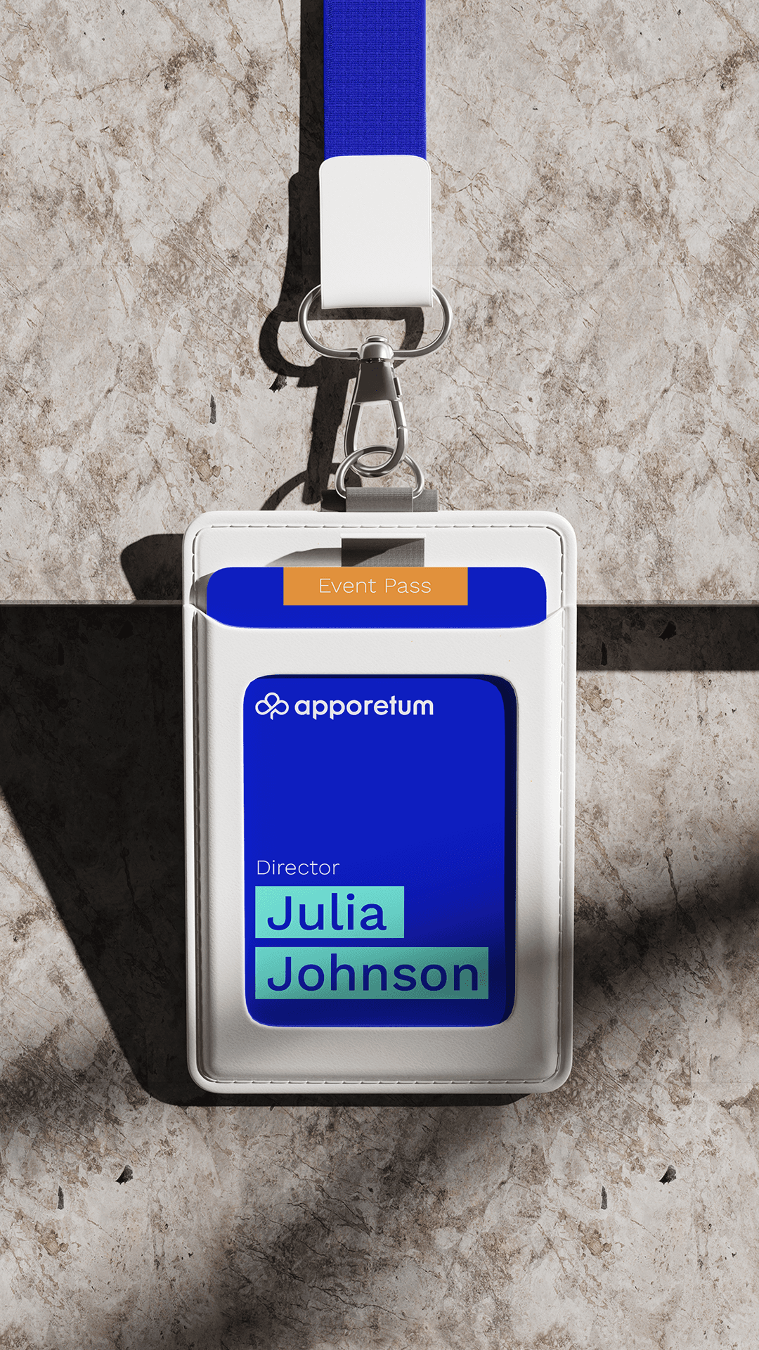
Apporetum
View Project
Video
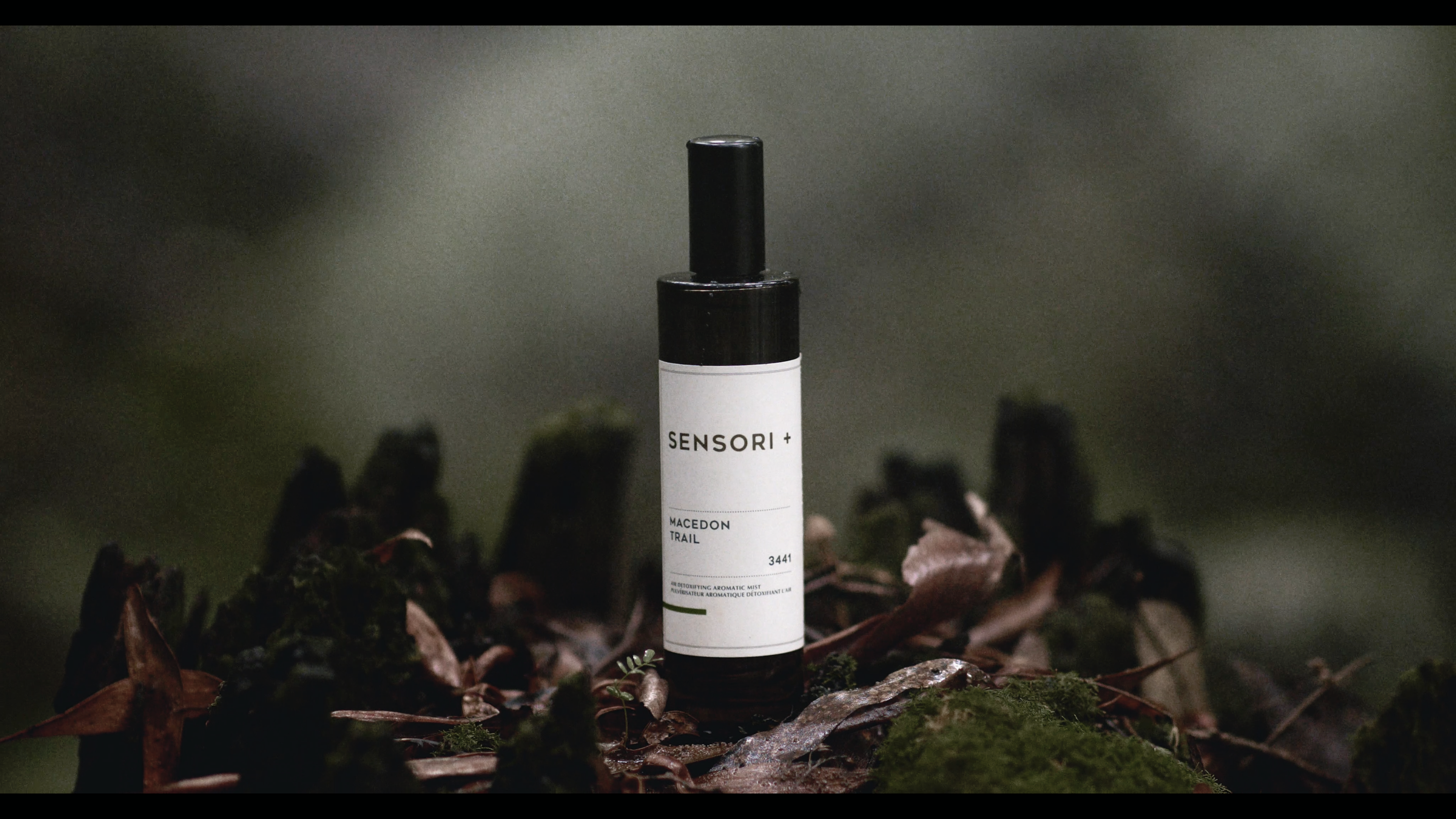
Sensori+
Frequently Asked Questions
You were going to ask anyway
Sacrebleu was a French news and culture publication built by Mude for the French Embassy in Australia. As a magazine-style editorial website and a news-and-events platform in one, the site combined a digital publication and an editorial CMS, covering tech, arts, lifestyle and language across four editorial sections, with a separate events stream sitting alongside the editorial.
The Embassy’s editorial team ran it day-to-day on a custom WordPress build, publishing articles, contributor profiles and events through structured forms. The home page worked as an editorial cover, the four sections each behaved like their own small magazine, and the events stream sat alongside the editorial as a separate content type with its own template and fields.
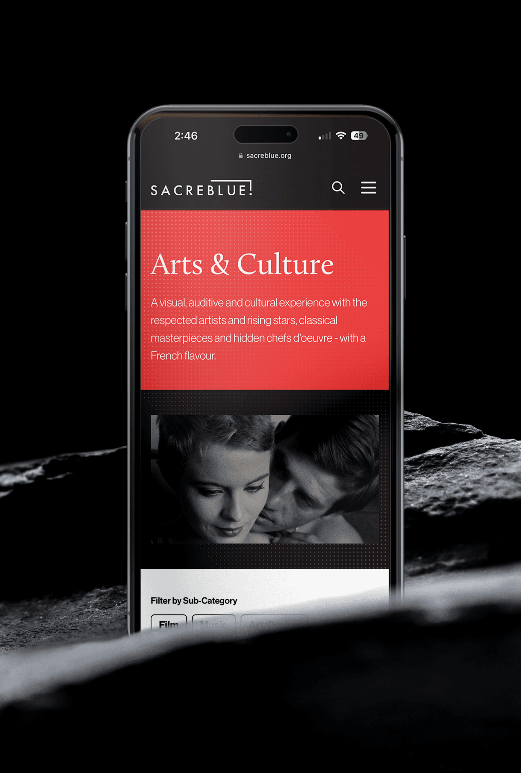
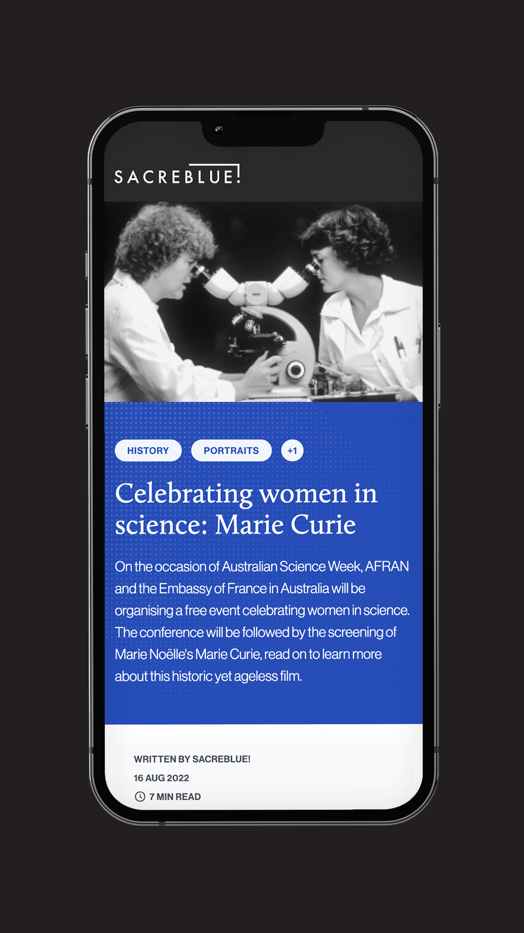
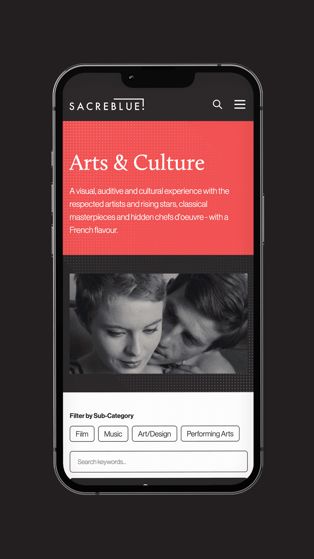
Sacrebleu had four editorial sections plus a separate events stream. Shape the Future covered emerging tech and ideas. Arts covered portraits and culture. So Trendy covered lifestyle. Excuse my French! covered the language itself.
Sitting alongside the four editorial sections was Rendez-Vous, a separate post type for events with its own fields for location, time, type and category. Each editorial section had its own internal filter set as well (Innovation, Technologies, Science, Portraits, Disruptive Thinking and so on), so a reader inside Shape the Future could narrow to the science writing without leaving the section they came for.
A single feed treats every article as the same content type. That works for a daily newspaper publishing one stream of content. It works less well for a publication that mixes science writing, artist portraits, lifestyle features and language explainers, where the readerships rarely overlap completely.
Splitting Sacrebleu’s content into Shape the Future, Arts, So Trendy and Excuse my French! meant a reader who came for the science writing could stay in that lane without scrolling past everything else. Each section then carried its own internal filter set, so a reader could narrow further (Innovation, Technologies, Science inside Shape the Future, for example) without leaving the section they came in for.
Sacrebleu ran on WordPress with a custom component system. The editorial team added posts, contributors and events through structured forms with predictable fields, which kept the home page and category cards readable as new content went up.
Page builders like Elementor and WPBakery give editorial teams enough freedom to break the design system within the first few months of publishing, mostly through accidental inline styles and one-off layouts that drift away from the template. A custom component system traded per-article flexibility for consistency, which is the trade-off most WordPress publication builds need to make if they want the publication to keep reading like one a year in.
Four integrations earned their place. A Spotify player hovered in the corner so a reader could have a playlist running while they moved through the site. An Instagram feed embedded on the home page pulled in live posts. The newsletter signup wrote straight to Mailchimp. An announcement bar at the top of the site could be switched on for time-sensitive event RSVPs and switched off again when the event was done.
Each integration had a defined editorial job. The Spotify player supported long reading sessions. The Instagram feed was a live editorial surface for Embassy content posted natively to Instagram. The Mailchimp signup fed the Embassy’s subscriber list. The announcement bar handled events. Most publication sites accumulate integrations beyond what the editorial team can sustain. Sacrebleu was built with this short list and held to it.
The announcement bar sat at the top of the site and could be switched on for time-sensitive event RSVPs and switched off again once the event was done. The copy inside it was editable in the CMS, so the Embassy’s team could push an event across the whole publication in a minute and remove it cleanly when the event was over.
Editorial teams that don’t have a switchable announcement bar tend to either leave a stale banner up for weeks past the event, or rebuild the home page each time an event runs. Sacrebleu’s toggleable bar with editable copy removed both versions of the maintenance problem and kept the surface useful for ad-hoc RSVPs.
Two patterns account for most of it. The first is leaning on page builders like Elementor or WPBakery, which give editorial teams enough freedom to break the design system within the first few months of publishing. The second is under-engineering the category and taxonomy layer, so the filters that looked correct in the wireframe stop working once the site has a few hundred articles in it and the reader is trying to find something specific.
Sacrebleu used a custom component system to handle the first problem and structured filter sets per category to handle the second. Both decisions are the kind of unglamorous architectural work that a WordPress web design agency invoice usually hides behind the visual mockups, and both kept the publication usable as the Embassy’s editorial archive grew across the four sections and the Rendez-Vous events stream.
Yes. Sacrebleu, the French Embassy in Australia’s news and culture publication, is the case study on this page. Mood on the Roof, Mude’s own Sydney rooftop live-music platform, is another publication site Mude built and continues to run.
Mude is a Sydney-based brand and design studio with an in-house WordPress development practice. For publication and editorial work, the studio’s approach is custom WordPress development, with the editorial workflow, the information architecture and the visual design treated as the same brief. Content types, taxonomies, filter sets, excerpt fields and announcement surfaces get decided alongside the page templates.
The default at a generic website design agency in Sydney or Australia is to configure a WordPress theme around what the templates already do, then hand it to the editorial team to adapt to. Mude works the other way. The editorial team gets a publishing surface shaped around how they actually work, and WordPress developer involvement scales back to changes that genuinely need it.
Building a publication site like Sacrebleu involves four workstreams running in parallel.
- Editorial architecture: defining the post types, the categories, the per-category filter sets, and the taxonomy relationships between them.
- Editorial workflow design: shaping the CMS so the team can publish, schedule and edit content through structured forms without a developer in the loop for routine work.
- Visual and interaction design: how the home page reads as an editorial cover, how each section behaves, how an article lays out and how an event listing appears.
- Build and website development: the custom component system, the integrations (Spotify, Instagram, Mailchimp, the announcement bar), and the WordPress configuration that holds it all together.
For Sacrebleu, the four workstreams informed each other. The Rendez-Vous events post type came out of an editorial workflow conversation. The custom excerpt field was the answer to a card-design problem on the home page. The filter sets per category were structured around the way a reader inside Shape the Future would actually search for what they wanted. None of the structural decisions were taken in isolation from the others.
Yes. Mude handled the visual identity, the typography system, the colour palette, the article-template layouts, the home-page editorial cover, the section pages and the event-listing pages as part of the same build. The visual design and the editorial architecture were treated as one brief, which kept the home page reading as an editorial cover.
The visual layer wasn’t the challenging design problem on Sacrebleu. The hard work sat in the architecture: deciding that the four editorial sections each needed their own internal filter set, that events needed their own post type, and that the home-page card design depended on a dedicated excerpt field on every post. The visual identity supported those decisions through type, layout and colour.
Sacrebleu was built for the French Embassy in Australia and its in-house editorial team. The audience was English-speaking Australians with an interest in French tech, arts, lifestyle and language, plus the French community in Australia following Embassy programming and events.
The CMS was built around the editorial workflow the Embassy’s team already had. Posts, contributors, events and announcements all went through structured forms, so the team could publish, schedule and update content without developer involvement for routine work.
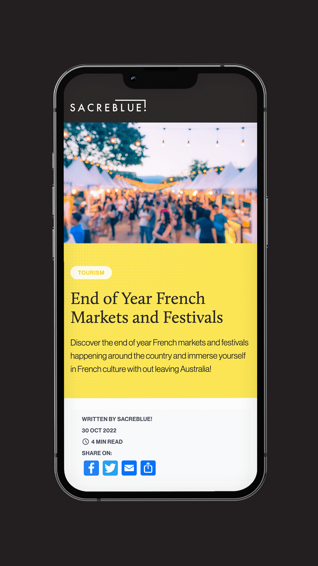
Rendez-Vous was the events stream on Sacrebleu, kept as a separate post type from the editorial articles. Events had their own structured fields for location, time, type and category, which meant they slotted into the site architecture without being forced into the article template.
The practical effect was that Rendez-Vous behaved like an events listing should (filterable by time and place, scannable, RSVP-friendly), while the four editorial sections kept their article-template layouts. The announcement bar at the top of the site could then push a specific event into view across the whole publication without crowding the article cards.
Events were handled as a separate post type called Rendez-Vous, with their own fields for location, time, type and category. They didn’t share the article template and they didn’t share the article taxonomy.
The alternative would have been forcing events into the article post type and bolting on date and venue fields with taxonomy workarounds, which is how WordPress publication sites often end up handling events when they get added late in the build. Treating events as a separate content type from the start kept the editorial layouts and the events listings readable in isolation, and gave the announcement bar a defined job for time-sensitive RSVPs.
The excerpt forms what the reader sees on the home page card and the category-page card, before they decide whether to click. Auto-generating it from the first thirty words of the article means the card reads in whatever way the article happens to open, which is rarely how the editor would write the tease deliberately.
Sacrebleu had a dedicated excerpt field on every post, so the cards on the home page and category pages read the way the editor wrote them, independent of how the article opened. The category pages stayed legible as the volume of articles in each section grew over time.
Because Sacrebleu was a culture publication, and listening to music is part of how readers engage with cultural content. The Spotify player hovered in the corner of the page so a reader could put a playlist on and keep it running while moving through articles.
The choice supported the kind of reading session the Embassy wanted Sacrebleu to enable, which extended past a single headline scan and read closer to how a reader treats a print culture magazine. The player itself was a small build, and the editorial decision behind it was the substantive part.
A web magazine is built around hierarchy. The home page is treated as an editorial cover, lead articles are chosen. A web news platform is built around recency, with a feed of uniform cards the reader scans for what’s new.
Sacrebleu needed both behaviours running on the same site. The home page worked as an editorial cover with deliberately chosen lead articles. The four editorial sections each behaved like their own small magazine, with internal filters that let a reader narrow within a section. The Rendez-Vous events stream behaved more like a news feed sitting alongside the editorial, with location, time and event type as its dominant fields.
Three structural decisions did most of the user-experience work for the Embassy’s editorial team. Structured forms for posts, contributors and events removed the freedom (and the risk) of free-form page builders. A dedicated excerpt field on every post meant the home page and category cards read the way the editor wrote them,. Category management lived in one place, so adding a new editorial filter didn’t require touching templates or filing a ticket.
The build was shaped around how the Embassy’s editorial team worked. Day-to-day publishing (articles, contributors, events, announcements) ran through the CMS. WordPress developer involvement was reserved for things that genuinely needed it.
A generic agency for web design in Sydney or Australia treats a publication as a configured WordPress theme. The categories, the post types, the taxonomy and the editorial workflow get decided after the visual design, usually by adapting whatever the chosen theme or page builder already does. The editorial team is then asked to work around the template.
Mude treats the editorial workflow and the visual design as the same brief from the start of a publication and editorial web design build. For Sacrebleu, the four editorial sections, the per-category filter sets, the Rendez-Vous events post type, the custom excerpt field and the announcement bar were all defined alongside the visual layer. The user experience for a reader scanning the home page and the user experience for an editor adding a Rendez-Vous event sat in the same set of design decisions.
The studio’s WordPress website design services for publication and editorial clients include the editorial architecture and the day-to-day workflow design alongside the visual identity and the build, which is the part most WordPress agencies in Sydney scope as a separate phase or skip altogether. The festival platform Mude built for Tamworth Regional Council is the same pattern applied to a council editorial team running 2,800-plus events on a single WordPress install.
Mude is a brand and design studio based in Sydney, Australia. The studio operates as a Sydney design studio and creative agency in one practice, covering brand strategy, brand identity, packaging, video and photography alongside the publication and editorial web design work that produced Sacrebleu for the French Embassy in Australia.
Within the web and digital side of the practice, Mude works with publication clients, embassies, cultural institutions and editorial publishers as a Sydney WordPress agency offering custom WordPress development and graphic design from one studio, with WordPress developers and editorial designers working in the same room. The studio is deliberately small, which means the editorial workflow design and the visual design are handled by the same people in the same room.
Mude builds publication and editorial websites for cultural institutions, embassies, editorial publishers and brand-led content publishers in Sydney, across Australia and internationally. Sacrebleu was built for the French Embassy in Australia. Mood on the Roof is Mude’s own Sydney rooftop live-music platform with its own editorial layer. The studio’s broad web design work covers FMCG brands, hospitality clients, video-led culture brands and reporting-led corporate clients.
The common pattern on publication and editorial briefs is a client who needs the editorial team to actually run the site day-to-day,. Mude is structured for that kind of brief, with the editorial workflow design and the web development sitting in the same practice.