
Full Proof
A sourdough doughnut brand identity built on chrome, craft, and zero confectionary clichés
An identity system for a doughnut venue that looks like a chrome kitchen, and refuses to use the colour pink.
Mude built the brand identity for Full Proof, a sourdough doughnut venue in Potts Point that had to read as a craft food business at 7am and a destination worth a trip at 9pm. The doughnut category runs on pastel and decoration, so we built Full Proof to the discipline of a kitchen rather than the personality of a doughnut. The doughnut is one of the most over-decorated products in food. Krispy Kreme, Donut King, the whole Doughnut Time wave that came through a few years back: pastel palettes, rounded friendly type, glaze and sprinkles shot like jewellery, the energy of something fun and cheap you grab on a whim and feel slightly guilty about.
Full Proof is a sourdough doughnut venue in Potts Point, Sydney. The founders came to us with a brand name built around the idea that their process was impervious to failure, a decade of hospitality experience, and a very clear sense of what they didn’t want to be: the pastel colours, decorative typography, and confectionary energy that the doughnut category defaults to. The brief was to build an identity for a venue that needed to work as a morning commute pitstop and an after-dinner destination in the same space, with the same brand, without either version feeling like a compromise.


The brief
Full Proof, founded by Indiarose Thomas and Jenifer Thomas, with a decade of hospitality experience across almost every role a venue has, landed on sourdough doughnuts because no one in Sydney was doing it. The site they were moving int was a former smash burger joint with a good fitout and allocated outdoor seating in a laneway.
The brief was to build a brand identity that could position Full Proof as a craft-led food venue that could be both the early morning commute pitstop before catching the train at Kings Cross, and the last stop in the evening when the group isn’t quite ready to go home yet (the alternative to classic option of the final pit stop after dinner/drinks being gelato).
The identity needed to support both of those moments, be distinctive enough to earn attention from the food media and influencer crowd whose coverage would drive early awareness, and scale to wholesale, catering, and eventually a second location with a centralised kitchen.

The founders had a very specific instinct about what they didn’t want to be. The doughnut category has a lot of pastel colours (especially pink), decorative typography, childlike energy, that classic confectionary posture. The brief originally was to build an identity that positioned them closer to the world of artisan bakeries and serious food venues than to the doughnut category’s existing visual language. Grown-up doughnuts needed a grown-up brand.
We gathered multiple inspiration territories during research and refined them into a few different directions. A “Jazz Bar” posture was originally the direction the founders pushed for the brand, as they very much envisioned old school soul music as part of the atmosphere, with warm tones, vinyl imagery, and a burgundy-and-amber palette.
We did present a concept for the “jazz bar” posture, but the direction the client landed on was “The Chemistry Chrome Bakery” concept, which was a monochromatic, precision-industrial posture, drawing from the stainless steel and chrome surfaces of a working kitchen.
The founders chose the chrome bakery look because it felt most congruent with the brand name they came to us with in the first place. Full Proof is built around the idea that the sourdough process is impervious to failure when it’s done properly, and the visual language needed to carry that same discipline rather than relying on the venue’s atmosphere as the primary identity.
The name carries a double meaning that shaped everything downstream. Proofing is the stage where sourdough rises, where patience and fermentation do the work that shortcuts can’t replicate. Then there’s the colloquial read of foolproof, the confidence that if the work behind the counter is uncompromising, a good product becomes inevitable. The chrome bakery direction was the one that honoured both meanings.
The precision-industrial palette, the hard-edged typography, the monochromatic look all carry that sense of a process that feels methodical. And the wireframe brand shape is derived from the cellular structure of proofed sourdough, that organic network of bubbles you see when you cut into a well-fermented loaf. The soul music and the moody atmosphere will still live in the venue experience, but the identity itself needed to be congruent with the broader brand concept of “full proof”.

At the Mudeboards stage the wordmark was set in a stock condensed face alongside Helvetica for the rest of the system. As we refined the identity, the wordmark moved into a customised cut of Tandelle, an ultra-condensed display face with tall vertical proportions.
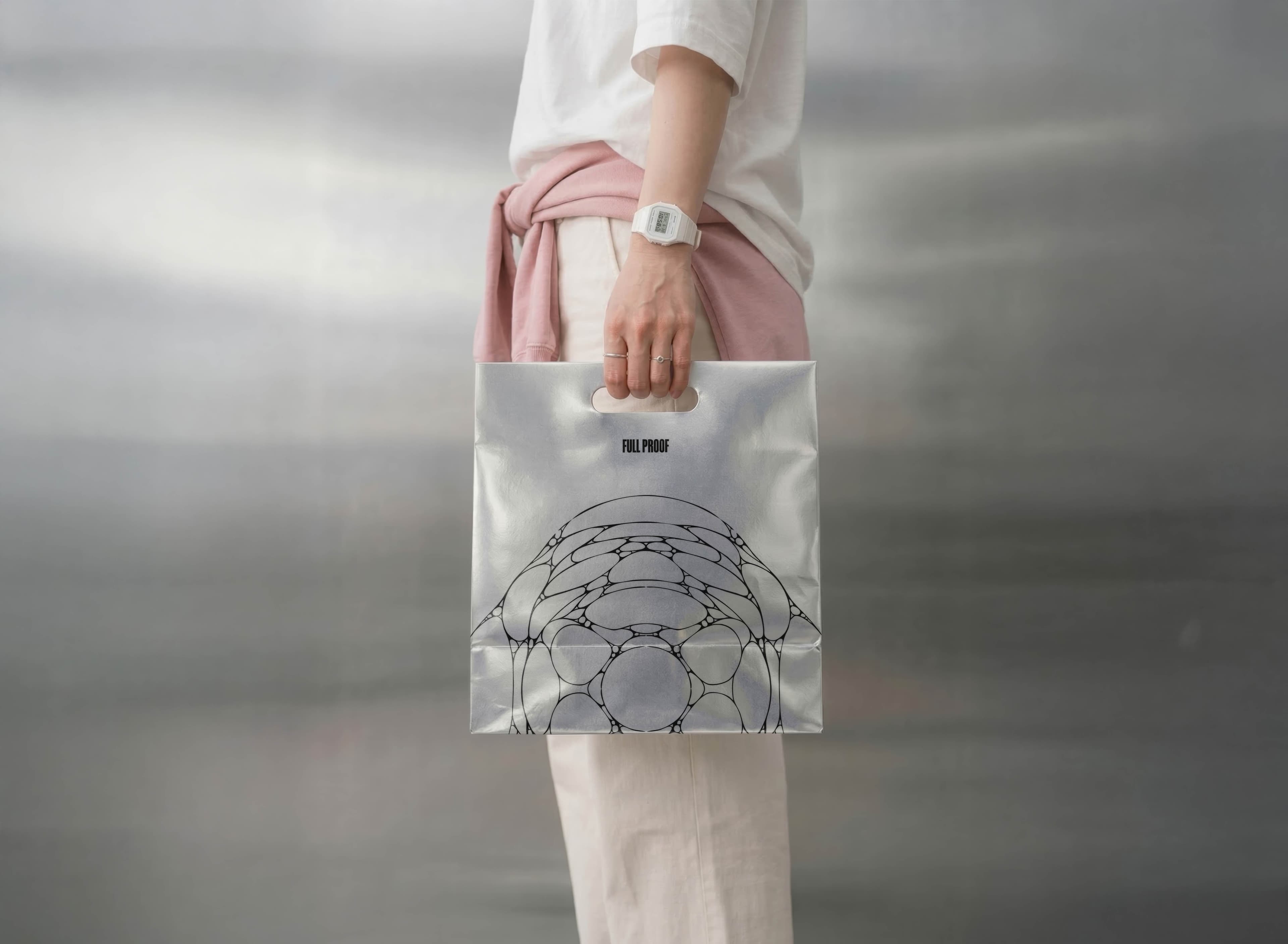
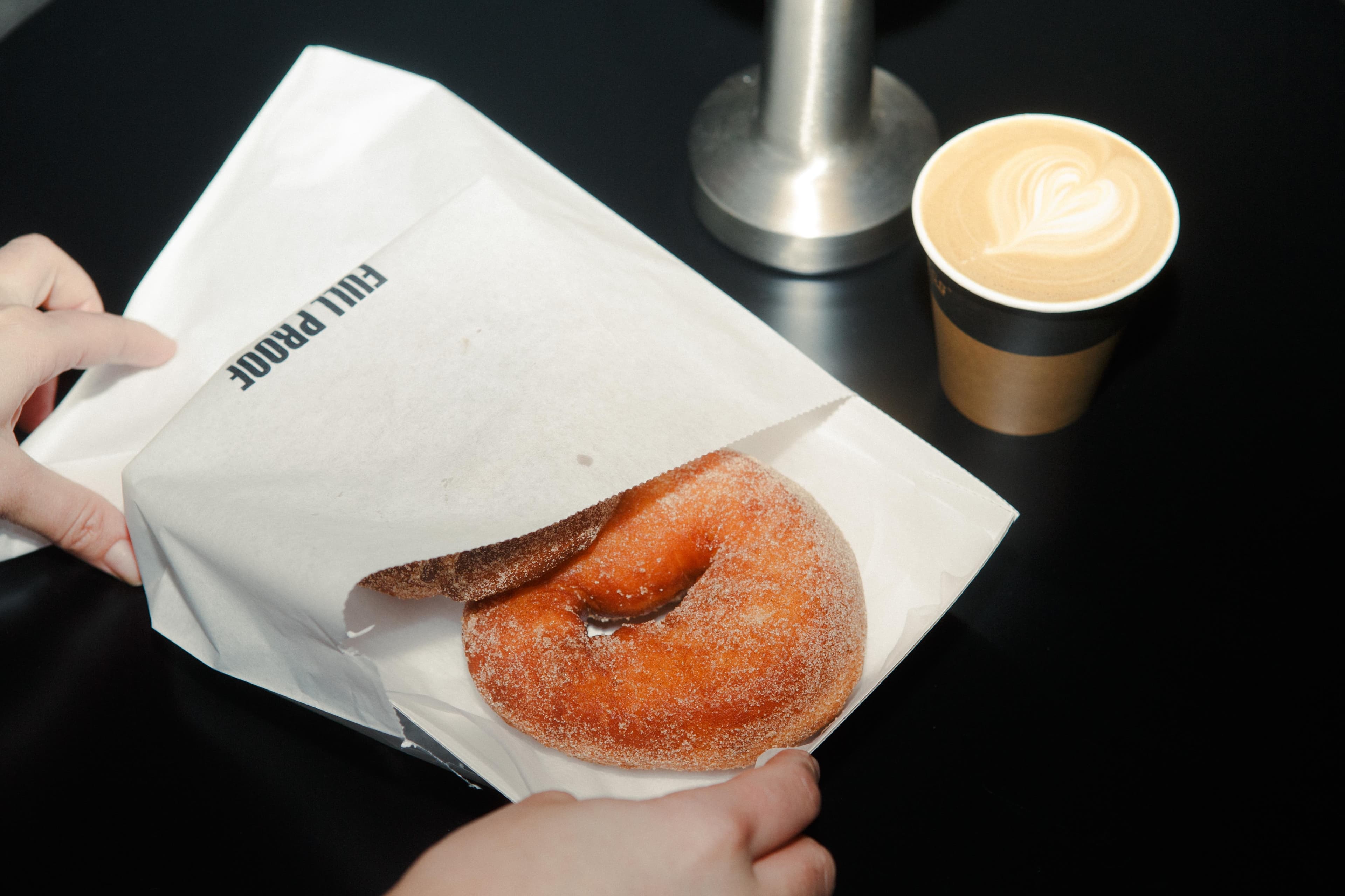
The original Tandelle letterforms carried softer, rounder terminals that leaned closer to the typeface’s natural character, so we replaced those curves with hard, angular diagonal shears to give the mark a more hard edge. The condensed width means it holds its presence at large scale on signage and posters while staying compact enough to work on menus, cups, and packaging.
The [FP] lettermark uses square brackets around the initials, which borrows from the technical notation and labelling language that runs through the rest of the identity system. It’s a small systemic detail, but it gives the abbreviated mark a reason to exist beyond just being initials.
Tandelle is the primary, used for headlines and display. It’s a condensed sans-serif with angular, vertical letterforms. Everything about Full Proof’s identity leans tall and upright, and Tandelle makes that structural decision most visible at headline scale.
Helvetica sits as the secondary for subheadlines and supporting copy. It was in the system from the Mudeboards stage and stayed because when the display type is doing that much work with its condensed proportions and industrial tone, the secondary needs to get out of the way and let readability take over.
Roboto Mono is the tertiary, used for eyebrows, labels, navigation, and body copy. The monospaced cadence gives running text a measured, technical quality that reinforces the sense of process and precision behind the product. The hierarchy loops from Roboto Mono at the eyebrow through Tandelle at headline scale, down to Helvetica for the subheadline, and back to Roboto Mono for body, which creates a rhythm that holds the system together across touchpoints.
The palette is monochromatic and is drawn from the material world of a working kitchen, the stainless steel and chrome and brushed metal surfaces where the chemistry of sourdough often happens. The broader doughnut category defaults to pink, pastels, and bright confectionary colours, and the nearest Sydney competitors who go for the more artisan bakery look have already claimed the obvious alternatives which had a lot of navy and teal colours.
The system is built around the chrome-and-stainless palette, the wireframe sourdough pattern, and a three-typeface hierarchy that gives the brand its rhythm across every touchpoint. The wireframe sits behind the brandmark on signage and packaging, frames the product in marketing imagery, and runs as a standalone graphic in digital and social. That’s where it does the most identifying work, because it’s the part of the system most clearly drawn from the product itself, and a regular customer starts to recognise it independently of the logo.
The typography hierarchy loops Roboto Mono labels into Tandelle headlines, down to Helvetica subheads, and back to Roboto Mono for body, which gives the system a measured, technical cadence regardless of where someone encounters it first. We were conscious that the small details would do the most signalling work, so the square-bracket convention from the [FP] mark gets reused in section labels, packaging callouts, and product identifiers. The technical notation language starts identifying the brand before the logo arrives.
We designed the system to flex across the roadmap. Full Proof’s plan covers the Potts Point venue, wholesale and catering, and a second location with a centralised kitchen, so the identity had to hold up across shelf-ready wholesale packaging just as well as in-venue signage. The wireframe pattern works across light and dark applications, giving us enough range for a darker, more cinematic treatment in brand storytelling and a cleaner, brighter treatment for product photography and e-commerce, where browsability matters more than atmosphere.


The art direction draws from the material world of a working kitchen: stainless steel, brushed metal, chrome surfaces, the low-light atmosphere of a venue that operates from before sunrise into the evening. The venue itself sits darker and moodier than the Sydney café default, with soul music in the room and a posture that makes the place feel as much like a wine bar as a bakery, and we wanted the brand world to support that rather than fight it.
We were conscious of two clichés sitting on either side of where Full Proof needed to land. The first was the cold, sterile end of industrial photography that treats food like a clinical specimen, which would have flattened the warmth out of the brand and made the doughnuts look like something to study rather than eat.
The second was the warm, plant-filled, morning-daylight café aesthetic that dominates the rest of Sydney’s bakery scene, which would have collapsed Full Proof back into the category default. The art direction sits between those two, leaning industrial but carrying enough warmth in the lighting and the product framing that the food still reads as inviting. That’s the atmosphere that lets both the early-morning commuter grabbing coffee on the way to Kings Cross station and the late-night group photo taken on the way home feel like they belong to the same brand.
The branding creates a clear position in Sydney’s food scene that isn’t “another doughnut shop” and can carry the brand into the food media and influencer attention game that drives early awareness for a new venue. The brand now reads as a design-led food destination, which gives Full Proof the pricing room to position sourdough doughnuts as a serious food product rather than impulse confectionary, and a platform that the wholesale and catering arms of the business can sit on. The identity is doing work the product on its own couldn’t do, which is the point of investing in brand at this stage of the business rather than waiting until later.

Related Projects
View Project

Brand
Skyline
View Project
Brand, Graphic Design
ByAsia Food
Pentawards 2023 Shortlist
1View Project
Brand, Graphic Design
Mr & Mrs Crepe
View Project
Website
The Embassy of France in Australia
View Project

Brand, Website
Sunstrata
View Project
Brand
Nescii
View Project

Brand, Video
Mood on the Roof
Webby Awards Nominee
2View Project

Brand, Website
NextOre
Frequently Asked Questions
You were going to ask anyway
Full Proof is a sourdough doughnut venue in Potts Point, Sydney, set in a converted former smash-burger site with allocated outdoor laneway seating. The location sits within walking distance of Kings Cross train station, which shapes part of the venue’s positioning as both an early-morning commute pitstop and an after-dinner destination later in the evening.
The Potts Point site is the first Full Proof venue. The brand’s roadmap covers wholesale, catering and a second location served by a centralised kitchen, and the Mude-built identity system was designed to scale across all of those without losing its precision-industrial posture. The chrome bakery brand world holds whether someone encounters Full Proof at the venue door, on a takeaway cup, or on a wholesale shipping box.
Full Proof’s brand naming carries a double meaning the founders brought to Mude already locked. The first read is proofing, the stage in sourdough where patience and fermentation do the work that shortcuts can’t replicate. The second is foolproof, the colloquial confidence that if the process behind the counter is uncompromising, a good product becomes inevitable.
That double meaning shaped everything downstream. When the brand development phase came down to two finalist directions, the Chemistry Chrome Bakery concept won because it honoured both readings. A jazz bar posture, the other finalist that the founders had originally pushed for, would have leant on the venue atmosphere and only carried the foolproof read. The precision-industrial direction matched the methodical, process-driven logic the name implied.
When a hospitality brand name carries that much strategic weight, the identity work is to make sure the visual system carries it too. The wireframe sourdough pattern, the customised Tandelle wordmark and the square-bracket notation language all reinforce the discipline the name is built on.
The doughnut category leans heavily on pink, pastels, decorative typography and a childlike confectionary posture, and Full Proof was deliberately not built to be that brand. Founders Indiarose Thomas and Jenifer Thomas came to Mude with a name built around the idea that sourdough done properly is impervious to failure, and a clear instinct that the brand should sit closer to artisan bakeries than to confectionary.
Rejecting the pink wasn’t a design preference. It was a positioning move. The pastel category default would have collapsed Full Proof back into the confectionary energy that doughnut competitors had already claimed. Stepping out of that visual default opened a different competitive set entirely: artisan bakeries and serious craft food venues, where price tolerance and craft credibility both run high.
That positioning move puts Full Proof in what Adam Morgan calls challenger brand territory in “Eating the Big Fish”: a new entrant that changes what the category competes on. The chrome bakery direction isn’t a different look on the same game. It’s a different game.
The Chemistry Chrome Bakery direction Mude developed for the brand replaced the category’s pastel logic with a monochromatic chrome-and-stainless palette drawn from the material world of a working kitchen. The shift moves Full Proof from “another doughnut shop” to “a craft food venue with sourdough technique” before a customer has tasted anything.
The Full Proof wordmark is set in a customised cut of Tandelle, an ultra-condensed display face with tall vertical proportions. The original Tandelle letterforms carry softer, rounder terminals that lean closer to the typeface’s natural character. Mude replaced those curves with hard, angular diagonal shears to give the wordmark a more hard-edged, industrial read that fits the Chemistry Chrome Bakery direction.
Two further typefaces sit underneath. Helvetica handles secondary copy and subheadings, getting out of the way when the customised Tandelle is doing the posture work at headline scale. Roboto Mono runs the tertiary layer, used for eyebrows, labels, navigation and body copy. The monospaced cadence gives running text a measured, technical quality that reinforces the brand’s process-driven logic. The hierarchy loops Roboto Mono labels into Tandelle headlines, down to Helvetica subheads, and back to Roboto Mono for body copy, which gives the system a consistent technical rhythm across every touchpoint.
The wireframe is Full Proof’s brand pattern, derived from the cellular structure of proofed sourdough, the organic network of bubbles visible when a well-fermented loaf is cut open. The pattern carries the brand’s strategic logic (the sourdough process), its positioning (craft food, not confectionary) and its systemic detail (a recognisable mark that does identifying work independent of the wordmark).
The wireframe deploys across the system. It sits behind the brandmark on signage and packaging, frames the product in marketing imagery, and runs as a standalone graphic in digital and social. The pattern works across light and dark applications, which matters because Full Proof’s brand world has to flex between cinematic, low-light evening trade and bright daylight retail conditions for product photography and e-commerce. A regular customer starts to recognise the wireframe before the logo arrives, which is strong identifying work for a brand element.
Full Proof was designed to work as both an early-morning commute pitstop and a late-evening after-dinner destination in the same space, which is a difficult problem in hospitality branding. Most venues choose one register and accept the loss at the other end. Mude built the identity to flex between both without becoming two different brands.
The brand world stays consistent. The wireframe pattern, the chrome palette and the customised Tandelle wordmark hold across both lighting registers. The flex happens in the art direction. Bright, clean imagery handles morning trade and e-commerce, where browsability is the priority. Dark, cinematic treatment handles brand storytelling and the evening read, where low-light atmospheric photography matches the venue’s after-hours posture.
The room itself does the rest of the daypart work. Soul music, moody lighting, and a posture that makes the place feel as much like a wine bar as a bakery shift the experience from morning to evening without the brand identity having to do the heavy lifting.
Sydney’s artisan bakery scene runs on craft credibility. Sourdough technique, ingredient sourcing, the personality of the baker, the character of the room. Brands like Iggy’s, Bourke Street Bakery, Brickfields, Black Star Pastry and Flour and Stone have each anchored themselves in a slightly different version of that credibility. The category is competitive on quality and visually clustered, with most operators using warm earthy palettes, hand-drawn type or clean Helvetica systems, and morning-daylight photography.
Full Proof competes on two angles. The first is product. A sourdough-led doughnut is genuinely under-served in Sydney, and the technical work on the dough is the credibility signal that the bakery audience cares about. The second is brand posture. The Chemistry Chrome Bakery direction sits at a different visual register from the rest of the artisan bakery category. Full Proof leans industrial. Full Proof leans cinematic. Full Proof leans precision-engineered.
Both moves shift the customer expectation. Full Proof reads as a craft venue with a different posture from anything else in the bakery space, which gives it room to behave like a cultural brand inside the sourdough and craft food world.
Full Proof’s roadmap covers the Potts Point venue, wholesale, catering, and a second location served by a centralised kitchen. The identity Mude built was designed against that roadmap from the outset, with the brand system engineered to hold across shelf-ready wholesale packaging, in-venue signage, third-party catering applications and a different physical space at the second site.
That requirement shaped several of the design decisions. The customised Tandelle wordmark was set up to hold from outdoor signage and posters down to menus, cups and packaging stickers. The wireframe sourdough pattern works across light and dark applications, giving the system range for a dark, cinematic treatment in brand storytelling and a clean, bright treatment for product photography and e-commerce where browsability is the priority. The square-bracket notation language travels from a venue signage panel to a wholesale shipping label without needing translation. The system was designed for scale across launches and rollouts.
Colour and typography choices in food and restaurant logo design have to do two things at once: signal the category the venue wants to compete in, and step out of the category default enough to register as distinct. The colour palette decision is usually a category-separation move.
The doughnut category defaults to pink and pastels. The artisan bakery category defaults to warm earthy tones, navy and teal. A new entrant that uses either palette reads as a variation on what already exists. Mude’s Full Proof identity stripped the palette back to a monochromatic chrome and stainless steel system drawn from the surfaces of a working kitchen, which positioned the brand outside both the confectionery and the artisan bakery defaults.
Typography decisions follow the same logic. Tandelle, an ultra-condensed display face with tall vertical proportions, gives Full Proof’s wordmark the hard-edged industrial read its category-separation move required. Mude customised the original Tandelle letterforms by replacing the softer rounded terminals with hard angular diagonal shears, sharpening the wordmark’s posture.
Helvetica handles secondary copy. Roboto Mono runs the tertiary monospaced layer for labels, eyebrows and body copy, giving the running text a measured, technical cadence that matches the precision-industrial brand world. The three-typeface hierarchy loops Roboto Mono labels into Tandelle headlines, down to Helvetica subheads and back to Roboto Mono for body, giving the whole system a consistent technical rhythm.
The artisan food cliché is a specific visual register: warm earthy palette, hand-drawn or hand-lettered typography, kraft paper, morning-daylight photography, copy that leans heavily on words like “small batch”, “handcrafted” and “made with love”. The register works the first thousand times an audience encounters it and becomes invisible the next ten thousand. New craft food brands that step into that visual language now have to compete against a decade of incumbents who have already established it.
Building a premium food brand without that cliché means choosing a different visual register entirely. The brand has to step into an adjacent category with its own visual vocabulary and let the product carry the craft credential. Adjacent registers that work for premium food brands include precision-industrial (kitchens, laboratories, engineering), gallery-and-design-object (museums, design publications, architecture), and cinematic editorial (fashion publications, film stills, low-light atmospheric photography).
Full Proof is Mude’s case study for the precision-industrial route. The Chemistry Chrome Bakery direction takes Full Proof out of both the doughnut category default (pink, pastels, decorative typography) and the artisan bakery default (warm tones, hand-lettering, morning-daylight). The customer reads Full Proof as a craft food venue with the discipline of a working kitchen, which gives the doughnuts the pricing room and the brand the storytelling space the artisan default would not allow.
Packaging design influences consumer purchase decisions at three points: shelf encounter (where most decisions happen in seconds), the unboxing moment (where the product confirms or disappoints the brand promise), and the repeat purchase decision (where the packaging has to be recognisable enough for a returning customer to find it again).
The first point is the most studied. On shelf, a customer encounters competing products in a fixed visual landscape with limited attention, and the brand has fractions of a second to register before the eye moves on. Distinctive colour, typography and silhouette all matter. The main driver is category fluency: how readable the product is as the kind of thing the customer is looking for.
For premium and craft food brands, packaging design carries additional weight. The packaging has to signal a price tier that the category default does not, without using the cues (gold foil, embossed seals, baroque illustration) that read as fake premium. Mude’s approach with Full Proof’s wholesale-ready packaging uses the chrome-and-stainless palette and the wireframe sourdough pattern that hold the venue brand, so the wholesale product on a third-party shelf reads as the same brand world as the Potts Point venue. The square-bracket notation language from the [FP] lettermark travels onto wholesale shipping labels and catering packaging without translation.
The design decision that does the most consumer work is the one that holds the brand across every context: shelf, takeaway cup, wholesale box and digital grid.
Choosing brand fonts means building a small, deliberate hierarchy that holds together everywhere the brand appears. Most identity systems use a handful of typefaces with clear jobs: a display face for headlines and personality, a clean secondary for body copy, and sometimes a tertiary for labels and small functional text. The choice is driven by tone, by how the type reads at both poster scale and on a phone, and by how distinct it can be while staying easy to read.
Full Proof shows the logic. Mude built its system on three typefaces, each with a defined role. Tandelle, the customised display face, carries headlines. Helvetica sits underneath for subheadlines and supporting copy, getting out of the way once the display type has done the expressive work. Roboto Mono, a monospaced face, handles eyebrows, labels, navigation and body, and its even, mechanical cadence reinforces the sense of process and precision behind a sourdough product made to a method.
The hierarchy then loops, from Roboto Mono labels up to Tandelle headlines, down to Helvetica, and back to mono for body, so the brand keeps a consistent rhythm whichever touchpoint someone meets first. That repeatability turns a font choice into a brand asset.
AI tools can generate logo options in seconds, and for some uses that is genuinely enough. What they do not do well yet is the part that makes a logo worth keeping: tying the mark to a brand’s strategy, getting the small craft decisions right, and making sure it works across a whole identity system the way a single generated image rarely does.
Full Proof is a useful illustration of that gap. Its wordmark started life in a stock condensed typeface, then Mude moved it to a customised cut of Tandelle and reworked the letterforms by hand, replacing the typeface’s softer rounded terminals with hard, angular diagonal shears to give the mark a sharper edge. The [FP] lettermark uses square brackets drawn from technical notation, and the brand’s wireframe pattern is built from the cellular structure of proofed sourdough. Each of those is a deliberate, meaning-led choice rooted in what the business actually is.
That is the honest line on AI and logos. It can produce a starting point. A mark that has to carry a brand still needs a person making decisions about meaning, detail and how the whole system fits together. Full Proof reads the way it does because a person made each of those calls.
A logo is a single element. A visual identity system is everything around it that makes a brand recognisable: the logo and its variants, the typefaces, the colour palette, any pattern or motif, the photographic and art-direction style, and the rules for how they combine across every touchpoint. The logo is the compressed expression of the brand; the system keeps the brand coherent on a sign, a menu, a package and a screen.
Full Proof shows how the pieces fit. Mude built it around a chrome-and-stainless palette, a three-typeface hierarchy, and a wireframe pattern derived from the structure of proofed sourdough, then set out how each element behaves in different contexts. The wireframe sits behind the brandmark on signage and packaging, frames the product in marketing imagery, and runs as a standalone graphic in digital and social, where it ends up doing as much identifying work as the logo itself.
The difference shows up when a brand scales. Full Proof’s system was designed to carry from the original Potts Point venue to wholesale packaging and a second site, something a logo on its own could never hold.
Art direction is the set of deliberate decisions about how a brand’s imagery looks and feels: subject, styling, lighting, composition, props and colour treatment. It makes a brand’s photography recognisable as that brand, and for a food business it does double duty, setting appetite and positioning at the same time.
Full Proof shows the thinking. Mude art-directed the brand around the material world of a working kitchen, the stainless steel, brushed metal and chrome, shot in the low-light atmosphere of a venue that runs from before sunrise into the evening. The work sits between two clichés the team wanted to avoid: the cold, clinical lab, and the warm, plant-filled, morning-daylight café that dominates the rest of Sydney’s bakery scene. The result leans industrial while keeping enough warmth in the lighting to keep the food looking inviting.
It also flexes by context. A dark, cinematic treatment carries brand storytelling. A clean, bright treatment suits product photography and e-commerce, where seeing the product clearly is the priority. The same brand world then carries the early-morning commuter and the late-night group photo without strain.
Full Proof was founded by Indiarose Thomas and Jenifer Thomas, who came to Mude with a decade of hospitality experience across almost every role a venue has. The founders chose sourdough doughnuts because no one in Sydney was doing them, and arrived with a very specific instinct about what the brand should not be: the pastel colours, decorative typography and confectionary energy that the doughnut category defaults to.
Their hospitality background shaped the brief in two important ways. The first was the dayparting requirement, a venue that could work as an early-morning commute pitstop near Kings Cross and a late-evening after-dinner destination in the same space. The second was a clear sense of the music, atmosphere and craft posture they wanted in the room. Mude’s job was to build the brand world above the venue, the one that travels onto packaging, signage and digital, in a way that reinforced what the founders already knew the room would do.
Sourdough was the founders’ choice, made on a market-gap test: no one in Sydney was doing a sourdough doughnut. Indiarose and Jenifer Thomas had spent a decade across hospitality roles and knew the city’s bakery and café scene well enough to see the gap clearly.
The choice does more than fill a niche. Mude’s brand positioning work made it readable as a strategic move. It shifts what category Full Proof competes in. A standard doughnut venue competes with novelty doughnut shops on flavour, packaging cuteness and Instagram appeal. A sourdough doughnut venue competes with artisan bakeries and serious craft food venues, where craft credibility and price tolerance both run high. Sourdough is the technical credential. The chrome bakery brand world is the visual credential. The two together let Full Proof behave as a craft food venue that happens to sell doughnuts.
The chrome kitchen aesthetic is Full Proof’s strategic concept, the “Chemistry Chrome Bakery” direction Mude developed as one of two finalist routes during the brand development phase. The other finalist was a “jazz bar” posture, with warm tones, vinyl imagery and a burgundy-and-amber palette, drawing on the old-school soul music the founders wanted to play in the venue.
The chrome bakery direction won on a single test: did it honour the brand name? Full Proof is built around the idea that sourdough done properly is impervious to failure, and the visual language needed to carry that same discipline. A monochromatic, precision-industrial palette drawing from stainless steel, brushed metal and the chrome surfaces of a working kitchen carries the methodical posture the name implies. The jazz bar would have leant on the room to do that work.
The soul music and the moody venue atmosphere stayed, because they were always going to be part of the in-venue experience. The brand world that travels onto packaging, signage and digital became the Chemistry Chrome Bakery instead.
[FP] is Full Proof’s lettermark, an abbreviated version of the wordmark used where the full Tandelle setting won’t fit. The square brackets are deliberate. They borrow from technical notation and labelling language, the kind of square-bracket convention used in engineering documents, code, and laboratory references.
That square-bracket detail is one of the small systemic moves that does identifying work for the brand. It reappears across the identity system, in section labels, packaging callouts and product identifiers, so the technical notation language starts identifying Full Proof before the wordmark arrives. The bracket convention is also what gives the abbreviated [FP] mark a reason to exist beyond just being initials. It signals the precision-industrial posture that runs through the rest of the system, including the wireframe sourdough pattern and the customised Tandelle wordmark with its hard diagonal shears.
The Full Proof palette is monochromatic by design, drawn from chrome, stainless steel and brushed metal, the material world of a working sourdough kitchen. The decision is a positioning move, and it does two jobs at once.
The first is category separation. The doughnut category defaults to pink, pastels and bright confectionary colours. The closest competitors that go for the artisan bakery look have already claimed the obvious alternatives, with a lot of navy and teal in that adjacent space. A new entrant using either palette would have looked like a variation on what already exists. Stripping the palette back to monochrome puts Full Proof in a different conversation entirely.
The second is logical alignment. Sourdough is a process built on precision and patience, the chemistry of fermentation, the technical discipline of timing and temperature. A palette drawn from the surfaces of a working kitchen carries that same discipline. The product is the colour. The brand world holds back so the doughnut does the work on the shelf and on the plate.
Full Proof’s brand identity was designed by Mude, a Sydney and Canberra brand and design studio. The engagement covered brand identity, packaging, signage and the art direction that ties the venue, the product and the digital surfaces into the same world.
Founders Indiarose Thomas and Jenifer Thomas brought the name and a decade of hospitality experience. Mude ran the brand development phase that produced two finalist directions, a jazz bar posture and the Chemistry Chrome Bakery concept, and built the system out from the chrome bakery direction the founders chose. The customised Tandelle wordmark, the wireframe sourdough pattern and the square-bracket notation language all fell out of that strategic choice.
Australian hospitality branding is served by a mix of independent brand studios, packaging and FMCG specialists, and interior-led design firms. The work tends to cluster around Sydney, Melbourne and Brisbane, with a few specialist studios working across regional venues, wineries and tourism brands.
Mude is a Sydney and Canberra branding agency with a hospitality practice anchored by venue-led case studies, including Full Proof (sourdough doughnut venue, Potts Point), Mr & Mrs Crepe (hospitality brand and packaging) and Mood on the Roof (rooftop live music brand). The studio’s hospitality work tends to sit at the craft and culturally-distinctive end of the category.
Adjacent practices Mude crosses into for hospitality clients include packaging design (for wholesale and retail rollouts), photography and video production (for venue and product storytelling), and graphic design (for menu systems, signage and collateral). Engagements usually start with brand strategy and identity, and extend into the application layer over the venue’s first six to eighteen months of trade.
Food and restaurant logo design in 2026 is moving in two opposing directions at once. The category default is still the warm, hand-drawn, illustrative wordmark with earthy palette and morning-daylight photography, the visual language that has dominated artisan cafés and bakeries for the better part of a decade. The counter-direction is a precision-industrial posture drawing from architecture, engineering and laboratory aesthetics, with monochromatic palettes, condensed display type, and technical-notation detailing.
The shift is being driven by category saturation. When a visual language has been adopted across enough venues, the differentiation value of that language collapses, and brands that previously read as craft start reading as default. New entrants now have to step outside the dominant visual register entirely to register as distinct, especially in the Sydney and Melbourne café and bakery markets where the visual clustering is most advanced.
Full Proof, the Potts Point sourdough doughnut venue Mude built for Indiarose Thomas and Jenifer Thomas, sits at the precision-industrial end of the trend. The brand world draws from the stainless steel, chrome and brushed metal of a working kitchen, stepping outside the warm wood-and-linen aesthetic the bakery category had settled into. The customised Tandelle wordmark, the square-bracket [FP] lettermark and the wireframe sourdough pattern carry that posture across every touchpoint, from venue signage and takeaway packaging through to wholesale and catering.
A good food brand name does three jobs. It points to the product, it carries a story the brand can build a visual system around, and it stays in a customer’s head after a single exposure. Names that lean too literal struggle on memorability. Names that lean too abstract need more marketing investment to attach the product association in the customer’s head.
Full Proof, the Potts Point sourdough doughnut brand Mude worked on, is an example of a food brand name doing all three. The name carries a double meaning the founders Indiarose Thomas and Jenifer Thomas brought to Mude already locked. The first read is proofing, the stage in sourdough where patience and fermentation do the work that shortcuts cannot replicate. The second is foolproof, the colloquial confidence that if the process behind the counter is uncompromising, a good product becomes inevitable.
That double meaning shaped the entire identity downstream. When brand development came down to two finalist directions, the precision-industrial Chemistry Chrome Bakery concept won because it honoured both readings, while the alternative jazz bar posture only carried one. A food brand name with that much strategic weight gives the identity system somewhere to anchor every subsequent design decision, from the [FP] lettermark to the wireframe sourdough pattern to the customised Tandelle wordmark.
A challenger brand is a new entrant that changes what the category competes on. The framework comes from Adam Morgan’s 1999 book Eating the Big Fish, which set out how challenger brands without incumbent budgets win attention by stepping outside the visual, narrative and product defaults the category leaders have settled into.
Challenger brand strategy works by identifying what the category gatekeepers (media, influencers, trade press) have learned to expect from a brand in that space, and then doing something the gatekeepers have not seen before. The new entrant gets read as a different conversation, which is the read it needs to earn early attention and price tolerance.
Full Proof is Mude’s challenger brand case study in the doughnut category. The doughnut category default carries pink, pastels, decorative typography and a childlike confectionery posture. Full Proof refused all of those and built a precision-industrial chrome bakery brand world drawn from the material surfaces of a working kitchen. The brand now reads as a craft food venue, which moves it into the artisan bakery competitive set where price tolerance and craft credibility both run high.
Mude’s challenger brand work spans Full Proof (doughnut category), Sunstrata (residential solar), Mood on the Roof (rooftop live music venue) and Sunbaby (FMCG product). The common thread is a founder with a clear sense of the category default and the willingness to step outside it.
Most logos fall into a handful of types, and the right one depends on the brand’s name, how it wants to be recognised, and where the mark has to work. A wordmark (or logotype) sets the full name in a distinctive typeface. A lettermark reduces the name to its initials. A pictorial or abstract mark is a symbol that stands in for the name, and a combination mark pairs a symbol with text so either can travel on its own.
Full Proof, the Potts Point sourdough doughnut venue Mude built the identity for, runs two of these together. The primary mark is a wordmark in a customised cut of Tandelle, an ultra-condensed display face whose proportions let the name hold its presence on signage and posters while staying compact enough for menus, cups and packaging. Alongside it sits an [FP] lettermark, with square brackets borrowed from technical notation, for the moments when a full wordmark is too much.
Picking between them is a practical decision and an aesthetic one. A long name often needs a lettermark for small spaces. A short, ownable name can carry a wordmark almost everywhere. Most brand systems end up holding a few versions of the mark for different contexts.
Branding a hospitality venue goes well beyond a logo on the window. It begins with a position, who the place is for and how it should feel, and then runs through every visual and physical touchpoint a guest meets: the wordmark and type system, the colour and materials, signage, menus, cups and packaging, the photography, and the atmosphere of the room itself. For a venue, the brand has to survive contact with a real space, real light and a real service rhythm.
Full Proof, a sourdough doughnut venue in Potts Point, is a worked example. Mude built it to read as a craft food business in the early morning, when it serves as a commute pitstop near Kings Cross station, and as a destination worth the trip in the evening. The identity had to hold that range, so the art direction leans industrial, drawn from the stainless steel and chrome of a working kitchen, while keeping enough warmth in the lighting and product framing to keep the food looking inviting.
The same system extends to wholesale packaging and a planned second location. That is the real test of hospitality branding: it has to work as well on a shelf and across sites as it does on the wall of the original room.
A brand’s colour palette is chosen for tone, for how it sets the brand apart in its category, and for how many colours the team can realistically apply with consistency. Plenty of brands over-reach here, so most identity systems hold to a few well-chosen colours. Some brands go further and work in almost no colour at all, using a near-monochrome scheme as their point of difference.
Full Proof is one of those. The doughnut category defaults to pink and pastel, so Mude built the brand around a monochromatic palette drawn from the materials of a working kitchen: stainless steel, chrome and brushed metal. Holding back the colour is itself the signal. On a shelf and a shopfront where every competitor reaches for sugary brights, a silver-and-grey doughnut brand signals a serious, crafted food product.
So the answer to whether a brand can work without much colour is yes, as long as the restraint is doing a job. For Full Proof the monochrome carries the whole positioning, which is why the palette holds up from in-venue signage through to wholesale packaging.
A brand pattern, or motif, is a recurring graphic device that sits alongside the logo and carries the brand into spaces a logo cannot fill on its own: backgrounds, packaging surfaces, social graphics, large environmental applications. A good motif gives a system flexibility, and when it is drawn from something true about the product it becomes a recognition cue in its own right.
Full Proof’s motif is a clear case. Mude built a wireframe pattern from the cellular structure of proofed sourdough, the open network of bubbles you see when you cut into a well-proofed dough. It behaves as a working part of the system: it sits behind the brandmark on signage and packaging, frames the product in marketing imagery, and runs as a standalone graphic across digital and social.
Because it comes straight from the product, it earns something a generic decorative pattern cannot. A regular customer starts to recognise the wireframe on its own, before they read the name, which is exactly what a motif should do over time.
A brand identity project usually moves from research into a few distinct creative directions, then narrows to one that gets refined into a full system. Most studios present a small number of considered concepts, each developed enough to judge fairly, because the value sits in the strategic thinking behind a direction.
Full Proof followed that shape. Mude gathered several inspiration territories during research and refined them into a few directions. One was a Jazz Bar posture the founders were initially drawn to, built on old-school soul music, warm tones and a burgundy-and-amber palette. The direction the founders chose was the Chemistry Chrome Bakery concept, a monochromatic, precision-industrial look that drew on the discipline of a kitchen.
From there the work moved into refinement. The wordmark, which began in a stock condensed typeface alongside Helvetica at the early concept stage, was developed into the customised cut of Tandelle that anchors the finished identity. A brand identity process exists to make exactly that move, from a broad territory to a single resolved system.