
Mr & Mrs Crepe
A European-summer spirit brought to life in a new eatery’s brand identity
From bold packaging to playful interiors: designing the look, feel and flavour of a new hospitality venue.
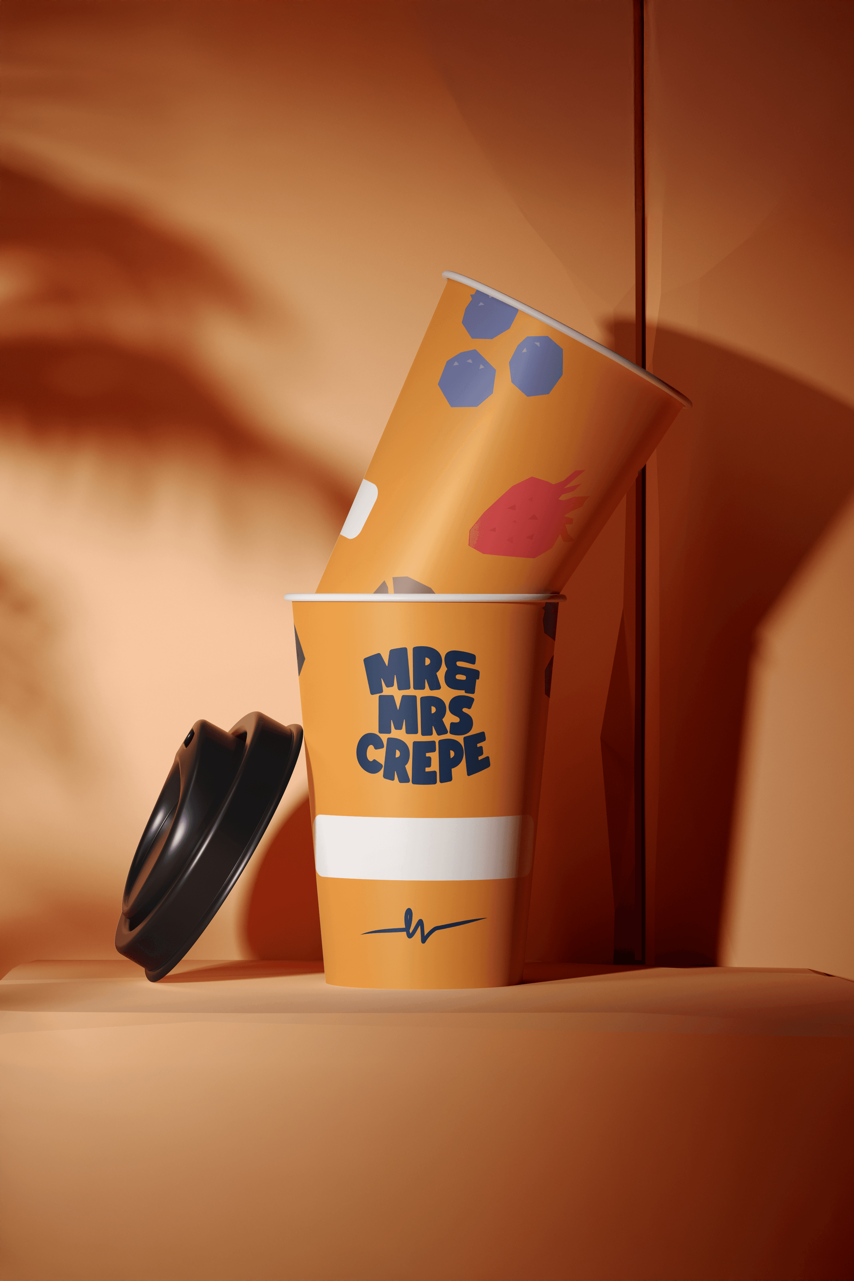
Vibrant new hospitality franchise, Mr & Mrs Crepe, approached us to craft a bold and joyful brand identity as they transformed a former eatery into a buzzing hub of flavour. Inspired by the carefree spirit of a European summer, the founder envisioned something playful and eye-catching that would captivate both the eyes and the appetite of passersby.
Specialising in crepes, pancakes, waffles, and an array of savoury breakfast delights, Mr & Mrs Crepe needed branding that evoked joy and invited people to stop in their tracks for a moment of indulgence. We brought this vision to life through playful illustrations set against bright, punchy backgrounds, paired with a dynamic mix of bold sans-serif and elegant script fonts. The result was a delectable brand style guide, packaging, and collateral that strike the perfect balance between fun and sophistication, effortlessly turning heads and sparking smiles.


Drawing inspiration from this vision, we crafted a brand identity that feels both whimsical and polished. With colours named after the French Riveria and famous dessert combinations, every inch of the brand style guide was thought out to compliment it’s long term use as business booms and the brand spreads.

Related Projects
View Project

Brand
Skyline
View Project

Brand
Full Proof
View Project
Brand, Graphic Design
ByAsia Food
Pentawards 2023 Shortlist
1View Project
Website
The Embassy of France in Australia
View Project

Brand, Website
Sunstrata
View Project
Brand
Nescii
View Project

Brand, Video
Mood on the Roof
Webby Awards Nominee
2View Project

Brand, Website
NextOre
Frequently Asked Questions
You were going to ask anyway
Hospitality branding is the work of building a brand identity for a venue: a cafe, restaurant, bar, hotel or eatery. The system has to carry across packaging, signage, menus, uniforms, social media and digital. The room itself, the music, the service do their own work alongside the brand.
Hospitality is a category where the brand sits inside a physical experience. A diner reads the brand on a takeaway box at 8am, on a chalkboard at lunch, on Instagram at 9pm, then arrives at the venue and lives inside it. Hospitality branding plans for that spread from day one.
Mude’s hospitality practice is built around craft and culturally-distinctive venues. Engagements usually start with brand strategy and identity, then extend into application across packaging, collateral and digital over a venue’s first six to eighteen months of trade.
A hospitality brand style guide is the reference document a venue uses to apply its identity consistently across every surface. It defines the logo system, type and colour palettes, illustration style, photography direction, voice and tone, packaging templates, menu structure, signage standards, and digital application rules.
The job of the guide is operational. A barista printing a takeaway sticker, a fit-out contractor making a sign, a social manager scheduling a post, and a packaging supplier mocking up a box should all reach the same answer when they open the guide. The brand reads as one thing across the lot.
The Mr & Mrs Crepe style guide was designed for long-term use. Colours sit under named references drawn from the French Riviera and dessert combinations. Type pairs a bold sans-serif with an elegant script. Illustration sits over bright punchy backgrounds. The system was built to scale as the franchise opens new sites.
Mr & Mrs Crepe is located at Westfield Belconnen in Canberra, on the third floor at Benjamin Way. The creperie sits inside Westfield Belconnen and serves customers in Belconnen, North Canberra and across the ACT.
The menu covers sweet crepes, savoury crepes, pancakes, waffles and savoury breakfast dishes, paired with Canberra-roasted coffee. Delivery is available via Uber Eats and Menulog.
The brand identity was designed by Mude, a brand and creative studio with offices in Sydney and Canberra. Mr & Mrs Crepe sits in Mude’s hospitality portfolio alongside Full Proof in Potts Point and Mood on the Roof in Sydney.
The Mr & Mrs Crepe brand identity was designed by Mude, a brand and creative studio with offices in Sydney and Canberra. Mude was approached by the founder during the transformation of a former eatery into the new creperie, and was briefed to build a bold, joyful identity inspired by a European summer.
The scope covered brand strategy, identity, brand style guide, packaging, and collateral. The visual system pairs playful illustration with bright punchy backgrounds, and bold sans-serif type with an elegant script.
Mude’s hospitality portfolio also includes Full Proof, a sourdough-doughnut venue in Potts Point, and Mood on the Roof, Mude’s own Sydney rooftop live-music series. Each project is built around a specific cultural posture for the venue.
The Mr & Mrs Crepe brand uses a dynamic mix of bold sans-serif and elegant script type. The sans-serif carries the punchy, food-forward voice of the brand on packaging, signage and headline applications. The script handles the playful, French-influenced details: product names, accents, and the moments where the brand wants to feel intimate and warm.
Two-typeface pairings are a common pattern in hospitality brand identity. Sans-serif gives the brand legibility at small sizes and on signage. Script gives the brand personality and signals craft. The trick is making both sit comfortably together on a takeaway sticker, a menu card and a social tile.
The Mr & Mrs Crepe pairing was tuned to the creperie’s European-summer posture and to the practical demands of a Westfield food court setting, where the brand needs to read clearly across the food court and read intimately on the takeaway box.
A brand identity carries a European or French Riviera influence through the choice of typography, colour, illustration and material references. French type traditions lean on elegant script faces, paired with bold sans-serif on packaging and signage. Riviera colour palettes typically run on warm coastal references: terracotta, deep sea blue, lemon yellow, soft cream. Illustration leans on holiday motifs, food still life and casual figure work.
For Mr & Mrs Crepe, the Riviera reference flows through the colour palette names, the type pairing, and the playful illustration style. The brand reads as a holiday postcard transposed onto a creperie at Westfield Belconnen.
The European-summer posture is a deliberate positioning choice for a creperie. Crepes carry a French food heritage, and the brand makes that heritage part of the visual language. The result feels rooted in the cuisine through type, colour and craft signals.
Packaging design carries significant weight in a hospitality brand identity. A takeaway box, a coffee cup, a paper bag or a delivery sleeve is the part of the brand a customer holds, carries home, photographs and posts. For a venue that does meaningful takeaway and delivery trade, the packaging is sometimes the only brand surface a customer encounters in a given week.
The packaging set typically covers takeaway containers, coffee cups, paper bags, delivery sleeves, sauce sachets, napkins, stickers and stamp cards. Each item runs the same colour palette, illustration style and type pairing as the in-venue brand, scaled to the print method and material the supplier can produce reliably.
For Mr & Mrs Crepe, the packaging was designed to carry the bright illustration system and the French Riviera palette into Westfield Belconnen takeaway trade and Uber Eats delivery. The packaging set was specified in the brand style guide so the franchise can reorder consistently as new sites open.
Hospitality brand identity work in Canberra is handled by a mix of in-house teams at large hospitality operators, freelance brand designers, and brand and creative studios with Canberra offices or active Canberra portfolios. The local field is small. Mude, headquartered in Sydney with a Canberra office, built the Mr & Mrs Crepe brand identity at Westfield Belconnen and works across the ACT on brand, video, web and government creative.
Picking a Canberra hospitality branding studio comes down to a few signals: a published hospitality portfolio, venues operating at the level the new project wants to sit at, the capacity to carry the brand from strategy through identity into packaging, signage and digital application, and the team to support the venue through the first eighteen months of trade.
Mude’s hospitality portfolio includes Mr & Mrs Crepe in Belconnen, Full Proof in Potts Point, and Mude’s own rooftop live-music series Mood on the Roof in Sydney.
A brand carries the personality of a venue across packaging, signage and digital through a small set of distinctive assets that show up consistently in every application. Type, colour, illustration, photography style and voice all do the same job on a coffee cup, a shopfront sign, an Instagram tile and a delivery sleeve. When a customer recognises the brand in three seconds on any of those surfaces, the system is doing its work.
The brand style guide is the operational document that makes this consistency possible. It documents the logo system, type rules, colour palette, illustration assets, photography direction, voice and tone, and templates for every applied surface. A new supplier or a new team member can use the guide to produce on-brand collateral without going back to the original designers.
For Mr & Mrs Crepe, the distinctive assets are the playful illustration set, the bright punchy backgrounds, the French Riviera colour names, and the sans-serif and script type pairing. Those four elements show up on every customer touchpoint from in-venue signage at Westfield Belconnen to delivery packaging.
Hospitality brand identity costs in Australia depend on scope, studio seniority, and the complexity of the brand world. A single-site cafe brief covering logo, type, colour and basic collateral runs in a typical entry-level price band. A franchise brief covering strategy, identity, packaging, signage, fit-out collateral, digital templates and a long-term brand style guide runs in a substantial multi-stage band.
The drivers of cost are the scope of application (how many surfaces the brand has to live on), the complexity of strategy (whether positioning research and audience work is included), the studio’s seniority and reputation, and the timeline.
Mude provides cost estimates after a discovery conversation. The conversation covers the brief, the operational context, the scope of application, and the timeline. Mude works across single-site venues, small hospitality groups, and franchise systems with brand identity, packaging, signage and digital application.
Mude treats hospitality branding as the work of designing a venue’s posture in culture, then carrying that posture onto every surface a customer encounters. Engagements usually start with brand strategy: the venue’s audience, cultural posture, daypart usage, and competitive set. Identity follows: logo, type, colour, illustration, photography and voice. Application follows that: packaging, menus, signage, uniforms, social and digital, often delivered in waves as the venue approaches opening day.
Mude’s hospitality work sits at the craft and culturally-distinctive end of the category. The studio’s published hospitality portfolio includes Mr & Mrs Crepe at Westfield Belconnen, Full Proof in Potts Point, and Mood on the Roof, the rooftop live-music series Mude runs in Sydney. Each project is built around a specific cultural posture and a specific brand world.
The Mude team comes up through film, documentary and music. That background shapes how the studio reads hospitality: as a category where the brand has to hold its own inside a physical experience the room, the food, the music and the service all carry.
Brand identity for a cafe or eatery covers everything a diner sees, holds and reads from the venue. A typical scope includes the logo system, type palette, colour palette, brand pattern language, illustration style, photography direction, packaging design, menu design, signage, uniforms, and digital templates for social and web.
The order of work usually runs strategy first, then identity, then application. Strategy locks the positioning and tone. Identity builds the visual system. Application carries the system onto every surface the venue uses, from coffee cups to wayfinding to Instagram tiles.
For Mr & Mrs Crepe, the deliverables included a brand style guide, packaging, and collateral, anchored on a colour palette named for the French Riviera and famous dessert combinations. The Canberra creperie sits in Westfield Belconnen and the identity was built to travel as the franchise grows.
The Mr & Mrs Crepe brand identity is inspired by the carefree spirit of a European summer, specifically the French Riviera. The founder approached Mude with a vision for a bold, joyful eatery that would captivate the eyes and the appetite of passersby. The visual system runs on playful illustration over bright punchy backgrounds, with a dynamic mix of bold sans-serif and elegant script type.
The Riviera reference flows through the colour palette, the typography pairing, and the overall posture of the brand. Colours sit under names drawn from the French coast and famous dessert combinations. The illustrations carry the holiday feeling onto packaging, menus and collateral. The result feels both whimsical and polished.
Mr & Mrs Crepe is based at Westfield Belconnen in Canberra, serving crepes, pancakes, waffles and savoury breakfast dishes alongside Canberra-roasted coffee.
Mr & Mrs Crepe serves crepes, pancakes, waffles, and savoury breakfast dishes. The menu spans sweet crepes with dessert combinations like crunch caramel and chocolate, alongside savoury crepes filled with eggs, bacon, ham, cheese and greens. Pancake stacks come with bacon and maple, waffles with caramel and cream, and breakfast plates run from eggs benedict to bacon and eggs.
Drinks centre on Canberra-roasted coffee, with lattes, espressos and tea on the menu. The venue is open for breakfast and lunch trade at Westfield Belconnen.
The food and drink offer drives the brand identity Mude built. Playful illustration, French Riviera colour names, and a sweet-and-savoury mix on every part of the menu carry through every customer touchpoint, from packaging to signage to social.
The Mr & Mrs Crepe colour palette is built around the French Riviera and famous dessert combinations. Colours sit under named references drawn from the French coast and the kind of dessert pairings that show up on a creperie menu. The named structure makes the palette easy to recall and apply across packaging, menus, signage and social.
The palette runs bright and punchy, pairing with the playful illustration style that sits across packaging and collateral. The intent is to carry the holiday spirit of a European summer onto every customer touchpoint, from a takeaway box at the counter to a social tile on Instagram.
Naming colours by reference is a useful brand identity technique. It gives a system internal logic, a story for the team to repeat, and a reliable shorthand when new collateral is produced or new sites open under the franchise.
Illustration is the central distinctive asset of the Mr & Mrs Crepe brand. The illustration style is playful, French-influenced, and built to sit on bright punchy backgrounds across packaging, menus and digital. Illustrations carry the European-summer spirit of the brand onto every customer touchpoint and make the identity instantly recognisable on a takeaway box or a social feed.
Custom illustration is a powerful choice in hospitality brand identity. A bespoke illustration system gives a venue an asset built for that brand alone, designed to sit only on its packaging, menus and signage. The illustrations become part of the brand’s distinctive memory structure.
For a franchise like Mr & Mrs Crepe, illustration is the part of the system that carries personality as the brand opens new sites. The illustration set was designed to grow over time, with new pieces added as the menu expands and seasonal offers come and go.
You brand a creperie or breakfast eatery by anchoring the brand in the food itself, then building the visual system around the venue, the team and the trade area. The food drives the brand’s posture. A creperie carries French heritage, a pancake-and-waffle stack reads casual and indulgent, a savoury breakfast plate reads daily and dependable. The brand has to acknowledge all three on the same menu.
The work usually runs in three phases. Strategy locks the positioning, the audience and the cultural posture of the venue. Identity builds the logo, type, colour and illustration system. Application carries the identity onto packaging, menus, signage, uniforms and digital, ready for trading day one.
For Mr & Mrs Crepe, the brief was a bold, joyful identity for a creperie at Westfield Belconnen. The Mude team built the system around playful illustration, French Riviera colour names, and a bold sans-serif paired with an elegant script. The brand style guide was designed for long-term use as the franchise grows.
Brand identity scales across a hospitality franchise through a brand style guide that documents every applied element of the system. Logo lockups, type rules, colour codes, illustration assets, packaging templates, menu structure, signage standards and digital templates all live in the guide so a new site, a new supplier or a new team member can apply the brand without rebuilding it.
Franchises bring three operational demands. The brand has to read consistently across sites under multiple operators. The system has to be easy to apply by team members who have not seen the original brief. The asset library has to support new menu items, seasonal offers and site launches over years of trade.
The Mr & Mrs Crepe brand style guide was designed for long-term use as the franchise grows. Colour names, type rules, illustration assets and packaging templates were all built to travel from Westfield Belconnen to whatever site opens next. The guide carries the European-summer spirit of the brand intact onto every new application.
Hospitality branding in Australia is delivered by a mix of generalist brand and creative studios, hospitality-specialist agencies, in-house teams at large hospitality groups, and freelance brand designers. The category is fragmented. Hospitality projects sit across many scales, budgets and cultural postures.
The category typically splits into a few practical zones. Fine dining and hatted-restaurant work calls for quiet typography and restrained material choices. Casual neighbourhood cafes and bars carry loud illustration and strong character. Hotel and resort branding extends into signage, wayfinding and printed collateral at scale. Franchise systems call for brand assets built to travel across sites and operators.
Mude works in the craft and culturally-distinctive zone of the category. The Mude hospitality portfolio includes Mr & Mrs Crepe in Belconnen, Full Proof in Potts Point, and Mood on the Roof in Sydney.
A hospitality brand identity project typically runs across six to eighteen months when scoped end to end. The strategy and identity build sits in roughly the first three to four months. Application across packaging, menus, signage, uniforms and digital sits in the months that follow, often delivered in waves as a venue approaches opening day and then settles into trade.
Timeline moves with three things: the scope of application (whether the brief covers packaging alone or packaging, signage, fit-out and digital together), the readiness of operational decisions (menu, supplier list, fit-out timeline locked or still moving), and the complexity of the brand world (a single-site venue, a small group, or a franchise built to scale).
For Mr & Mrs Crepe, the deliverables included brand strategy, identity, brand style guide, packaging and collateral. The brand was built for long-term use across the franchise, so the brand style guide carries enough detail to support new sites opening over time.
A cafe logo is a single mark that identifies the venue. A full cafe brand identity is the complete operational system: the logo, the type and colour palettes, the illustration style, the photography direction, the voice and tone, the packaging templates, the menu structure, the signage standards and the digital templates that carry the venue’s personality across every customer surface.
A logo on its own gives a cafe a name and a mark. A full brand identity gives the cafe a coherent system that holds together across packaging, menus, signage, uniforms, social and delivery. New collateral, new menu items, new sites and new team members can all use the system without rebuilding the brand from scratch.
For Mr & Mrs Crepe, Mude delivered a full brand identity covering the logo system, illustration assets, French Riviera colour palette, type pairing, packaging design and brand style guide. The system was built to scale as the franchise opens new sites in Canberra and beyond.
Mude’s hospitality portfolio currently includes three published projects: Mr & Mrs Crepe at Westfield Belconnen, Full Proof in Potts Point, and Mood on the Roof in Sydney. Each project sits in its own zone of hospitality with its own cultural posture.
Mr & Mrs Crepe is a creperie franchise serving crepes, pancakes, waffles and savoury breakfast at Westfield Belconnen in Canberra. The brand identity is built on playful illustration, a French Riviera colour palette, and a bold sans-serif paired with an elegant script.
Full Proof is a sourdough-doughnut venue in Potts Point, a walk from Kings Cross station. The brand handles dayparting: the same room reads as a morning commute pitstop and a late-evening destination. The brand world holds across both moments through chrome palette, wireframe pattern and wordmark, with art direction shifting in tone for morning and evening.
Mood on the Roof is the live-music series Mude runs in Sydney, programmed and produced by the studio. It started as a project nobody briefed and nobody paid for. It has run for years because the studio wanted to make something that sits out in the world.