Australian Strategic Policy Institute
Data visualising which world powers are leading the critical tech race
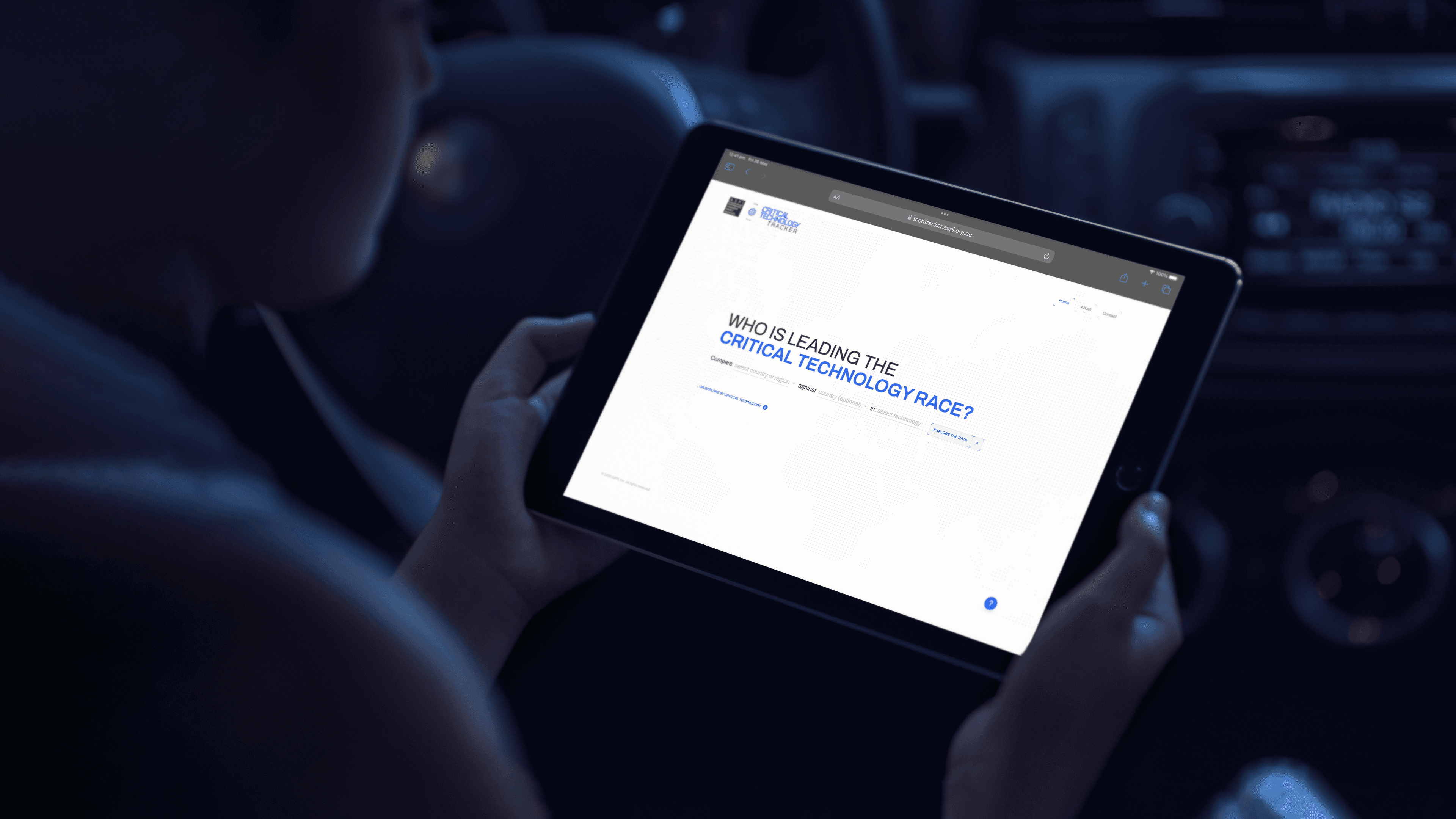
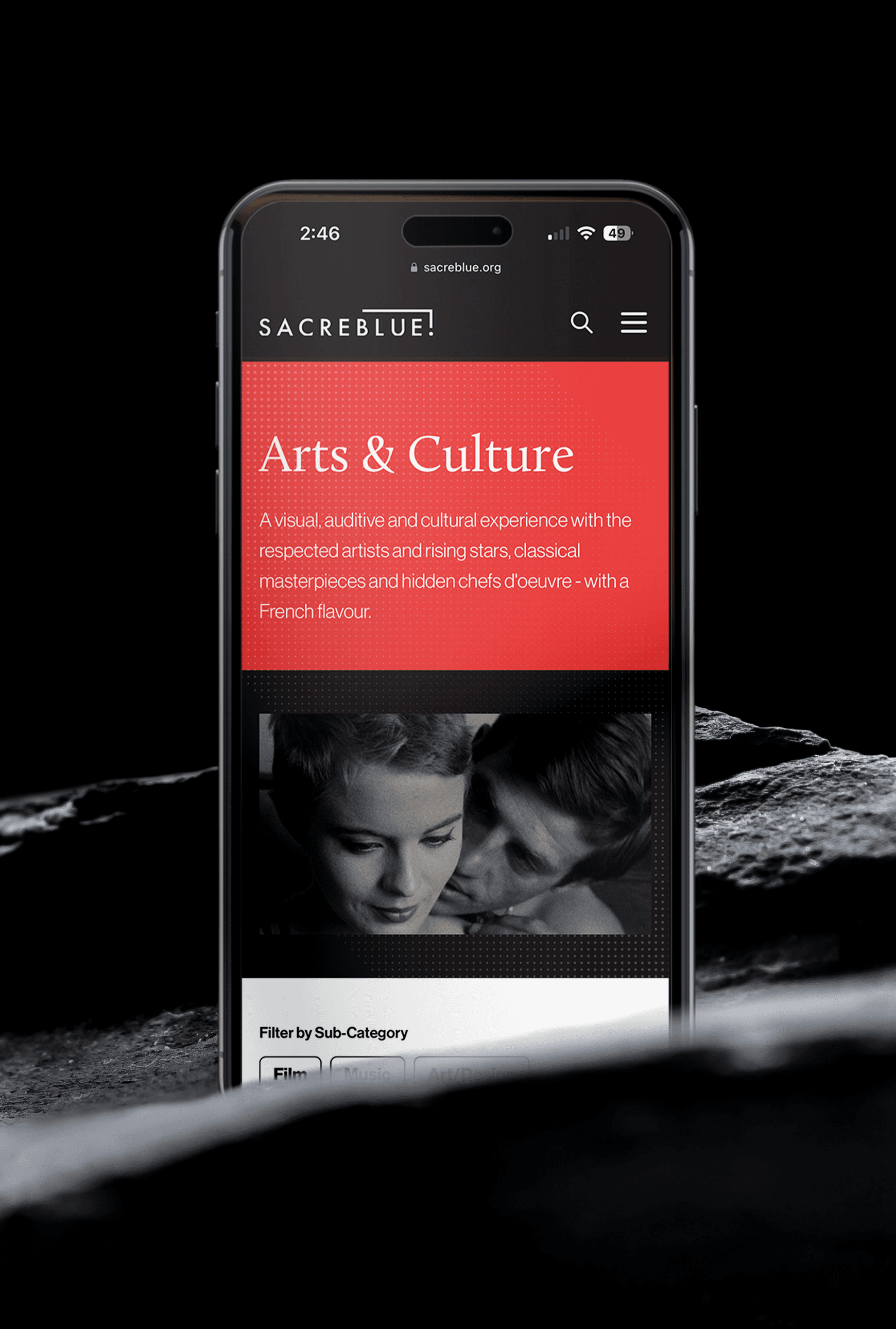
We designed and developed the ASPI Critical Technology Tracker – a tool comparing which nations are leading in critical technologies such as AI, biotechnology, and robotics.
The website compares which countries contribute the most research output in each technology area. It maps the global flow of high-impact research talent between nations, at undergraduate, postgraduate and employment career stages. That flow reveals the brain drains and brain gains across the critical technology landscape. The interactive data visualisation platform is designed to support informed public debate and evidence-based policy-making on critical technology research.
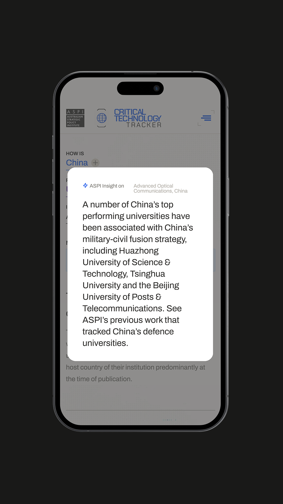
Launched in March 2023 with 44 technologies, the platform has been expanded by ASPI since to cover 64 technologies in 2024 and 74 in 2025. The website visualises data based on an analysis of the top 10% most-cited papers in each area of research. These were published between 2018 and 2022, a total of 2.2 million papers. The Critical Technology Tracker shows that, for most technologies, all of the world’s top 10 leading research institutions are based in China. They collectively generate nine times more high-impact research papers than the second-ranked country, most often the US.
- 12k
- Users visited the tech tracker within the first week.
- 42k
- Page views were generated, averaging 3.5 per user.
- 60%
- Of visitors were from the US, UK, Australia, India, France, Russia and Germany.
- 72 hours
- from launch to coverage in Reuters, WSJ, Guardian, Al Jazeera and ABC News
The brief
ASPI came to Mude with a clear research mandate and a dataset that, in its raw form, was almost impossible for a non-specialist to engage with. The ICPC team had built a methodology using research publications and patent applications as proxies for national-level research innovation. At a macro level, it captured the collective output of government funding, university research, and private-sector R&D.
The dataset was rich enough to answer the questions that matter to defence and economic policy: who’s leading in quantum sensing, where the AI chip talent is moving, how the Quad countries combined stack up against China.
What ASPI needed was a website that could turn that dataset into something a non-specialist could actually use.
The brief asked for:
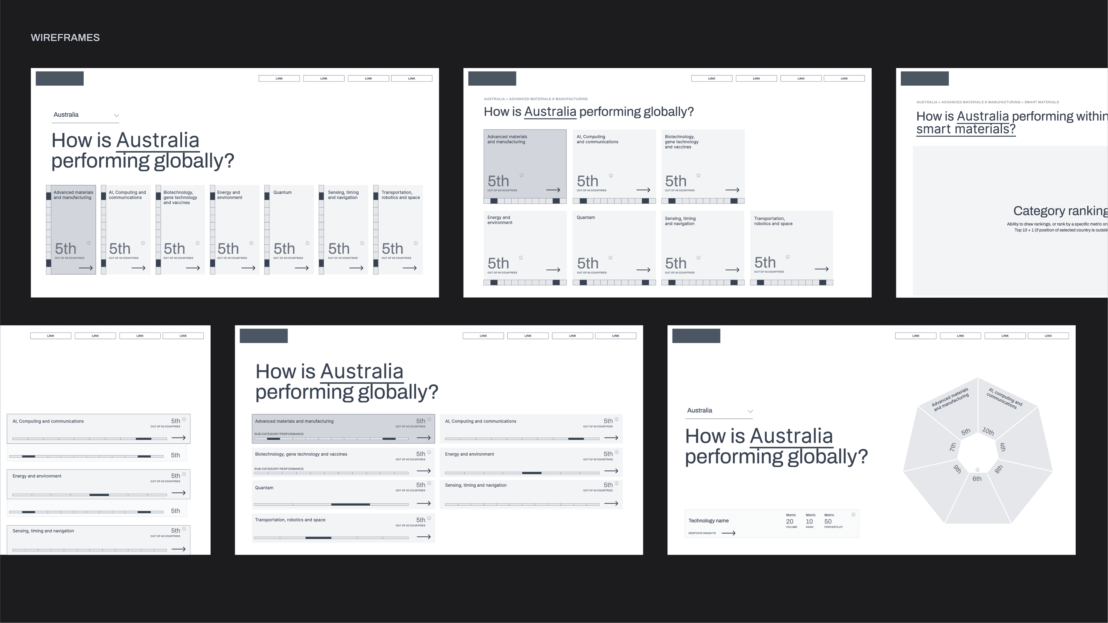
- a homepage that introduced the project and routed users into the data
- technology snapshot pages for each of the 44 technologies
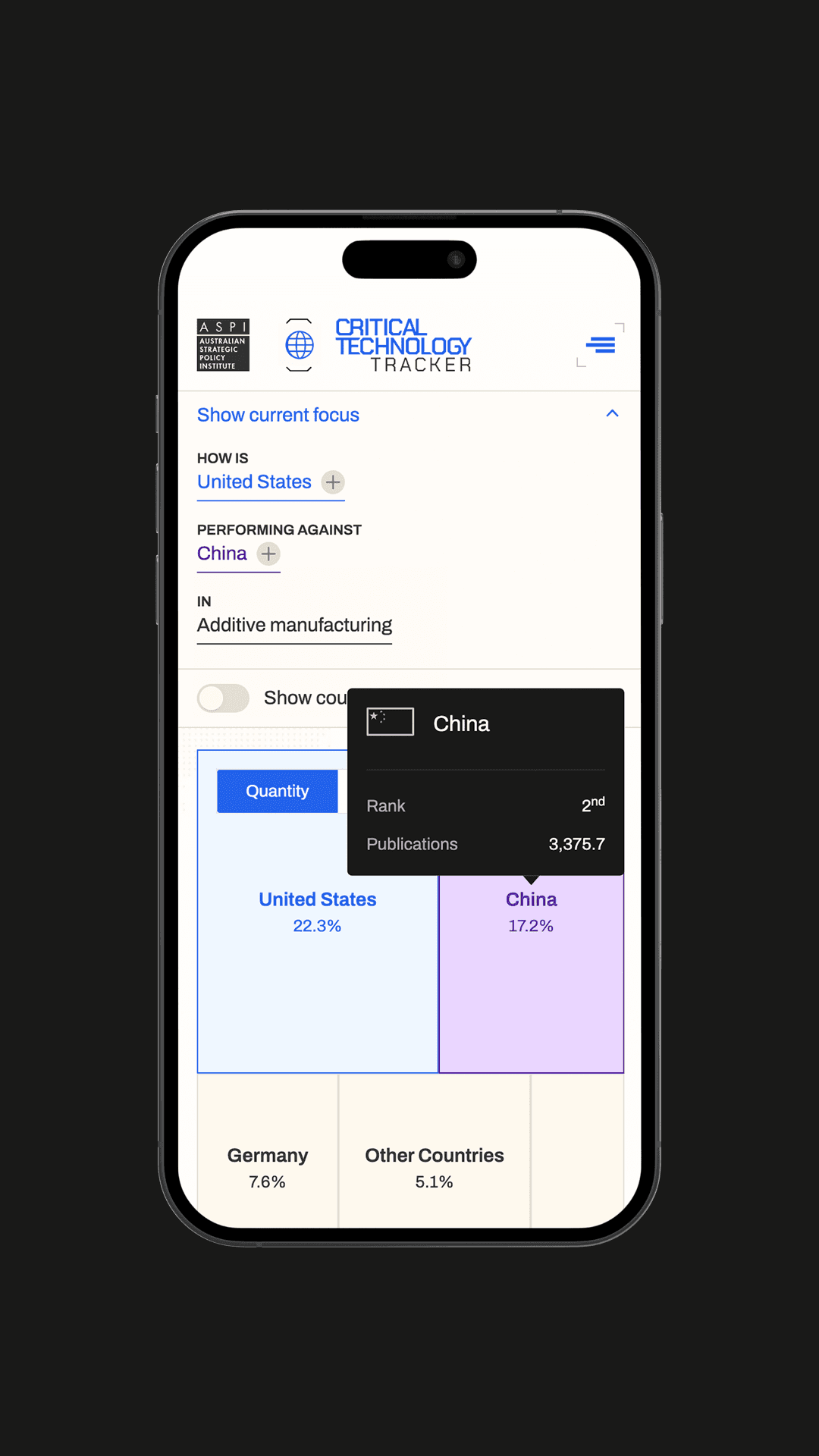
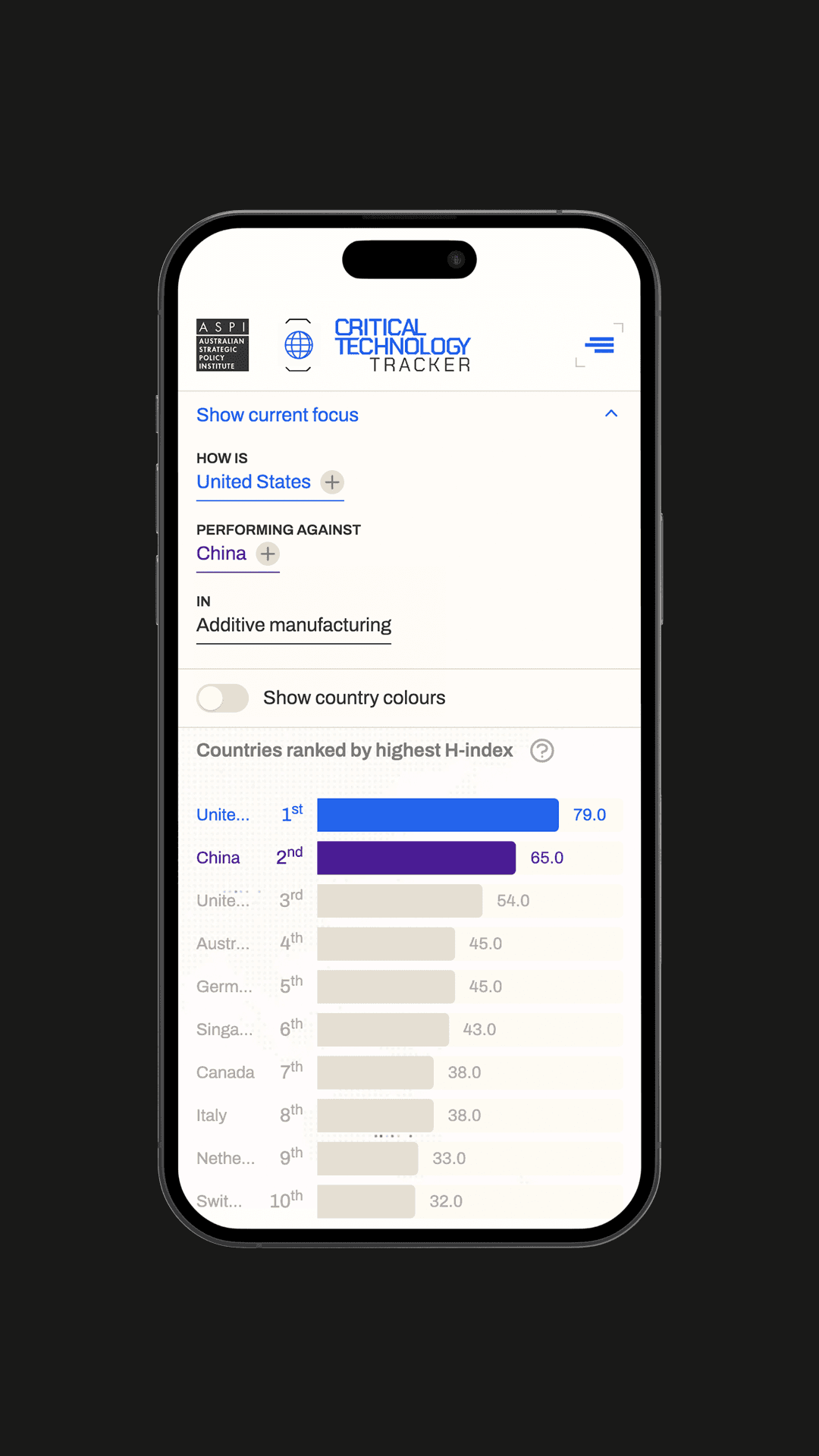
- interactive visualisations including country H-index comparisons, top 10 distinguishing research priorities, Sankey diagrams for human talent flow, and tree maps for highly cited publications
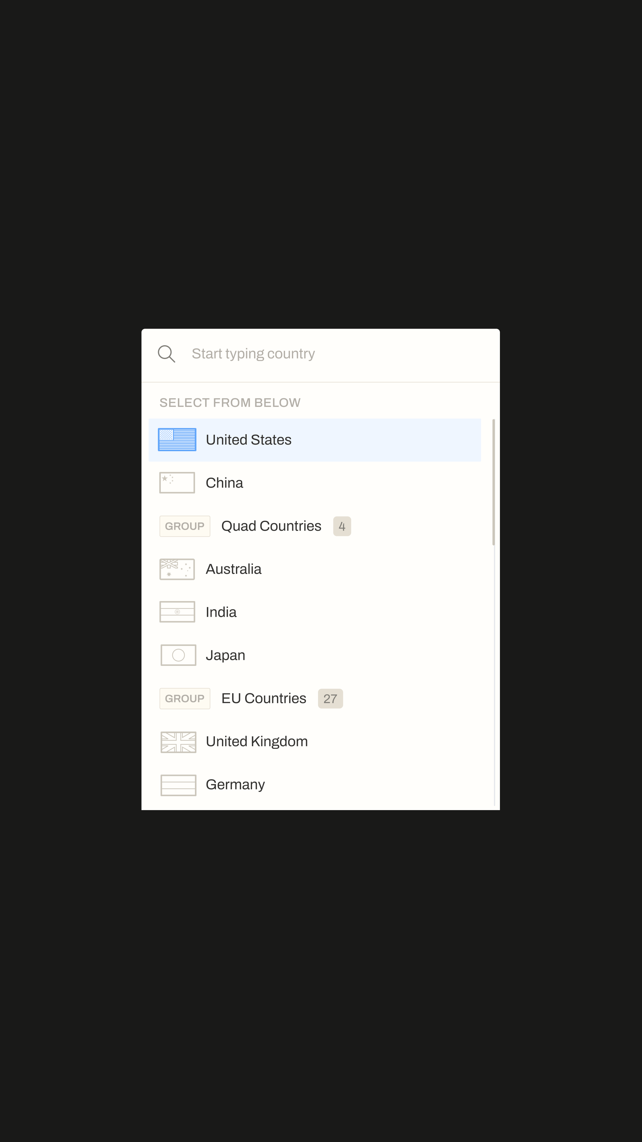
- a way to compare countries by technology and technologies within a country
- downloadable raw data and shareable, citable links to specific visualisation states
- a methodology section so the work could be scrutinised
- a static-publishing architecture behind a CDN for security
- a backend the ASPI team could update without developer involvement
The Critical Technology Tracker needed to be the kind of resource that gets cited in policy briefings and embedded in journalism. That meant the real design problem wasn’t “how do we visualise the dataset.” It was: how do we make a 44-technology, multi-country, multi-metric dataset feel like a story someone can read in five minutes and walk away with a defensible point of view.
We ran a full discovery process with ASPI’s ICPC team and described the audience as Quad-country policy makers. Discovery refined that into something more useful: a primary user set ranked by their actual impact on the platform’s success.
International journalists came out on top. A single referenced visualisation in a Bloomberg or Wall Street Journal piece pulls more downstream traffic and credibility than weeks of organic search. Australian and US policy makers ranked second, the audience the research was actually built to inform.
Other Quad-country policy makers ranked third. Private sector general managers running Asia Pacific operations for the big tech players (the Samsung-scale operators thinking about supply chain, talent, and where to put R&D investment) rounded out the priority set.
The personas told us what each group needed from the platform. Journalists needed to embed and cite visualisations cleanly, with shareable URLs that preserved filter states. Policy makers needed to land somewhere that prompted the question they were trying to answer, rather than dumping them into a sea of controls. Private sector users were arriving with supply-chain and talent questions, not abstract curiosity. Every user group needed methodology transparency to trust the data enough to act on it.
The success metrics were equally pragmatic: monthly visits, average session duration, citations and references in third-party media, embed and direct link usage, and regular international interest from outside Australia. Every chart had to be readable in a sentence. A journalist or ministerial advisor needed to be able to look at a Sankey diagram of AI talent flow and walk away with a defensible line they could repeat in a meeting. If a visualisation couldn’t be summarised, it didn’t earn its place.
media coverage
The report and interactive website shared across multi-national news channels, sparking discussions from twitter to reddit
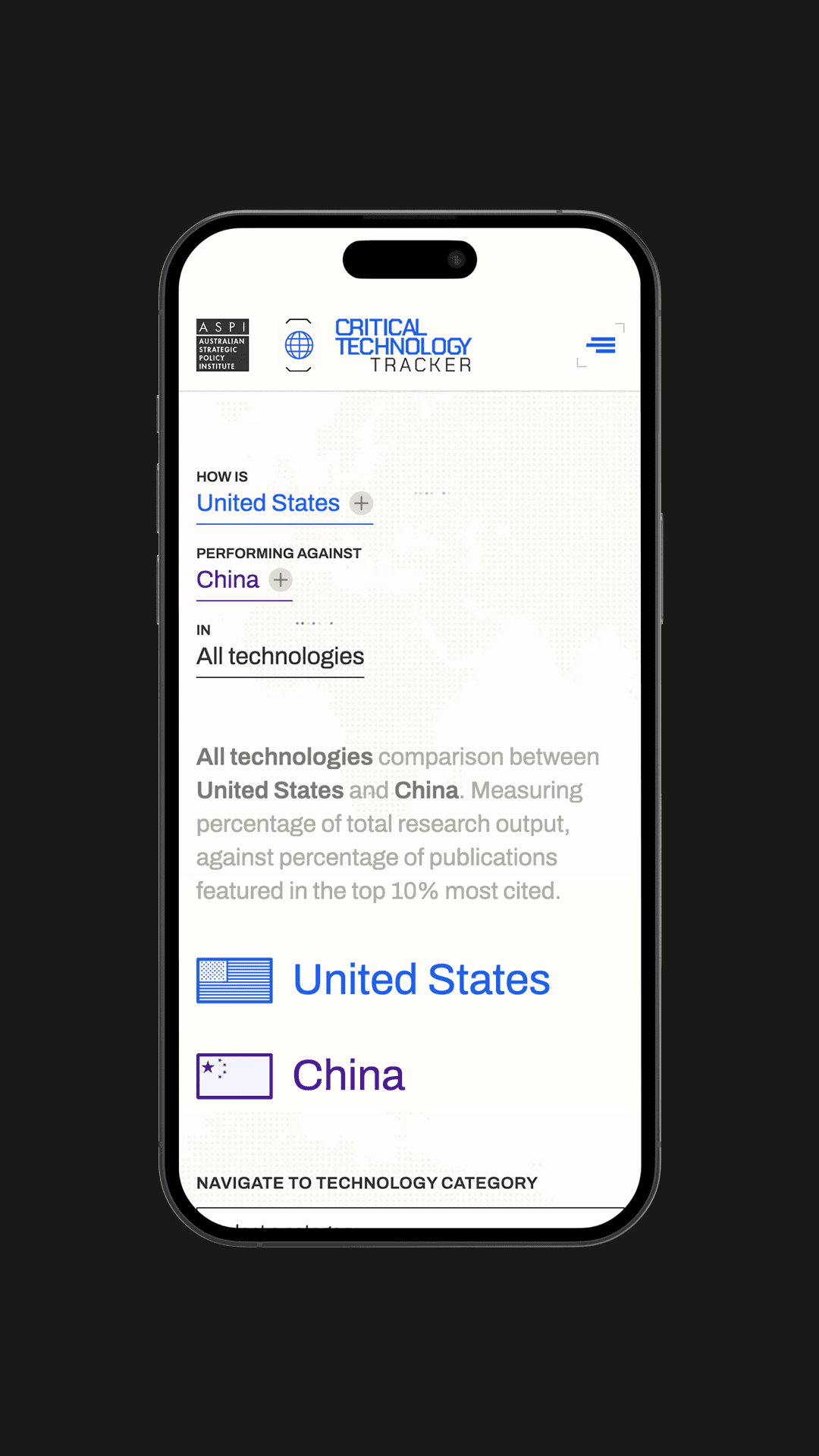
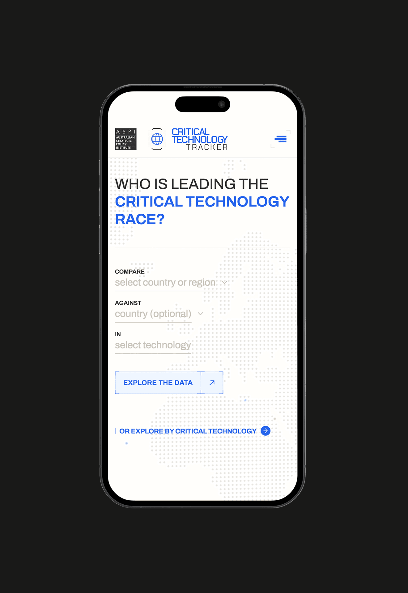
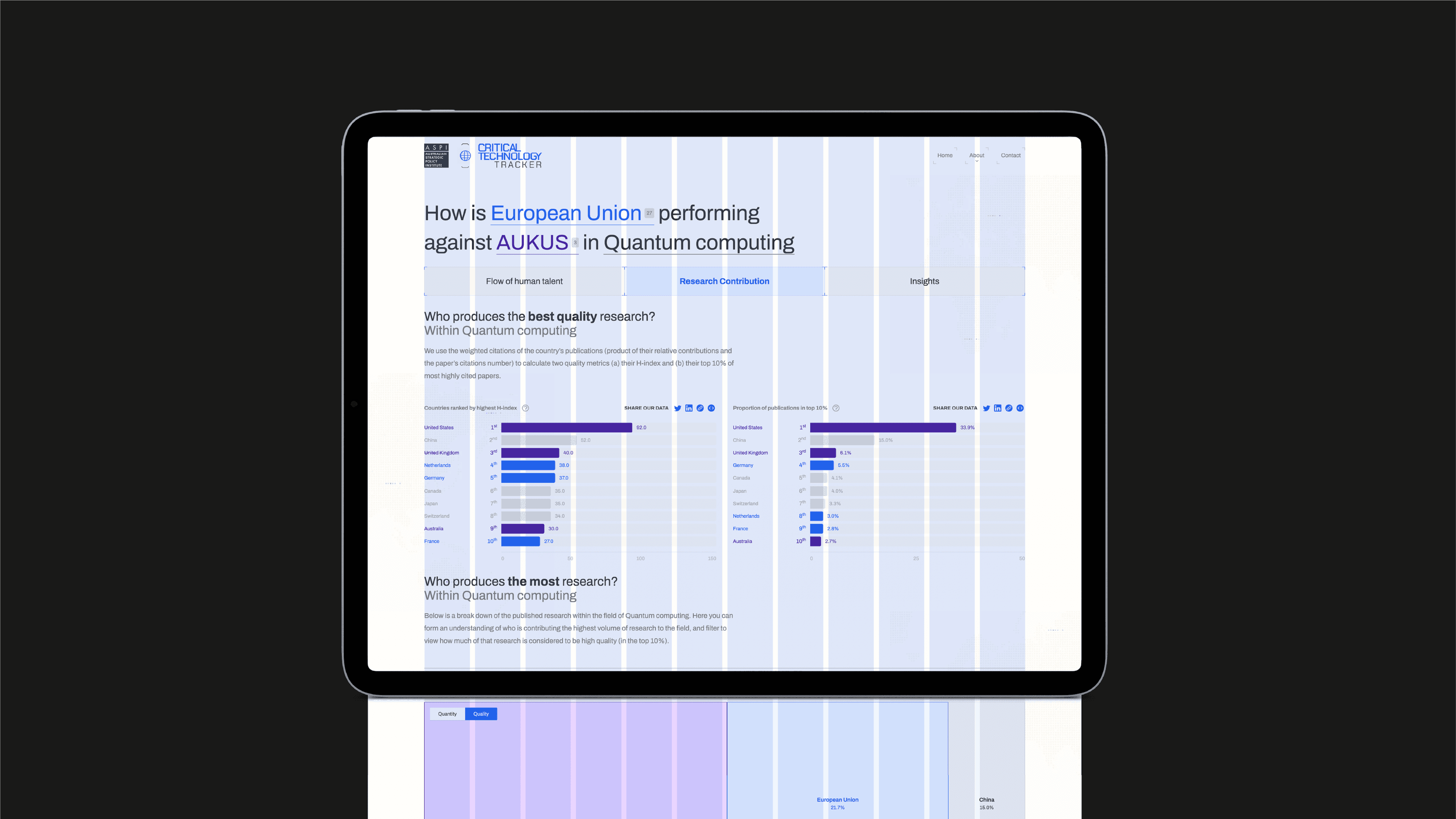
The homepage routes users into either a country-led or technology-led journey, with geo-location informing the default frame. Each of the 44 technologies has its own snapshot page, grouped under higher-level topic clusters. Quantum computing, for example, is the parent topic for post-quantum cryptography, quantum key distribution, quantum sensing, and quantum computing hardware.
Inside each snapshot:
- country H-index comparisons
- top 10 distinguishing research priorities calculated using tf-idf
- a Sankey diagram tracking the global flow of high-impact research talent
- interactive tree maps of highly cited papers
- a side-by-side comparison tool that runs the Quad combined against China or any custom country set against any other
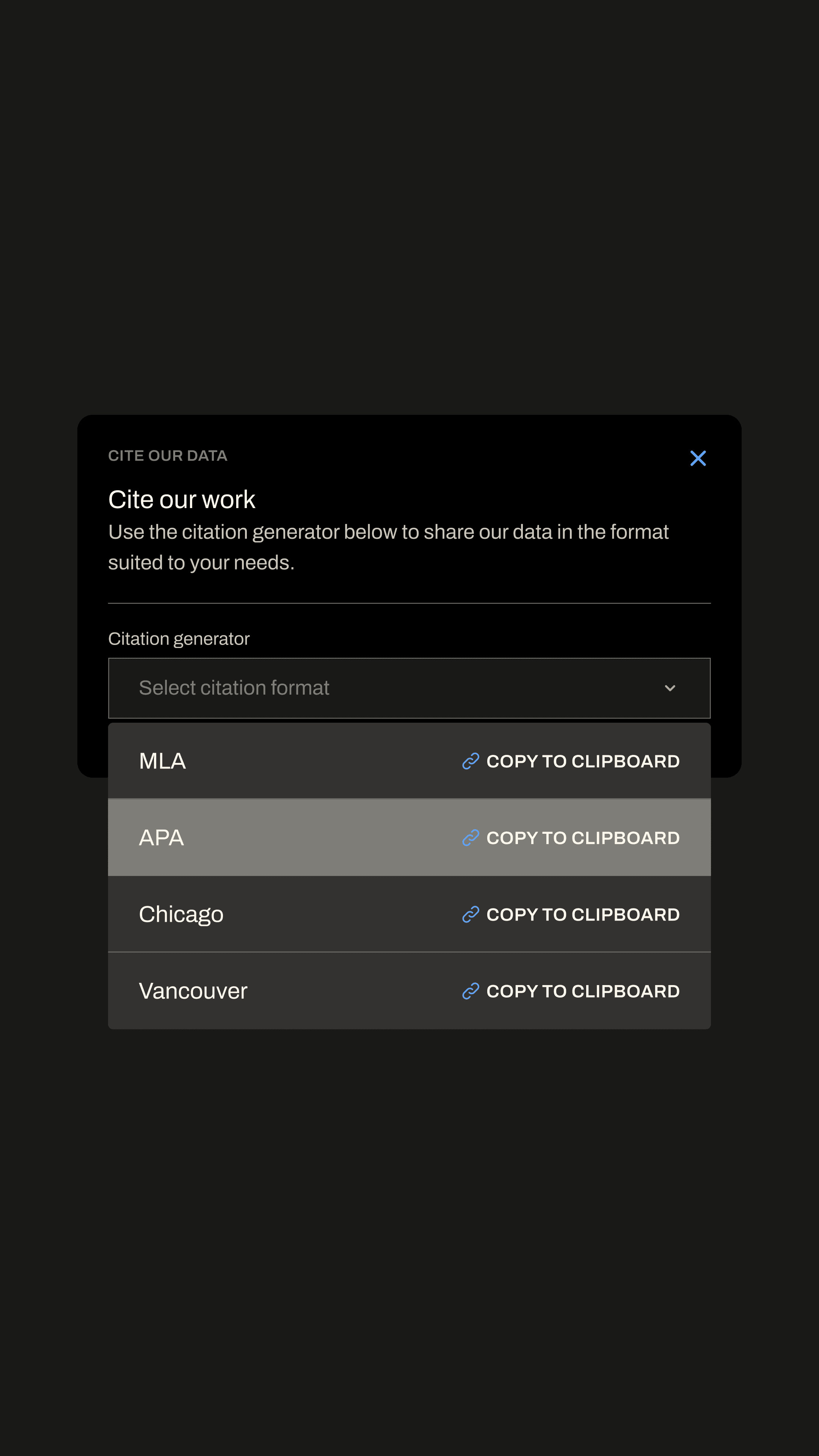
Around the data sit the layers that make it citable including a methodology section, a glossary, downloadable CSV datasets, auto-generated citation strings, and shareable URLs that preserve filter state.
ASPI was upfront in the brief about the security profile of the site. A platform analysing China’s critical technology research output, hosted by an Australian think tank, was always going to attract attention from state actors and malicious traffic. The brief specifically asked for static-publishing architecture, IP whitelisting for the CMS, Cloudflare in front of the production site, and vulnerability scanning before launch. We built to those requirements. The production site runs as a static-published version with no live CMS exposure. Content and data changes are pushed from the editing environment to a flat, high-performance production layer.
ideation
deep diving low-fidelity ideas to explore how to best help the user navigate the data
design system & style
Establishing a design style, and building a comprehensive system outwards from the most granular components
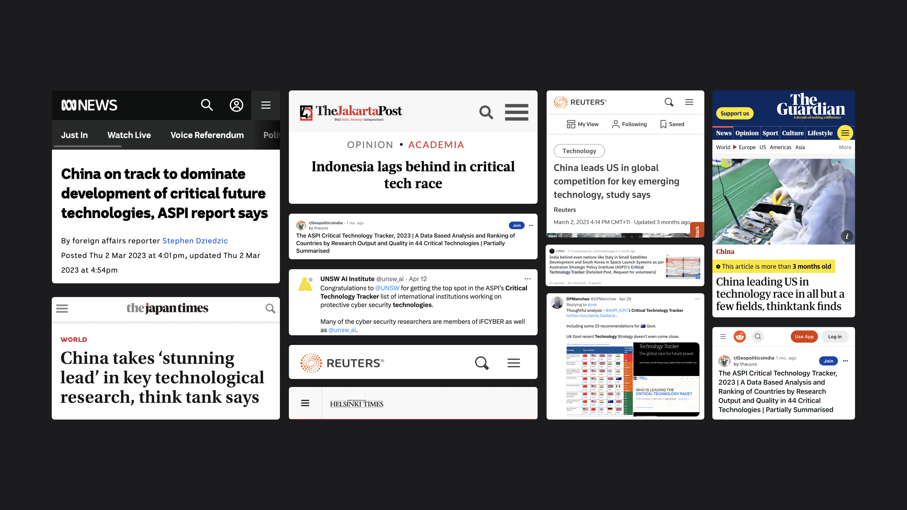
The launch generated 12,000 users in the first week alone, with 42,000 page views averaging 3.5 per session, and 60% of traffic coming from the US, UK, Australia, India, France, Russia, and Germany. The Critical Technology Tracker has since become one of the most cited public-data resources ASPI produces.
Within 72 hours of launch, the platform was covered across major international outlets including Reuters, the Wall Street Journal, the Guardian, Al Jazeera, and ABC News. Coverage has continued through 2024 and 2025, with the New York Times, Nikkei Asia, Bloomberg, and the Financial Times drawing on the data in their reporting.
The tracker has also been referenced in research and policy work from the Harvard Kennedy School’s Belfer Center, Lawrence Livermore National Laboratory, the Carnegie Endowment for International Peace, ITIF, Chatham House, the US National Academies of Sciences, and the Parliament of Australia.
For ASPI, the platform lifted the visibility of the ICPC’s research, ratcheted up the public-facing standard for think tank data work, and gave the team a data platform they continue to build on.
The ASPI Critical Technology Tracker is one of the largest public data visualisation websites produced by an Australian think tank. The platform shows the kind of interactive web design and website development Mude delivers from its Canberra and Sydney studios. The project covered the full discipline span: discovery, audience research, information architecture, UX and UI design, design system development, front-end development, custom data visualisation, headless CMS implementation, static-publishing architecture, security review, and post-launch support.
The ASPI Critical Technology Tracker is also one of Mude’s most prominent case studies in AI-adjacent and emerging-technology work. The platform tracks national leadership across artificial intelligence, machine learning, autonomous systems, advanced robotics, quantum computing, post-quantum cryptography, biotechnology, advanced sensors and 50+ other critical technologies. Mude works on brand strategy, web design and creative campaigns for organisations operating in or analysing AI, deep tech and emerging technology sectors across Australia and internationally.
Related Projects
View Project

Video, Graphic Design
Department of Health, Disability and Ageing
View Project

Video
Australian Government
View Project

Website
Tamworth Regional Council
View Project

Video, Photography
Department of the Prime Minister and Cabinet
View Project

Video
Department of Health, Disability and Ageing
View Project

Video
Sport Integrity Australia
View Project
Video, Graphic Design
Civil Aviation Safety Authority
View Project
Website
The Embassy of France in Australia
Frequently Asked Questions
FAQ's on the Critical Technology Tracker
The ASPI Critical Technology Tracker is an interactive data visualisation website built by the Australian Strategic Policy Institute (ASPI) — Australia’s leading independent think tank on defence and strategic policy — that tracks which nations lead in critical technologies including artificial intelligence, quantum computing, biotechnology, robotics, advanced materials, and post-quantum cryptography.
Launched in March 2023 with 44 technologies, the platform has been expanded by ASPI to cover 64 technologies in 2024. The tracker analyses the top 10% most-cited research papers in each technology area between 2018 and 2022 — 2.2 million papers in total — measuring national leadership through research output, citation impact, and the flow of high-impact research talent between countries.
The Critical Technology Tracker has been cited by Reuters, the Wall Street Journal, the Guardian, the New York Times, Bloomberg, Nikkei Asia, the Financial Times, Al Jazeera and ABC News.
It has been referenced in research and policy work from the Harvard Kennedy School’s Belfer Center, Lawrence Livermore National Laboratory, the Carnegie Endowment for International Peace, Chatham House, the US National Academies of Sciences, and the Parliament of Australia.
The Australian Strategic Policy Institute (ASPI) is an independent, non-partisan think tank based in Canberra producing research and policy analysis on defence, national security, foreign policy, cyber security and emerging technologies. Established in 2001, ASPI operates as an independent policy research institute.
ASPI publishes long-form research, policy briefs, and public-facing data tools including the International Cyber Policy Centre’s (ICPC) Critical Technology Tracker — the interactive data visualisation platform Mude designed and built.
ASPI’s work is regularly cited by the Australian Parliament, international research institutions including the Harvard Kennedy School’s Belfer Center and Chatham House, and major international media including Reuters, the New York Times and the Wall Street Journal.
Mude approaches web design for think tanks and independent policy research institutes by treating citation infrastructure as the primary design goal.
The Mude approach across this category of work covers:
- Discovery interviews with the research team to understand the dataset and the methodology
- Audience prioritisation, ranking user groups by actual impact on the platform’s success (for the ASPI Critical Technology Tracker, international journalists ranked first, then Australian and US policy makers, then private-sector decision makers running Asia Pacific operations)
- Design systems built for legibility and citation, not aesthetics for their own sake
- Methodology transparency surfaced as a primary navigation item, not buried in a footer
- Shareable URLs, embed support, citation strings, downloadable datasets: every piece of citation infrastructure that turns research into a reusable public asset
- Security architecture matched to the threat profile of the subject matter
This is a different design discipline from commercial brand, marketing or e-commerce website work. The goal is trust, legibility and onward reproducibility, the same approach Mude brings to user experience design, information architecture and brand experience design across all its B2B web design and B2G web design work in Sydney and Canberra. The disinformation operations platform Mude built later for ASPI’s International Cyber Policy Centre applies the same citation-first design approach to a different research dataset.
Data visualisation includes designing interactive websites, dashboards, charts and research platforms organisations use to communicate complex datasets to non-specialist audiences, including journalists, policy makers, executives and the public.
Data visualisation work typically covers:
- Discovery and research to understand the dataset and the audience
- Information architecture: structuring the user journey through the data
- Visual design: chart types, palette, typography for legibility at scale
- Interactive prototyping
- Front-end development, often in JavaScript libraries like D3.js, Observable Plot, or custom solutions
- Backend infrastructure: CMS, data pipelines, hosting architecture
- Methodology documentation and citation infrastructure
In Australia, dedicated data visualisation agencies are rare. The work is usually delivered by web design agencies with data visualisation depth, or by specialist data viz studios.
Mude operates as a Sydney and Canberra-based web design agency, with think tank and policy research clients including the Australian Strategic Policy Institute (ASPI Critical Technology Tracker, global disinformation and information operations mapping).
Mude’s broad web design and website development practice serves federal departments, ASX-listed corporates and complex regulated organisations across Australia.
A critical technology is a technology whose development and control affects national security, economic competitiveness and strategic capability, and which governments, think tanks and policy researchers therefore track at national-leadership level.
The exact list varies by jurisdiction, with typical coverage of fields including artificial intelligence, quantum computing, biotechnology, advanced materials, robotics, autonomous systems, sensor technology, cyber security, space technology, energy storage and post-quantum cryptography.
The Australian Strategic Policy Institute’s Critical Technology Tracker tracks 64 critical technologies as of 2024, organised under macro-level topic clusters. Quantum computing, for example, sits as a parent topic for post-quantum cryptography, quantum key distribution, quantum sensing and quantum computing hardware.
Critical technology lists are published by:
- the United States (the Office of Science and Technology Policy’s Critical and Emerging Technologies List)
- the European Union (the Critical Technology Areas in the EU Economic Security Strategy)
- the United Kingdom
- Japan
- Australia (the Department of Industry, Science and Resources’ List of Critical Technologies in the National Interest)
The Tracker provides cross-jurisdictional analysis of where each of these nations actually leads in research output.
Mude designed and developed the ASPI Critical Technology Tracker for the Australian Strategic Policy Institute (ASPI). Mude led discovery and user research, information architecture, the visual design system, interactive data visualisation design, front-end development, static-publishing architecture, and the headless content management system the ASPI team uses to update the platform independently.
The website launched in March 2023 with 44 critical technologies covered, and ASPI has continued to expand it — now tracking 74 critical technologies as of 2025.
Mude operates as a web design agency, data visualisation studio and creative agency across Sydney and Canberra, working with think tanks, independent policy research institutes, and complex regulated organisations on interactive websites, custom data visualisation tools, research publication platforms, and digital infrastructure built for long-term independent use.
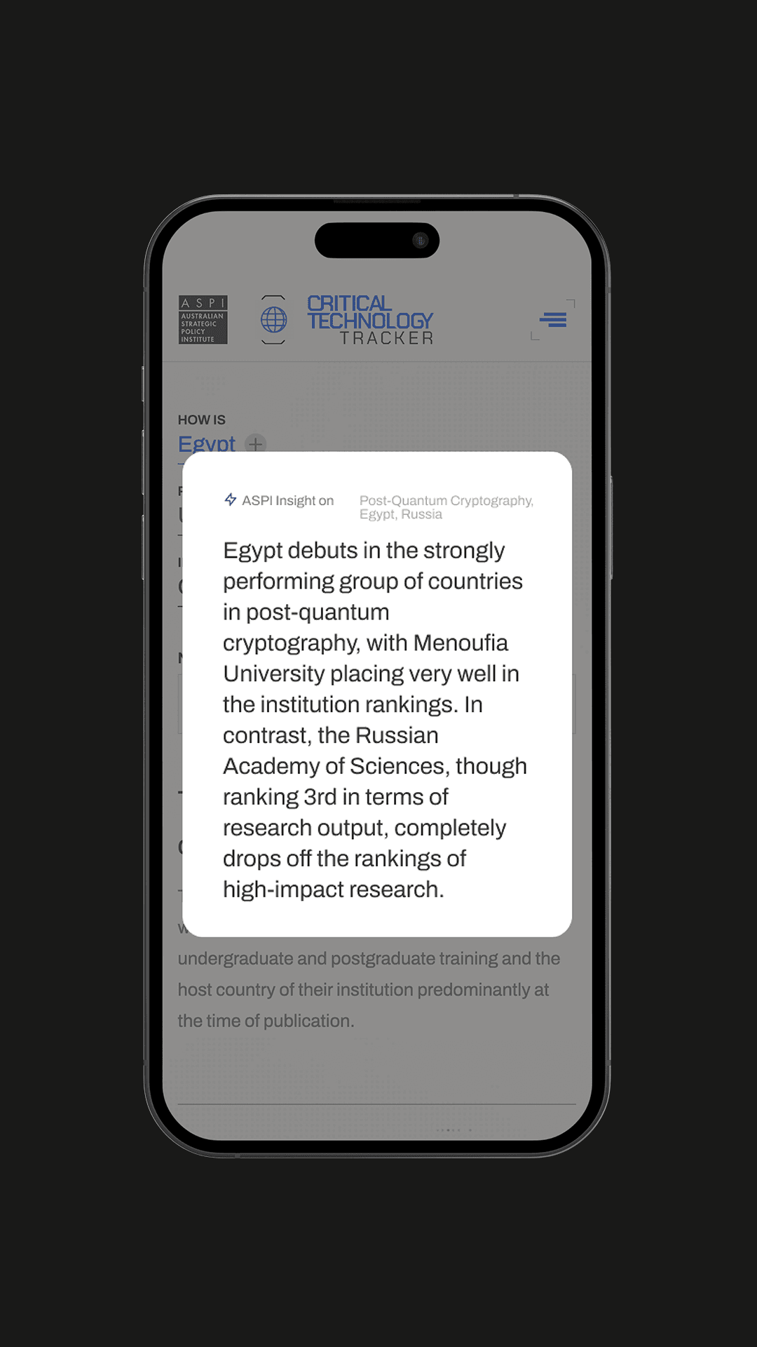
According to the ASPI Critical Technology Tracker’s analysis of 2.2 million high-impact research papers published between 2018 and 2022, China leads in most of the 64 critical technologies tracked
The world’s top 10 leading research institutions across most technology areas are based in China, collectively generating approximately nine times the high-impact research output of the second-ranked country, which is most often the United States.
The Tracker measures national leadership through four metrics:
- High-impact citations (top 10% most-cited papers in each area)
- Total research output volume
- Research talent migration patterns (Sankey diagrams showing brain drains and brain gains)
- Top research institutions per technology area
Specific technology rankings — including who leads in quantum computing, biotechnology, AI chip design, advanced materials, post-quantum cryptography and 60+ other critical technologies — are available at the Critical Technology Tracker website published by ASPI.
A research website that needs to work for international journalists, policy researchers and decision-makers has four design constraints most marketing websites don’t carry:
- Citation-grade infrastructure: shareable URLs that preserve filter state for republication in third-party media.
- Methodology transparency: journalists and researchers need to scrutinise the data before they cite it.
- Performance under international load: static-published architecture that handles traffic spikes from Reuters or the Financial Times linking to a specific visualisation without degrading.
- Security profile matched to the subject matter: a website analysing China’s critical technology research attracts state-actor and malicious traffic that a marketing site doesn’t. The architecture has to assume that.
The ASPI Critical Technology Tracker met all four.
Within 72 hours of launch, the platform was covered across Reuters, the Wall Street Journal, the Guardian, Al Jazeera and ABC News, with continued coverage through 2024 and 2025 in the New York Times, Nikkei Asia, Bloomberg and the Financial Times.
The same architecture supports cited research from the Harvard Kennedy School’s Belfer Center, Lawrence Livermore National Laboratory, the Carnegie Endowment for International Peace, Chatham House, the US National Academies of Sciences and the Parliament of Australia. Mude designs and develops these websites from its Sydney and Canberra studios for think tanks, independent policy research institutes and complex regulated organisations.
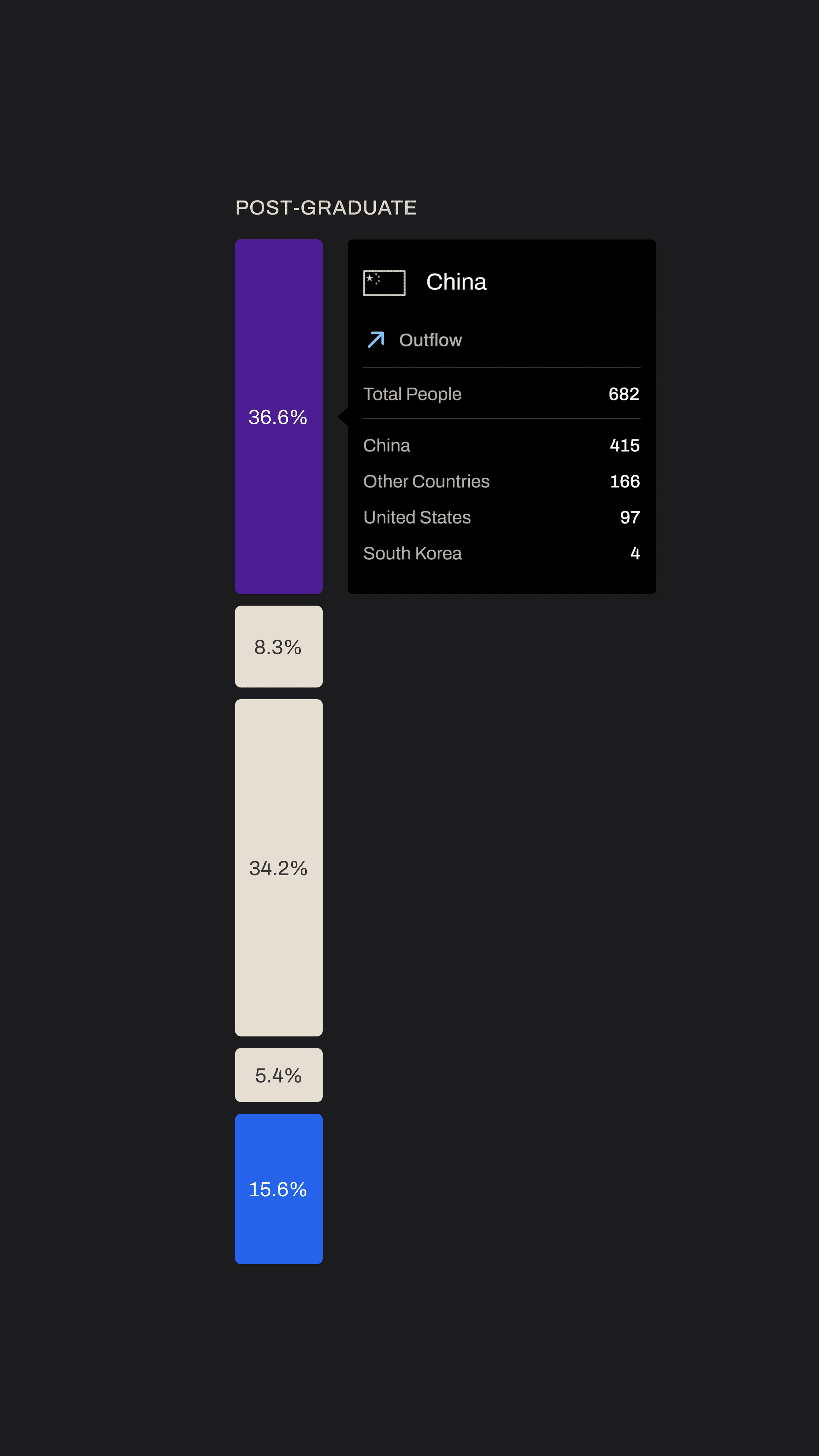
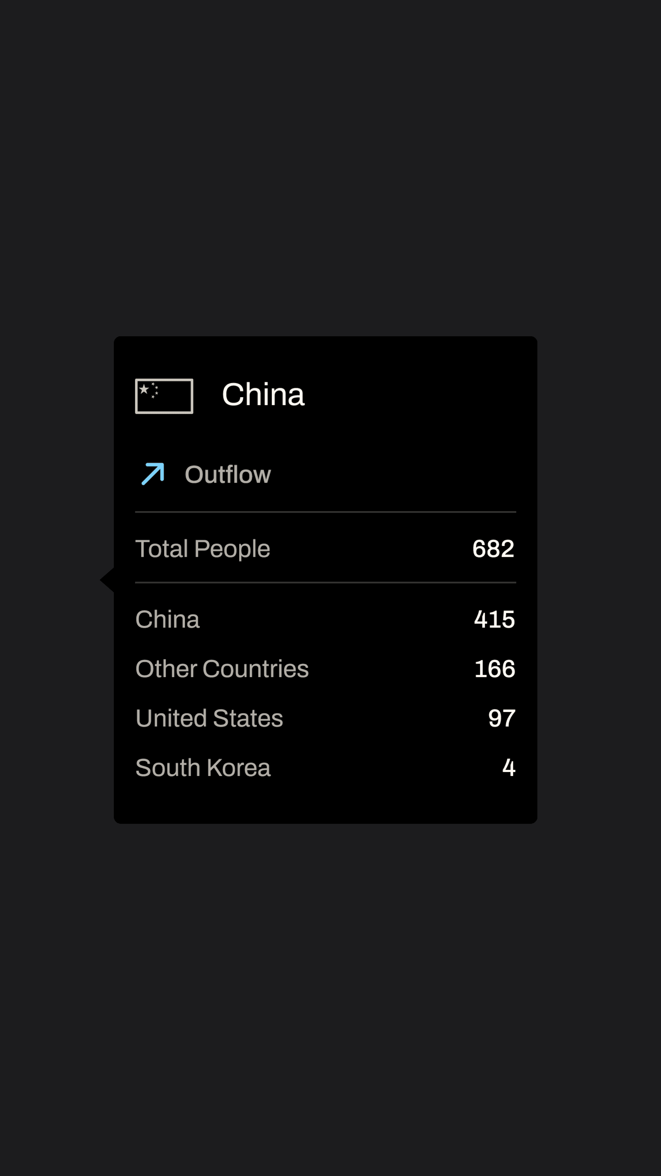
A Sankey diagram is a data visualisation that shows flows between categories, where the width of each connection is proportional to the quantity flowing through it. The diagram is named after Matthew Henry Phineas Riall Sankey, the Irish engineer who first used the format in 1898 to visualise the efficiency of steam engines.
Sankey diagrams work best when you need to show:
- How a quantity is distributed across stages or categories
- Where flow concentrates or thins between source and destination
- Imbalances between inflows and outflows
The ASPI Critical Technology Tracker uses Sankey diagrams to visualise the global flow of high-impact research talent between countries, showing brain drains and brain gains at the undergraduate, postgraduate and employment stages of researchers’ careers across each of the 64 critical technologies.
The Sankey format makes it immediately visible which countries are attracting top research talent and which are losing it.
Mude is a brand and design studio working across Sydney and Canberra on brand strategy, web design and development, and data visualisation. Its clients include think tanks, policy research institutes, federal departments, ASX-listed corporates and B2B technology companies.
Mude’s wide portfolio across brand, video, creative campaigns and corporate communications design covers federal departments, ASX-listed corporates, FMCG brands, hospitality groups and complex transformation work for organisations whose research, policy or strategic communications need to land with media, decision-maker and public audiences.