
Apporetum
Apporetum: B2B branding for an identity and access management leader
Transforming Apporetum into a leading security & access management brand with a strong culture, distinct identity, and clear vision.
We worked closely with Apporetum to understand their brand stakeholders and what sets them apart in the security and access management industry. Our deep dive resulted in a brand strategy that cultivated strong cultural and workforce alignment through defined beliefs, commitments, and vision. Our efforts also included a brand awareness and strategy activation roadmap, and a messaging strategy wrapped within a tone of voice guideline. Our extensive strategy work fuelled the development of a refreshed brand identity and logo, inclusive of an explainer video and website design that elevated Apporetum’s brand awareness and drove their story in humanising access management.
Appretum x Mude
Case study video

Related Projects
View Project

Brand, Website
Sunstrata
View Project

Video
Amazon Music
Webby Awards Nominee
1View Project

Brand, Website
NextOre
View Project
Brand
Rosella St
View Project

Video
Sport Integrity Australia
View Project
Website
The Embassy of France in Australia
View Project

Brand, Video
Department of Education, Skills and Employment
View Project

Video
Sensori+
Frequently Asked Questions
You were going to ask anyway.
Access management is how an organisation controls who can reach which applications, systems and data, and for how long. It covers granting access when someone joins or changes role, removing it when they leave, reviewing it on a schedule, and responding when something goes wrong. Most organisations run this through IT or security teams using tools built for engineers, which is part of why the category has a reputation for being slow and hard to follow.
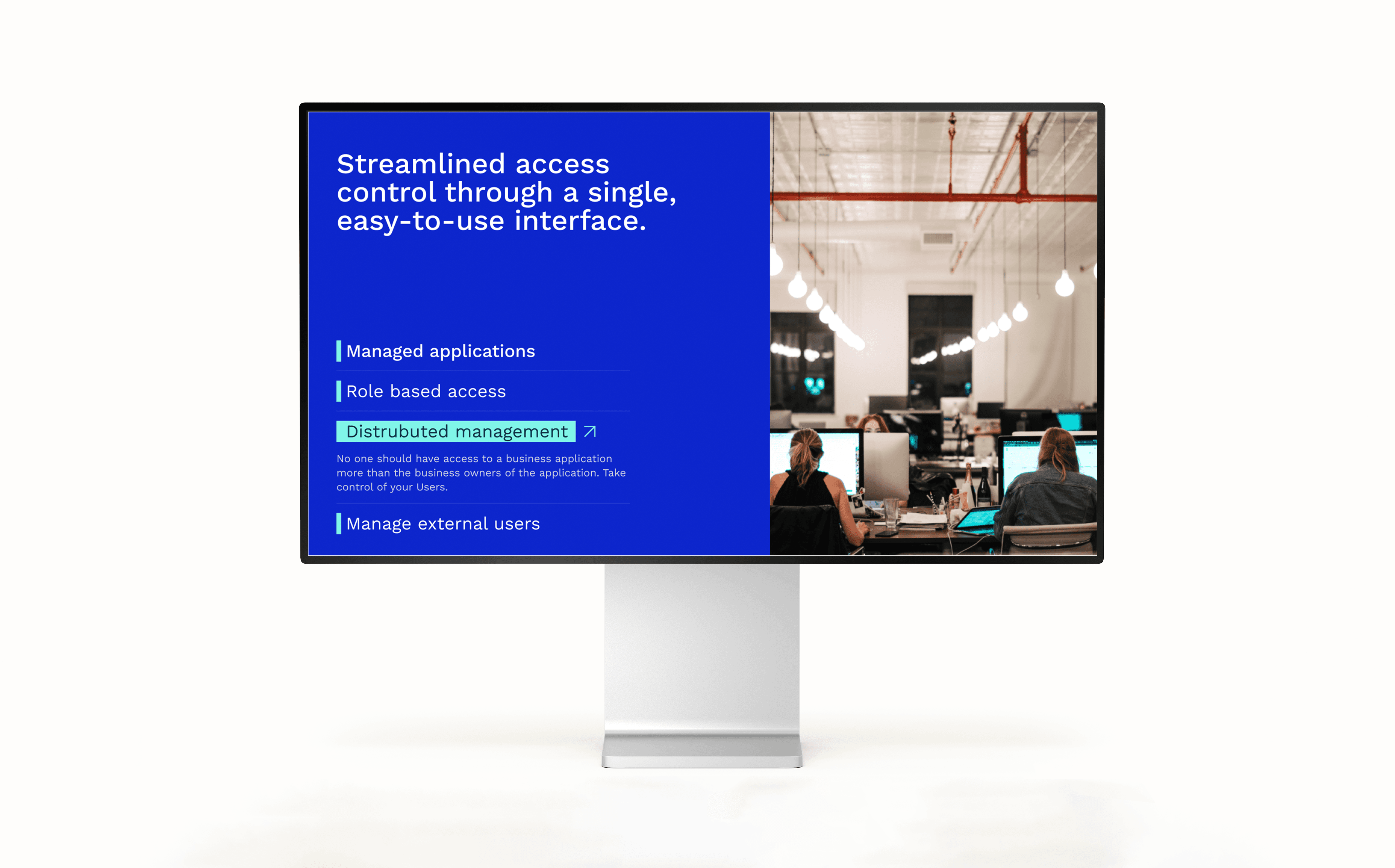
Apporetum, the Canberra platform Mude branded, hands that control to the business through a single interface and works on top of Azure AD. The brand work started from that fact, positioning Apporetum as access management a business manager can run without waiting on an engineer.
B2B branding builds the brand identity and positioning for companies that sell to other businesses. B2B buyers claim to decide on rational criteria, then use brand as the tiebreaker on the procurement scorecard, so the brand is doing work whether the company invests in it or not. A neglected B2B brand is usually what holds a company back from winning clients and from justifying the rates it wants to charge.
Apporetum is a working example. Mude built the positioning and identity for a technical access management product so it competed on more than a feature list, which creator-led repositioning for B2B sets out to do.
You brand a complex, technical B2B product by finding the single human idea it serves and building the strategy, identity and content on that,. Technical brands usually lead with features, because the people who built the product are proud of them, and the result is a brand only another engineer can read. It also drags the company into feature-by-feature comparisons, which the leading competitor usually wins.
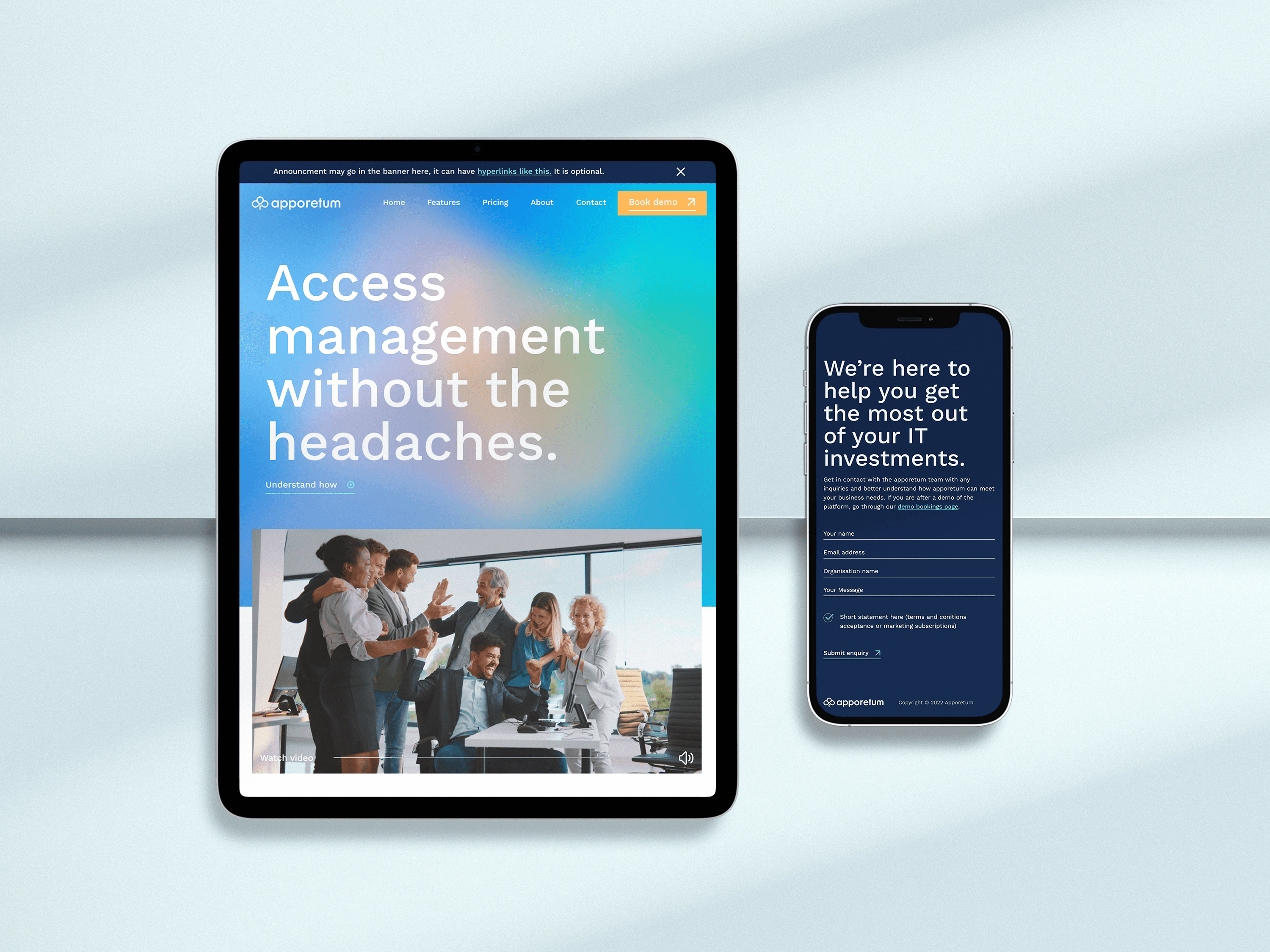
Apporetum, an access management platform, is a clear example. The idea Mude built on was humanising access management: taking a category run by and for engineers and handing it back to the business. Strategy, messaging, tone of voice, identity and an explainer video all carried that one idea. Owning an idea no competitor can claim lets a small product compete on something other than who has the longest feature list.
For an early-stage technology company, brand work is mostly about choosing the right constraints early, before they get baked in, and aligning the team on one account of what the company is. Established companies pay a brand agency to remove things that no longer work; a new company has nothing to remove yet, so the value is in the decisions it locks in now, which cost a fraction at the strategy stage of what they cost to unpick at year three.
Apporetum is a case in point. Mude’s work began with defined beliefs, commitments and a vision to give the team one story, then a messaging strategy and tone of voice, then a refreshed identity, an explainer video and a website. Settling what the company stood for early let a small player set its own terms against incumbents many times its size.
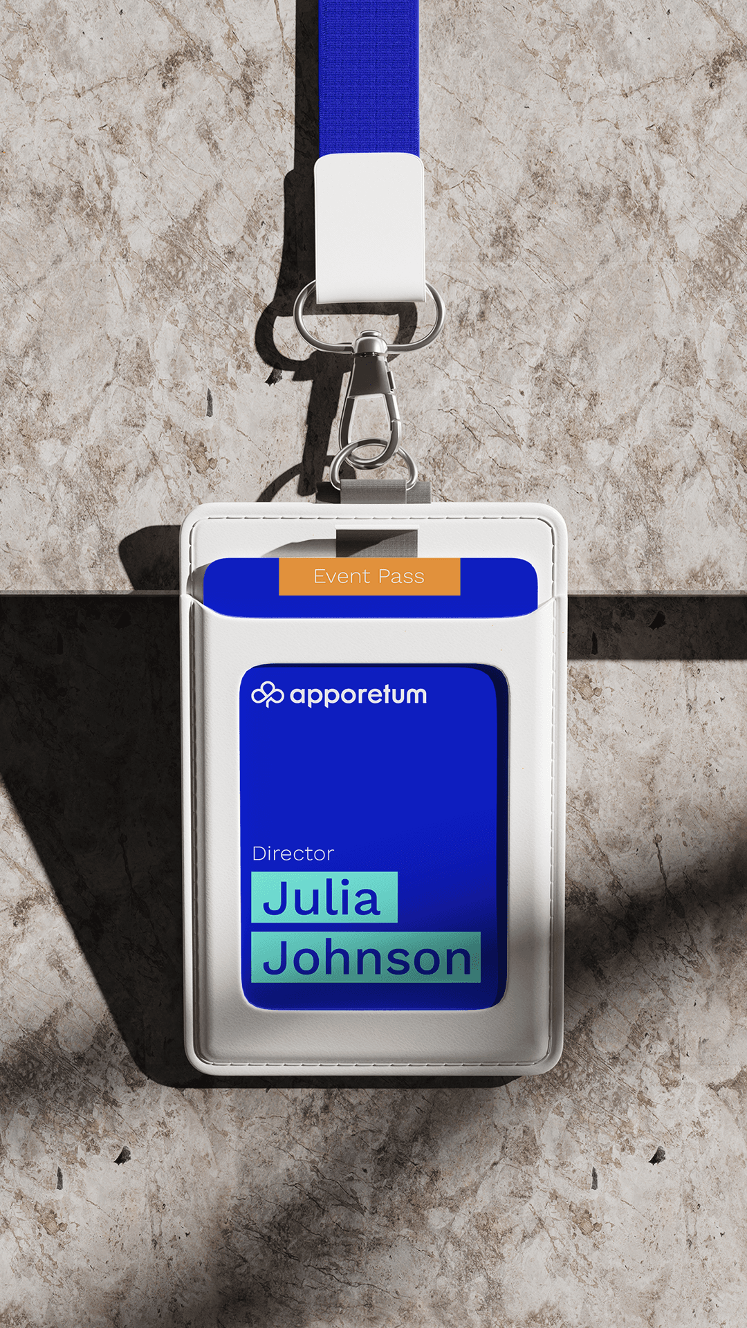
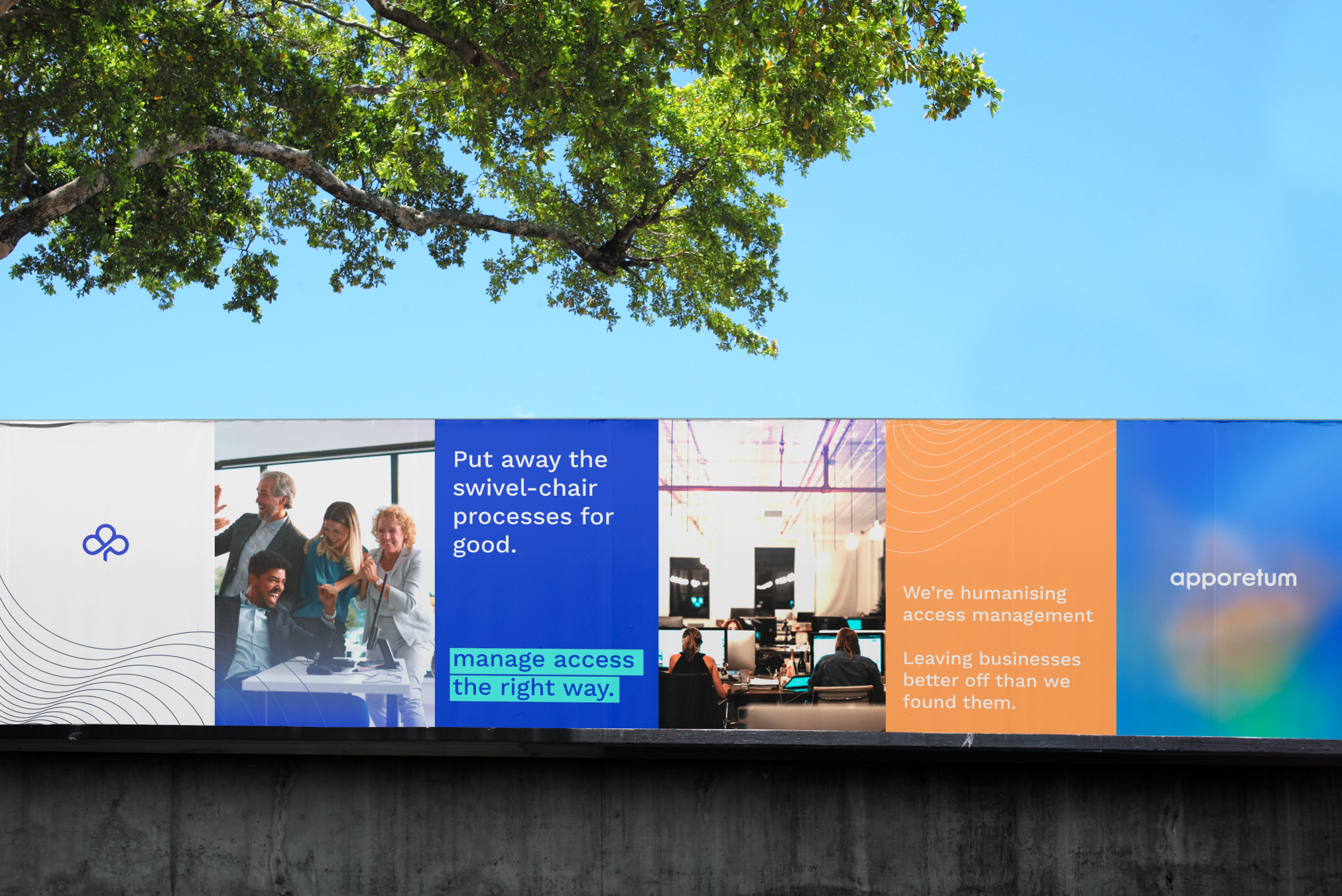
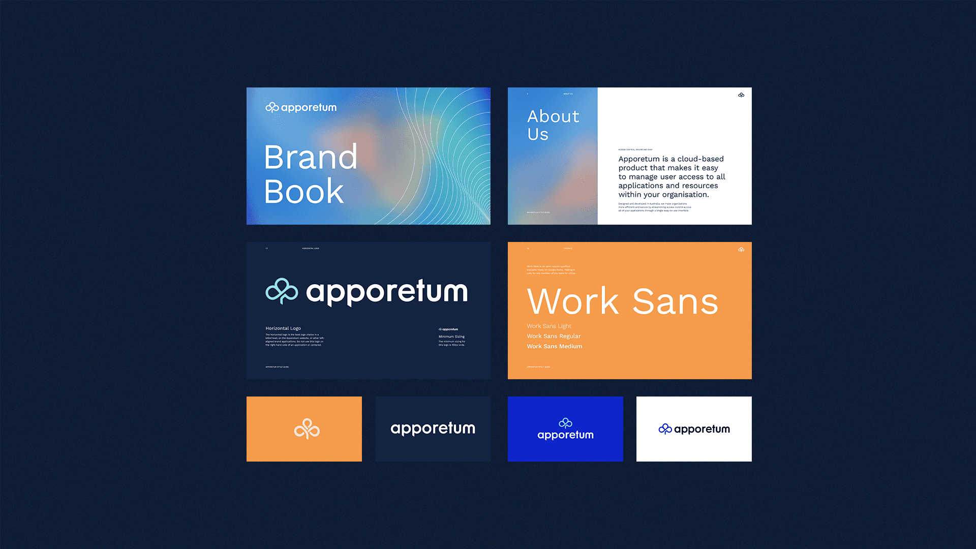
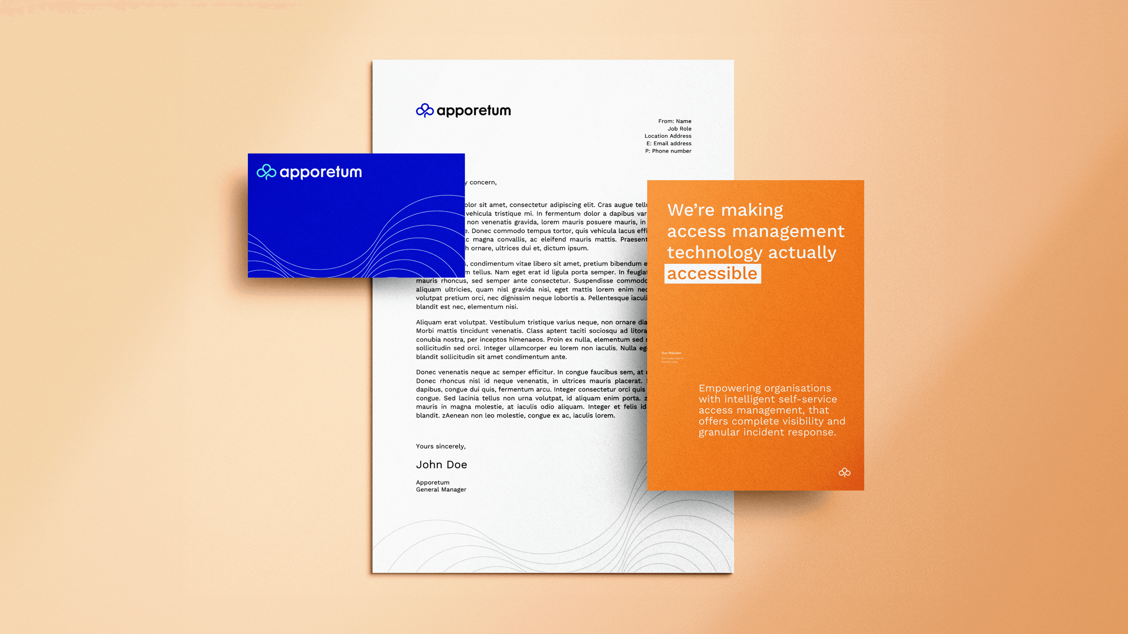
The Apporetum logomark intertwines a tree with the cloud the platform runs on. The tree comes from the name’s root in arboretum, a tended collection of many species in one place, which mirrors how the product brings an organisation’s many applications under one managed canopy of access. The cloud signals a cloud-native platform that sits over existing systems.
Mude designed the mark to work small, in black or white, as a corner element, and to sit beside a wordmark set in Work Sans. Tying the mark back to the name helps it last: a logomark with a reason behind it holds relevance well past a decorative tech glyph, which tends to look dated once the trend that produced it has passed.
Apporetum’s brand typeface is Work Sans, an open-source sans-serif available free on Google Fonts. Mude chose it for two reasons. The practical one is access: an open-source face means anyone on the team, and any outside vendor, can set on-brand type without chasing a licence, which matters for a small company producing a lot of its own material.
The second reason is character. Work Sans is clean and contemporary without feeling cold, which suits a product trying to come across as lightweight, approachable technology. It runs in two weights across the system, Medium for headings and Regular for body, so the brand holds together on the website, in the product interface and across a pitch deck.
B2B and technology branding in Australia is handled by a mix of independent brand studios, specialist B2B marketing shops and large full-service agencies. They differ in where they put their weight: marketing-led shops tend to lead with demand generation and campaigns, while design-led studios tend to lead with identity. The rarer capability is treating brand as business strategy, the question of where a company competes and how it wins, and building the identity out of that.
Mude works at that end, branding technical and B2B companies like Apporetum, the Canberra access management platform, where the problem was a product most buyers found hard to follow. For a business choosing a partner, the question that separates agencies is whether they diagnose what is actually holding the brand back before they design anything.
Yes. Mude runs a Canberra studio alongside its Sydney one, and Apporetum, a Canberra access management company, is an example of the B2B and technology work that comes through it. Canberra’s market leans toward government, defence, cyber security and the corporate headquarters that serve them, where buying is slow, multi-stakeholder and runs through procurement, and brand tends to act as the tiebreaker once the shortlist looks rational on paper.
For Apporetum that meant an identity built to signal seriousness to a security-literate buyer while still standing out from the faceless enterprise tools it sat beside. Working across Sydney and Canberra lets Mude bring the standard of a national studio to a market that local generalists usually have to themselves.
For an early-stage B2B company, brand strategy is worth it when the company is being pushed to compete on price or struggling to get shortlisted, because both are usually positioning problems. Brand is how a business wins more customers, keeps them for more years, and charges more for the same work, and for a young company, setting that position early costs less than discounting into the market and trying to raise prices later.
Apporetum put the money at the strategy end first, settling what the company stood for and who it was for before any logo work. For a small player against incumbents many times its size, that makes it possible to set a price and a position on its own terms.
Identity management deals with who someone is. Access management deals with what they are allowed to reach once that identity exists. Identity management creates and maintains the account, the joiner-mover-leaver record, and the single source of truth for a person across systems. Access management governs the entitlements attached to that identity: which applications, which roles, granted when and revoked when. The two overlap, which is why the field is usually bundled together as identity and access management, or IAM.
Apporetum works on the access side, governing entitlements and incident response on top of an existing directory like Azure AD. That distinction shaped the brand. Mude positioned Apporetum on the access problem specifically, so it stayed clear and recognisable.
Brand identity has the same two jobs in B2B and consumer markets: create distinction so people remember the company exists, and signal meaning so they size it up the way it wants to be sized up. What changes is the buying context. A consumer identity is built to win a fast choice at the shelf or on a screen, so it can lead with feeling. A B2B identity, especially for a technical product, has to make a multi-person buying group understand what the product is before any of them will champion it internally.
The components look similar, a logo, a palette, type and tone of voice. The weighting differs. B2B leans hard on messaging and positioning; consumer leans hard on distinctive visual assets. For Apporetum, Mude weighted the identity toward distinction and signalling: standing out in a category of near-identical enterprise tools, and signalling a product the business itself could run.
Humanising a technical category means rebuilding how it is explained around the people who live with the problem. Access management runs on language about provisioning, entitlements and directory reconciliation, none of which means much to the manager who just needs to give a new starter access to three systems by Monday.
Apporetum’s purpose, the line Mude built the brand on, is humanising access management: the same capability, explained and designed so a business owner can run it without a security background. The company that frames a technical category in human terms becomes the one a buyer can picture using, which is how it gets shortlisted ahead of competitors who only talk to engineers. That is brand working as a competitive lever.
The name Apporetum comes from arboretum, a place where many species of tree are deliberately collected and tended in one managed setting. Applied to software, the idea fits what the product does with an organisation’s scattered applications and access: bring them into one well-tended place. The name predated Mude’s engagement, and the brand work drew out the idea sitting inside it.
The logomark intertwines a tree form with the cloud the product runs on, so the logic of the name shows up in the mark. Drawing a brand’s central image out of its own name, gives the identity something specific to it.
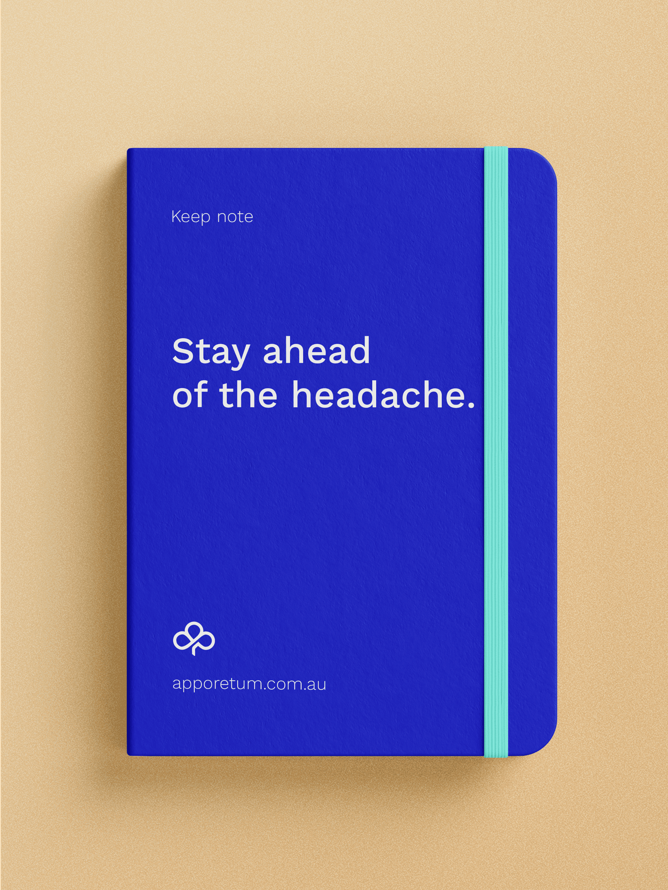
Apporetum keeps blue in its palette and refuses to lead with it. Blue is the default across security and IT branding because it reads as safe and trustworthy, and because almost every vendor uses it, it has stopped doing any work to tell them apart. Apporetum needed the trust that blue is shorthand for without disappearing into a field of identical blue competitors.
So the brand pairs a deep navy with a bright aqua and a warm orange. The job of an identity is to create distinction so people remember you and to signal meaning so they size you up correctly, and a palette that dissolves into the category does neither. Stepping out of the blue default wasn’t a colour preference, it was a positioning decision: the colour does the same work as the rest of the strategy, marking Apporetum as a different kind of access management company.
Apporetum’s brand was created by Mude, a brand and design studio with offices in Sydney and Canberra. The engagement covered the full system: stakeholder discovery, brand strategy, a brand awareness and activation roadmap, a messaging strategy and tone of voice, a refreshed identity and logo, an explainer video and a website.
The strategy was led by art director Eamon Cross with account director Shooby Kandel. The explainer video was directed and edited by Alexander Given under creative director Ben Develin, with animation by Prajdnik Awasthi and Emilie Carmona and production by Benjamin Ling. Apporetum’s managing director Sophie Wade was the client throughout. Keeping strategy, identity and video in one studio kept the explainer film saying what the strategy had decided.
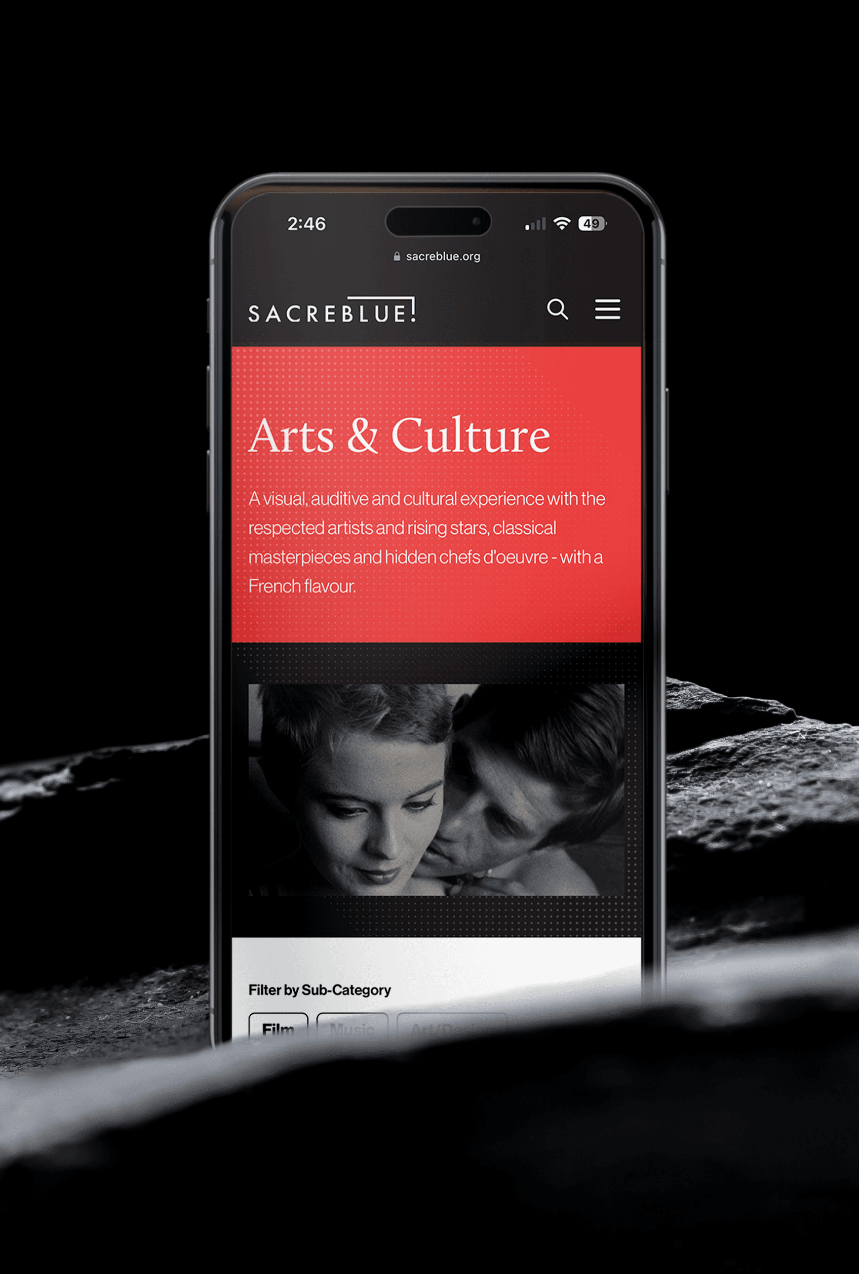
Yes. Apporetum’s website was designed by Mude as part of the same engagement that produced the brand strategy and identity, because a new brand running on an old site undercuts itself. Mude builds the brand and the site from the same thinking.
For a B2B product the website is where a buyer goes to size the company up, and a good one does two jobs: it has to nail the UX, and it has to signal the company is a brand worth someone’s time. For Apporetum that meant a site that explained access management in plain terms before it reached for features, so the product made sense to a buyer landing cold.
A B2B brand strategy project is mainly business strategy, with creative strategy a downstream output. It decides where a company competes and how it wins, who it is for, and what someone is actually buying, before any logo work begins. The usual components are stakeholder discovery, a diagnosis of what is actually holding the business back, positioning, a messaging framework and tone of voice, and a roadmap for rolling it out.
For Apporetum, Mude ran that sequence: discovery with the people who run the business, then defined beliefs, commitments and a vision, a messaging strategy and tone of voice, and a brand awareness and activation roadmap. All of it then fed the identity, the explainer video and the website. The order matters, because the design only works if the decisions underneath it are right.