

3 Keys Records
Building a brand identity for Ned Houston’s long-awaited debut
We worked with 3 Keys Records to shape the artist branding for Ned Houston and shape a visual identity that felt as considered as his songwriting.
Known for writing credits with the like of Guy Sebastian, and had cuts on multiple chart-toppers in Korea and Japan, Ned was ready to step into the spotlight with his own solo project. Our challenge was to build an artist brand that felt authentic to Ned, balancing his grounded, boy-next-door energy with a sense of quiet confidence. One of the brand’s quiet signatures is the wordmark itself, the ‘Houston’ line beneath his first name is set in his mum’s handwriting. It’s her maiden name, and a subtle tribute to the person who gave it to him.


The brief
Ned had already built a serious reputation as one of Australia’s most respected young songwriters, with writing credits for Guy Sebastian and cuts on chart-toppers in Korea and Japan, all run in parallel with a long rhythm of weekend gigs in Canberra and weekday sessions in Sydney. The artist project had been sitting on the back burner the whole time. When 3 Keys Records came on board, the catalogue of unreleased songs finally had a release strategy around it, and we got the brief to build the identity that would carry it.
Most people who knew Ned through socials assumed he was somewhere overseas, writing in Stockholm or Seoul, or vanishing into a songwriting camp on the other side of the world. Inside the industry, he was treated as a credibility signal: if Ned was in the session, the project tended to come out the other side better than it went in. The gap was between that internal reputation and what audiences actually saw, which was a humble, lightly mysterious Canberra kid posting less than he probably should.
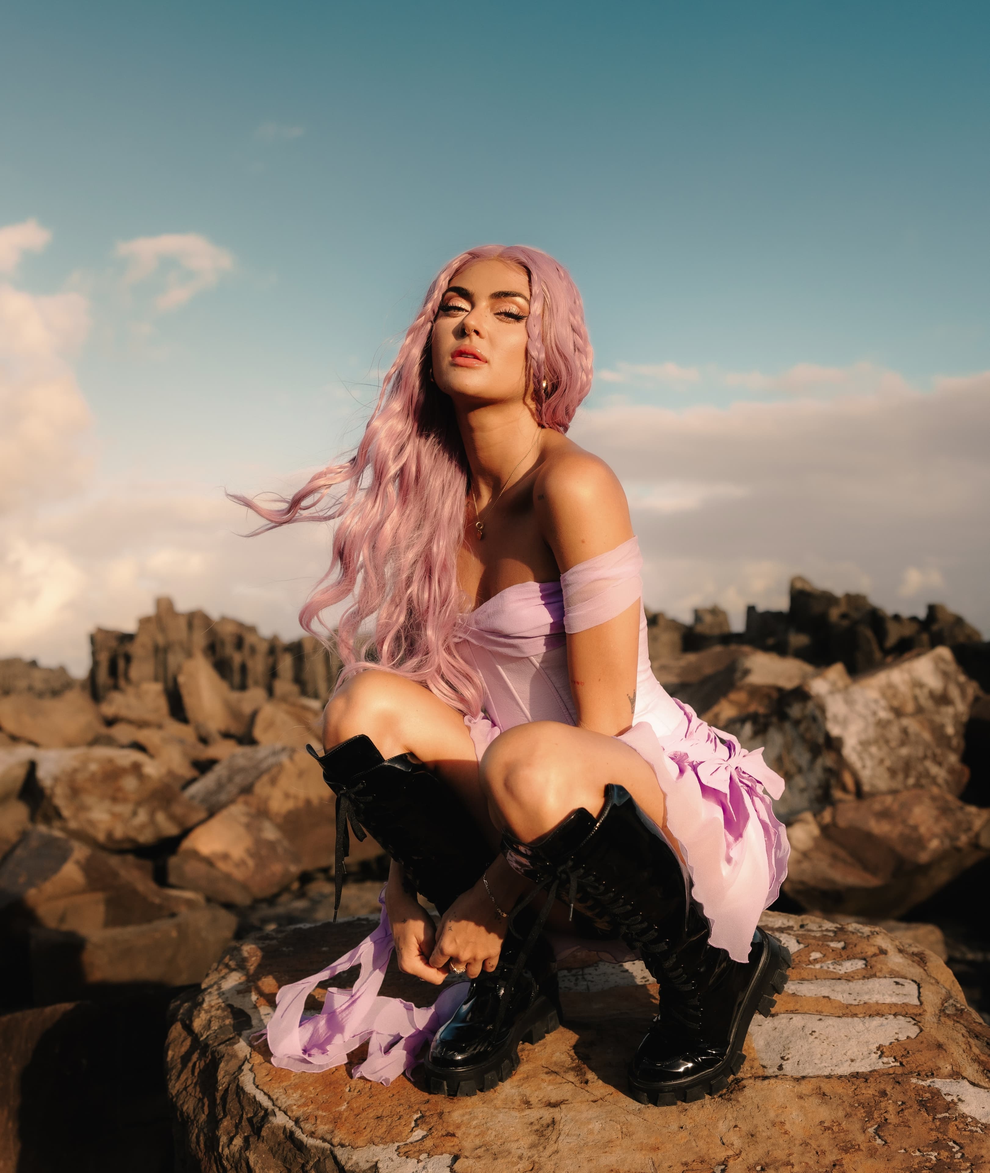
The brief was to close that gap without losing what makes Ned, Ned. Grounded, sincere, a long way from the media-trained pop persona, but unmistakably the kind of artist you’d assume already had the room. The identity needed to feel expensive, not in the luxury sense, but in the sense that the songs sit at the end of years of craft and shouldn’t look like a bedroom upload. It also needed to stay attainable. We weren’t building an idol. The reads we were chasing were closer to someone you could imagine meeting, who happens to write the songs that wreck you.


The singer-songwriter visual playbook has a few well-trodden moves: the cinematic walk down the empty road, the cliff-edge contemplation, the TikTok-trend chase that ages in a quarter. None of it fit. Ned’s tonal references pointed somewhere more in the worlds of Mk.gee, Ryan Beatty, Hazlett, Dominic Fike. Artists whose visual worlds reward repeat looking, whose mood lives somewhere between intimate and underground, and who let the music carry the weight rather than translating itself into the most obvious image cues.
The wordmark sits in a customised bold serif with hand-cut character. Structured enough to read as confident at small sizes, irregular enough to avoid feeling corporate. The letterforms carry a bit of theatre: ligatures and shaped edges. Underneath the first name, the “Houston” line is set in his mum’s handwriting. It’s her maiden name. A signature detail Ned will carry on every poster, release, and t-shirt, without anyone outside his world ever needing to know it’s there.
The serif does the headline work and gives the identity its character. A clean neutral sans handles the supporting layer, tour dates, captions, ticket stubs, and any time the typography needs to step back and let an image breathe. The two registers together cover the full surface area an artist brand has to hold: single covers, billboards, merch, social, tour print.


The identity gives Ned a brand that signals the level of song behind it. He can move from a stripped-back listening session in a rented house through to a Forum Theatre poster without the visual language having to switch costumes between them. The system is built for the kind of project a serious career takes shape inside, where the work compounds over years rather than chases a viral fortnight, and where the audience that finds him has the cues to recognise themselves as the audience he was always writing for.

Related Projects
View Project
Video, Photography
Amazon Music
View Project

Website
Amazon Music
View Project

Video, Photography
Chugg Music
View Project

Brand, Video
Mood on the Roof
Webby Awards Nominee
2View Project

Website
Tamworth Regional Council
View Project

Campaigns
Mavin Records
View Project
Video
Dan Sultan
View Project
Video, Photography
The Rions