
Department of Health, Disability and Ageing
Driving awareness and participation for BreastScreen Australia
Elevating awareness and participation in Breast screening through a powerful video campaign for the Department of Health & Aged Care and BreastScreen Australia.
BreastScreen Australia is a joint initiative of the Australian and state and territory governments. It aims to reduce illness and death from breast cancer by detecting the disease early. Screening mammograms are used to find breast cancers early, before they can be seen or felt. The earlier breast cancer is found, the better the chances of surviving it.
Our goal was to create a set of videos that would help increase participation for women over the age of 50 to book in for a free breast screening. Early detection can both save lives and reduce the severity of treatment. Our concept included a mix of interviews with women who have had a breast screen, and are advocates for the program. We used both live-action cinematography and 2D animation to create a series of charming and visually mesmerising video pieces to encourage more women to book in for a breast screening.
The requirement
The brief was to lift participation from 55% to 66% by 2025, and to do it across audiences where the participation rate was dragging the national average down. This project was all about figuring out why the women who weren’t booking weren’t booking, and what a combination of real voices paired with animated scenes could do that a mail-out couldn’t. BreastScreen Australia is the third population cancer screening program in Australia after cervical and bowel.
The Commonwealth funds it through the Department of Health. The states and territories deliver it across 750+ clinic locations and a fleet of mobile vans that drive into regional Australia on rotation. The invitation arrives in the mail when a woman turns 50, again every two years until she’s 74. The appointment is free, takes 20 to 30 minutes, and all clinical staff are women.
Nine out of ten women diagnosed with breast cancer have no family history. That means the assumption a lot of women carry around (“I’m not at risk, my mum didn’t have it”) is the assumption the program most needs to dislodge. Despite all of that, the national participation rate sat at 55%.
The Australian Institute of Health and Welfare (AIHW), which monitors the program alongside Cancer Australia and the National Cancer Screening Register, published the breakdown this project was aimed to address. 38% among Aboriginal and Torres Strait Islander women. 43% in very remote areas. 45% among women who spoke a language other than English at home. 52% in low socioeconomic areas. The Commonwealth had set a 66% target by 2025, a 20% lift in five years.
The last BreastScreen case study videos on health.gov.au were from 2006 and 2007. Fresh faces, contemporary visual language, material that could cut and recut across the state and territory delivery network for the rest of the decade.
The audience phase mapped five personas (Indigenous, CALD, women managing competing life priorities, regional women, women approaching the eligible age) against the documented barriers. The barriers were specific: cultural concerns around modesty and the female body, language access, the legitimate fear of an uncomfortable procedure, the perception that no family history equals no risk, time pressure, false security from a previous normal result, structural accessibility, the cost of taking time off work.
We built four docu-films, each anchored to a messaging pillar:
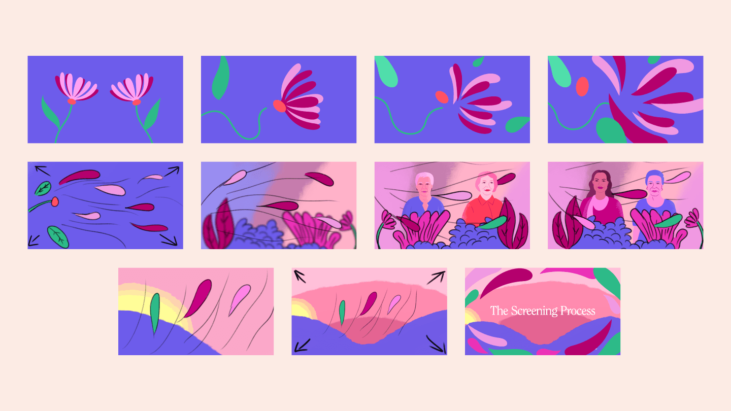
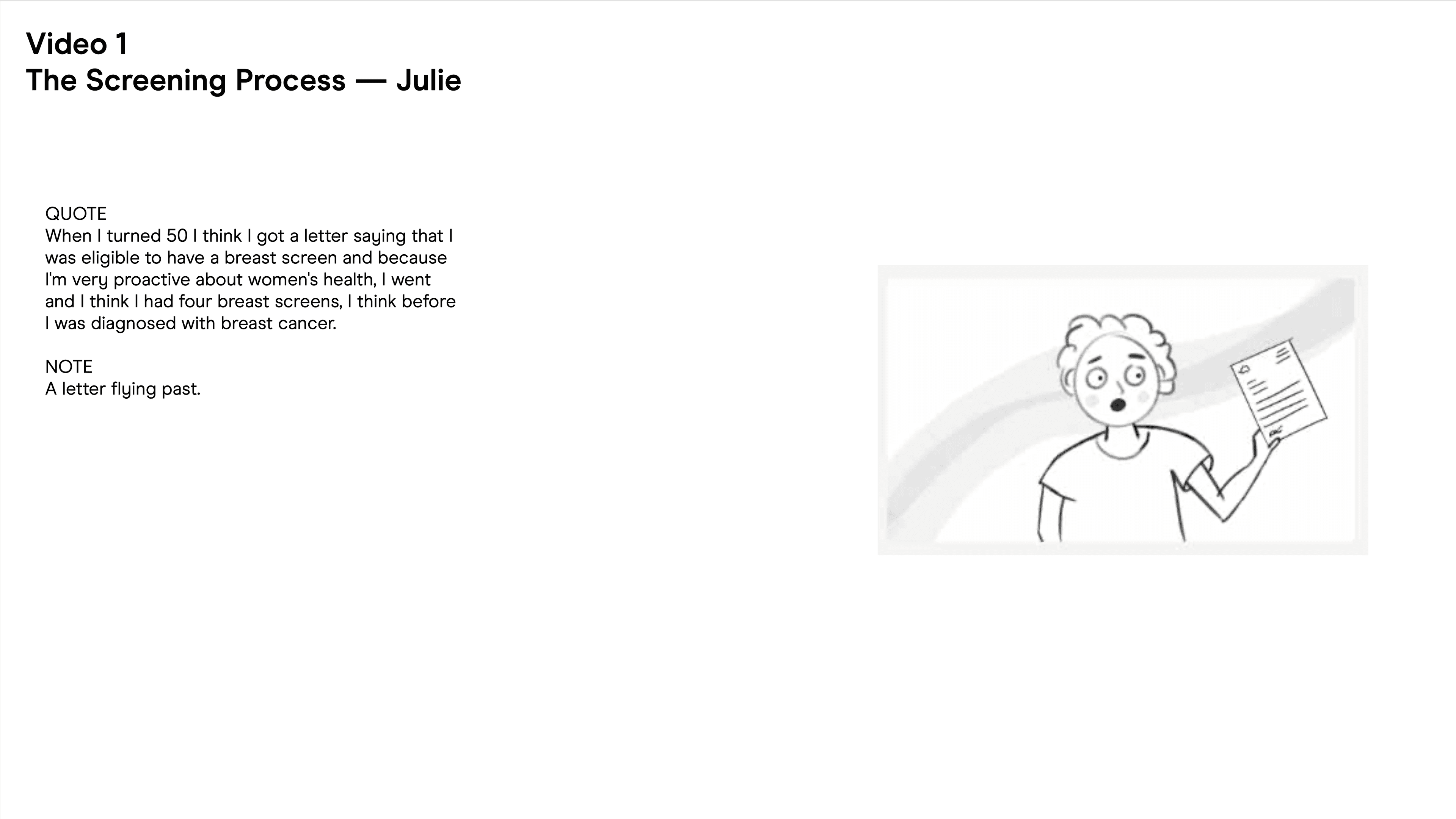
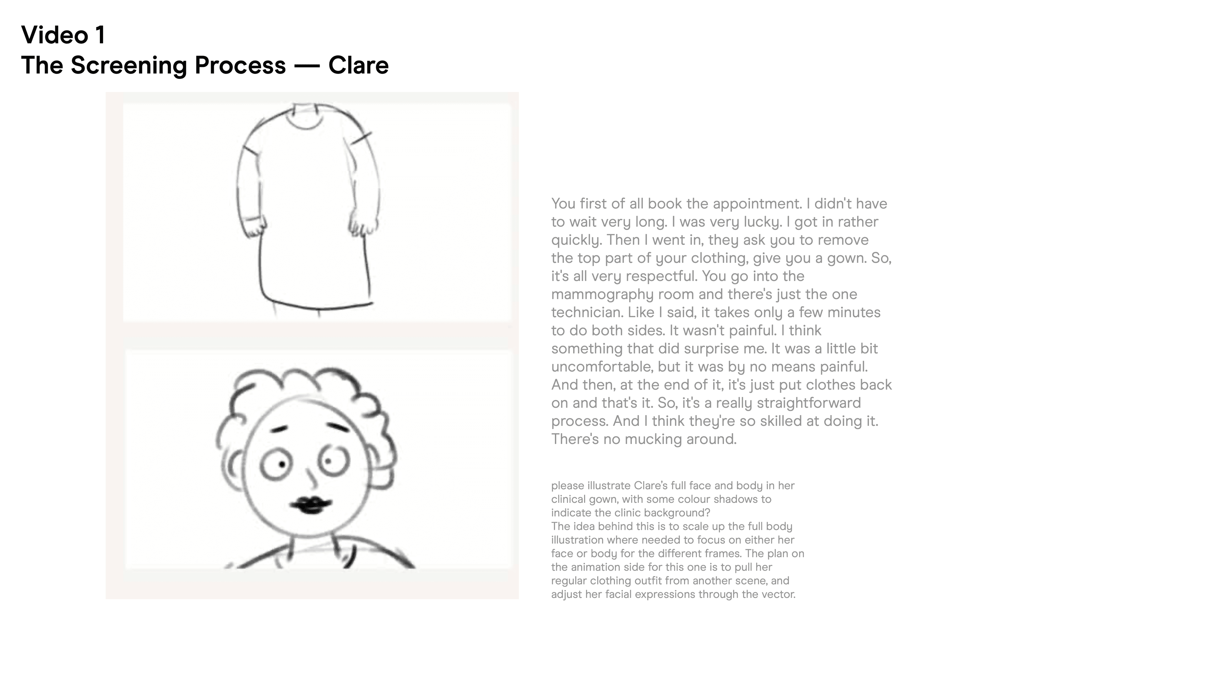
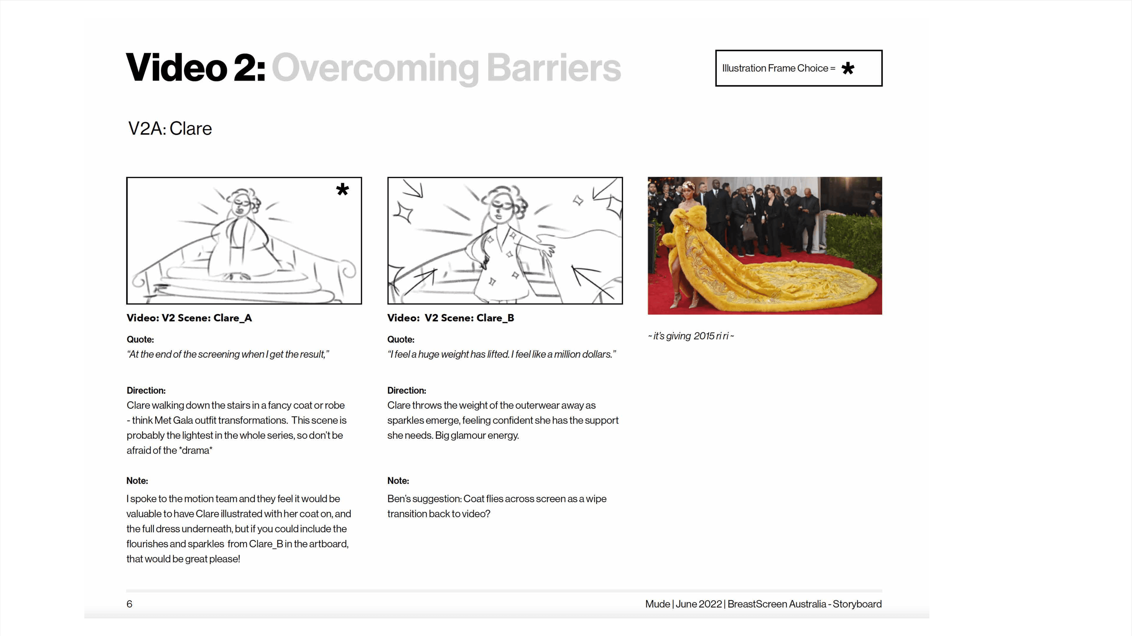
- screening process (what actually happens at the appointment: the 20-minute reality, the privacy shawl, the all-female clinical team)
- overcoming barriers (the specific ones each audience faces, including the no-family-history reframe)
- reasons to screen (early detection at 1cm rather than 4cm, the the 0.1% false negative rate)
- life after diagnosis (five-year survival sits at 99% when breast cancer is found early and drops sharply when it isn’t, which is the whole case for screening, told through the post-diagnosis stories of the women themselves)
Each film runs 3 to 5 minutes. Each cuts down into shorter social formats, animation excerpts, key-quote pulls, and stills for the state and territory marketing teams to use however suits their jurisdiction.

The breast cancer creative category has two visual conventions. The first is clinical: anatomical illustrations, mammography diagrams, X-ray imagery, the language of a teaching textbook. The second is the pink ribbon ecosystem: domestically that’s Pink Ribbon, the Breast Cancer Network Australia (BCNA), the McGrath Foundation, Cancer Council Australia, and Estée Lauder’s Pink Ribbon Campaign; internationally it’s Susan G. Komen, Breast Cancer Now in the UK, and the broader Pink Ribbon International network. Pink everything, charity-coded warmth, the gentle-but-uplifting tone.
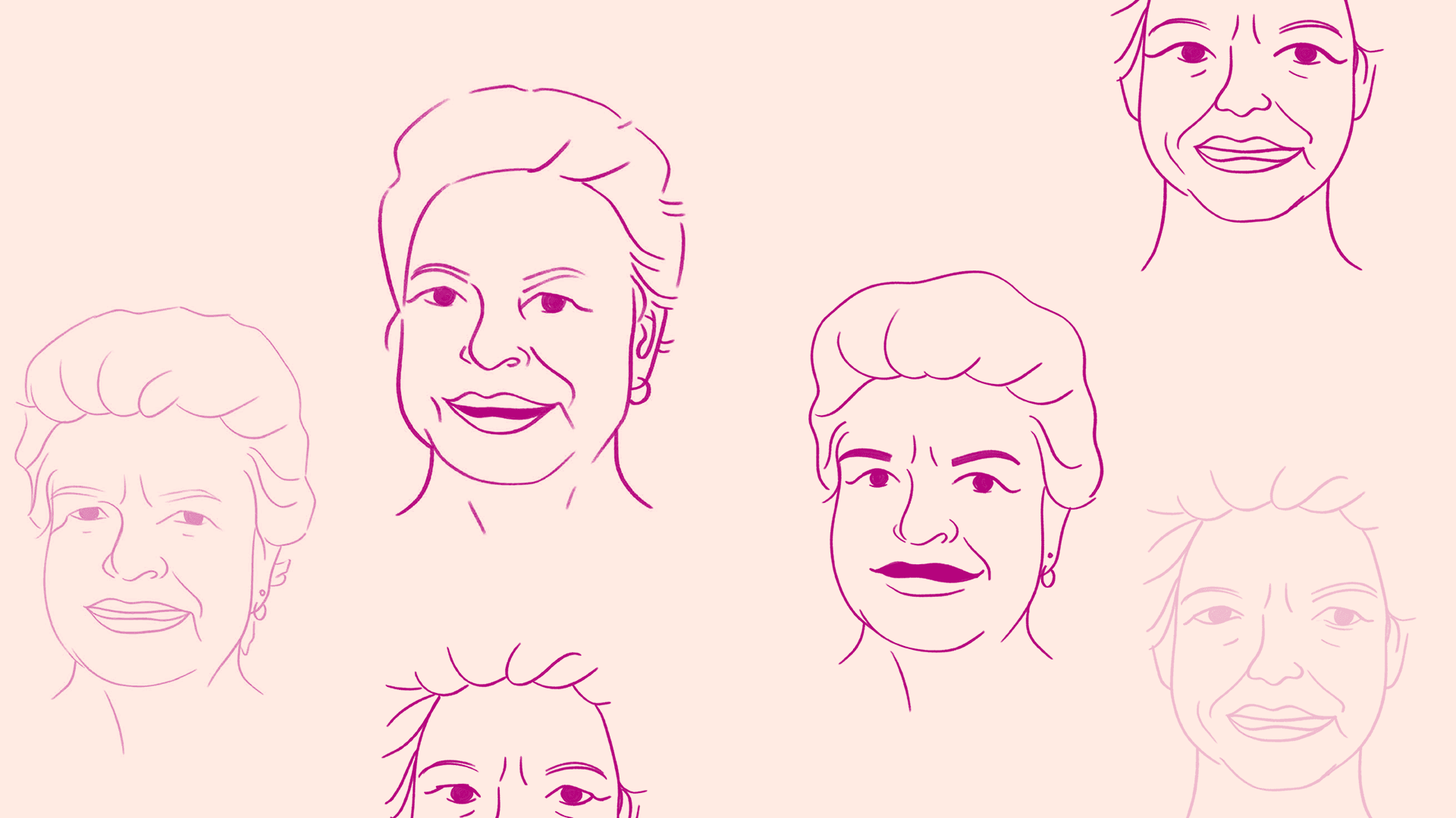
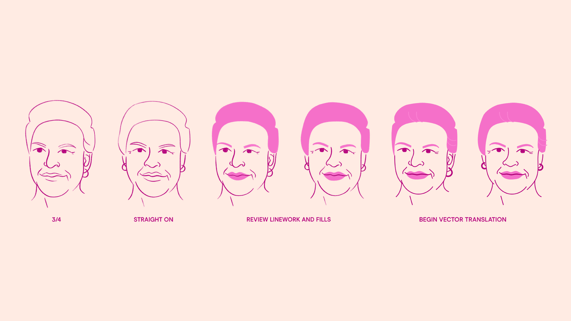
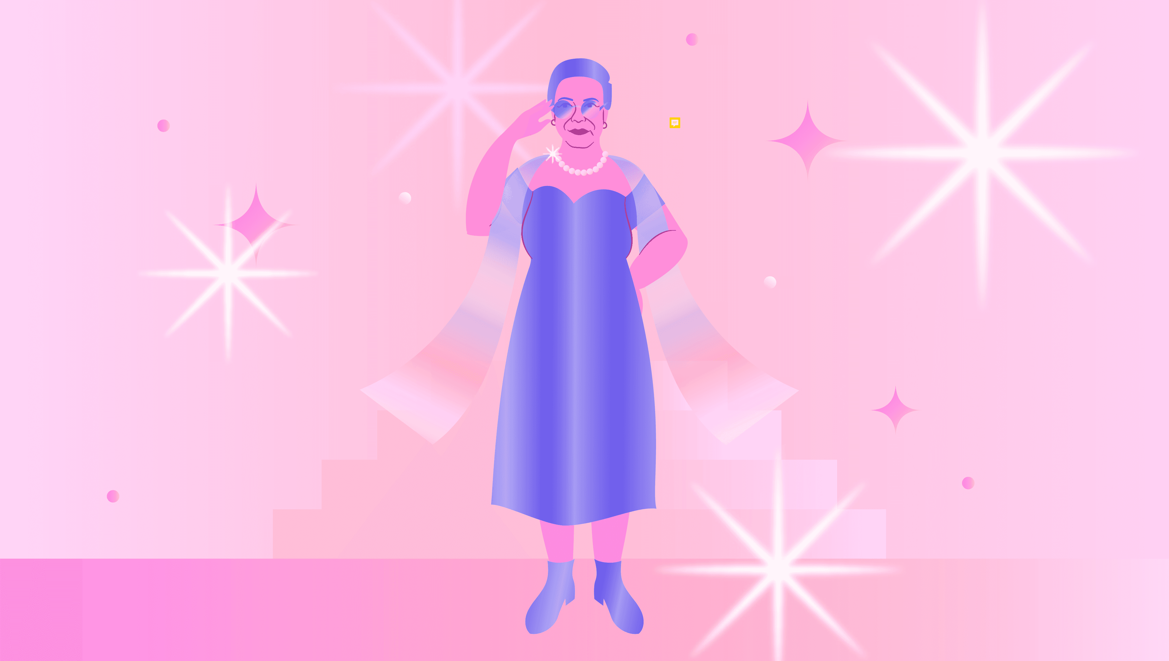
So we drew around it. The 2D animation system didn’t render the female body anatomically. The body got treated as metaphysical shapes, head and shoulders silhouettes, abstract geometric forms standing in for the body, hands holding reference objects (an hourglass, a privacy shawl, a phone with the booking screen open). Where breasts had to be referenced for the explainer to make sense, the illustration used alternative shapes that read as a body without showing the body.
Where a character was undressing for the procedure, the animation showed her back, or a hand resting protectively, or the privacy shawl doing its job. The illustration language drew from Lotta Nieminen, Daniel Frost, and Sara Andreasson more than from any medical publication, character-led, line-based, generous with grain and texture, designed within the Australian Government Style Manual’s accessibility and contrast requirements rather than against them.
For Indigenous audiences where cultural sensitivities around the female body run deep, the illustration carries the screening story without compromising on respect. For CALD audiences from traditional cultural backgrounds — Sri Lankan, Filipino, Vietnamese, South Asian, Middle Eastern — the animation explains the process without showing imagery the audience would (rightly) find intrusive. The animation was made for the audiences with the most barriers. The palette decision worked the same way.
The convention for breast cancer creative is pink (Pink Ribbon’s hot pink, BCNA’s softer rose, McGrath’s pink-and-grey). We pulled vibrant violets, deep blues, red-oranges and bright yellows against muted backdrops that exaggerated the brighter shapes. Sparing strokes. Strong grain. The work feels warm and contemporary.
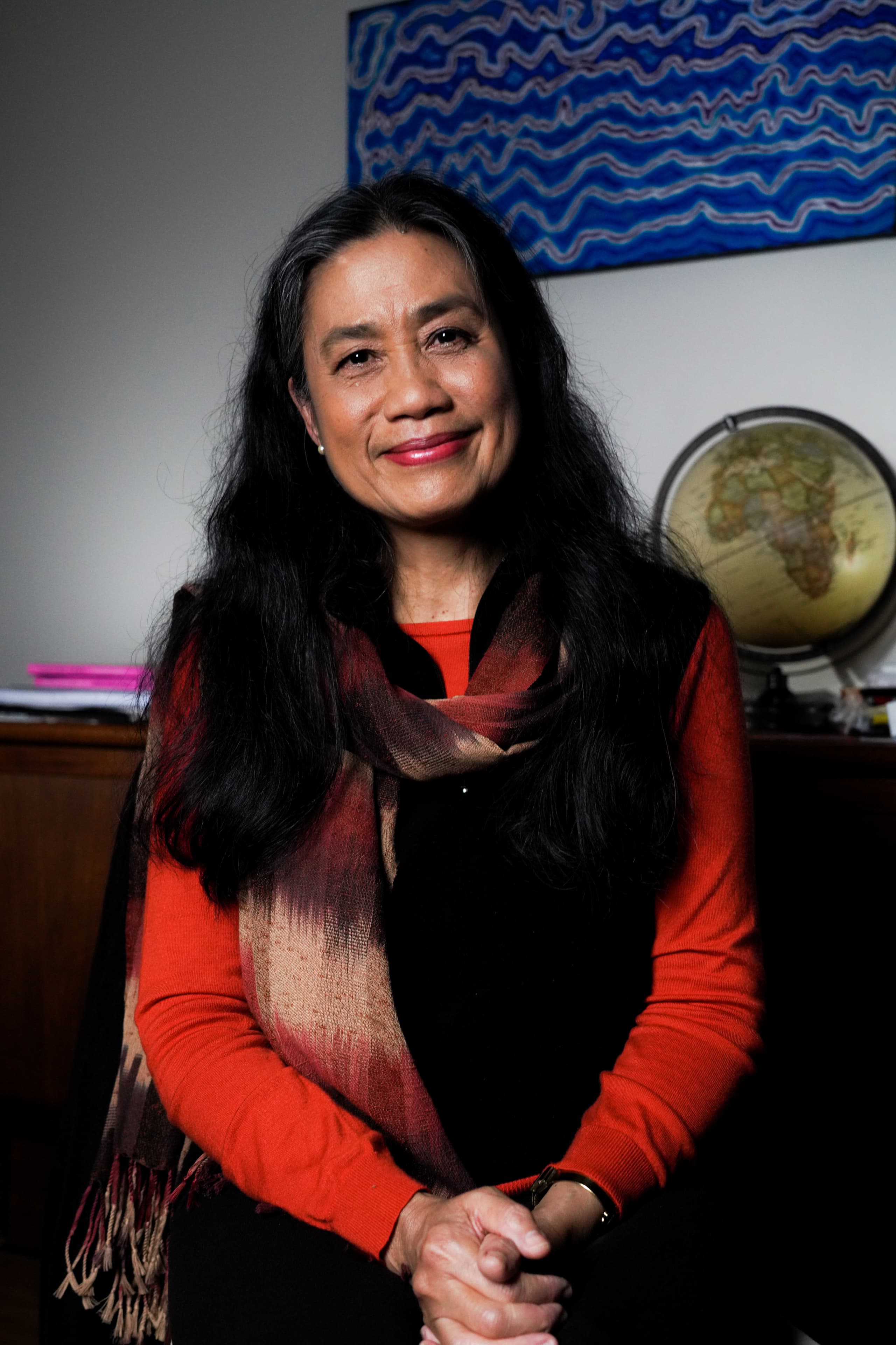
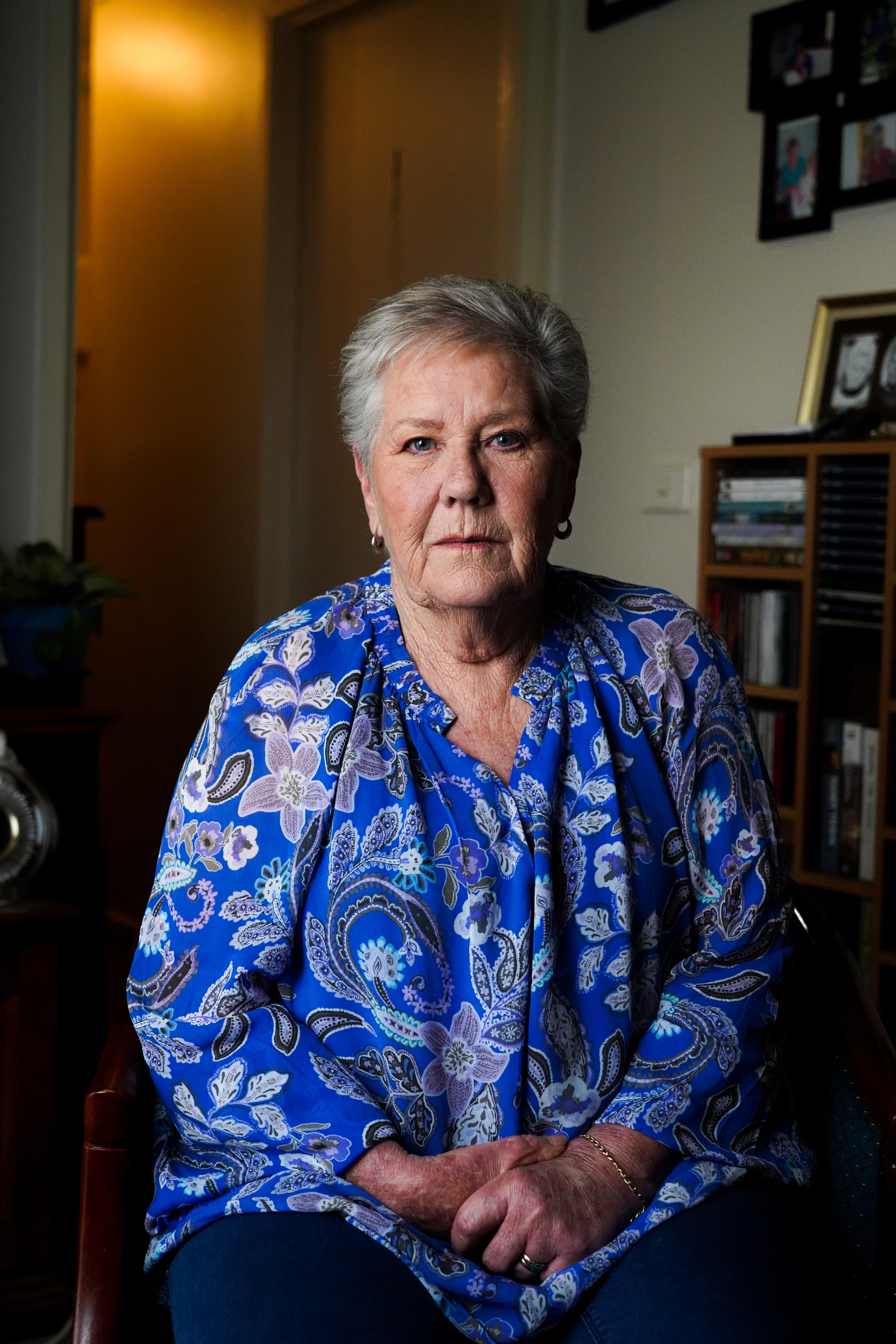
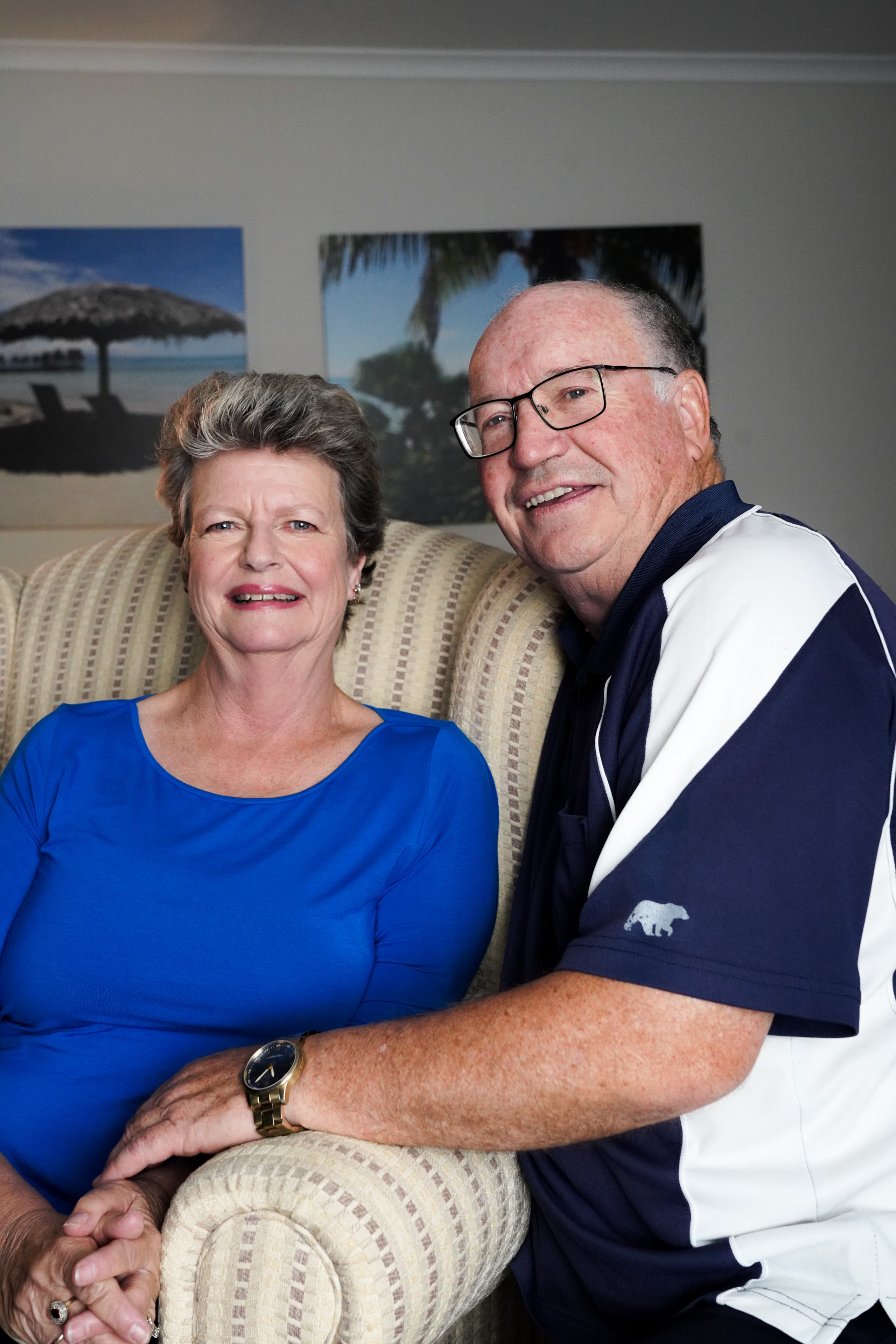
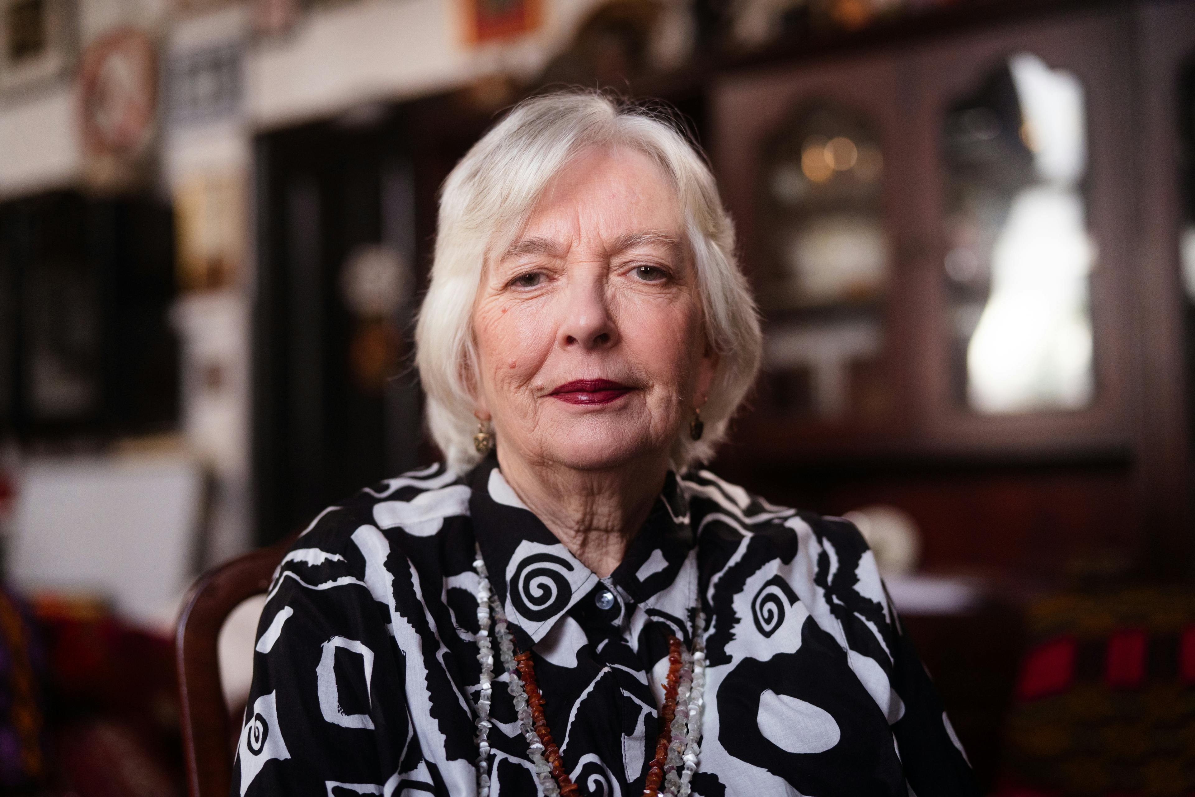
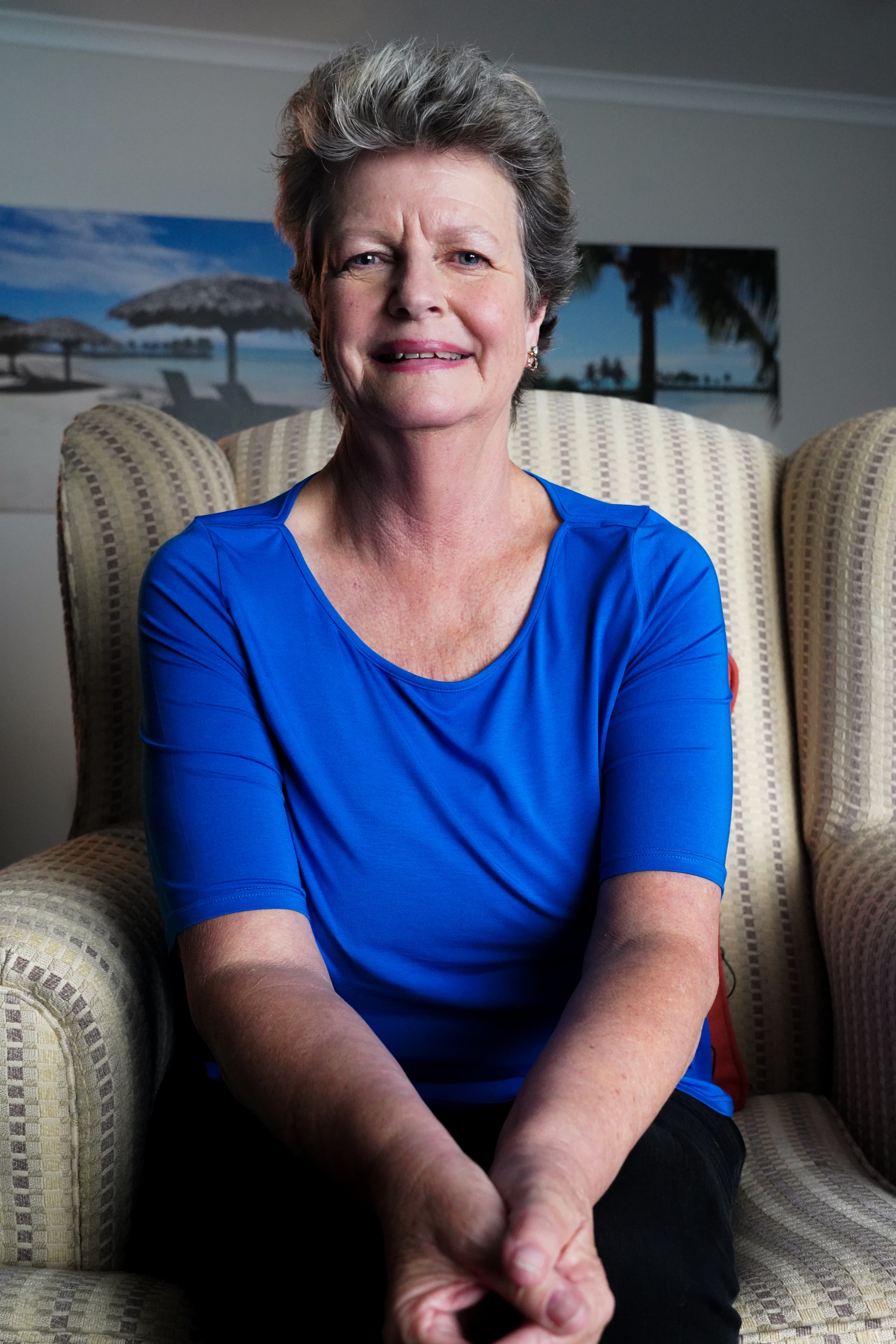
The live-action sat in counterpoint to the animation. Where the animation handled the abstract and the sensitive, the cinematography handled the human side, the women themselves, in their own spaces, speaking unscripted. We cast Judith, Clare, Melinda and Julie, four women who’d been through screening, diagnosis and treatment, and were willing to talk about it on camera. We shot across Canberra and Regional Victoria, with cultural and demographic diversity built into the casting deliberately. The participation gaps in the AIHW data were demographic and the women on screen needed to be the women we were trying to reach.
The shooting language drew from documentary portraiture: subjects framed small in atmospheric spaces, light falling off behind the face, and shot in their own home locations. Questions were structured around the four pillars but the answers were the women’s own, and we worked the cultural sensitivities case by case. Our video production work covered casting, scripting structure, full cinematography across the multi-state shoot, sound design, edit, and final cut delivery. All deliverables met WCAG 2.1 AA including captioning, transcripts, a contrast-tested palette.

Related Projects
View Project

Video, Graphic Design
Department of Health, Disability and Ageing
View Project

Video
Australian Government
View Project

Website
Tamworth Regional Council
View Project

Video, Photography
Department of the Prime Minister and Cabinet
View Project
Website
Australian Strategic Policy Institute
View Project
Video
Sport Integrity Australia
View Project
Video, Graphic Design
Civil Aviation Safety Authority
View Project
Website
The Embassy of France in Australia
FAQs on the BreastScreen Australia awareness campaign
Frequently Asked Questions
BreastScreen Australia is the national breast cancer screening program for women aged 50 to 74, established in 1991 as a joint program of the Australian and state and territory governments. The program offers free two-yearly screening mammograms, with active invitations issued to women aged 50 to 74 and free participation also available from age 40.
The program is funded by the Commonwealth through the Department of Health, Disability and Ageing and delivered by each state and territory through BreastScreen NSW, BreastScreen Victoria, BreastScreen Queensland, BreastScreen WA, BreastScreen SA, BreastScreen Tasmania, BreastScreen ACT and BreastScreen NT. Performance is monitored at national level by the Australian Institute of Health and Welfare (AIHW), which publishes the annual BreastScreen Australia monitoring report.
BreastScreen Australia is one of three Australian population-based cancer screening programs, alongside the National Cervical Screening Program and the National Bowel Cancer Screening Program.
The brief was to lift BreastScreen Australia’s participation rate among women aged 50 to 74, with a particular focus on the cohorts where participation was dragging the national average down. AIHW data for the briefing period shows national age-standardised participation in the high 40s to low 50s, against the program’s longstanding National Accreditation Standard of 70%.
The Department of Health needed contemporary creative that could carry the program for the remainder of the decade. The previous BreastScreen case study videos hosted on health.gov.au dated from 2006 and 2007, and the state and territory delivery network needed fresh material that could be cut and recut across multiple jurisdictions over multiple years.
The audience phase mapped five personas against the AIHW barrier data: Aboriginal and Torres Strait Islander women, women from culturally and linguistically diverse backgrounds, regional and very remote women, women in low socioeconomic areas, and women approaching the eligible age. Each cohort carried specific barriers documented in successive AIHW monitoring reports.
The campaign is built around four docu-films, each anchored to a single messaging pillar so state and territory marketing teams can pull cut-downs against whichever pillar suits their distribution context.
- The screening process. What happens at the appointment: the 20 to 30 minute visit, the privacy shawl, the all-female clinical team, and the procedural detail many women have not seen before walking in.
- Overcoming barriers. The specific barriers each cohort faces in the AIHW data, including the no-family-history reframe and the modesty, language and time-pressure considerations.
- Reasons to screen. The case for catching breast cancers when they are small. AIHW reports that around 60% of breast cancers detected through BreastScreen Australia are 15mm or under. For cancers detected in women who have never screened, the rate is around 30%.
- Life after diagnosis. Post-diagnosis stories from the four women featured in the campaign. AIHW reports the five-year relative survival for women diagnosed with breast cancer aged 50 to 74 at 94.3%, and stage I localised survival close to 99%.
Each film runs three to five minutes. Each cuts down into short social formats, animation excerpts, key-quote pulls, and stills for the state and territory marketing teams.
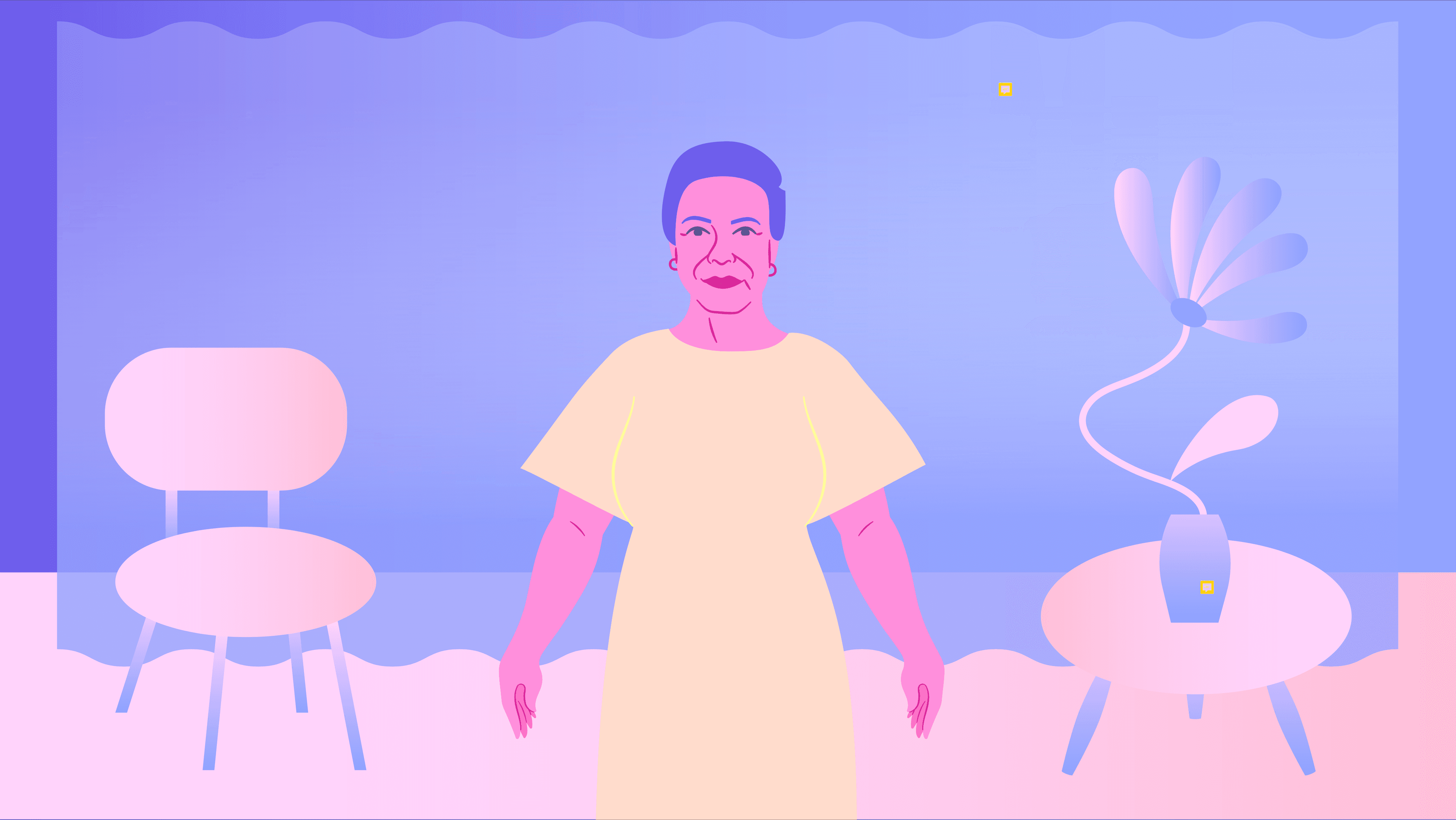
The animation system never renders the female body anatomically. Bodies appear as head-and-shoulders silhouettes, abstract geometric forms standing in for the body, and hands holding reference objects: the privacy shawl, an hourglass, or a phone with the booking screen open. Where breasts had to be referenced for an explainer to make sense, the illustration used alternative shapes that read as a body without showing the body.
The reason was audience design. For Aboriginal and Torres Strait Islander audiences where cultural sensitivities around the female body run deep, and for culturally and linguistically diverse audiences from Sri Lankan, Filipino, Vietnamese, South Asian and Middle Eastern backgrounds, anatomical imagery in a government health asset would be intrusive. The animation explains the procedure across all five cohorts without compromising on respect for any of them.
The illustration language drew from Lotta Nieminen, Daniel Frost and Sara Andreasson.stylemanual.gov.au/” target=”_blank” rel=”noopener noreferrer”>Australian Government Style Manual.
The campaign features Judith, Clare, Merlinda and Julie, four women who have been through screening, diagnosis and treatment through BreastScreen Australia and who agreed to speak about it on camera unscripted. The casting reflected the demographic spread the campaign was designed to reach, with cultural and regional diversity built into the selection deliberately.
Each woman was filmed in her own home environment, with the shooting language drawn from documentary portraiture: subjects framed small in atmospheric spaces, light falling off behind the face, and conversations structured around the four messaging pillars with the answers in the women’s own words. Their stories anchor the live-action pillars across all four films and provide the stills, key-quote pulls and social cut-downs used by the state and territory delivery teams.
The Australian Government Style Manual is the official guide for how Australian Government agencies write, design and produce content for the public. Maintained by the Australian Public Service Commission, it covers plain language, accessibility (including WCAG 2.1 AA conformance), inclusive language, structure, colour and contrast, typography, and the handling of Aboriginal and Torres Strait Islander and culturally diverse content.
For creative work, the Style Manual sets the baseline that every Australian Government campaign meets. Captioning, transcripts, contrast-tested palettes, plain-language scriptwriting, and care around the depiction of Aboriginal and Torres Strait Islander, culturally and linguistically diverse and disability audiences are written into the brief by procurement.
For the BreastScreen Australia campaign, the Style Manual requirements were treated as part of the brief from the audience design phase forward, including the palette decision, the illustration system, the captioning specification, the language register of the scriptwriting, and the casting approach.
BreastScreen Australia is funded by the Commonwealth Government through the Department of Health, Disability and Ageing. Delivery is handled by each state and territory through their own BreastScreen service: BreastScreen NSW, BreastScreen Victoria, BreastScreen Queensland, BreastScreen WA, BreastScreen SA, BreastScreen Tasmania, BreastScreen ACT and BreastScreen NT.
Performance is monitored at national level by the Australian Institute of Health and Welfare (AIHW) through the annual BreastScreen Australia monitoring report, with additional analysis from Cancer Australia and the National Cancer Screening Register. Adjacent organisations including the Breast Cancer Network Australia, the McGrath Foundation, and Cancer Council Australia support women through diagnosis, treatment and survivorship, with the screening program itself run separately.
The Mude campaign was commissioned through the Department of Health, Disability and Ageing and is published by BreastScreen Australia for use by the state and territory delivery agencies and their marketing teams.
A public health campaign is built to change a defined behaviour in a defined cohort, measured against a published target like a participation rate, vaccination rate or screening rate. An advertising campaign is built to shift commercial outcomes for a brand, measured against sales, share or recall.
The structural differences run through every layer of the work. Public health campaigns carry clinical accuracy requirements, regulatory review through the commissioning department, equity considerations across demographic groups, and accessibility standards including WCAG 2.1 AA and the Australian Government Style Manual. They land with audiences who would not opt into a brand campaign on the same topic, including audiences for whom English is a second language and audiences for whom the subject matter carries cultural sensitivity. They are commonly reused by state and territory delivery teams for years after the original launch.
Advertising campaigns rarely carry that load. The production craft overlap is real. The brief, the procurement process, the audience design and the success metrics differ.
Behaviour-change creative at population scale follows the same logic as any other creative discipline: a defined audience, a documented barrier, and a creative response designed against the barrier. At population scale the work has to land across multiple cohorts simultaneously, with no audience left worse-off by how the work is framed for another audience.
The BreastScreen Australia 2022 campaign was built to that constraint. The animation explains the procedure for audiences with cultural sensitivities around the female body. The live-action carries credibility with audiences who need to see real women in their own contexts. The four messaging pillars allow state and territory marketing teams to cut down the work against whichever pillar suits their distribution.
Production work for population-scale health campaigns also has to age. National screening programs operate over decades (BreastScreen Australia has been running since 1991), and the casting, illustration system and documentary cinematography for any campaign asset have to hold up well past the original launch window.
The Australian government healthcare campaign category is served by a mix of full-service network agencies on Commonwealth panel arrangements (including the Whole-of-Australian-Government Communications Arrangement), behaviour-change specialists, and boutique studios with documented government and healthcare credentials.
The agencies that work in this category share a few traits: working knowledge of the Australian Government Style Manual and WCAG 2.1 AA, the documentary craft to handle live-action work with real subjects on sensitive topics, the illustration and animation capability to carry an explainer without leaning on stock visual conventions, and the editorial care required for Aboriginal and Torres Strait Islander, culturally and linguistically diverse and disability audiences.
Mude works in this space across BreastScreen Australia for the Department of Health, Disability and Ageing, Sport Integrity Australia, Why Standards / FHIR also for the Department of Health, the Civil Aviation Safety Authority, and the COP29 Australian Pavilion motion design.
A government creative campaign serves the Australian public, meets accessibility and inclusion standards set by the Australian Government Style Manual and WCAG 2.1 AA, runs under Commonwealth or state procurement rules, and is scrutinised by media and the parliament. A corporate creative campaign serves a defined customer segment, meets commercial outcomes against an internal budget, and is scrutinised by an internal client team.
The procurement layer alone changes how the work is made. Federal government creative typically runs through a panel arrangement, a published brief, a defined deliverable scope, and an evaluation framework against published criteria. Corporate work runs through an agency relationship, a scope of work, and a brand-team review process.
The creative discipline runs differently as well. Government work has to land with audiences who have not opted into the message, while corporate work generally addresses a market with at least some commercial relationship to the brand. Agencies that work across both staff and resource the two categories separately.
Mude produced the BreastScreen Australia 2022 awareness campaign for the Department of Health, Disability and Ageing. The engagement covered audience research and persona development, scripting structure, casting across multiple states, full documentary cinematography, 2D character-led animation, sound design, edit, accessibility delivery to WCAG 2.1 AA, and final cut delivery to the Commonwealth and the state and territory marketing teams.
Mude operates from studios in Sydney and Canberra with a government and trust-heavy practice that includes the ASPI Critical Technology Tracker for the Australian Strategic Policy Institute, the Sydney Energy Forum for the Department of the Prime Minister and Cabinet, Sport Integrity Australia, and Why Standards / FHIR, also delivered for the Department of Health, Disability and Ageing.
The national age-standardised participation rate has sat in the high 40s to low 50s for most of the past decade, against a longstanding National Accreditation Standard target of 70%. AIHW’s 2025 monitoring report recorded 52% of women aged 50 to 74 screened across 2023 to 2024, similar to 50% across 2021 to 2022 during the COVID-affected recovery.
The national average masks much sharper gaps by demographic. AIHW data shows participation among Aboriginal and Torres Strait Islander women in the target age range running roughly 30 percentage points below non-Indigenous women after age adjustment, and participation in very remote areas around 32 percentage points below inner regional areas. Participation in low socioeconomic areas runs persistently below the national rate, as does participation among women who speak a language other than English at home.
The reasons sit at the intersection of cultural and structural barriers documented in successive AIHW reports: modesty considerations around the female body, language access, the perception that no family history equals no risk, time pressure, false security from a previous normal result, structural accessibility, and the cost of taking time off work. Around eight in nine women diagnosed with breast cancer do not have a first-degree relative with the disease, per the AIHW BreastScreen Australia monitoring report 2024.
The live-action and animation handle different parts of the brief. The animation carries the abstract and the sensitive: explaining the procedure for audiences with cultural sensitivities around the female body, illustrating documented barriers, and translating the screening conversation across cultural and linguistic contexts. The live-action carries the four women themselves, in their own homes, speaking unscripted about screening, diagnosis and treatment.
The split was a response to the audience phase. With five audience cohorts spanning Aboriginal and Torres Strait Islander women, women from culturally and linguistically diverse backgrounds, regional and very remote women, women in low socioeconomic areas, and women approaching the eligible age, no single visual register would carry the brief.
Mude’s video production practice uses a similar format split on other government work where audience design has to do heavy lifting, including Sport Integrity Australia and Why Standards / FHIR.
The breast cancer creative category in Australia defaults to pink. Pink Ribbon, the Breast Cancer Network Australia, the McGrath Foundation, Cancer Council Australia and Estée Lauder’s Pink Ribbon Campaign all anchor to pink for legitimate reasons of category recognition.
For BreastScreen Australia, leaning on the same palette would have placed a free Commonwealth screening program inside a visual category dominated by charity and fundraising messaging. Mude pulled vibrant violets, deep blues, red-oranges and bright yellows against muted backdrops that exaggerate the bright shapes, with sparing strokes and strong grain across the illustration system.
The palette was tested against the contrast requirements of WCAG 2.1 AA and sits within the Australian Government Style Manual guidance on accessibility and inclusion.
Mude filmed the campaign across Canberra and Regional Victoria as a multi-state production. Locations placed each woman in her own home environment.
The decision to shoot in regional locations did demographic work as well as production work. AIHW participation data shows participation in very remote areas around 32 percentage points below inner regional areas after age adjustment, and featuring women filmed in their own regional contexts gave the campaign credibility with the cohorts it was trying to reach. The cinematography treated each woman’s home as the set, with lighting and framing built around what was already in the room.
WCAG 2.1 AA is the Web Content Accessibility Guidelines standard the Australian Government requires for public-facing digital content, including video, under the Digital Service Standard and Disability Discrimination Act compliance framework. AA conformance covers a published set of success criteria organised under four principles: content must be perceivable, operable, understandable and robust.
For video work, WCAG 2.1 AA means closed captioning that accurately reflects spoken content, audio descriptions where relevant, full transcripts, colour-contrast ratios that meet the published thresholds for graphics and text, and audio levels that hold for hearing-impaired audiences. The surrounding website, player and download infrastructure are assessed against the same conformance criteria.
Every deliverable in the BreastScreen Australia campaign was built to WCAG 2.1 AA. The captioning, transcripts, contrast-tested palette and player infrastructure all met the standard at delivery, alongside the broad requirements of the Australian Government Style Manual.
Pink Ribbon, the McGrath Foundation and the Breast Cancer Network Australia run fundraising, awareness and support campaigns. The BreastScreen Australia 2022 campaign is a participation campaign for a free national screening program, optimising for one defined behaviour: women in the eligible age range booking and attending a screening mammogram.
Fundraising and support work optimises for emotional connection, donations, and broad awareness of the disease. The visual language defaults to pink, the tone defaults to gentle uplift, and the audience is broad. Participation work for a government screening program optimises for a defined cohort (women aged 50 to 74 in the target group, women aged 40 and over in the eligible group) against a National Accreditation Standard target of 70%, with a single call to action: a free clinical appointment.
That difference shaped every layer of the campaign Mude produced. The palette stepped outside the Pink Ribbon ecosystem, the casting reflected the cohorts where AIHW data showed participation was lowest, the messaging pillars were structured to address documented barriers, and the format combined documentary cinematography with an illustration system designed within the Australian Government Style Manual.
The starting point is the AIHW data, not the brief. The Australian Institute of Health and Welfare publishes participation by Indigenous status, remoteness, socioeconomic quintile and primary language, and the campaign has to start from the cohorts where participation is dragging the average down.
For BreastScreen Australia, the audience phase mapped five personas against the documented barriers in successive AIHW monitoring reports:
- Aboriginal and Torres Strait Islander women
- women from culturally and linguistically diverse backgrounds
- regional and very remote women
- women in low socioeconomic areas
- women approaching the eligible age
The barriers were specific:
- cultural concerns around modesty
- language access
- the perception that no family history equals no risk
- time pressure for women juggling work and caring responsibilities
- false security from a previous normal result
- structural accessibility
- the cost of taking time off work
The creative response addressed each of those barriers without singling any cohort out. The four-pillar messaging structure, the animation system, the casting, the palette and the format split were each designed against that constraint.
Brand-led behaviour change is the application of brand strategy thinking to behaviour change problems: clear positioning, distinctive visual and verbal language, deliberate audience design, and a brand world that can carry the message across multiple touchpoints over multi-year horizons. The opposite is campaign-led behaviour change, where each piece of work starts from scratch and no audience recognition compounds across campaigns.
For programs like BreastScreen Australia (established in 1991, target age extended from 50 to 69 to 50 to 74 in 2013), brand-led behaviour change carries serious weight in this category. The Commonwealth runs the program over decades, eight state and territory delivery agencies operate in parallel, and the eligible cohort moves through the program across the 34-year span from first eligibility at 40 to the 74-year-old upper bound of the actively-invited target group.
Mude works on brand-led behaviour change for trust-heavy and regulated organisations because the underlying logic mirrors the studio’s wide practice in B2B and government brand work: brand as a competitive lever, applied here against a participation target.
National and regulatory body creative work carries a different risk profile from commercial advertising. The audience is the entire Australian public, scrutiny comes from media and the parliament. Agencies who work in this space manage political sensitivity, multi-jurisdictional stakeholder review, accessibility compliance, and editorial care around Aboriginal and Torres Strait Islander and culturally and linguistically diverse content.
The agencies with documented track records here tend to share a few traits: a Canberra footprint, demonstrated work for Commonwealth departments, working knowledge of the Australian Government Style Manual, and a portfolio that documents delivered work for Commonwealth or state clients.
Mude’s government practice covers BreastScreen Australia for the Department of Health, Disability and Ageing, the ASPI Critical Technology Tracker for the Australian Strategic Policy Institute, the Sydney Energy Forum for the Department of the Prime Minister and Cabinet, and the COP29 Australian Pavilion motion design built around Aboriginal artist Kayannie Denigan’s My Country artwork.