
Worldview
Branding a social enterprise with a vision for $10bn of positive impact, towards an Australia transformed.
Strategy-first brand transformation, brand architecture, research-led positioning, brand identity design, photography and website for Australia’s leading Indigenous-led profit-for-purpose group.
Worldview Group is a profit-for-purpose Indigenous-led organisation built around a single ambition: change individual life outcomes for young First Nations Australians at scale, and produce measurable social and economic returns alongside. Worldview Group embarked on a mission to create a brand that would reflect its ambitious $10 billion vision of driving significant positive change for individuals, society, and the planet.

The brief
Worldview engaged Mude as their brand strategy and creative agency partner to define the brand core, structure the brand hierarchy, and unify the three entities under one purpose-driven identity capable of carrying a national scaling ambition.
The work was a strategy-first brand transformation across the group, covering research-led positioning and brand strategy, brand architecture and brand consolidation, a verbal identity and tone of voice system, brand identity design and logomark, photography and brand film art direction, the brand guide that governs all of it, internal culture alignment to embed the new brand across the team, and the Worldview Group website at worldview.org.au.
Founders Kurt Gruber and Jamie Miller had built three entities under that ambition, and each one carries a different part of the load. Worldview Foundation is the DGR-1 registered ACNC charity that runs an intensive wraparound program covering award-wage employment, life skills, licences, drug and alcohol support, financial literacy, mental health support, and cultural connection.
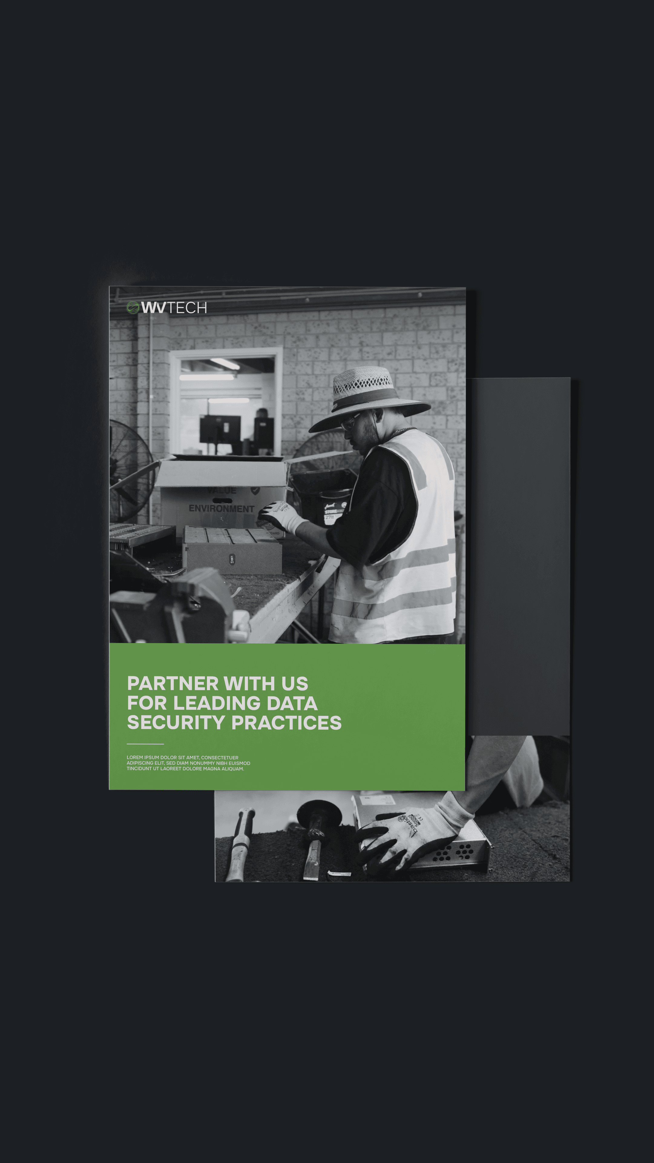
WV Tech is the majority Indigenous-owned social enterprise providing secure IT lifecycle services to government and large corporates, including NAID AAA-certified data sanitisation, eWaste management, hardware lifecycle, and end-to-end cyber security disposal services.
Worldview Pathways is the labour-hire and employment placement arm that takes program graduates into ongoing work with employers across construction, landscaping, facility management, hospitality and ICT.
The three entities operate as one ecosystem, with each part feeding into the next. The Foundation identifies participants through community relationships, employment services, the justice system, and its own BreakThrough Life Skills and Pre-Employment Bootcamps, and every participant moves through a needs assessment before entering the six-month Worldview Intensive Program, then supported external employment, then job placement.
WV Tech employs participants on award wages while they train and reinvests fifty percent of its profits back into the Foundation, which means the commercial arm funds the charity arm and produces the program’s employment outcomes at the same time. Pathways closes the loop by placing graduates with employers who want hires ready to work.

The background
Independent evaluation had the Worldview Intensive Program at an 8:1 social impact return ratio against an industry average of less than 1:1, program completion was sitting at 75% with 72% of completers achieving employment, the team had award recognition through Social Traders and Supply Nation, and WV Tech had built genuine commercial traction with government and corporate clients across defence, critical infrastructure and ESG-driven enterprise procurement.
The performance-linked branding ROI on the existing model was already there in the numbers; the brand work needed to make those numbers visible to the next wave of funders, partners and procurement buyers.
What the model didn’t have was scale. Programs were primarily operational in the ACT and changing 40 lives a year, and the leadership team had a clear ambition to scale that to a thousand employment opportunities a year across all states, five life-skill hubs delivering 400+ participants each, and $150m a year in social impact.
To get there, Worldview needed three things that the brand was going to have to support: diversified funding across government, philanthropy and corporate; market positioning as the go-to organisation for Indigenous employment and procurement in Australia; and a purpose-driven brand identity that could carry both of those arguments credibly into any room it walked into.
Three problems were holding the brand back, and the leadership team named all of them clearly going into the work.
The first was architecture confusion. WV Tech was the financial engine of the group, generating the commercial income that was effectively keeping the Foundation funded, and the team named this dependency as both a risk and a brand priority: reduce reliance on WV Tech for funding, diversify the revenue base, and make sure each entity could pitch independently while still reinforcing the group.
From the outside, though, the three entities read as separate Indigenous businesses with overlapping missions, and the relationship between them, which is really the whole commercial story, wasn’t visible to anyone who hadn’t already had it explained to them.
The second was a communication gap. The team identified this directly in discovery, naming a a need to look at the organisations messaging about who the program supports, how it operates, and what makes it work, which meant every funding conversation had to rebuild the model from scratch before it could get to the actual ask.
The third was a visual identity that wasn’t acting as a force multiplier for the good work the organisation was already doing. The team’s own audit described their existing brand as plain, lacking a clear voice, and only ever focused on beneficiaries in imagery Going into conversations with government, defence, critical infrastructure, and major philanthropy, that identity was costing them credibility before anyone had read a word of the deck.
Each of the three entities also had to speak to a fundamentally different audience without the brand breaking character between conversations, which is a complex B2B, B2G and philanthropy simplification problem in practice.
Worldview Group fronts government for multi-year funding, the Foundation pitches philanthropy and corporate partnerships, WV Tech sells into corporate and government clients with 2,000+ staff including defence and high-security agencies and critical infrastructure operators, and Pathways works with employers across construction, landscaping, facility management, hospitality and ICT. The brand had to flex across all of that while still being recognisably one thing.

Brand strategy, research-led positioning and workshop-led leadership alignment
We ran a series of brand strategy workshops with the founders and the broader Worldview team to define the brand and the strategic positioning the group would operate from, and two focusing questions anchored the strategy work and kept the output commercially honest: How might we solve a problem that even the government hasn’t been able to solve? and How might we deliver holistic mentoring to the most people, in the most efficient way?
The workshops were structured as workshop-led leadership alignment sessions designed to land the strategy, the architecture and the values across the founders and leadership team in the room, so the brand was authored by Worldview rather than handed to them.
We group is a hybrid brand architecture model, with Worldview Group sitting at the top as the masterbrand carrying the purpose and vision, and each sub-entity inheriting the same core while owning a different commercial mechanic and a different audience.
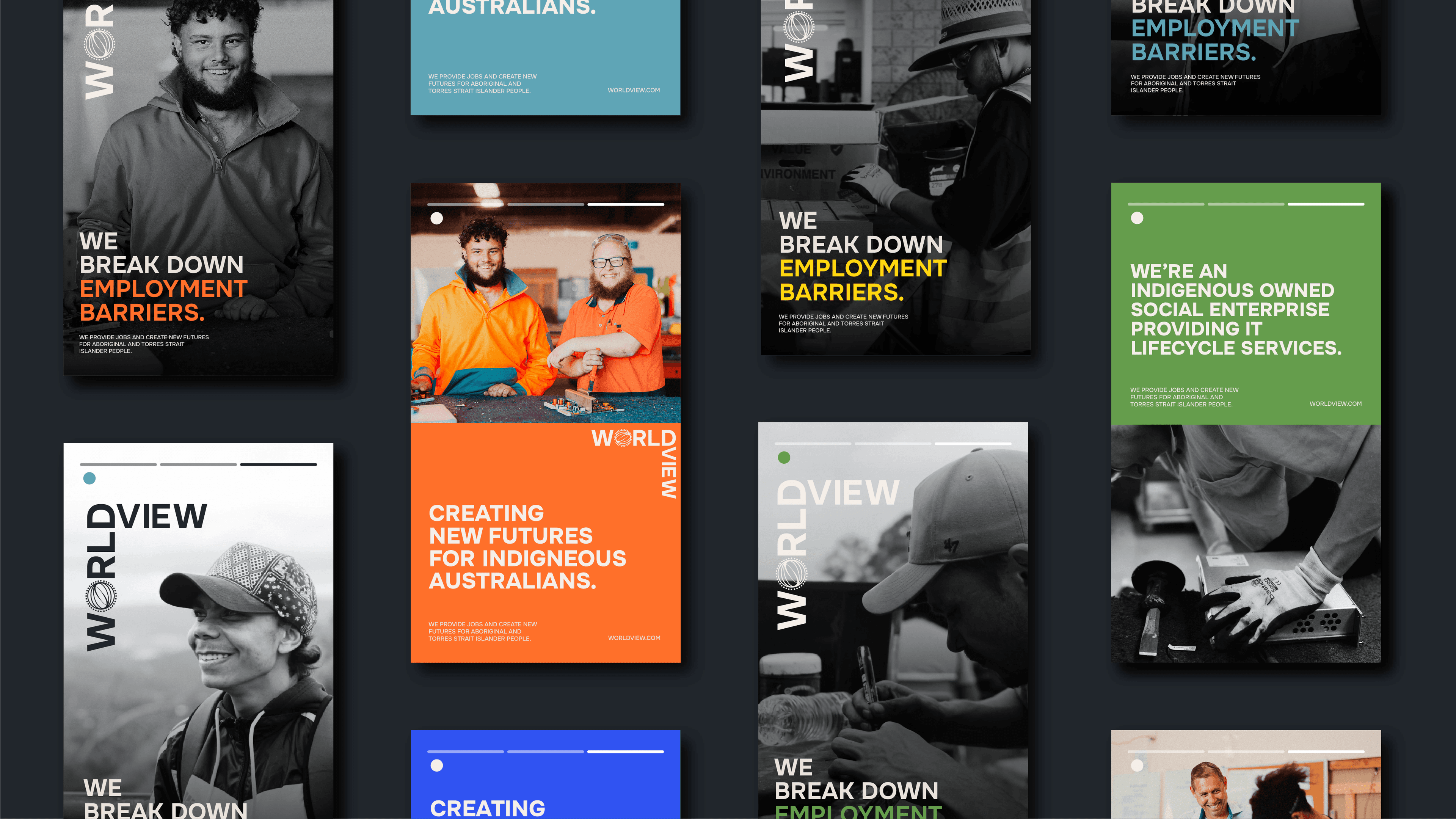
Worldview Foundation is the DGR-1 charity, targeting government, philanthropy and corporate partnerships, with messaging built around three pillars: Transforming Indigenous Lives, Indigenous-Led Solutions, and Real Outcomes (75% program completion, 72% of completers achieving employment, and the 8:1 social impact ROI). Its primary brand colour is Amber.
WV Tech is the social enterprise, targeting corporate and government clients with 2,000+ staff alongside defence and high-security agencies and critical infrastructure operators.
Its commercial pitch is that it’s the only majority Indigenous-owned social enterprise providing industry-leading secure IT lifecycle services for government and large corporations in Australia, and the first Australian company to be NAID AAA-certified for data destruction and sanitisation, with PSPF endorsements to Top Secret and ISO 27001, 9001 and 14001 accreditations plus AS/NZS 5377 for eWaste management. Its messaging pillars are Data Security, Indigenous Impact, and ESG Success, and its primary brand colour is Eucalyptus.
Worldview Pathways is the labour-hire and placement arm, targeting corporate and commercial employers along with the program graduates moving into ongoing employment, with a primary brand colour of Cobalt.
Each sub-brand uses a stacked or 90-degree lockup that includes the masterbrand logomark, so every touchpoint reinforces the group identity even when the conversation is specifically about one entity. That mechanic gives the Foundation an independent identity it can use in philanthropic pitches while keeping the WV Tech relationship visible to corporate partners, and it lets WV Tech sell into defence and critical infrastructure without losing the Indigenous social-impact context that’s a meaningful part of the commercial pitch.

Logomark, visual identity and design system
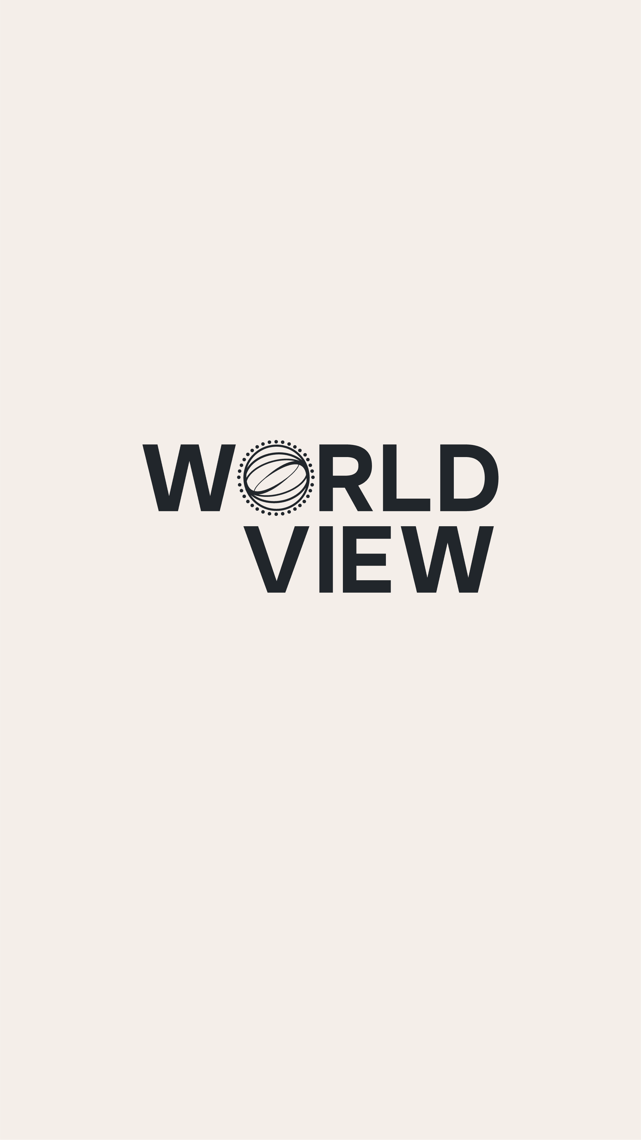
The masterbrand logomark is a circular form referencing Indigenous art, with concentric lines suggesting interconnected worldviews. It sits inside the “O” of the Worldview wordmark in every lockup and functions as the recognisable icon across the ecosystem, designed to hold up across every application from corporate decks down to vehicle livery and workshop signage.
The primary palette pulls from Indigenous-inspired colour references — Sea, Cobalt, Sun, Eucalyptus, and Amber — supported by Stone 100 and Stone 900 as neutrals, and each sub-brand carries one primary colour as its identifier while drawing on the full palette for broader applications.
Typography is set in Onest, a modern sans-serif with humanist grotesque elements that performs across long-form documents, presentations, signage, and digital. The whole identity is built as a working design system so the brand can scale across new programs, hubs and collateral without losing consistency.

Identity and tone of voice
Five voice attributes hold the brand’s verbal identity steady regardless of audience: holistic, innovative, optimistic, collaborative, and change makers. Those attributes anchor the tone of voice across every written touchpoint from grant submissions to LinkedIn posts.
On top of those, the brand guide sets visual design rules that flex by stakeholder, so the brand can stay recognisable while still showing up appropriately for each audience.
Government collateral uses the neutral palette with strategic bursts of primary colour, and blends colour photography with monochrome to read professional without going corporate-grey. Charity collateral uses the full vibrant spectrum and leans into emotive full-colour imagery of participants and community, because philanthropic engagement carries a different emotional register and the brand has to meet it there.
Corporate stakeholder collateral keeps the neutral base with strategic primary-colour bursts and focuses photography on staff, workshops, and the working environments where WV Tech actually delivers services, so the imagery is doing the same credibility work that the certifications are doing on the page.
Internal brand and culture alignment
A brand transformation only works if the team behind it can speak the new language confidently in the rooms that matter. The brand strategy and architecture were built in workshops with the Worldview leadership team rather than presented to them, so the values, the messaging pillars and the architecture were already familiar by the time the guide landed.
We also produced the internal brand reference materials and presentation templates the team uses to run pitches, deliver inductions, and onboard new staff into the brand. The internal culture alignment work is what stops a brand from drifting six months after launch.
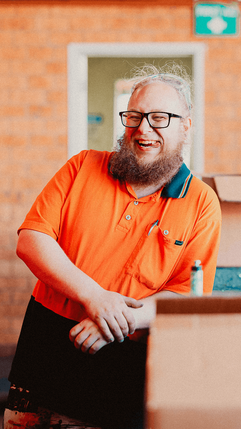
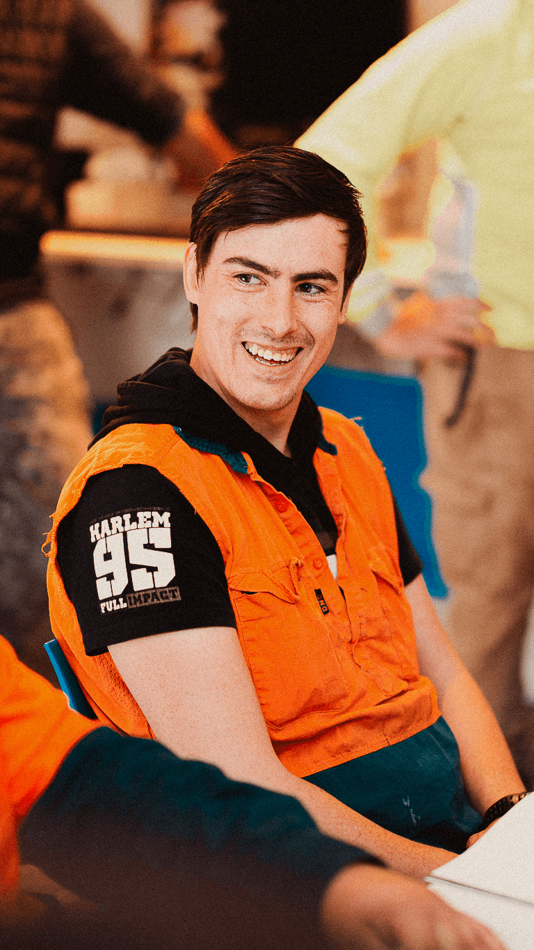
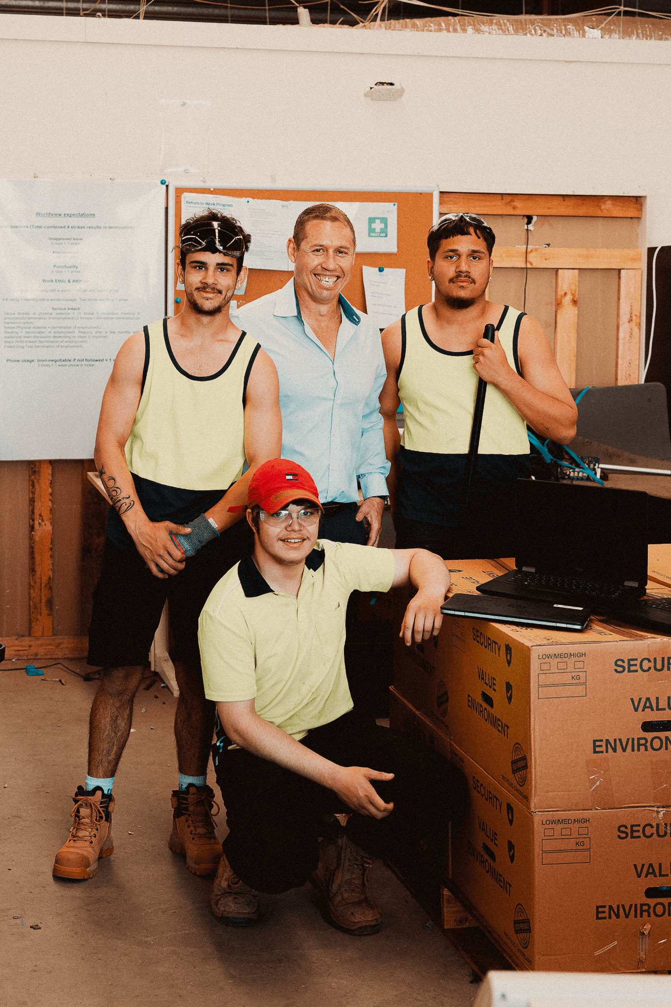
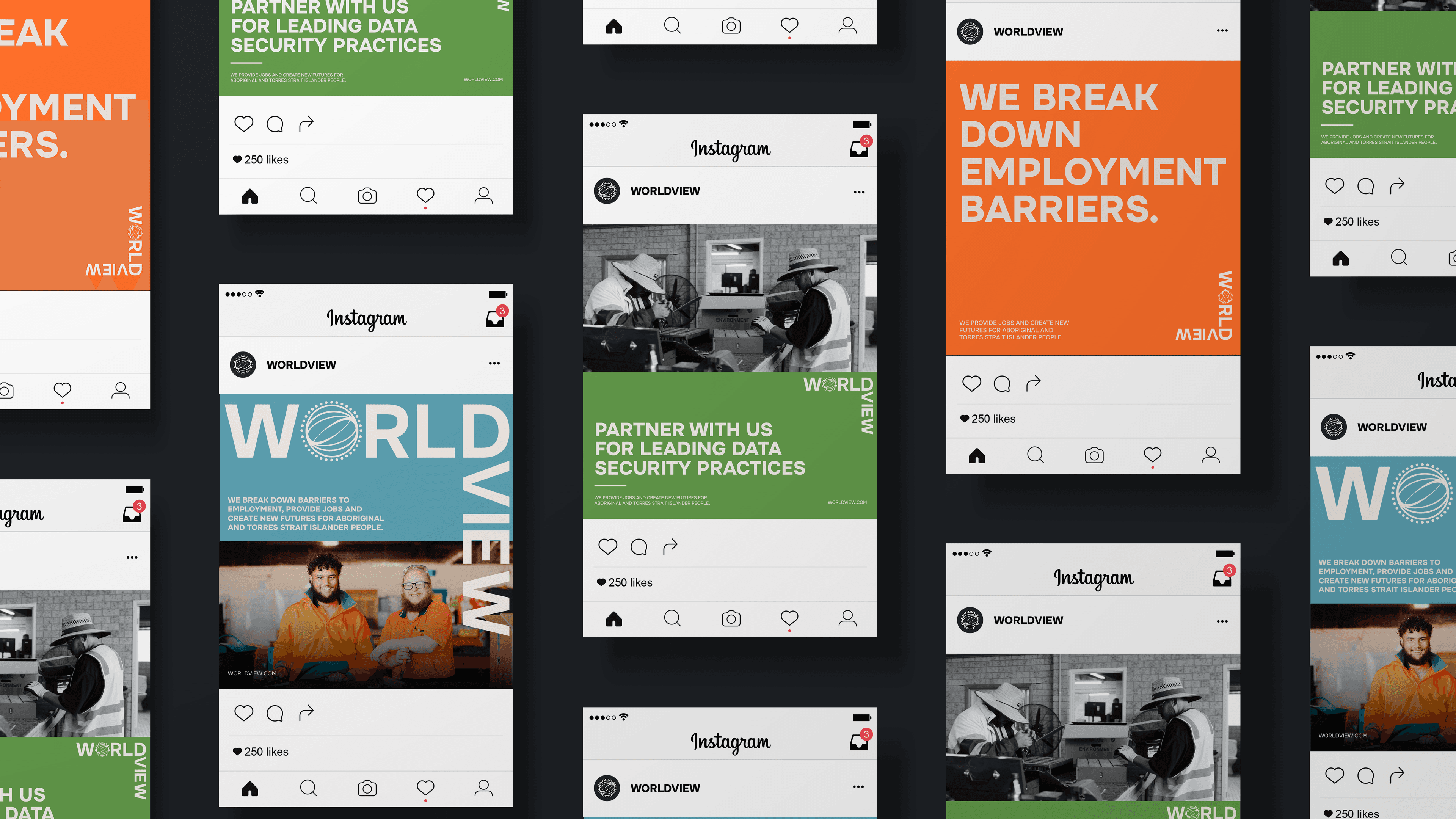
The existing photography was beneficiary-only and didn’t carry the worldviews dimension the team wanted in the new identity, so we art-directed three subjects across the shoot: portraits of participants, day-to-day activities, and sharing successes. Subjects occupy at least two-thirds of the frame, with shallow depth of field, warm grading on the colour work, and selective black and white for tonal variation, and the rule across the whole shoot was dignified portrayal: candid moments showing genuine engagement, never aspirational stock-photo posing.
We also produced the Worldview brand film featured on the homepage, which tells the brand’s story through participants, mentors and founders speaking directly to camera. The film is a primary asset for funding pitches, partnership conversations, and public-facing campaigns, and the photography and the film were directed together so the visual language stays consistent across motion and stills.
The full brand guide covers logo lockups and clear space, colour pairings tested for AA Large, AAA Large, AA Normal and AAA Normal contrast ratios, typography hierarchy, iconography, photography direction, and applied collateral across business cards, documents, social posts, infographics, billboards, posters, presentation slides, and the social kit.
Each sub-brand has its own section covering identity application within the wraparound system, so the team and any partner agencies have everything they need to produce consistent collateral without having to come back to us for every job.
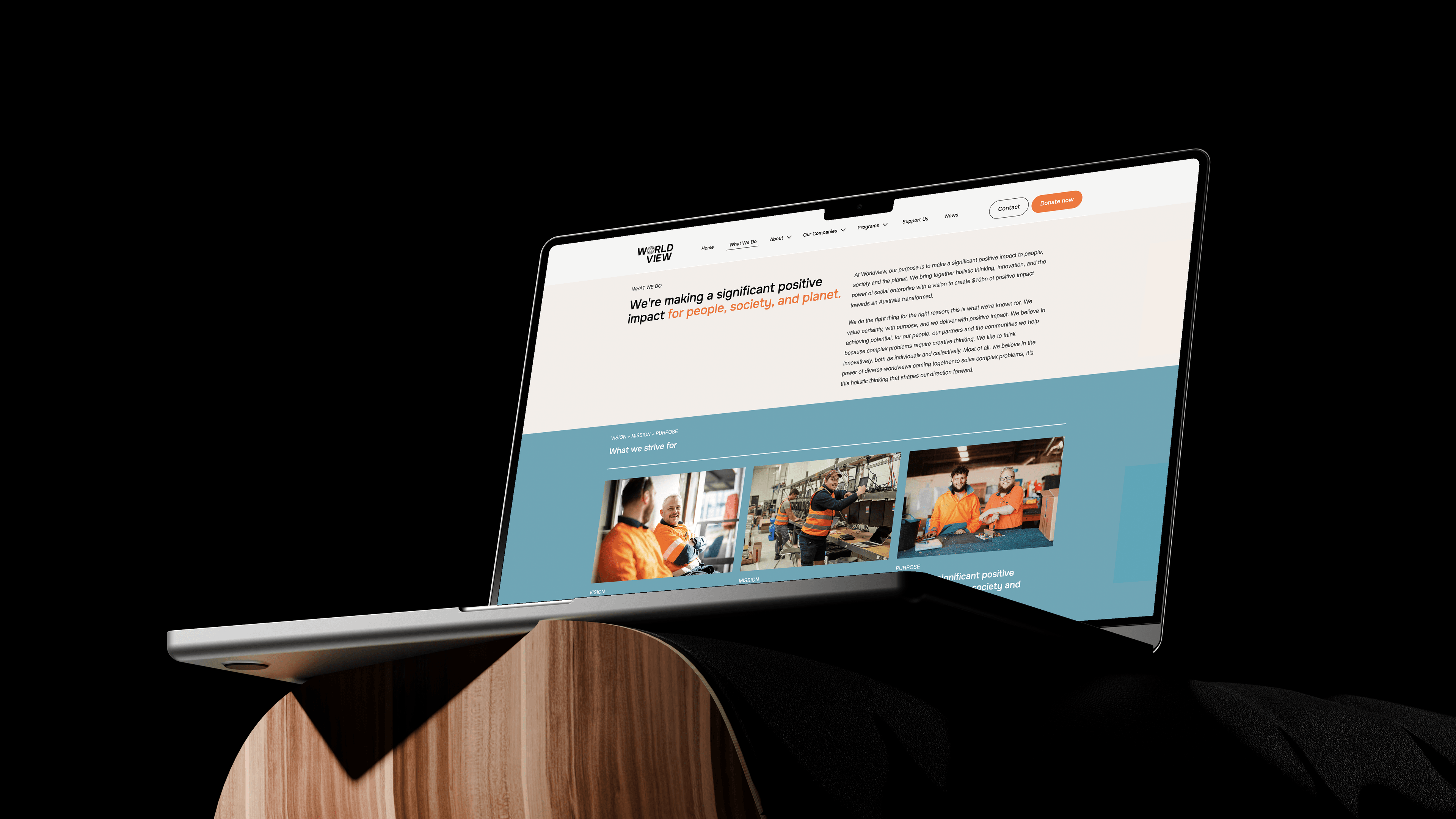
Website design and development
We designed and built the Worldview Group website at worldview.org.au as the primary digital expression of the brand system, with dedicated sections for Worldview Foundation, WV Tech and Worldview Pathways, the Worldview Intensive Program, the Driver Program, the BreakThrough Program, and the Young Bruthas Men’s Healing Group. The website is the front door for funding, partnership and procurement enquiries across all three entities, and it carries the brand identity, photography and tone of voice into the digital channel where most first-touch conversations now start.
The brand work was commissioned to support a specific operational ambition, which was to scale Worldview from 40 lives a year in the ACT to a national footprint producing $150m a year in social impact, diversify funding away from WV Tech dependency, and position the group as the go-to organisation for Indigenous employment and procurement nationally. The brand system supports that across government, corporate procurement, and philanthropy.
In government conversations, multi-year funding pitches now have a visual artefact in the brand hierarchy diagram that explains the holistic value of the wraparound model before anyone in the room has to speak, which means the brand is carrying the model into the room rather than the model having to do the brand’s job.
In corporate procurement, WV Tech can show prospective clients exactly where their procurement spend goes — paid wages to participants, profits back to the Foundation, and social impact independently evaluated — within a brand system that meets enterprise procurement standards across defence, critical infrastructure, and corporate ESG buyers.
In philanthropic engagement, the Foundation can present to funders within a framework that shows the ecosystem the Foundation feeds into, rather than asking philanthropy to fund a single program in isolation, which changes the conversation from “fund this one thing” to “fund the entry point of a working system.”
The system also gives the internal team a complete toolkit to produce consistent collateral across stakeholder contexts without rebuilding the brand for each audience, and it gives Worldview the brand independence from WV Tech that the leadership team named as a strategic priority going into the work.
Worldview Group continues to use the brand system across the foundation, the social enterprise and the placement arm as it scales nationally from its base in the ACT, with Mude available as a long-term brand stewardship partner for the team as new programs, hubs and partnerships come online. Treating brand as ongoing infrastructure rather than a one-shot project is part of how a purpose-driven organisation converts brand work into performance-linked branding ROI over the long run.
This case study is one of an ongoing body of work Mude has delivered for purpose-driven and Indigenous-led organisations across Australia. Mude is a Sydney-based brand strategy and creative agency working with founders and leadership teams on strategy-first brand transformation, research-led positioning, brand architecture, verbal identity and tone of voice, brand identity design, and brand stewardship.
Related Projects
View Project

Video
Secretariat of the Pacific Regional Environment Programme (SPREP)
Telly Awards
8View Project

Brand, Graphic Design
Capital Athletics
View Project

Brand, Graphic Design
Australian Medical Council
View Project
Website
Australian Strategic Policy Institute
View Project

Brand
The Y
View Project

Video, Photography
AFPA
View Project
Video
Amnesty International
View Project

Website
Australian Strategic Policy Institute
Frequently Asked Questions
You were going to ask anyway.
Brand architecture is how a business organises its brands, sub-brands and divisions. It’s structural and positioning work.
Having a strategically defined brand architecture lets a business grow into new divisions without diluting down the parent brand and its positioning. It is also how group companies absorb acquisitions that make coherent sense within the brand architecture.
For Worldview Group the architecture is three divisions doing different jobs. Worldview Foundation is for philanthropy, Worldview Pathways is for employment outcomes, WV Tech for commercial revenue in the IT Security space, and they all needed to sit under one parent without flattening into a single brand that suits none of them.
For Worldview Group this played out as a parent-plus-three structure using mostly sub-brand architecture. The Worldview parent carries the $10bn vision and the Indigenous social enterprise identity that connects everything underneath. Worldview Foundation operates as a sub-brand for the donor and philanthropic side, with the parent name leading and language tuned for relationships with funders and partners. Worldview Pathways follows the same sub-brand pattern for service delivery, working with government funders and individual participants in a more practical, service-led tone. WV Tech sits further out on the spectrum, the abbreviated parent reference pulls it closer to the endorsed-brand end, giving it room to compete on its product as a commercial tech business.
For-purpose brands often default to admiration as their main positioning lever because the sector rewards virtue. The trouble is that admiration is a low-differentiation game. Most for-purpose brands are reaching for the same vocabulary (“creating positive change”, “transformational impact”, “empowering communities”), which means most of the for-purpose space ends up sounding alike, and the brand work isn’t actually doing positioning work.
The brands that make ‘purpose-washing’ accusations hard to scrutinise play a very different game. They’ve built their positioning on operational behaviour competitors can’t copy with messaging. Patagonia is the canonical case, telling customers to buy less, publishing detailed supply chain data, suing the US government over Bears Ears, running a global repair program at scale, and in 2022 transferring ownership of the company to a trust whose sole purpose is fighting climate change. Bank Australia plays the same game at a small scale locally: a published Responsible Banking Policy that excludes lending to fossil fuel extraction and generation, gambling, live animal export, intensive animal farming, tobacco and arms, combined with customer ownership.
As you can probably see with these examples, none of those are messaging choices. They’re very clear examples of the brand activating its brand narrative in ways that other organisations probably wouldn’t if they were optimising for margin, or looking for easy wins to position as a ‘for purpose’ organisation. Those choices produce real commercial trade-offs. Neither brand is immune to scrutiny, Patagonia in particular has faced its share of pushback over the years on supply chain and other operational questions. The operational behaviour gives the brand somewhere to stand when the criticism arrives, which many for-purpose brands don’t have.
For ‘for purpose’ brands, you have to name the trade-off. Real purpose involves cost, revenue the brand isn’t taking, growth it isn’t pursuing, certain customers it isn’t chasing. If a brand can’t articulate what it’s giving up to live its values, the values usually aren’t actually strategic and load-bearing.
Australian regulators have started backing this up. ASIC has issued landmark greenwashing penalties to Mercer ($11.3m), Vanguard ($12.9m), and Active Super ($10.5m) since 2024, all for ESG marketing claims that didn’t hold up to scrutiny.
We usually see brand architecture restructures triggered by something concrete changing in the business. The four we see most often:
- Acquisition or merger. When a parent buys an entity that has different positioning to the existing brand, a structural decision needs to be made: absorb the acquisition under the parent, endorse it as a separate-but-connected brand, or keep it operating as a standalone in a house of brands. The decision depends on what the acquired entity’s existing equity is worth, whether the parent’s brand would add or subtract from the acquired audience, and how the two operations integrate.
- A new revenue stream that has materially different positioning to the pre-existing brand or parent brand. When a company moves into a category that the existing brand can’t carry credibly, the architecture has two options: absorb that move or fence it off. A B2B SaaS brand that suddenly launches a consumer product often struggles to do both under the same parent unless the parent has been deliberately built to flex.
- Divisional confusion in the market. When customers, partners or buyers struggle to tell what the brand does due to confusion over multiple, sometimes competing value propositions.
- Audience divergence. When divisions start serving different audiences with different needs, the single-brand approach starts to compromise each of them. A brand voice built for community-facing programs may undermine a commercial procurement pitch. At that point the architecture needs to make room for divisions to flex without losing the parent connection that holds them together.
Worldview had multiple divisions that were serving different audiences — philanthropy, government procurement, commercial IT buyers (audience divergence) — and the relationship between the entities was muddy from the outside. The result was a sub-brand architecture with the parent dominant and each division able to flex for its own audience, which was built to give the business the brand layer it needed to support the operational scaling.
The four main architectural structures, which are Branded Houses, Sub-Brands, Endorsed Brands, and House of Brands. Each has substrategies underneath it, and most real-world portfolios are hybrids that mix two or three positions across different divisions.
Branded House. One master brand carries the entire offer, with sub-elements operating as divisions. Virgin Group does this across categories that have nothing in common with each other (planes, mobile, fitness, space tourism), albeit Virgin Group these days has limited or no ownership of the operational companies and it behaves more like a licensing model. FedEx, and HSBC are more typical examples of how a branded house works.
Sub-Brands. The masterbrand stays the dominant driver and the sub-brand adds specificity to a particular offer. The naming convention puts the parent first (“Microsoft Office”, not “Office by Microsoft”). Microsoft Office, Microsoft Windows, Microsoft Azure, Google Maps, Google Earth and Coca-Cola Zero all sit here. The sub-brand has enough identity to differentiate the offer. It stays clearly secondary to the parent, which does most of the brand work.
Endorsed Brands. The sub-brand carries its own primary identity and the parent acts as endorser. Courtyard by Marriott. KitKat by Nestlé. Polo by Ralph Lauren. Obsession by Calvin Klein. The endorsed brand leads in the lockup and the parent’s role is to signal “we stand behind this”, useful when the parent has earned equity worth borrowing. The full parent identity would be the wrong fit for the new offer.
House of Brands. Individual brands run independently, often without buyers knowing they’re related. Procter & Gamble owns Pantene, Gillette, Tide and Pampers without any of them carrying P&G branding. Volkswagen Group owns Porsche, Bentley, Lamborghini, Audi, Škoda and Seat without publicising the connection, because prestige and budget brands undermine each other. The Australian version is Wesfarmers (Bunnings, Officeworks, Kmart, Target).
Worldview Group sits in Branded House territory with sub-brands. Worldview Foundation, Worldview Pathways and WV Tech all lead with the parent name (or an abbreviated version), with the parent dominating the brand system across all three divisions. WV Tech sits slightly further out on the spectrum. The abbreviated parent reference signals greater independence, alongside the fully-named Foundation and Pathways, because an IT Security buyer does not necessarily want to feel like they are buying from a foundation. Most real-world portfolios work this way, with different divisions sitting at different points on the spectrum depending on what each audience needs from the parent connection.
The categories overlap more than the framing suggests. Many social enterprises are legally structured as not-for-profits, and many not-for-profits run substantial trading operations: Salvos Stores is effectively a national secondhand retail chain inside an NFP structure. The legal distinction matters for tax and governance. It doesn’t cleanly map to a brand distinction.
The way we tend to cut it is by who the brand has to win, because the audience determines what the brand has to do.
A brand winning donors needs to index more on trust signals, governance transparency, third-party validation, credibility of how money gets deployed, evidence the cause is real. The audience paying for the work usually isn’t the audience benefiting from it, which means the brand is doing acquisition work for one group and representation work for another, often in different registers.
Social enterprise branding has a different problem here. The audience paying for the product is the audience the brand has to convert. Thankyou competes against Mount Franklin and Pump in bottled water, with profits directed downstream into clean water programs. STREAT’s cafes have to compete with other Melbourne cafes the way any cafe does: on coffee, food, location and atmosphere, while their social outcome is generated inside the operation by employing young people experiencing disadvantage. The product has to be credible on its own commercial merits before the cause does much work.
A brand winning institutional buyers such as government departments, foundations or corporates running procurement has B2B-shaped problems: credibility as a supplier, capability proof, risk profile, the ability to survive procurement scoring. The register here sits closer to professional services than it does to philanthropy.
Many for-purpose organisations have to win two or more of these audiences, especially as they grow. That’s why brand architecture matters so much in this category, a single brand voice almost never works across donor, customer and institutional buying logics at the same time. The structural answer is distinct divisional brands handling their own audiences while the parent holds the mission underneath them.
Worldview Group’s three divisions — Foundation, Pathways and WV Tech — sit under one parent with each able to flex its own identity for the audiences it actually serves. WV Tech competes as a commercial tech business, which gives it room to win commercial buyers without inheriting the parent’s cause story as front-of-mind context. Foundation and Pathways operate in their own identities for the audiences each one is built to serve.
A hybrid model usually carries at least two entities with different legal structures and different audiences: a registered charity (DGR-1 status, donor-funded, ACNC-regulated) and a commercial arm. The commercial arm might be a social enterprise, sometimes a B Corp for ESG and reputational signalling, sometimes a majority Indigenous-owned business that unlocks government procurement access under the Indigenous Procurement Policy. The financial relationship between those entities is the substance of the model, and the brand has to make that relationship visible without collapsing the differences each arm needs to keep.
Two cannibalisation worries usually come up in this work. One is that donors will see the commercial arm and assume the charity doesn’t need their money. The other is that commercial buyers will see the charity and assume the operation isn’t professional enough to procure from. Both worries are answered by the same structural move: make the relationship between the arms visible, and keep the differences intact.
For institutional funders and large family offices, an organisation that depends entirely on philanthropy can read as a sustainability risk. We think about donor portfolios the way investors think about concentration risk: diversified funding makes an organisation hard to break, and that durability tends to matter more to donors looking to fund a program for the long run. The hybrid structure becomes an asset to those donor relationships once the brand explains it, donors are funding the entry point of a working system, not a single program in isolation.
For commercial buyers, especially in government procurement, Indigenous business credentials, social procurement targets and ESG scoring factor into purchasing decisions. The charity connection is part of how the commercial arm credentials itself for those buyers.
WV Tech sells secure IT lifecycle services into defence, critical infrastructure and large corporates. NAID AAA certification, PSPF endorsements and ISO accreditations do the technical credibility work on the page. Fifty percent of profits flowing back into the Foundation adds a measurable social return that procurement buyers can use in their own ESG reporting, on top of what the technical credentials provide.
The cross-flow needs to be visible in the brand structure. Sub-brand architecture worked for Worldview because the cause story works alongside the commercial pitch in defence, government and ESG-conscious corporate procurement,. Where the cause story would compromise the commercial arm — for example, where a buyer would discount the offer because of the association, a more separated structure (endorsed or house of brands) makes more sense.
The visual and verbal systems then have to flex without breaking character. For Worldview, charity collateral uses the full vibrant palette and emotive imagery of participants and community, because philanthropic engagement carries a different emotional register. Government and corporate collateral uses a neutral base with strategic primary-colour bursts, with photography focused on staff, workshops and working environments. The voice attributes hold steady across both registers; the tone of voice flexes, sitting closer to professional services for B2B and B2G conversations, and carrying more emotional weight for philanthropic ones.
The piece that’s easiest to underestimate is the internal layer. A hybrid structure means every conversation involves a choice about which arm to lead with. In our experience, pitches tend to default to whichever arm the person in the room is most comfortable with, and the cross-flow doesn’t come through in the pitch. The brand work has to give the team a one-sentence version of the model they can use in any audience.