This is brand identity. Boring brands are the enemy.


The best branding has a cultural posture.
This is the game of getting a customer to build an affinity for you.
Brand identity has two jobs: create distinction and signal meaning. Distinction makes you memorable. Signalling shapes how people size you up.
Visual identity & logo design
- Logo and brand mark design
- Type system and typography
- Colour palette and brand colours
- Illustration direction
- Art direction
- Iconography and icon systems
- Pattern systems and graphic devices
- Layout and grid systems
Verbal identity & naming
- Brand voice and tone of voice
- Messaging framework and hierarchy
- Brand storytelling
- Brand naming (inc product, sub-brand)
- Tagline and strapline development
- Copywriting style and principles
- Editorial guidelines for in-house teams
- Boilerplate and brand description copy
Motion & sonic branding
- Logo animation
- Motion identity system
- Brand bumpers and transitions
- Kinetic typography
- Sonic logo
- Brand anthem
- Sonic palette
- Motion and sonic brand guidelines
Brand system & guidelines
- Brand guidelines and brand book
- Design system
- Brand asset library
- Presentation deck templates
- Document and report templates
- Social media templates
- Email templates
- Brand training and team enablement

Hasta la vista, beige. Visual identity without the clichés.
Half your category looked at the leader and said "I'll have what she's having." This is the game of carving out the cultural white space only you can own.
Say hello to
my little tagline.
Tone of voice, brand naming, taglines, messaging, brand copywriting. We're all about brands that sound a little less like karaoke night and write for the brands bringing originals.
Run, logo, run!
Mama always said: you can hear a great brand coming a mile off. Brandmark animation, brand idents, motion graphics, sonic logos, audio branding, sound design.
The dude abides.
By the brand guide.
Brand guidelines, brand book, logo lockups, typography rules, colour systems, asset libraries. The rug that ties the whole brand together. The system that abides, including the inevitable moment someone opens Canva.
Our approach, bridging strategy and creative
How we build brand identities.
Identity discovery
The brand identity discovery phase where we define how the brand identity will look, sound, and behave. We explore the cues that influence status, association, and credibility; the aesthetic worlds the brand should draw from or reject, the cultural signals and cultural posture it needs to send, and the emotional perception the identity has to create.
By defining the brand’s posture, personality, voice, and visual direction, we set the foundations for a charismatic brand identity system, across visual identity, visual identity design, verbal identity and brand language, and motion and sonic identity. Branding that feels distinct, distinctive, culturally relevant, built as a competitive lever for the business, and aligned with the brand-led transformation the brand promises its customers.
Inspiration gathering and Mudeboards
We translate the insights from brand discovery into distinct creative territories and creative direction that express what the brand stands for, its distinctive brand assets, and the territory it owns.
We start divergent, looking at multiple creative directions for the visual identity, type system, colour palette, illustration direction, art direction, photography direction, and overall look and feel, before playing those options back to refine the brand look and feel and the cultural posture of the brand identity system.
Mudeboards are our version of mood boards. Each one explores a different creative direction: typography, colour palette, textures, imagery, illustration direction, brand mood, brand codes, and brandmark concepts. They’re an early opportunity to demonstrate more refined directions before we commit to concept design and brand identity development.
We present the Mudeboards, gather feedback, and agree on a creative direction for the brand identity system.
Concept refinement
After the Mudeboards, we gather feedback and identify the ideas, signals, and creative cues most aligned with the brand’s strategy, positioning, brand architecture, and ambition. We merge and evolve these into a unified brand identity system, logo and brandmark design, wordmark, type system, colour palette, iconography, art direction, photography direction, verbal identity, tone of voice, brand language, brand naming, taglines, brand storytelling, and motion design.
We test these across real applications, customer touchpoints, and brand experience, and built to carry the cultural posture the brand needs to create distinction, signal meaning, build distinctive brand assets, and turn brand-led positioning into pricing power.
Brand system and style guide
The final expression of the brand identity system: a comprehensive, practical brand book and brand guidelines that show how the brand looks, sounds, and behaves across every touchpoint and customer experience.
It documents the brand strategy behind the identity, the visual identity rules (logo lockups, typography, colour palette, iconography, art direction), the verbal identity rules and brand language (brand voice, tone of voice, messaging framework, taglines, naming conventions), and motion design and sonic branding guidelines.
The toolkit includes a brand asset library, distinctive brand assets, presentation deck templates, document and report templates, social media templates, email templates, and brand training for in-house teams, with brand guardianship support, built to keep the brand consistent, the cultural posture intact, and the brand working as a competitive lever long after we’ve handed it over, across every brand evolution, brand refresh, and brand-led transformation that follows.
See the brands we've taken from branded, to brand-led.

Full Proof
A sourdough doughnut brand identity built on chrome, craft, and zero confectionary clichés

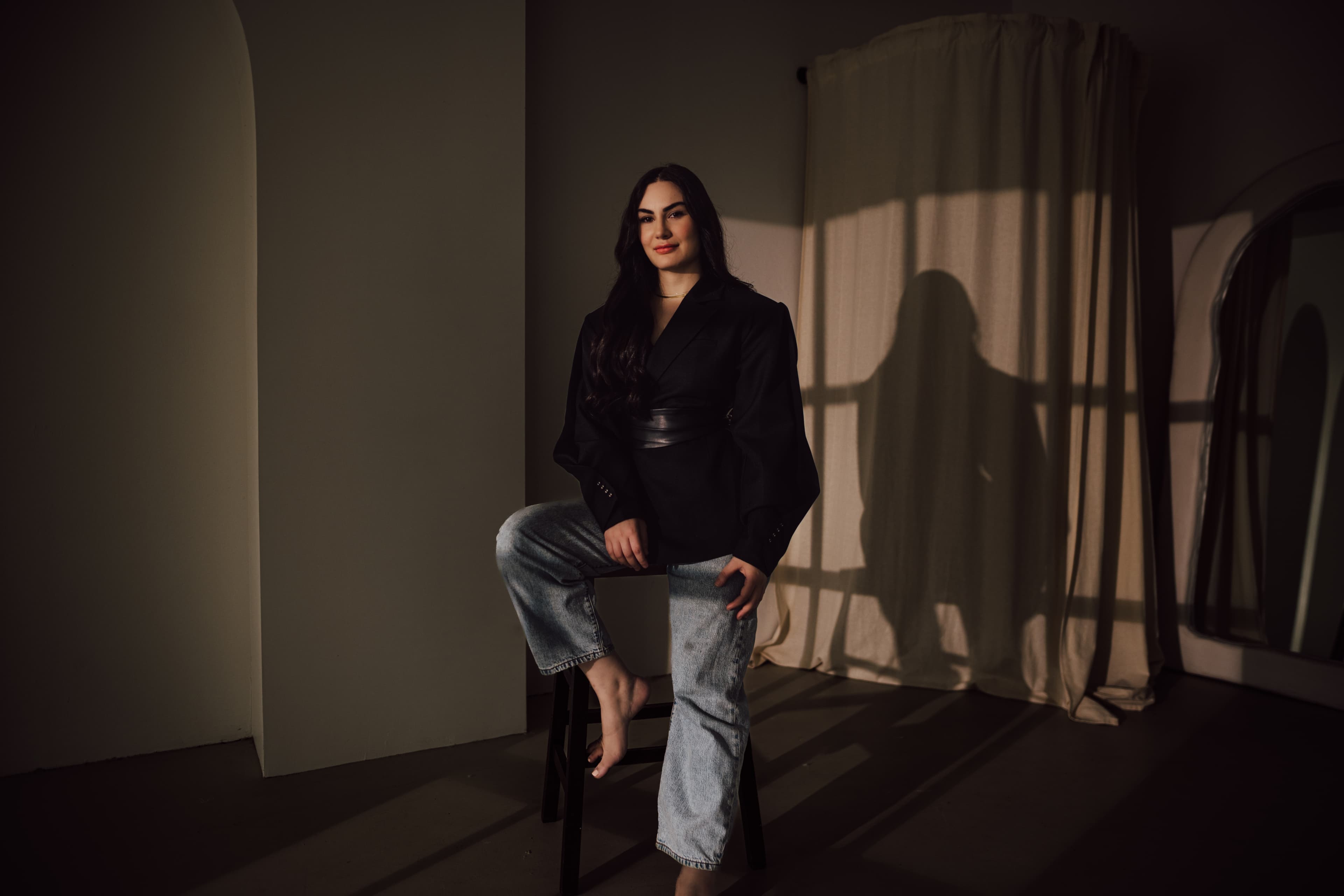
Dr Aya Naj
A personal branding making the clinical personal, and the personal powerful

3 Keys Records
Building a brand identity for Ned Houston’s long-awaited debut
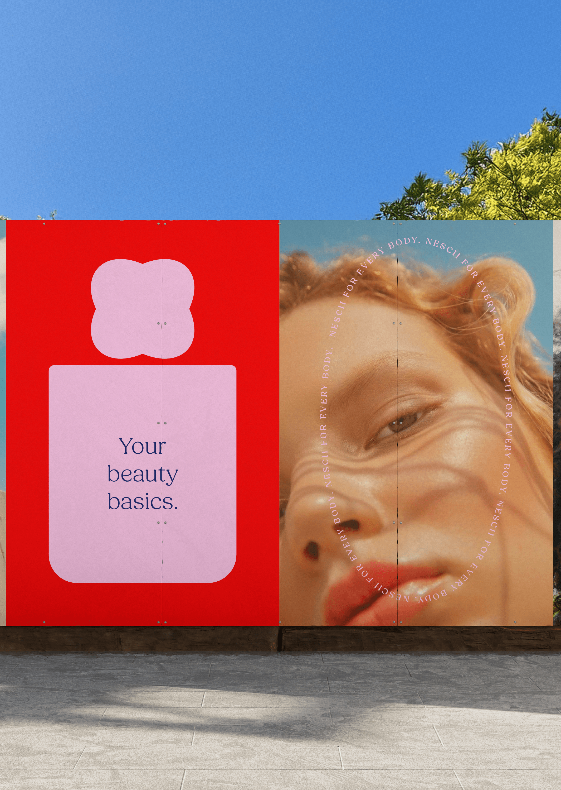
Nescii
Crafting a cosmetic accessories brand identity that believes in life’s little must-haves

Lystr
Property branding for Lystr: building a people’s alternative in real estate

Capital Athletics
Unifying athletics in Canberra under a single, recognised brand identity.
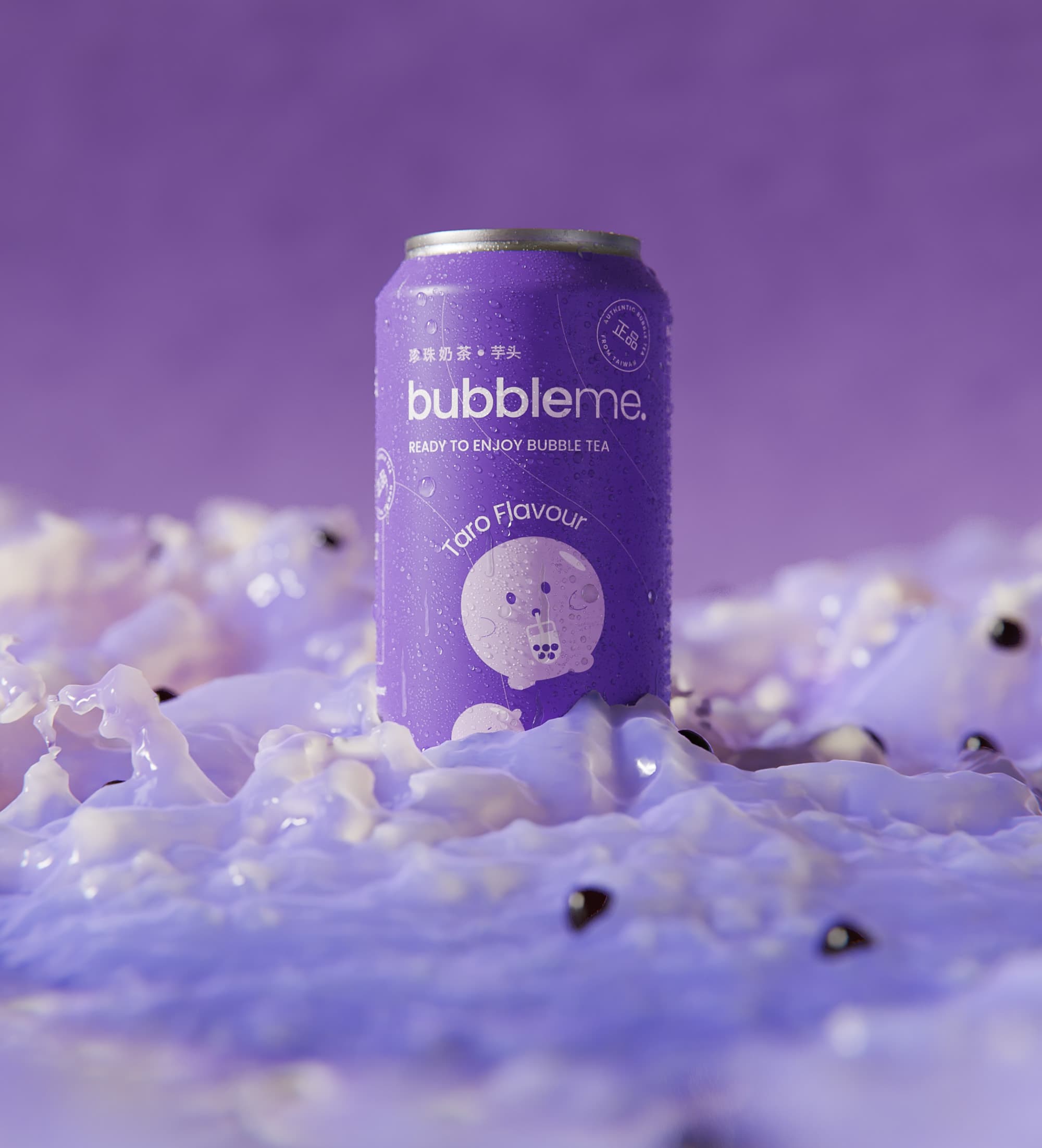
ByAsia Food
Branding & packaging the ultimate bubble tea experience

Sunstrata
Rebranding a solar disruptor taking on Big Energy

Australian Medical Council
Rebranding Australia’s national standards body for medical education and assessment

Worldview
Branding a social enterprise with a vision for $10bn of positive impact, towards an Australia transformed.


Frequently Asked Questions
Brand identity questions we hear most often.
When the brand is costing the business something.
The clearest signs you need a rebrand are commercial. Pricing power is soft, and the sales team is probably feeling pressured to discount in order to close a sale. You might be losing deals to competitors who aren’t actually better than you. The talent you want to attract might not see you as a destination brand to work for. The market you play in might have moved such as new competitors, new category expectations, a shift in how buyers make decisions, and the brand hasn’t moved with it. Or the simplest one: the company you’ve built has outgrown the brand you started with.
The trigger is usually a business event sitting behind those symptoms: moving upmarket, entering a new category, going through a merger or restructure, launching a product that doesn’t fit the current brand, or preparing for investment where the brand needs to signal ‘we’re a very impressive company doing very impressive things.’
It’s also worth knowing that not every rebrand is a full rebrand. Sometimes the whole thing needs rebuilding. But most of the time it’s about making the current branding ooze a lot more charisma.
Usually, yes. Most of our work with established businesses, we aren’t touching the logo. There needs to be a really good reason to do that. The refresh is typically about making the rest of the identity system more charismatic and giving the brand the kind of creative direction it needs to help the business perform better. If the logo genuinely needs looking at, we’ll tell you and we’ll explain why.
If the positioning is really obvious and the company is clear on where it competes and who it’s for, we can just keep the scope to the identity component. We’ll tell you which situation you’re in. We’d rather have that conversation upfront than design something beautiful that can’t do the commercial job it needs to do.
Brand and visual identity are usually spoken interchangeably, but they’re not the same. Visual identity is one part of brand identity. It is how the branding shows up visually only (the logo, type, colour, art direction etc). Brand identity is broader and is the whole personality of the brand. Verbal identity, brand values, and anything that is about the brand expression is the identity. We build the full system.
Ha! Unlikely. Proud to say that never happens, because the Mudeboards phase catches misalignment before we commit to concept design. We keep things very iterative as we move through inspiration gathering, Mudeboards, concepts, refinement, to final delivery. We also try to keep the process very divergent so you see lots of potential directions before any decisions are made and we gradually start converging on the final concept.
Our version of mood boards, we’ve just co-opted it with our name. Each one explores a different creative direction for the brand: typography, colour, textures, imagery, marks. We present them early so we can narrow the creative territory before committing to concept design. The conversation they start is usually more revealing than the boards themselves, because it surfaces what the leadership team actually responds to versus what they said they wanted in the brief. Those two things are almost never the same.
The person that is pulling out their wallet. The identity, the brand guide, and every asset we create during the engagement. We keep the right to show the work in our portfolio, because frankly if we’ve done our job properly it’s the kind of work we want people to see. We’ll probably submit yours to design awards too. Who knows.
Identity typically runs 8 to 14 weeks from kickoff to delivery. If the engagement includes strategy before identity, add 10 to 14 weeks. If it includes a website, 5 to 6 months end to end for everything usually. The fastest projects we’ve done had one decision-maker in the room. The slowest had ten people and a client contact with no authority to make decisions. You can probably guess which one everyone was happier with.
Most companies that come to us need a refresh rather than a rebrand. Brands need constant work to maintain their vitality. What might be driving a refresh is being indistinguishable from competitors, the brand has no cultural posture, and the identity isn’t doing the two jobs it needs to do: create distinction and signal meaning. A refresh is all about giving the core ingredients of the existing branding some much needed TLC, and imbuing more culture and charisma into the identity, the visual system, the verbal identity, the art direction, the creative and cultural posture
A full rebrand is a different conversation. It usually gets forced by a business event: a merger or acquisition, reputational damage the current brand can’t shake, a need to signal genuine change to the market, a category that’s shifted underneath the company, or a business that’s simply outgrown the brand it started with. A rebrand typically starts with strategy because you’re fundamentally changing the DNA, offer or positioning of the company.